This is the weekend edition of TheMarioBlog and will be updated as needed. The next blog post is Monday, Oct. 30.
It is important to make sure that traditional brands get exposed to those elusive young members of the audience—and I am talking young, as in 16-24 perhaps. One way to do that is via social media, and, more specifically, through Snapchat Discover, where the young traffic is, and where attention spans are as brief of that of a butterfly on a rose. Or briefer!
The Economist has a long tradition of excellence in journalism, dating to 1843, but it, too, must attract young audiences that need to sample that great content.
In a recent piece, The Economist editors relate their experience after one year publishing some of their stories on Snapchat Discover.
Having launched on Snapchat Discover in October 2016, The Economist has now published more than 50 editions, on everything from the threat posed by North Korea to the possibility of alien life to the legalization of drugs. And, says Tom Standage, deputy editor and head of digital strategy for The Economist:
Snapchat gives The Economist something most publishers are hungry for in today’s media environment: an audience of young, mobile-first consumers of news and analysis. The Snapchat audience is also large.
The most popular edition so far, “How Well Do You Know Your Presidents?”, which coincided with Donald Trump’s inauguration, reached more readers in a week than Economist.com does in a month. Overall, launching on Snapchat has resulted in “the biggest step-change in the audience of The Economist since 1843.”
One key mention in that piece, The Economist does not talk down to its younger readers. To me, this is extremely important. Young audiences are smart, well informed and will notice in an instant if a publication is dumbing down content.
I remember thinking exactly the same in the 1980s, when so many newspapers decided to devote a page or a weekly supplement to younger readers. The immediate reaction of editors and designers was to create a visual environment that looked a bit chaotic. To them, visual chaos (slanted headlines, upside down photos, mixing of color palettes) signaled “young”. Well, not at all. Sijply because the target audience was 15 year olds, it did not mean producing pages that were difficult to read.
The same applies today. The key, however, is to realize that attention spans (which has nothing to do with intelligence), is brief for the young audiences. Perhaps lean forward is een an exaggeration for this group. More like a flash of a moment of attention. So, a piece that may be a long narrative, an analysis of a complicated story, may be resumed in three screens, but the content itself will be robust on each of those screens. It will take very special editors and designers to extract what is important from a complicated story, adapt it visually to a few screens, and still convey information that is meaningful for a group that likes gourmet food, but wants to get it via the drive thru window.
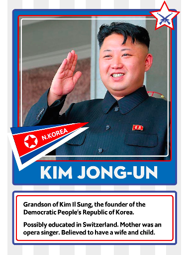
I have said it many times before: we must be able to serve the tapa and the full paella. Apparently, the folks at The Economist are doing it well, as in this example for a story related to North Korea.

In today’s editions of The Economist on Snapchat Discover we see short, simplified video clips for stories that could be complex.


TIME and Trump

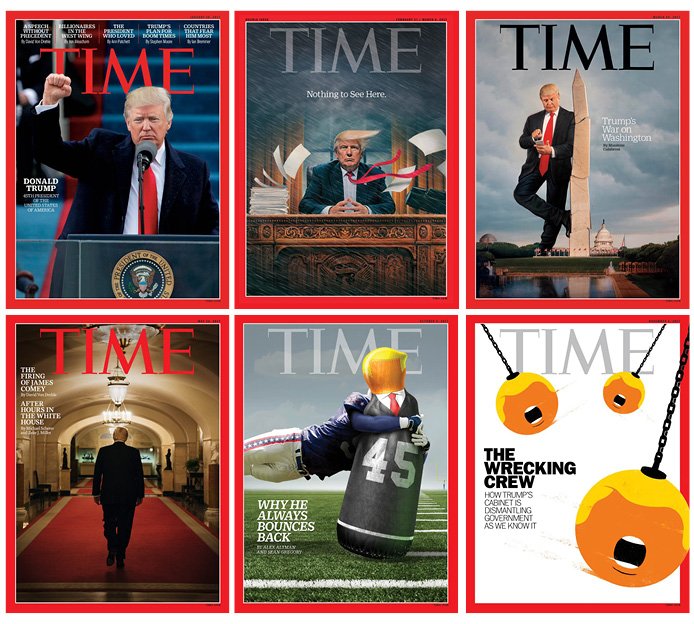
TIME Magazine has profiledPresident Trump on its cover six times in 2017. Thanks to designer Dario Forero for bringing it to our attention via Twitter.
Mario’s Speaking Engagements
Nov. 16-19, WAN IFRA Latin America, Buenos Aires, Argentina

April 18-19, 2018-–Newscamp ,Augsburg, Germany.

June 3-6, 2018—The Seminar, San Antonio, Texas.

Our digital transformation workshops

If you would like to find out more about our workshops for digital transformation, email me: mario@garciamedia.com
I will be happy to answer your questions and provide more information. Our workshops are offered in both English and Spanish.

TheMarioBlog post #2723
