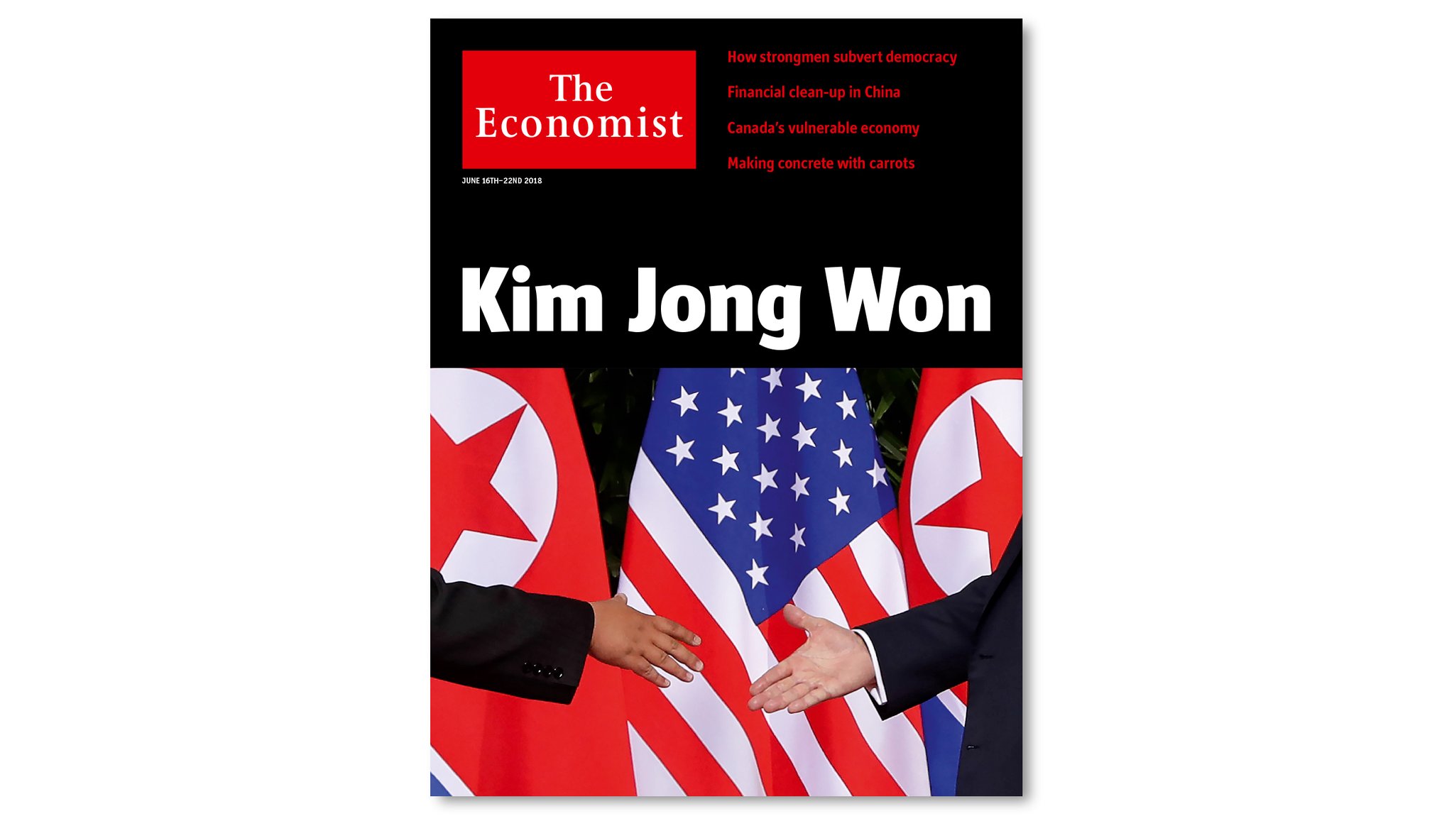
The folks at The Economist always surprise. And they make it all look so easy.
But we know differently: it takes creative workshopping, tons of back and forth on ideas before something like what you see here happens: the ultimate marriage of words and visual images.
This is WED at its best. Yes, WED as in Writing/Editing/Design that come together to tell a story quickly and effectively.
We can learn lessons from this cover.
It is fun, too.
Mario’s Speaking Engagements
August 2, Digital House (Facebook workshop), Buenos Aires

October 6, 20, 27–King’s College, New York City
The Basics of Visual Journalism seminars

Garcia Media: Over 25 years at your service

TheMarioBlog post #2862
The Mario Blog
04.14.2025—4pm
Mario Vargas Llosa (1936–2025): The Scent of a Master Writer
04.02.2025—1am
Teaching about two revolutions in the newsroom
03.31.2025—1am
For editorial teams, the product people are the challenge
03.30.2025—7am
When type alone does it!
03.28.2025—3am
Celebrating the 4000th entry of TheMarioBlog today
—2am
Has the first AI-generated newspaper set visual journalism back?
Sign up and we will keep you updated