This is the weekend edition of TheMarioBlog and will be updated as needed. The next blog post is Monday, January 22.
It’s been a long time since I had a question about the perils of the fold in a print layout.

But the morning mail brought a question from a designer in Switzerland who wanted to know:
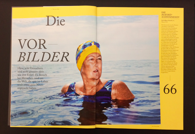
We, a design agency from switzerland, are in a never ending discussion about one particular layout spread.
If you, as a highly experienced magazine design expert, would be willing to give us your opinion it would be highly appreciated.
Our question
Is the position of the fold in the layout to be considered as mistake?
If yes, is it a major or a minor mistake?
Here is what I wrote back:
The fold in a magazine layout is always a challenge for designers.
It is one nobody can avoid.
However, WE try NEVER to put a face smack in the middle of the fold, which is what you did in this layout. It is OK for objects to go across the fold, but a face should not be split in the fold. I would have redone this layout to move the face of the lady to the right or left, but not in the fold.
Mario’s Speaking Engagements
April 18-19, 2018-–Newscamp ,Augsburg, Germany.

May 26, 2018 —Associacion Riograndense de Imprensa, Univesidad de Santa Cruz (Unisc), Brazil

June 3-6, 2018—The Seminar, San Antonio, Texas.

Garcia Media: Over 25 years at your service

TheMarioBlog post #2762