TAKEAWAY: When a writer sets out to find the best tea kettles she runs into hot water with the designers’ attempts to create the next big tea kettle. In our search to design the next big whatever, we often abandon functionality. PLUS: Pure Design download: indexing AND: In the UAE, the mega graphics still thrive on pages of newspapers here
Different not necessarily better
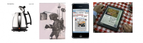
When writer Alice Rawsthorn set out on her quest for a new kettle in a London department store, she discovered that sometimes design gets on the way of functionality. Her chronicle, published in the International Herald Tribune, is a fascinating tale of what happens when something that should be simple and unbtrusive is anything but. Try “fiddly, fussy, overwrought and, at worst, downright ugly.”
It is not often that we go shopping for kettles. It is less often that we think much about the design of a kettle. And we definitely do not attach the term “design crime” to kettles. So, I was intrigued with Alice’s take on her search for the kettle that would do its job quietly and functionally. Alice wanted what we all want: a tea kettle that only raises its voice slightly to let us know that the water is hot and ready for making tea, coffee or soup.
However, Alice truly provoked me when she suddenly asked a question that applies to what we do, and to anything that is ever designed:
The design crimes of the kettle seem to be replicated in most of the other basic kitchen appliances that millions of people use every day. Why are seemingly simple products so badly designed?
Interesting question, Alice. But where your report intrigued me and provoked me is when you introduced me to a term that I definitely know only too well, but for which I never had coined the term.
“The kettle,” you wrote, “is a typical example of a product with a bad case of what I’ll call “designeritis.” “
Did she say designeritis?
What a delicious word, Alice.
I Googled it and Googled it through various dictionaries, only to get the expected message: The word you’ve entered isn’t in the dictionary. Click on a spelling suggestion below or try again using the search bar above.
But I don’t need a definition from Webster’s Dictionary, or any other dictionary for that matter. I even have my own definition:
A designer’s attempt to put the obvious aside, to cast function out the window in the quest to be different, to create an instant reaction of disbelief among users of the product and to let those same users struggle with things that won’t work as they should.
It happens in our business everyday. Designeritis lives. Designeritis thrives. It occurs when possibilities appear seemingly exhausted in making something more efficient, so a designer with a dream assignment forces himself to search for that next big idea, whether it is appropriate, functional or even attractive.
In the case of the kettle, writes Alice, “The only way for the designers of a new model to convince us that it is different enough to bother buying is by tweaking its looks.
That doesn’t give them much to play with, and goes some way to explaining why stellar designers aren’t exactly clamoring to reinvent the kettle.”
Tweeking what works to make it different
Perhaps there is nothing wrong with a little original tweeking in tea kettles, newspapers or automobiles. However, as I usually repeat, there are only so many ways to skin a cat, or remake a tea kettle, or a magazine/newspaper.
I have sat through plenty of planning meetings, at the onset of new projects, where an editor suggests that “an index to content” not appear on Page One because “everyone does it that way.”
Please, an index or navigator belongs somewhere on Page One, and everyone SHOULD do it that way. To put that index on Page 4, simply because it is different is the equivalent of thje tea kettle with no handle, because all kettles have handles on them.
And how often have we been subjected to creating a prototype where the obvious—-such as the promo boxes that should appear as high as possible on a page——is moved elsewhere, where it says goodbye to functionality, simply because “the two other newspapers in the region already have promo boxes at the very top.”. Well, promo boxes belong at the top—whether you put them over the publication’s logo or under it, that is a different story, but don’t push them to the very bottom where nobody can see them when the newspaper is folded. I must have had to EXPLAIN this phenomenon dozens of times.
Another item where editors and designers have probably exhausted their abilities to be different: where to place the lead story that begins on page one. In my view, the theme of the day story that begins on the front page should be immediately accessible on pages 2-3. No question about that. The reader will simply turn the page and get the full theme of the day coverage. However, I find myself looking for arguments to defend this. There is always the editor who will insist on putting this main story someplace else—-it could be two or three pages later—-simply to be different.
Yes, in each case the discussion was one of “let’s be different, not necessarily smart or functional.”
“Neurotically over-styled”
Alice discusses in detail how designers of kettles (definitely not the most exciting design job out there) end up going overboard finessing those spouts in your kettle, ” in their efforts to attract our attention, which is why so many new kettles look neurotically over-styled.”
Amen, Alice.
Beware, specifically, of any new products that fall under the “Back to the Future” or, in our case, the “newspaper of the future” concepts. The workshops usually leading to the creation of anything of the future are usually plagued by a total disregard for that which works, and an enormous desire for those involved to make their mark.
The results? Newspapers with logos that rest on their side, the total absence of stories of consequence or with the appropriately sized headline on the front page, not to mention miniature newspapers that you put in your coat pocket. The effort is always genuine, the outcome more a discussion piece than anything useful.
Beware of “inventing the future” projects
Inventing the future is a worthwhile activity, but it becomes richer when one holds on to the past with one firm hand, while letting the future lead us by the other.
Tea kettles and newspapers have existed for centuries, with a good record of performing well under extreme heat.
Let’s rethink the kettle and the newspaper by studying the functional components that have made them useful tools. There is room for the next big idea, for sure. But it isn’t going to come by fiddling with the kettle’s spout or with the newspaper’s ease of legibility, or the logical progression of stories. Logical thinking should never get on the way of that next big idea, especially when a designer is simply trying to be different.
If we all spent as much time making the already functional and logical excellent as we spend trying to make it different, the industry would be in a better place. Not to mention tea kettles.
Postcard from Dubai: Mega graphics are an everyday affair here
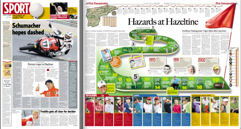
Gulf News: test your knowledge of the PGA Championship’s history
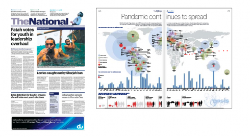
The National: double page graphic about the spread of swine flu worldwide
Oh, the days of the double page mega graphics! We remember them well. However, the economic crisis around the globe has forced newspaper editors to abandon those glorious big graphics that tell the story in visual detail.
In the UAE, those graphics still thrive. Today I found two wonderful examples of such graphics here.
Dubai’s Gulf News displays a playful graphic, headlined Hazards at Hazeltine, which deals with the PGA Championship. The graphic turns into a game, where readers can test their knowledge of the PGA Champioship and its history.
Abu Dhabi’s The National uses the centerspread of its Arts & Life section for an explanatory graphic about the global spread of H1N1 or swine flu.
Good examples both, and a reminder of what can be done when the space is available to tell stories differently.
In both cases, one sees clear, powerful examples
Pure Design: indexing
![]()
Who is Jacky?
Every Sunday: Jacky leads us to his favorite picks from Bild Am Sonntag!
Pure Design: Download entire section: Type
Download entire first section of Pure Design: Words
Now that I have fully presented the first of six sections of Pure Design on TheMarioBlog, I am offering the entire initial section, “Words,” available for download—all 33 pages of it. This may be useful for those of you saving or printing out Pure Design and will be done following each of the remaining sections. At the end of our journey through words, type, layout, color, pictures, and process, I will publish the entirety of Pure Design in one file.
WAN’s World Trends 2009 Report

The 2009 edition of World Press Trends from WAN/IFRA is now available. I always like to review this report for its complete information on global circulation, advertising and online trends in our industry. All countries in the world where daily newspapers are published are covered in the publication.
This year the WAN/IFRA folks have decided to publish a print version but only make the book available on pdf.
Those interested go:
http://www.wan-press.org/forms/wpt2009.html
Follow me at www.twitter.com/tweetsbydesign
Follow the Marios

Two Marios. Two Views.
Follow Mario Jr. and his blog about media analysis, web design and assorted topics related to the current state of our industry.
http://garciainteractive.com/
Visit Mario Sr. daily here, or through TweetsByDesign (www.twitter.com/tweetsbydesign)
In Spanish daily: The Rodrigo Fino blog
:
To read TheRodrigoFino blog, in Spanish, go:
https://garciamedia.com/latinamerica/blog/
TheMarioBlog posting #330