>h5>Update #1: Thursday, July 28, 2011: Cape Town, South Africa, 11:50
TAKEAWAY: While preparing for my series of tablet workshops here in South Africa (for Media 24 group) I was looking for models of apps that go the extra mile. I found a lot of what I was looking for in the new German app, Junction. Take a look
Simple, direct and fun to use: Junction
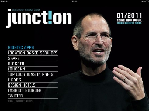
Contents page
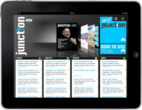
The Junction “cockpit”

Article opener page
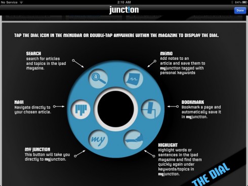
Dial a function
When conducting tablet development workshops for media groups, I believe it is not good just to show what other media-related apps do. In fact, I always try to find that one app that was created without the constraints of thinking with a print mentality.
For this workshop, my good find was the German app Junction, published in English and full of interesting details that all of us should look at.
AS you can see in the video here, the app has been created to reflect all the functions that we traditionally associate with reading a printed magazine or newspaper: marking the page, highlighting a sentence or two, etc. But, more importantly, the creators have thought of extra functions like if you wish to recall something you know you read in an article in the app, simply write a couple of key words and the article appears.
A “dial” appears upon recall anytime on the screen to allow you to perform any of the functions above.
But, as I told the workshop participants yesterday, Junction is NOT over the top, it does not have “explosions” on every screen, and, in terms of the design, it is more vanilla than passion fruit ice cream. However, the navigation is functional; the content flow is impeccable, and the information architecture makes it very easy to follow the main baskets of information: News, Blogs, Tweets(yes, there is a full section devoted to Tweets of interest), Jobs.
The creators call the landing page “the cockpit”, and on the right hand side of the screen one sees feeds settings, relaod feeds and my junction, where user can personalize the app with chosen feeds, memos, bookmarks, etc.
Published by Werben & Verkaufen, Junction is a free magazine targeted at business and online professionals, available exclusively for iPad. The topics have a global focus and include business, technology and lifestyle. Junction is a synergy of articles with real-time-feeds from the (social)web.
It is the extra functions, the ease of navigation and the fact that Junction does not attempt to replicate what we associate with the look of a printed journal that makes it special and worthy of study by all of us developing tablet apps.
And, in my view, the name Junction is most appropriate here: the perfect intersection of bringing the most intuitive functions that we associate with print, with the magic of what a true app can do.
A Junction where all of us should meet often——and soon.
Follow this video to check out all the features of Junction
Of interest today
Our colleague Joe Zeff participated in a program last night, sponsored by the Society of Professional Designers. The event, titled These Guys Kick Apps and So Can You, , included a variety of luminaries who are doing exciting work with app development.
Read Joe’s account of the event in An Event to Remember..
See Joe’s participation here:
http://www.youtube.com/watch?v=FX77GPIcSnA

I Just Died and Went to Samsung Galaxy Heaven
http://www.yankodesign.com/2011/07/26/i-just-died-and-went-to-samsung-galaxy-heaven/?utm_medium=referral&utm_source=pulsenews

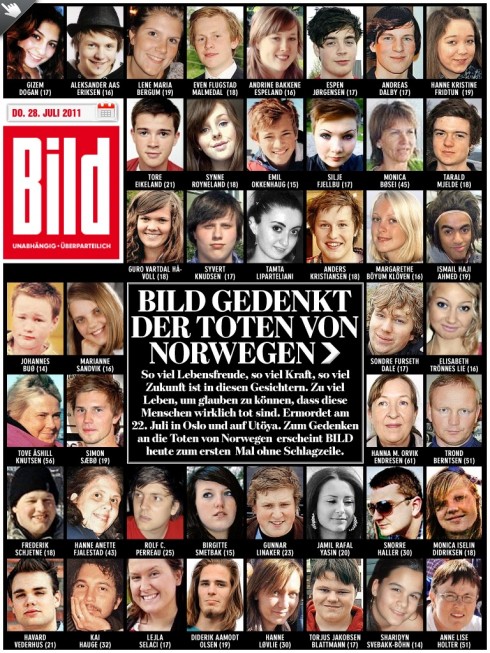
Germany’s Bild Zeitung today publishes a front page and reportage including photos of all those who died during the recent shooting at a youth summer camp in Utoya Island.
In Luxembourg: L’Essentiel rides the wave
This may be the story of the little newspaper that could.
L’Essentiel, the French language daily free newspaper of Luxembourg, proudly reports that it now has 193,000 daily readers, no small accomplishment when you consider that the tiny country of Luxembourg has a population of 458,000.
So, we are told by L’Essentiel, if you count all the readers from France and Belgium who cross the border and commute to work in Luxembourg, then L’Essentiel is coming very near becoming the #1 media outlet in Luxembourg.