Update #2: Monday, July 20, Kuala Lumpur, Malaysia, 18:31
TAKEAWAY: Take a look at Switzerland’s Tages Anzeiger’s new iPad app. It is not quite 5.0 yet, but it has many features that advance news apps to the next level. And, it is curated with two editions a day. PLUS: Mario Jr.‘s take on building a relationship with users AND today’s pop-up moment.
Noticeable upgrades in Tages Anzeiger’s new app
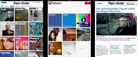
Users have the option of looking at app content through a pictorial navigator, a la Flipboard. The default navigator is a more traditional newspaper look
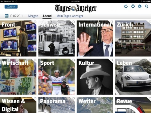
A visual way to navigate the app

Here is article opening for reading mode
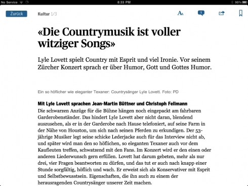
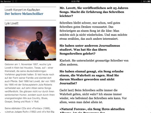
Something rare in many news apps: texture. You read the narrative, but you find secodary readings as well
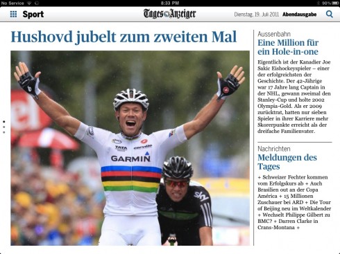
A secondary article opening screen, along with briefer stories: notice use of blue for headlines
Here is one news app to study for what it does and how it does it. The Swiss daily Tages Anzeiger has upgraded greatly on its 2010 entry into tablet territory.
The TA news app reminds us of what can be done when we begin to abandon notions of how to transfer a printed product to the tablet.
The opener is already more Flipboard than New York Times, with a series of images that guide the user to content. And what a pleasant way to look at the “menu”, inspired by photos of the day, then just let the finger do the rest. The app is divided into the following areas: front, Switzerland, Zurich, economy, culture, weather, food, puzzles, Sudoku, regions and the area of ??personalized “My Tages-Anzeiger”.
Hit the one photo that appeals to you, and you are right into story reading mode. Stories are not just text, but have been given the texture of secondary readings, quotes, and a pleasant typographic variety.

Other key features of notice:
My Topics

By subscribing to keywords you put together your individual Tages-Anzeiger.You decide that what topics you wish to stay tuned to.
Side matrix

A matrix makes navigation orientation easier and shows you which side you are (red), which pages you have visited (gray / white) and the download status (unfilled dot).
Editioning: Twice daily

Already by 3 clock at night the morning edition published with articles from the newspaper, you can use the clock from 18 evening edition of the daily updated content available.
Download the Tages Anzeiger app here:
http://ipad.tagesanzeiger.ch/uebersicht.html
Of special interest
Read Mario Garcia Jr’s take on creating registration pages that make users continue navigating your website:
http://garciainteractive.com/blog/view/65/
Today’s pop up moment

Germany’s Bild Zeitung gives us a pop up based on fitness for the man who wants new abs