TAKEAWAY: It is a decision that must be made early, how will your tablet edition look when the user’s eyes first land on it?

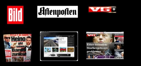
Three different ways of presenting the tablet design: Bild (Germany) uses the printed page as springboard for material; Aftenposten (Norway) uses a more curated edition; VG+(Norway) a curated edition that resembles the look and feel, and headline sizing, of the printed product.
When it comes to the look and feel of a tablet, especially one for a popular, more mass circulation newspaper, there are two ways to go: either the content comes out of a newspaper page template that looks like the printed product, or you go with a total curated edition, where elements are selected, but do not necessarily come out of a traditional newspaper page.
This is a philosophical question that the development team needs to discuss seriously before designing an app.
We find ourselves in the middle of that process with one of our clients at the moment, which prompts my discussing the topic today.
Both can be correct, it is a matter of intent, the impact one wishes to create, and how we feel the DNA of the printed product best translates. It is also a matter of human resources and the technology available to sustain it and make it all happen daily.
When should a tablet edition resemble the printed edition almost 100%?
Bild Zeitung, of Germany, which is one of our favorites in how they utilize the possibilities of the tablet, uses the printed page iconic look of Bild as the springboard to the tablet edition. It is as if the users can’t hardly tell the difference between print and tablet. The difference, however, is in the number of pop ups that Bild runs each day, the playfulness of the tablet edition, and how, in fact, stories that are already bold and upfront in print, gain longer legs on the tablet.
For Bild, this works. Its legendary bold and colorful look translates completely to the tablet, including those underlined bold headlines, the cutouts, the collages of photos where images rest on each other.
When should a tablet edition go its own way?
Again, a philosophical question, a matter of discussion.
In our workshop today the thought is that, while the logo and the DNA of the newspaper should be present visually, the desire is to depart from the newspaper look for a curated experience that is new, fresh and NOT at all relating directly to the printed version of the newspaper.
We now turn our attention to taking a full printed edition and going through the process of selecting the stories , deciding on pop up moments, etc.
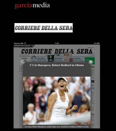
Corriere della Sera

The Italian daily, Corriere della Sera, uses the page as the navigational device for its app. Simply click on a story, and a pop up window appears with that story’s text and/or photo/video.
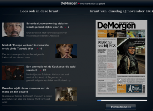
DeMorgen, Brussels

The Belgian daily, DeMorgen, also navigates the tablet edition from the image of the printed newspaper, and articles appear to the left of the page.
Of special interest today:
-Honoring creativity that sells papers in the Middle East
http://www.snd.org/2011/11/honoring-creativity-that-sells-papers-in-middle-east/
Today’s pop up

It is a big game between Germany and the Netherlands. Simple pop up allows user to click on football player and get specific information about that player.