Update #4: Sunday, 08:42 EST: This blog will be updated throughout Sunday as we make further progress in our work with Al Shabiba and Times of Oman here in Muscat
TAKEAWAY: As we continue work with Oman’s Arab language daily, Al Shabiba, we plan to hold a kind of “live” blog event, putting finishing touches on the logo of the newspaper, finishing off other pages, and getting ready for the launch of both Al Shabiba and Times of Oman, April 4. PLUS: Links to interesting weekend reads
Mario’s note: If you are an Arab language reader, or a designer/calligrapher, please let us hear from you about our work with this specific project for Al Shabiba
Lost in a sea of sheens, some with evil connotations!
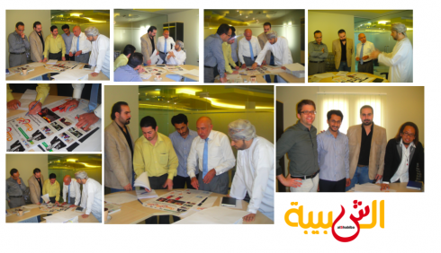
Here we show various scenes of our two-hour discussion all about the “sheen” in Al Shabiba logo today Sunday with CEO Mr. Ahmed (dressed in white at right in most photos)
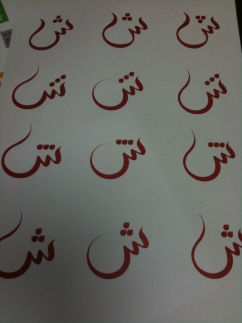
Sheens by the dozens come out of the calligrapher’s brush!
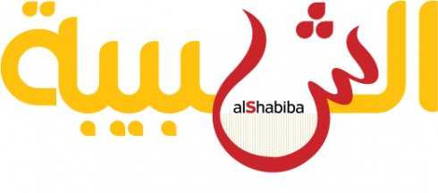
This is still our favorite by Sunday early evening here: tell us what you think
For those now joining thie weekend-long blog conversation: a sheen is the “sh” sound in Arabic, and represented by this character that resembles an upside down C in the Latin alphabet.
We have spent TWO hours today discussing the “sheen” and the calligrapher has gone back to draw many versions, although we still have our heart on the favorite, the one that many of you also say is your favorite. The most conservative elements here think it is too young, that the sheen dances into the page (anything wrong with that?) and that some older, more conservative readers might have an issue with it. We listen and we continue to work on this.
But, as I keep mentioning, the name of this newspaper, Al Shabiba, means The Youth, so a little young dancing on the page may not be a bad idea.
A fascinating aside: we had one version of the “sheen” drawn that, when seen by two Arab readers in the room, appeared to have what one described as a “connotation of evil” simply by the shape of the sheen. We quickly evolved from that one, but it goes to show that dealing with an Arab alphabet presents challenges we never have to worry about with a Latin alphabet, for example. Of course, I have seen Latin fonts where the “q” has connotations of evil, but mostly to the eye. (That’s another story, for another blog, for another day).
To be continued.
What’s in a sheen? What the CEO says….
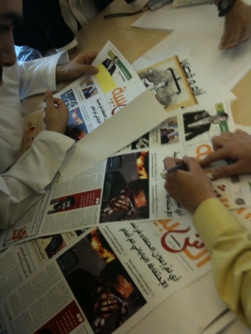
It takes many hands to create a sheen that hits the spot, as you can see here
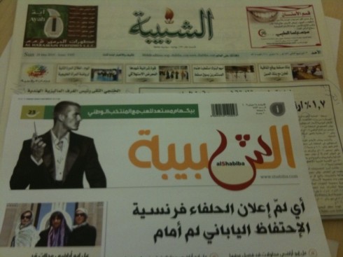
I put today’s Al Shabiba behind the prototype front page, to see how the new logo would play.
Shakespeare asked “What’s in a name?”
I am ready to ask “What’s in a sheen?, as in the Arab alphabet “sh” character.
We have spent two hours talking mostly about the sheen and how Arab readers may perceive it.
Of course, changes of logo are never easy, in any alphabet.
Here, we must make sure, as the CEO reminds me “that ministers, intellectuals and older readers don’t think that we have a punky version of the newspaper logo. We want it to be modern, but not to dance”.
So, during the course of the meeting, with Osama the calligrapher going back and forth, we toil away, and come up with one that may fit all the requirements: young, modern, classic, easy to read, liked by all.
Tall order.
Time for lunch. More to come.
We think we’ve got it

Wow, we think this is it: working around the clock, we now feel confident that this may be it.
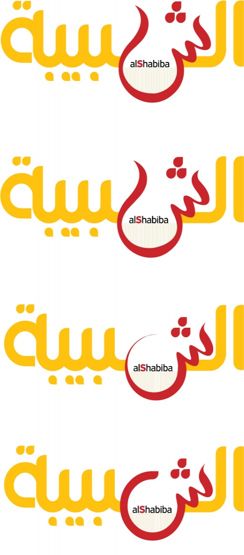
These are the finalists presented, from which we all picked the top one: but the last two had something to offer as well. Oh, decisions, decisions
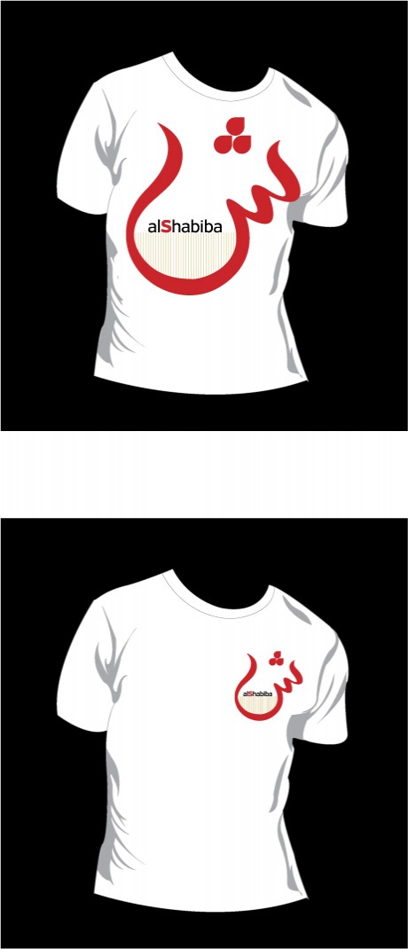
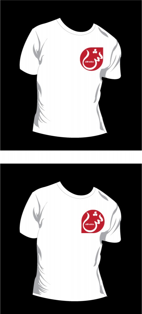
Thinking ahead: a logo becomes a brand that needs to have legs to go beyond the page. How would the logo look on a t-shirt?
Now the calligrapher, Osama Aljawish, returns with refinements of the one “sexy” version of the sheen that we all like. “It is now very easy to read for an Arab reader, but it is also interesting because it could be the stroke of a brush or pen, and that makes it natural,” he says proudly.
But Jan Kny, our Garcia Media art director (Garcia Media Europe) points out that the dots are too close to each other , so we ask him to separate him. Jan asks the question: “In Latin alphabets we don’t want characters to touch, is that the same in Arabic?”
Osama says that, indeed, characters should not touch, so he goes back to the drawing board and separates them.
I have a feeling we are almost there: this is it. But, of course, the CEO may have a different idea. Stay with us.
Presenting the latest version of the logo to the CEO
It is Sunday and we do final tweaking to the logo as we shall present it to the CEO in two hours.
Designers are busy printing latest versions.
Meanwhile, as we came into the building thru a backdoor today, I noticed a very old Al Shabiba logo still sitting at the top of the door. Here it is. A lot has happened since this version appeared.
We hope to emerge with a very modern one today.
Also, I give you a glimpse of the section fronts for Al Shabiba: opening of Local, Sports, Entertainment, all color coded.
More to come as the day progresses.
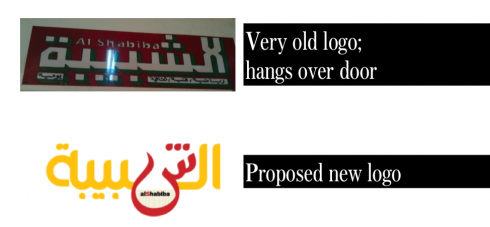
Old logo sits at the top of a backdoor; new version (latest one, anyway) below
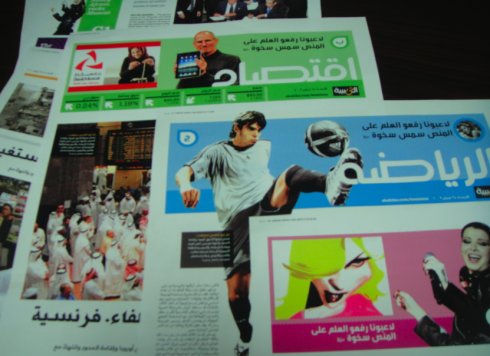
Prototype pages of Al Shabiba’s section fronts: soon to be launched
Reworking the Al Shabiba logo, one stroke at a time—-come join us
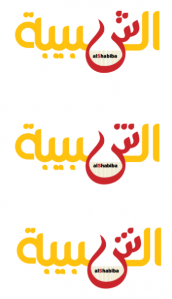
Final three versions of the day for logo of Al Shabiba: read below for progression of events and how we got here.
Time to close the shop this Saturday, and go for a run on the beach. Here is our final work of the day. The differences here are in the positioning of those dots, or whether they are looking up or down, bunched up or separated. I am told that there is flexibility on how they are utilized.
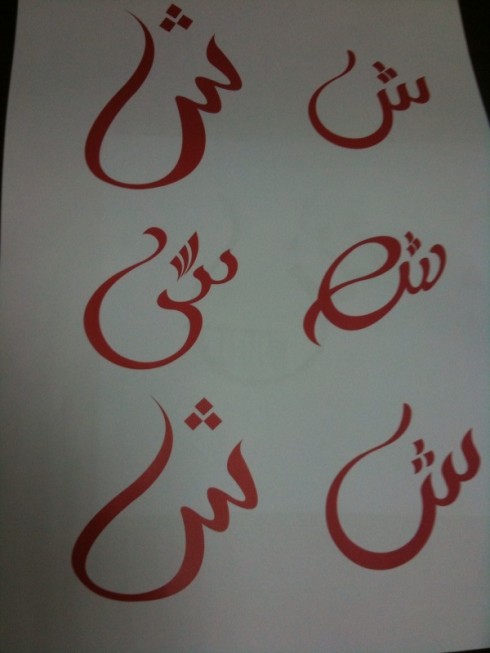
The calligrapher shows up with a variety of new “sheens” for us to see

Sheen 1 carries a lot of visual impact; but some of the Arab calligraphy experts in the room say: not easy to read
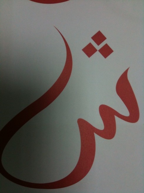
Sheen 2, sexy, but I am told that it is not “Arabic” enough in terms of legibility
So it is 5 pm Saturday and the CEO orders the calligrapher to offer more versions of the “sheen” or SH. We think we like what we already have, but apparently the big boss wants to see other versions. Along the way, we discover at least two that we like out of the various offerings from the calligrapher. See the sheet with all the new “sheens” and then the two we have singled out as having something special. What I call Sheen 1 is , well, sexy——a snake that appears all of a sudden, ready to attack or seduce; Sheen 2 has a sense of order. But, again, my western sensitivities are not what is important here. We continue to consult with the others. Stay tuned.
As we are doing final retouching of the Al Shabiba logo, six days prior to launch, we invite you to come to the blog during the weekend and see where our work takes us
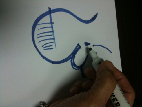
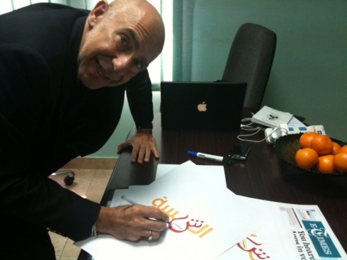
Not easy to recreate Arabic characters, but we give it a try
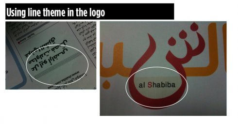
It is 4:40 in the afternoon, and as I look at the Al Shabiba logo I see that it is 90% of the way there, but something is missing: if we are going to use the “sheen” as a branding visual icon, then we have to tie it back to some element that appears consistently thru the design of the daily. So I take a good look and I see that we have a system of dividing lines. Working with the designer/calligrapher, we go back to the drawing board and add the lines to rest in sort of the bowl or oasis of the sheen, where the name Al Shabiba is spelled in Latin letters. It seems to work, but this is still work in progress.
It is Saturday in hot (try 42C) and sunny Muscat, but we only see the sun thru the windows, as we are diligently working on doing final tweaks to the logo of Al Shabiba. Working with our art director, Jan Kny, plus Adonis Durado, design director for Times of Oman/Al Shabiba, and Nasser Othman and and Osama Aljawish, we sketch, execute, look at it, and go back to the drawing board. The making of the logo involves heavy duty calligraphy, so it is good to have the calligraphers sitting next to us.
I take a long time to draw one Arab character, but I find that it is the best way for me to convey to the calligrapher what I have in mind, and how I wish to proceed.
Then comes the issue of how to take that key letter in the logo, the “sheen” which is sort of like an sh sound, to use as a branding element throughout the newspaper later on. How can one go modern, but not sacrifice the charm of the Arab character in the alphabet. We compromise, we go back to the drawing board. At the end, i ask the Arab language readers in the room to take a look and see what reaction they have in 10 seconds.
We are still going at it, and will keep you updated.
Good news on the Arab font development front
The days when a designer facing the task of redesigning an Arab language newspaper got quickly frustrated over the lack of typographic variety are over. Of course, there are still not as many designers working exclusively on Arab alphabets as we have for Latin fonts. But progress is tremendous, and we now have choices, including for Arab versions of fonts that we are well familiarized with, such as Palatino and Frutiger, among others. This does not mean that one cannot call the local calligrapher to create a customized font. That, I think, will always be a trademark of Arabic language publications generally.
We have had a good, although exhaustive experience, in recreating the logo of Oman’s Al Shabiba, which is a project we are currently finalizing to get it ready for an early April launch, the first major graphic/design and typographic change for this daily in decades. Al Shabiba, which means Youth, wants to be truer to its name: it wants to appeal to younger readers member of the Google generation. In our design work, we have not only concentrated on modern and faster navigational tools for each section, but also the creation of a softer, more modern color palette, and, a logo that is more clearly visible and says 2012 at a glance. The font utilized for headlines: Frutiger Arabic (see details below).
But getting here was not easy, and it has taken almost two years (a long, long time for a redesign by today’s standards, where a potential client calls and asks if the final product can be delivered four months from today). For Al Shabiba, time has been well spent. This week we give Al Shabiba its final touches, and I plan to blog from here part of the week, with more details about our work on the change for the newspaper’s brand, which was done thru the creation of a hand drawn logo. Adonis Dorado , design director for both Al Shabiba and the English-language Times of Oman (which we are also readying for a new design) is working hard on the new logo concepts along with designers Nasser Othman, and Osama Aljawish. I now join them with our Garcia Media Europe art director, Jan Kny, to give it all its final touches.
Discussions of logos such as Al Shabiba are more difficult than when one is looking at the logo in a Latin font. I personally must rely closely on the opinion of the locals here; what do the characters say? Is making one character bigger, or colorizing it, as we do here, going to somehow change the meaning or the perception? Here is one instance when “designing by committee” may be the best idea. We hope that by the end of Monday, we should have agreed on the final Al Shabiba logo!
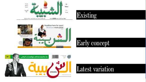
Evolution of a logo for Al Shabiba, and still tweeking it
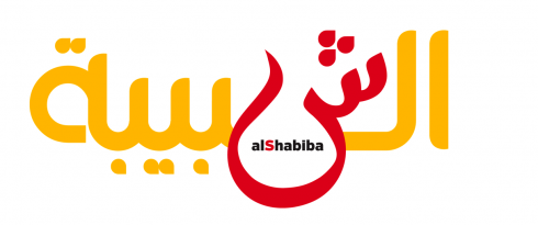
One almost final version of the Al Shabiba logo: still work in progress
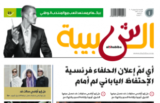
How logo would fit at the top of Page One in this prototype page
What’s new in Arab font development
Our intern, Reed Reibstein (Yale University ‘11) is quite interested in Arab language fonts. He and I often discuss the topic, especially now that he knows I am deeply involved with the launch of Al Shabiba here in Muscat. To that effect, I asked him what he had read recently about the subject of Arab font development. His report is, as usual, complete and with his opinions, which I always find refreshing.
There are many fewer professional Arabic type designers compared to those who work on the Latin script. So while dozens of exquisitely-designed Latin typefaces appear each year, only a small fraction of that number are designed for Arabic. Despite the slower pace of development, several typefaces complete with advanced typographic features, complemented by multiple weights, and suitable for book, poster, and, thankfully, publication design have emerged over the last few years. For the first time, re-thinking a Middle Eastern newspaper or magazine need not mean commissioning custom type—though custom type will often remain the mark of quality Arabic publications for years to come.
Here are a few relatively recent releases that could be of use in a contemporary newspaper or magazine:
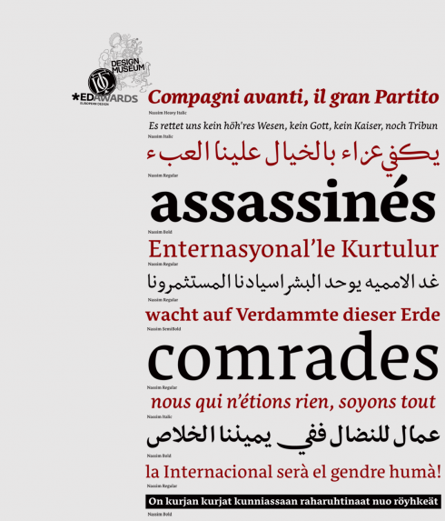
Nassim: adapts well to use in small sizes; created for Tasmeem, the plug-in for InDesign ME
Nassim (http://tntypography.com/nassim.html): Nassim was designed to work in small sizes, in a dictionary, say, or newspaper columns—a rare achievement. With five weights and perfectly matched Latin letters, it’s almost too good to be true. Perhaps the most exciting aspect of Nassim, however, is that it was designed for Tasmeem, the remarkable plug-in for InDesign ME that brings traditional Arabic calligraphic refinement to typography. Tasmeem really has to be seen to be believed: http://www.youtube.com/watch?v=g-1Y2yndUZQ. Even if implementing Tasmeem in newspaper text is too much to hope for, I would love to see Tasmeem-enabled fonts make an appearance in headlines, a modern version of the calligraphic handwritten headlines that some newspapers once used.
![]()
Remember Palatino? Not many designers use it these days, but it may have a vibrant renaissance in Arab language newspapers
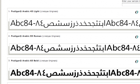
Frutiger: the Swiss font that many tabloids of the 80s loved for front page headlines. We use it for Al Shabiba
Palatino Arabic (http://www.linotype.com/286269/palatinoarabic-family.html) and Frutiger Arabic (http://www.linotype.com/270925/frutigerarabic-family.html): While their Latin complements have been around long enough (I have used them repeatedly over the years myself, but not much nowadays), to the Arabic reading world these are brand new looks. And of course the designs themselves are new, designed in the last several years by Nadine Chahine at Linotype in collaboration with both Zapf and Frutiger. “While many newly-designed publications have embraced Kufic-style type for its boldness (akin to a Latin sans-serif), I would love to see the elegant touch of Thuluth that would grace any page set in Palatino Arabic,” writes Reed. Chahine recently released her newest face, Neue Helvetica Arabic (http://ilovetypography.com/2009/12/04/neue-helvetica-arabic-wishing-on-a-typeface/).
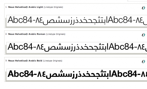
Neue Helvetica Arabic: the minimalist classic conquers new worlds
Reed says that this begs the question: Who will become the Frank Ariss of the Middle East by designing a grid-based newspaper set entirely in Neue Helvetica Arabic? Ariss, as some may know, revolutionized newspaper design in the late 60s when he created a version of the Minneapolis Tribune that was entirely done in Helvetica. It is still one of my favorite newspaper design experiments. And, who knows? Ariss himself may join forces with a young Arabic designer and create the Arabic version of his legendary US product.
One thing is for sure, many Arab language newspapers are NOW very ready to make design a part of their culture. Much has happened in the past five years in this regard, and I know of several other Arab language dailies considering design changes.
Arabian food at the highest level in Muscat: try Kargeen Caffe
Hungry for the best Arabian food in Muscat, Oman?
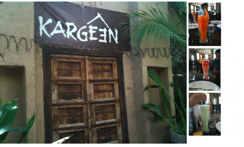
Kargeen Caffe, truly authentic, and don’t miss those fruit juices as you settle in for your meal
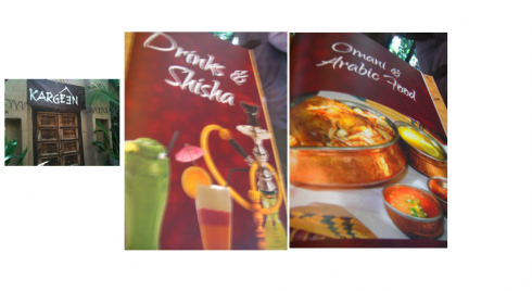
Here are sections of Kargeen Caffe’s menu, which, by the way, includes full page advertisements as well (see below)
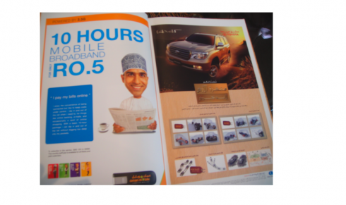
There are ads in the menu of the Kargeen Caffe—-and a hungry and captive audience to look at them
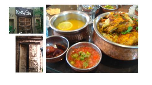
Here is my Briyani Dajav chicken, which comes in a pot with delicious rice mixed with nuts, and a light, vegetable-based soup with lemmon. For the finish, the ever present sweet dates.
Get to Kargeen Caffe. I paid my second visit to this fascinating and picturesque place today for lunch. I went for dinner before, and the ambience was totally different, a shisha at every table, or should I say cozy tables with see through glass that allows for a peek at the exhibit of artifacts under the glass, and little benches with comfy cushions.
Start with one of those fruit juices or smoothies. I made mine papaya, but my lunch companions opted for other choices, like the strawberry/mango/passion fruit smoothie (complete with some ice cream, and definitely not for those on the pineapple diet), or the antioxidant smoothie, green tea and kiwi, among other things. Go easy on the juice, because you still have those tempting plates of flavourful Hommos Bil Tahina, the moutabel and the Fatil al Bashia, but the winner here is the basket with Kargeen’s homemade Filafil special bread.
Kargeen can offer you pasta, pizzas and western style salads, but who wants to do that while sitting in the midst of a room with a lamp that hangs like an upside down barril from the ceiling making even short people like me have to lower our heads as we pass, not to mention the shishas that wrap themselves like snakes around the smokers, spewing out a rich aroma with the smoke that is like a mix of cinnamon, ginger and other spices. The house cat can come by and rub your legs, and if you ask him, he will jump and sit on the cushion next to you.
I am a chicken lover, so I went straight for the chicken dishes (see my meal in photo here), and picked the Briyani Dajav, which comes in a pot with delicious rice mixed with nuts, and a soup that was light enough for lunch in a day when the temperature was very high. Of course, there is a bowl of dates for something sweet after this way too big a meal for lunch. My lunch companions opted for lamb or fish dishes, all delicious, but such big portions that, in typical American style I asked for “doggie bags” and told the guys to take the big bag home to their families. Funny: we Americans don’t mind at all asking for the doggy bag to take home, even in the fanciest restaurant. But I notice that outside of the US, this is not customary. “Food should not be wasted,” I told the guys, who all agreed.
We all wanted to take a nap afterwards, and some of us decided that LUNCH was the meal of the day.
If you go: get all the information you need from their website, and you will like the home page music, too:
http://www.kargeencaffe.com/
The weekend is here and time to offer you some interesting links for when you are ready to sit down to catch up. Reed Reibstein has sent me some materials that I also find of importance for all of us before we head out to business meetings next week:
A superb summary of 15 video demonstrations of prototype publications on the iPad, from exact replicas of the print editions to truly interactive magazines.
Mario’s note: Don’t miss The New York Times and the Dutch daily De Telegraaf if you want to see rare demos of how newspapers will go iPad. So far it is usually magazines that project demos, so I found these to be quite interesting.
http://paidcontent.org/list/tabletmags/
Study on what potential tablet users plan to use them for; 1/3 plan to read newspapers and magazines, while another 1/3 does not plan to at all!
http://www.comscore.com/Press_Events/Press_Releases/2010/3/comScore_Releases_Results_of_Study_on_Apple_iPad
Good discussion of advertising strategies for the iPad
http://www.nytimes.com/2010/03/25/business/media/25ipad.html?emc=tnt&tntemail1=y
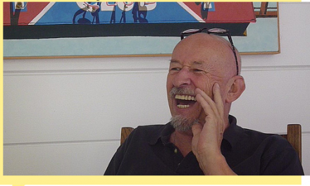
Video of Jim Parkinson interview: Don’t miss him discussing his most famous logos
Video interview with Jim Parkinson, designer of the Newsweek, Rolling Stone, and Los Angeles Times nameplates.
Mario’s note: Don’t miss this vintage Jim Parkinson interview: the master of newspaper and magazine logos sits at home and reminisces. At 69, Parkinson is still a genius to listen to.
I was honored to work with him through the years, and what a thrill it was to see him in action: listening to the briefing, then sending early drafts that you felt like hanging on the wall and preserving forever, except that he will tell you: “No, Mario, the caps are not quite right there, and I want to capture more of a Spanish and sports kind of flair for “El” in El Grafico.
I called upon the talents of Jim Parkinson for a variety of projects across the world. Each time he would produce a winner, whether it was restoration or creation. And, like people with his talents and genius, a humble, personable, great to work with person. He danced around the restoration of The Wall Street Journal logo with Joe Dizney and me; he cleaned The Charlotte Observer logo with us, and the Gulf News of Dubai, El Mercurio (Chile) and dozens of others. I still keep his early sketches for each in my files, precious mementos of the master at work.
http://fontfeed.com/archives/fontcast-10-jim-parkinson/