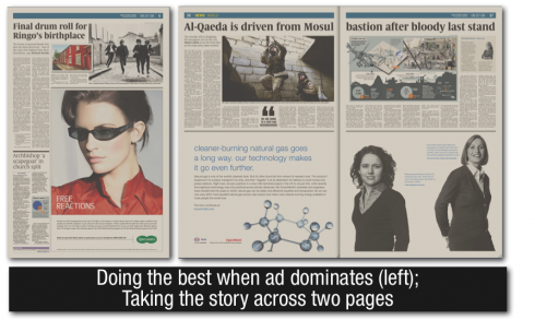
Regardless of the size of the ads, these pages show that one can maintain a sense of hierarchy, with one dominant story, secondary stories and briefs. In each case here, a visual dominates as well, becoming a Center of Visual Impact on the page, that one door that the reader kicks open first. True, the ads are dominant, but the surrounding elements are not hidden either.
Whenever possible, carry headlines and images two pages across, as seen here. More and more, tabloids are selling two pages across the bottom to advertising; the designer capitalizes on that type of horizontal movement to do the same with the design of elements at the top of the page. Headlines in this case need to be large (84 plus points preferred), to carry the eye across.
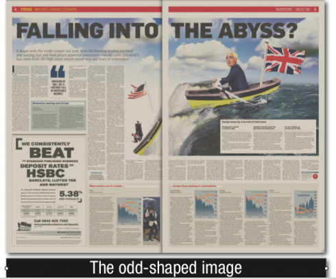
When working with images, it is not necessary to make it all rectangular; notice how the odd shape of this two-page illustration serves to bring us into the page. Headline and visuals are combined in this case, another good idea.
SOMETHING TO THINK ABOUT: In his review of the Sunday Times’ redesign (http://blogs.guardian.co.uk/organgrinder/2008/07/sunday_times_redesign_a_missed.html), Mark Porter, creative director of London’s The Guardian, comments that the design “lacks personality. This design contributes nothing to distinguish the Sunday Times from its competition.” I have been thinking about that statement. How important is this distinction from the competition? I wonder how many designers set out to create a prototype purposely attempting to be different; true, this may be a positive marketing idea. However, it is becoming more and more difficult to accomplish distinction. Like automobiles, which seem harder to tell apart these days, newspapers are designed with some features that are universally proven to work: a good sense of navigation, strong visuals on page one, good use of color on every page whenever possible, and, indeed, blue logos or red logos as the dominant color choices. So, what truly creates the distinction, in my view, is CONTENT. I bet that two almost identically designed newspapers in the same city can establish their own personality by the content included, the quality of the journalists, the columnists with a great following, and the service offered.
MARIO ASKS YOU: How important is visual distinction from the competition? How do you strive for it? How about content distinction?
LEARNING FROM THE POETS: Twice today, during conversation with editors, I heard the phrase “newspapers are on their death beds”. Twice today I insisted that such is not the case. In many parts of the world (India, Thailand, China and Nigeria, among others) newspapers are born. At the end of my day, I kept thinking of a phrase I read recently, from the Syrian-Lebanese poet, Adonis, who wrote: “Pessimism is a routine, optimism is creativity.”
Interesting thought to hang in newsrooms across the globe.
WHERE IS MARIO? In Paris; tomorrow flying back home to Florida, where I stay the week.