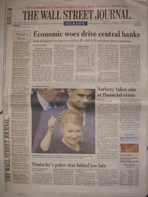
Here is the Friday/Sunday, Feb. 6-8, 2009 edition front page with a narrow, single column What’s News treatment

Here is one of the original front pages of the WSJ when it converted to tabloid, with a two column What’s News
What were they thinking?
We all know that the design of a newspaper is a constantly evolving process. We also know that there is quite a difference between a prototype created for a project, what actually comes out, and what is there one year or more later.
In the case of The Wall Street Journal Europe, when we did the conversion to tabloid in 2005, I remember that a most important and sacred part of the front page design was the What’s News column, that forever-the-best navigator ever created, and which the WSJ has carried on its front page for over 80 years. AS I have always said, whoever decided to do a full summary of the news on page one was a true visionary.
So I was quite surprised, as I passed thru the Frankfurt airport yesterday, to find a copy of The Wall Street Journal Europe, weekend edition, with a very skinny, almost-not-there version of What’s News.The more I looked at it, the more I asked myself the question: What were they thinking? Or, is the What’s News navigator on its way out? It is such an anorexic remnant of what it was, that this must be a way for the editors to begin the process of eliminating it. Or maybe this was just a one-day kind of experiment. I would hope so, anyway, since this What’s News full summary of the top of the news for each day is one navigator that the world needs to see as a model.
Coke with a coffee taste—-and the cafeine kick
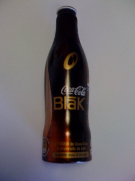
Perhaps I am the last person in the world to discover it, and it happened while in Paris this week: Coke fused with a coffee taste that is supposed to give you that much wanted kick in the middle of the afternoon. The bottle is interesting and conveys what this new Coke is all about in an instant. When one visits the Coke website to find out more, one encounters a beautifully designed—quite colorful—-website, but not much reference to this coffee-infused version of the legendary drink. Is it possible that it is only available in France? If you know, let me know.
Take a look: http://www.mycoke.com/home.jsp
Seeing red, and liking it
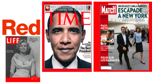
Magazine designers have always had a love affair with Red as the color of choice for logos.
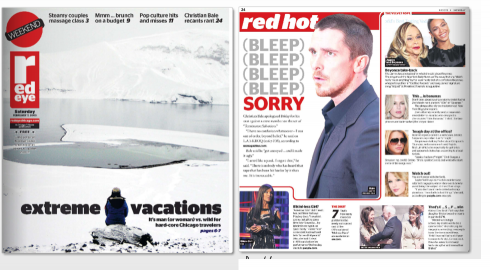
In Chicago, the free newspaper, Red Eye, even picked the fiery color for its name
Newspaper and magazine designers have known it for years. When in doubt, reach for the color RED, apply it to the logo or nameplate, and, presto, instant attention to that cover or front page.
Blue, on the other hand, is the color for travel sections, or for supplements emphasizing opinion and commentary: let the reader relax, contemplate, feel creative.
Now, a new study, published Thursday in the online edition of Science magazine (and reported in the International Herald Tribune) gives further credence to this belief: the color red can make people’s work more accurate, but blue can make them more creative. In the study, researchers at the University of British Columbia conducted tests with 600 participants to see how cognitive performance varies when people see red or blue. Participants performed tasks in which words or images were displayed against red, blue or neutral backgrounds on computer screens.
Red groups did better on tests of recall and attention to detail, like remembering words or checking spelling and punctuation. Blue groups did better on tests requiring invention and imagination: coming up with creative uses for a brick or creating toys from collections of shapes.
“If you’re talking about wanting enhanced memory for something like proofreading skills, then a red color should be used,” concluded Juliet Zhu, an assistant professor of marketing at the university’s business school, who conducted the studies.
There you go. Paris Match, TIME and hundreds of other magazines worldwide—-not to forget the original LIFE magazine—-made RED their logo color of choice. It appears that a majority of newspapers, opting to be more contemplative and relaxing, opted for blue logos, with exception of tabloids, which always went for the more aggressive red.
For the full article, and for the Science magazine piece:
http://www.iht.com/articles/2009/02/06/healthscience/color.php
http://www.sciencemag.org/cgi/search?src=hw&site_area=sci&fulltext=color+study&search_submit.x=14&search_submit.y=3&search_submit=go
TheMarioBlog posting #187