Because of the Easter holiday, this will be the weekend edition of TheMarioBlog. The next blog post is Tuesday, April 3.
Happy Easter to everyone!
It is always gratifying to receive feedback after a seminar presentation, especially one that is done for a large audience, where the interaction is less than desirable. I was a presenter for the Society of News Design’s annual conference, in New York City, last weekend. It was a good crowd, and I was given 30 minutes to present, which I knew would not be enough to allow for a Q&A session.
That’s why I am happy to be getting feedback via email, along with a question here or there. I thank those of you who are sending me messages to tell me how much you learned and the tips you took home.
One of the emails was specific in its inquiry: “You mentioned as one of your main six themes for your presentation, that one should begin designing with the smallest screen. Why is that?”
Start with the smallest
Good question. The answer is that when it comes to the presentation of information, we know that many in the audience will be consuming it on the phone, which is the second smallest of the screens in the media quintet: smartwatch, smartphone, online, tablet and print.
So, it is not just the visual elements that must work well FIRST on the smallest of the devices, but also the presentation of headlines, summary paragraphs and story structures generally.
In any of my current projects, I now start conceptualizing how the overall presentation of news will be on the phone. Here is some of the process:
1. Push notifications. Start with push notifications. These are short but important summaries of stories that we send to our subscribers to tease them about stories coming through the pipeline. The designer will create templates for push notifications, to make sure that icons, logos and other visual elements are clearly visible on the phone screen.


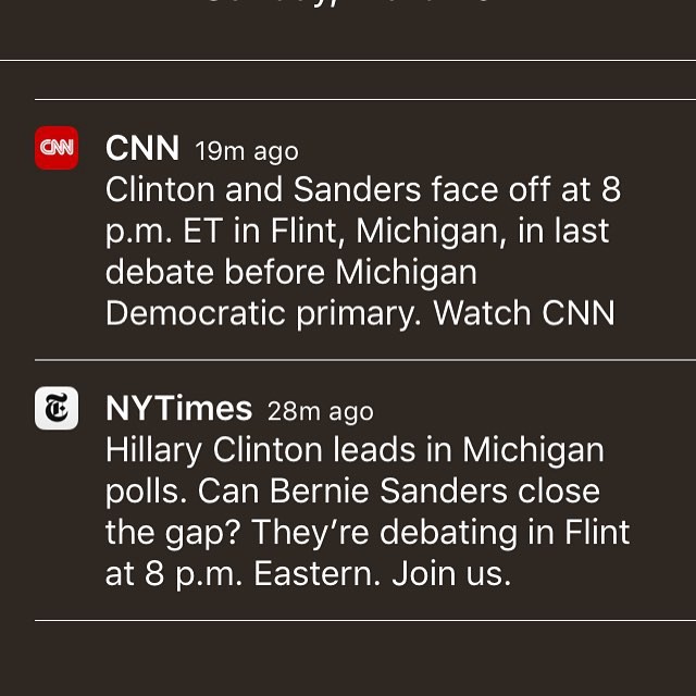
2. Logos. How does the logo, or branding, of your organization fit into the small screen. Long names don’t do well. Is there a way to create a simplified version of the logo to be used on small screens, such as how The New York Times uses its famous T as its digital brand, or the G for The Guardian.


3. Storytelling. How will the story flow as it is consumed on the phone. Here is where linear visual storytelling helps.
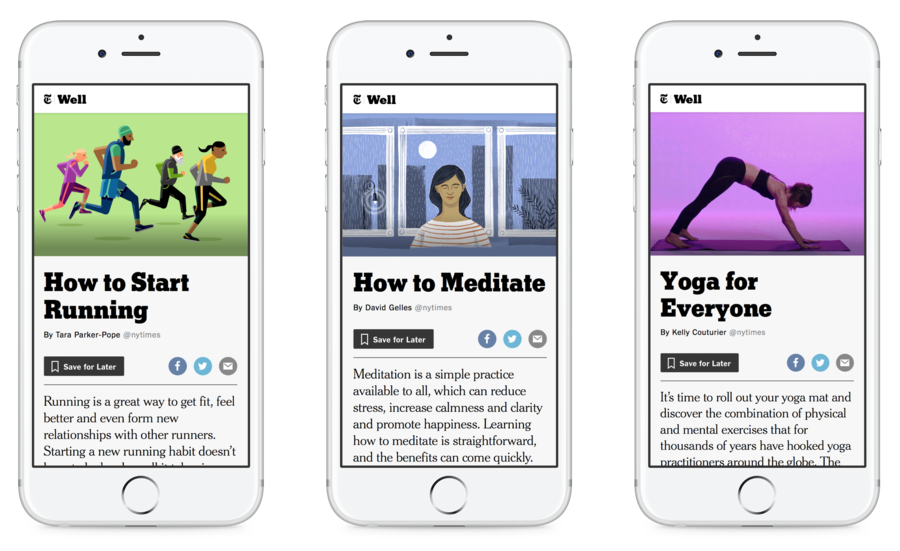
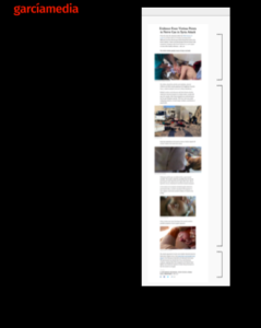
But simply because it works well on a small screen does not mean that it will be a success in other platforms, and here is where the designer/editor can work together to create differences that accommodate the specific qualities of a platform as it relates to how the content will be consumed.
I believe that much of what works on the phone will work online and on a tablet. Sometimes only small alterations need to be made for the print version of the story, although we should always remember that the way we read in print is different from how we consume information on a smartphone: in print, we look at photos, then read the captions; on the phone, the text leads to the photo and there is no need for captions.
In print, once the reader is reading the text, it is advisable NOT to interrupt the flow of text with images, something which is recommended for mobile (scrolling) reading.
Generally, what works on the smallest screen passes the test for all other platforms.
Mario’s Speaking Engagements
April 18-19, 2018-–Newscamp ,Augsburg, Germany.

June 3-6, 2018—The Seminar, San Antonio, Texas.

June 7-8—WAN-IFRA World Congress, Lisbon, Portugal
June 12-14, CUE Days , Aarhus, Denmark
http://www.ccieurope.com/news/6738/Video_What_is_CUE_Days_2018
December 6, El Pais Conference, Montevideo, Uruguay
A series of conferences and seminars for El Pais journalists, invited professionals and communications students: The future of journalism.

Garcia Media: Over 25 years at your service
TheMarioBlog post #2807