TAKEAWAY: What’s in a rebranding effort? Well, for Starbucks, the coffee giant, it all starts with dropping its name from the logo, letting the well known siren become the recognizable symbol of this company. This is the fourth change of logos for Starbucks in 40 years.
![]()
The new logo for Starbucks, introduced last week
![]()
This was the Starbucks logo until last week
It’s a new logo on your cup of Starbucks coffee. Hopefully, the taste of your cup of joe is the same.
I don’t know about you, but I am a loyal Starbuckscustomer, especially when I am in the US. I like the ambience with the comfy chairs, and the living room style groupings of sofas and love seats. I can take my iPad and read while sipping coffee or tea, and, at lunch time, I can always count on a light, quick to go meal, while listening to the latest CD from the Starbucks collection. You see, at Starbucks they don’t just sell you coffee. They sell you a restful environment with free wifi connection——the cafe environment of the 19th century with the technology of today, and a mean cinnamon cake light to go with your tea or coffee.
What a surprise for me, then, to find out that the Starbucks logo has changed as of last week. In a way, I am glad I was told, as otherwise I don’t think I would have noticed it. The change is minimal——-unless you are a marketing brand expert, then you may have issues with it.
The familiar green circle is still there, but the “siren” or mermaid now is the only image inside the circle. But, lo and behold, gone are the letters spelling Starbucks.
This is the type of change that I know would have sent newspaper and magazine managers rushing for oxygen. Changes of logos in newspapers often make for stressful discussions. In my experience, one should never trust a publisher who tells you: Go ahead and propose new logo ideas, as we are open to change.
The truth is they never are truly serious about the change; they fear it; they don’t want the change to happen on their watch and they won’t like anything you propose!
But for us in this business, it is fun to fantasize what that logo could look like with a different font, or without the state capitol stuck in the middle of two words. And sometimes you win.
Four logo changes in 40 years
This is not the first time that Starbucks changes its logo, although it does not do it as often as it changes the flavors (and names) for its coffees and teas. In fact, the company has made four changes to their logo in the last 40 years. All of the changes have been a redesign of the famously recognizable logo the company started with in 1971. According to Starbucks, the logo is a “16th century Norse woodcut of a twin-tailed mermaid, or Siren.”
Some of the marketing experts on rebranding assume that Starbucks may be deleting the name of the company from the logo as part of its future incursion into foreign markets such as China, with lower numbers of English speaking people. However, when international magazines go into this markets, such as GQ or Men’s Health, they put their logos in English right on the cover as a selling point for a recognized brand, even if the rest of the headlines are in the language of the country of publication.
Furthermore, in my experience working globally, people in foreign countries love their relationship with American products and saying the name of the company, even if it is the only English word they know. Something for Starbucks to think about.
From siren to frog
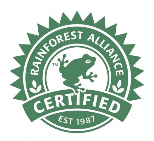
No, the siren did not turn into a frog: this is a different company with a ‘slight” resemblance to the Starbucks logo
What a surprise for me this morning at my hotel in-room coffee bar. I was up early ready to make me a cup of coffee and was so happy that the packages contained Starbucks coffee.
But, although the green circle looked familiar, that was not a siren there, it was more like a frog, and the name of the coffee company packaging these grains was Rainforest Alliance Certified Coffees.
But the green circle was quite similar to that of Starbucks.
A purely coincidental and confusing early morning moment. Siren or frog did not matter at the end. Their coffee was almost as good as Starbucks’.
Newspaper design contest in India
It is that time of the year again. Interested in entering your pages in a design contest? Here is how to do it:
Entries invited to the second edition of India’s first newspaper design competition conducted by www.newspaperdesign.ning.com
The Categories are
1.Best of Page one
2.Best of Feature page
3.Best of Business Page
4.Best of Art/literature Page
5.Best of Sports Page
6.Best of Infographics
7.Best of Centrespread
8.Best of Redesigned Daily
TheMarioBlog post #691