This is the weekend edition of TheMarioBlog and will be updated as needed. The next blog post is Monday, November 24
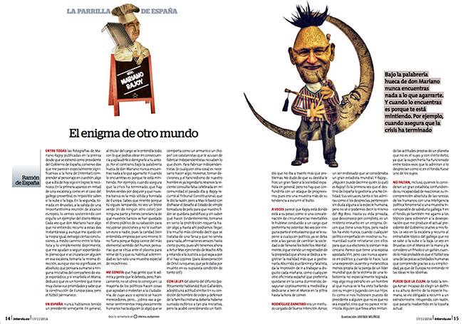
This image of Mariano Rajoy, President of the Spanish government, for Interviú magazine, as part of La parrilla de España (The Grill of Spain). Each week, the writer Ramon de España, creates a critical profile of a person in the news.
Javier Muñoz Fernandez’s illustration in this week’s Interviu Magazine of Spain is of the President of the Spanish Government, Mariano Rajoy, a controversial figure. It is exactly what this story needed for its visual presentation. It is a story with a point of view, and the illustration conveys it immediately.
That’s what illustrations can do for stories where a photo would not do the job. I had a conversation with Javier about his own work and the present and future of illustrations as part of storytelling.
A chat with Javier:
Mario:
Illustrations have suffered in many publications around the world as a result of cuts in graphic/design departments. We don’t see as many illustrations in US publications, for example. But I still see great illustrations in Spain’s publications, in spite of the economic crisis there. What’s your thought on this?
Javier:
In Spain we have very good illustrators. There are newspapers and magazines, that, in spite of the cuts, still invest in illustrations and infographics. Such national dailies as El Mundo and El Pais, and the regional El Correo still value an illustration. They believe in design. The culture of journalistic design in Spain is new, and we have to be grateful to people like Javier Errea (designer) for pushing for this.
It is difficult to predict the future of printed newspapers and magazines. It is possible that only a few newspapers will survive, but those that do, in Spain, will take care of their visual presentation.
Mario:
What’s the role of illustrations in digital platforms?
Javier:
Digitally speaking, I don’t think that editors in Spain have learned how to use illustrations well. They do use them, of course, but not in a manner which makes them shine; the digital design has not evolved much in this area, I believe, but I am sure that, with time, illustrations will gain a prominent place in digital platforms, along with animated graphics.
The process behind the Mariano Rajoy illustration for Intervieu Magazine
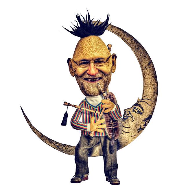
Javier describes the process as he was assigned to do this illustration of Mariano Rajoy for Interviu:
The writer, Ramón de España, sends me his completed article each Monday afternoon. I normally have the illustration ready Wednesday by noon.
Interviu gives me total freedom, and they have never censored anything I have done up to now. When art director Ana de Blas hired me for this job, she asked me for a specific style, always satirical. She prefers the absurd and surrealist, and she likes my occasional references to classical art.
About the Rajoy illustration: I was inspired by the text. Rajoy is a gray president in a difficult period. He is aloof and his few speeches are not in touch with the reality faced by the people. His answers tend to be always evasive, Galician style. He never says anything. Last week we celebrated 45 years of Sesame Street in Spanish TV, and so I thought I would pay homage to that wonderful world. Blas (Bert) is a grouchy and bland character. I like the clean look, to do soft satire, respecting each character's dignity. I like to do my work from an affectionate viewpoint and not be destructive
For the Interviu piece, in Spanish:
http://www.interviu.es/opinion/la-parrilla-de-espana/el-enigma-de-otro-mundo
From the Javier Muñoz Fernández Portfolio

Self caricature: Javier Muñoz Fernández
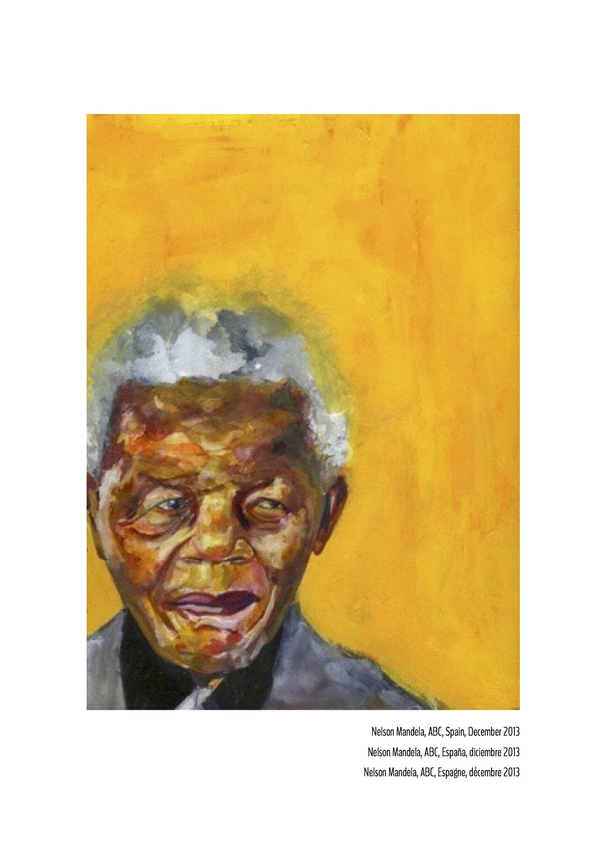
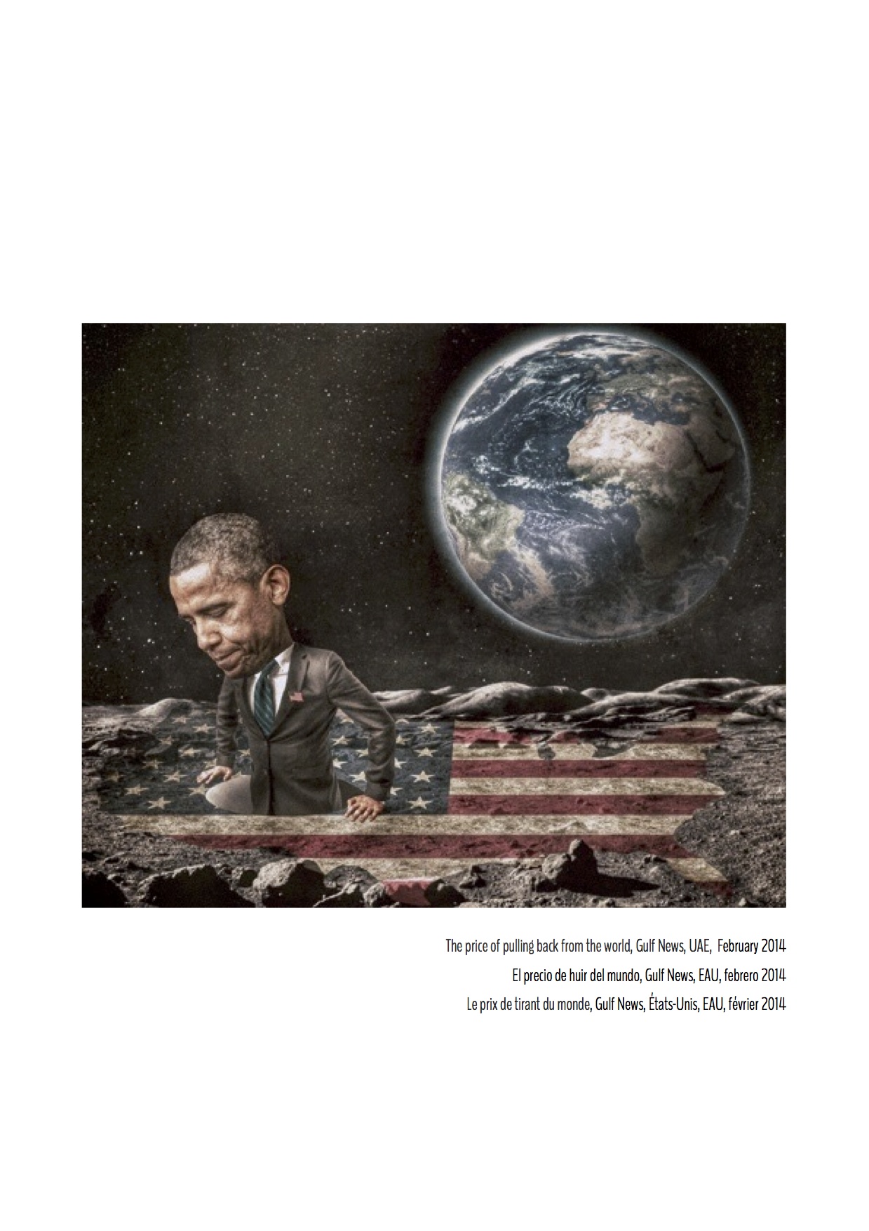
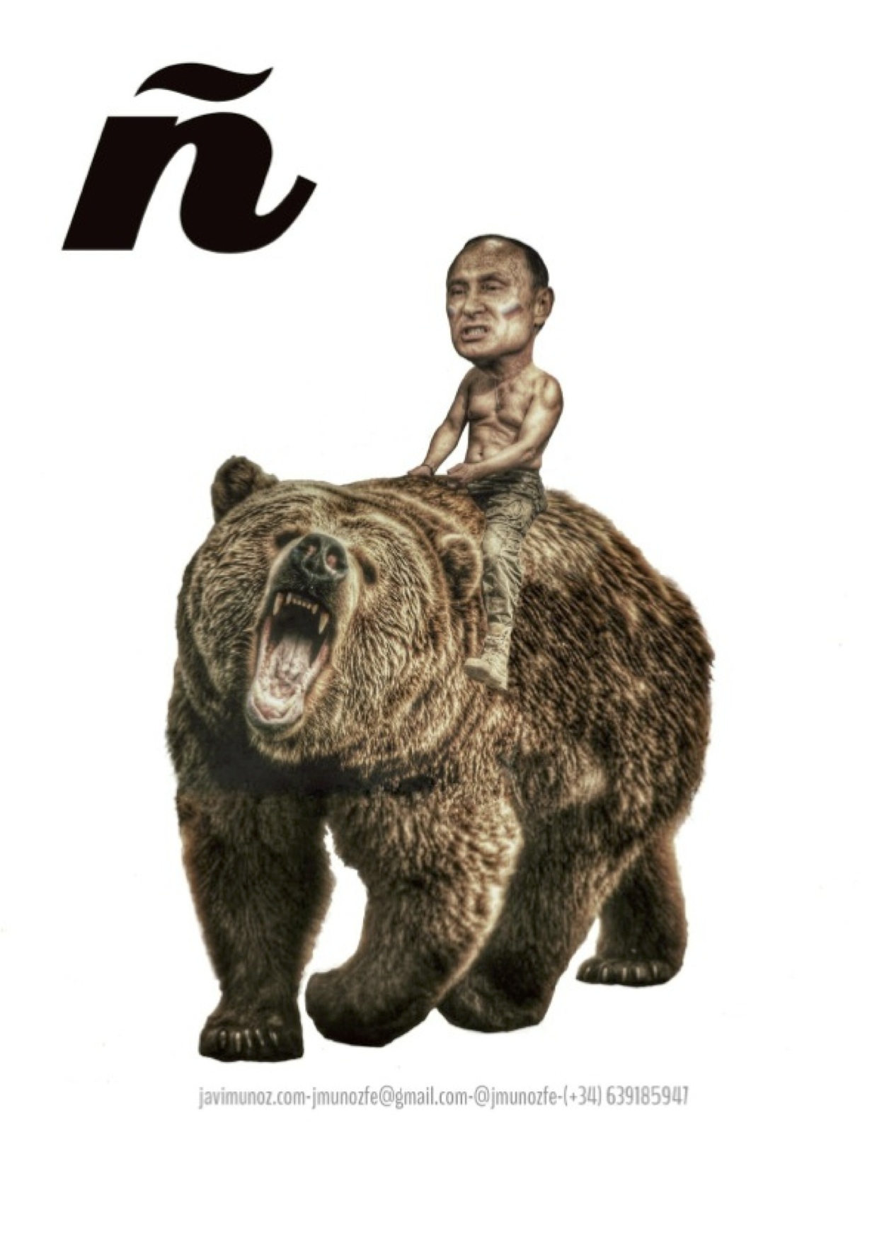
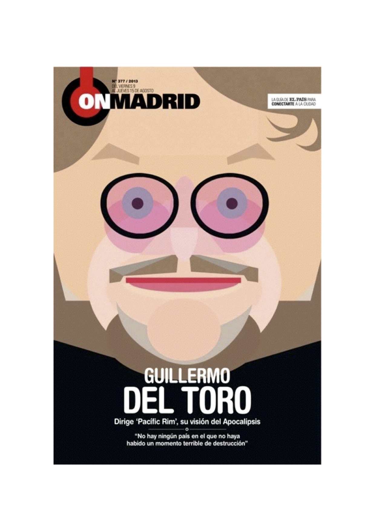
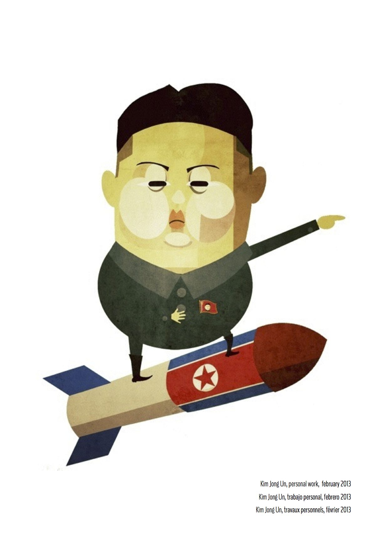
Javier Muñoz Fernández is a freelance illustrator whose work appears in various publications in Spain and worldwide. Among his clients CNN, El Pais, Le Monde, ABC, Folha de Sao Paulo, Rolling Stone, Gulf News, Variety, Forbes.
Weekend reads
New York Times Invests Millions in Sunday Magazine to Lure Advertisers
Highlight:
“…. the New York Times Co. invests millions of dollars in its Sunday magazine, a nearly 120-year-old bastion of long-form journalism. A redesign of the print magazine, including a thicker paper stock, is scheduled for Feb. 22. Mr.(Jake) Silverstein (editor in chief of the Magazine) declined to describe the new look in detail, but said, “There will be more change than continuity.” Already, he's rearranged portions of the magazine and killed two sections that appeared in the front, “The One-Page Magazine” and “Who Made That?”