The age of the digital obituary has arrived
The original blog post
https://www.garciamedia.com/blog/categories/obituaries
As I praised The New York Times' great crafting of obituaries, I also wrote:
What fun it would have been to see a Gabriel Garcia Marquez obituary complete with a bit of audio, as with Gabo reading from his work.
It’s a matter of time before the obit as film documentary arrives, perhaps making that ticket to the Times’ obit page a bit more precious to get.
Indeed, the obituary for the digital age has arrived, and one example of it occurred recently following the death of Maya Angelou.
The follow up
The digital-age obituary
http://www.capitalnewyork.com/article/media/2014/06/8546269/digital-age-obituary?top-featured-2
Highlight:
When news broke that poet and author Maya Angelou had passed away early last Wednesday morning, The New York Times was prepared.
At 8:54 a.m., just short of an hour after Angelou died, and before her family could confirm her death, the Times Twitter account linked to her obituary packaged with a photo slideshow and a close to three-minute video bidding farewell to the I Know Why the Caged Bird Sings author.
In addition to a slideshow and video clip, the Times also dug into their archives and re-upped an original review of one of Angelou's earliest books. Readers using the the Times iPhone app received a push alert that promoted the review.
We now hope these type of digital driven obituaries will become the norm and not the exception. They may attract a new generation of readers to the “obit” page, no doubt
Go here for the Times' obituary of Maya Angelou:
In Ottawa: the tablet edition of all tablet editions thrives
The original blog post
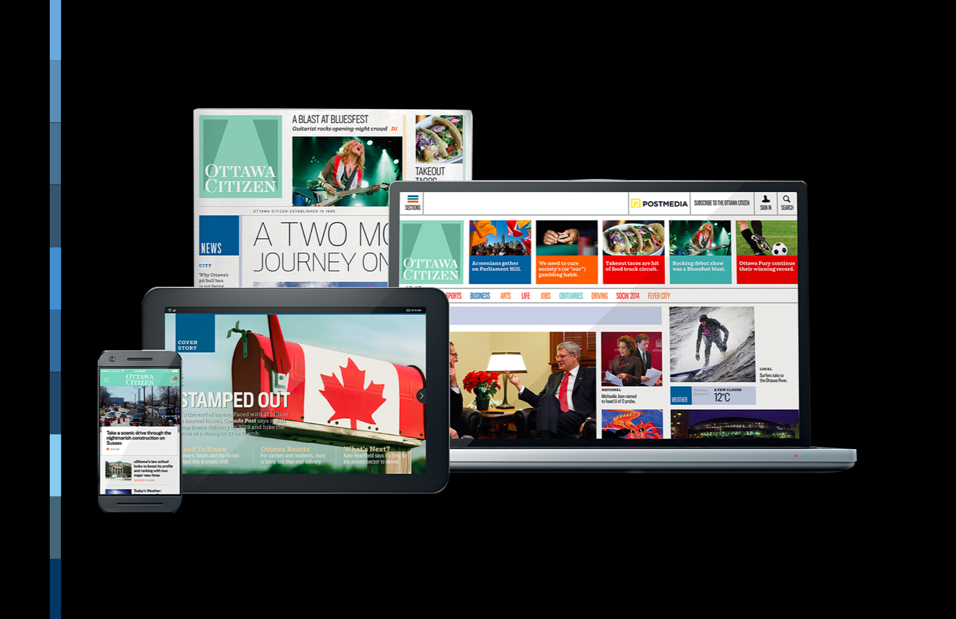
Ottawa Citizen for iPad: Precisely what a tablet edition should be
https://garciamedia.com/blog/ottawa_citizen_for_ipad_precisely_what_a_tablet_edition_should_be
The Ottawa Citizen is the first of the Postmedia's Canadian titles to go through the launch of a totally new concept. Its evening tablet edition is just what the rest of the industry needs to see.
AT the time of the launch of the Citizen's new tablet edition, I wrote:
The fun we have with this tablet edition is a reason to subscribe, to feel that we can have the best of the two worlds: what journalistic history and credibility offer, alongisde the more animated and engaging storytelling tools of today.
The follow up in Ottawa

Now, a few days after the launch, a chat with Rob McLaughlin, Postmedia vice president of editorial and responsible for leading the teams in the development of the the tablet and smartphone products.
The dust has yet to settle on the launch… And a post mortem and detailed planning for the next site begins in earnest next week.
A quote from me…please take as much or as little as you need.
“The audience response to the evening tablet edition has been overwhelmingly positive. A significant amount of the feedback has expressed it's surprise and delight with the range of interactive forms and the use of video elements throughout the editions. Of course, a lot of feedback has simply said how amazed they are at how “good” everything looks… But many have also expressed their delight that each edition delivers a complete content experience and isn't simply a supplement to the paper edition. We are now working hard to grow our audiences for all our new products and are seeing encouraging results at all levels.”
In Norway: How quality now rethinking of Aftenposten fares

The original blog post
Norway's Aftenposten: a total rethink for the digital age
https://garciamedia.com/blog/norways_aftenposten_a_total_rethink_for_the_digital_age
A highlight of our project work in 2014 has been Aftenposten, which has gone through a rethinking under the leadership of new editor in chief Espen Egil Hansen.
At the time of the launch, we wrote:
The 154-year-old Norwegian daily, Aftenposten, embraces a new philosophy to remain vibrant and essential in a digital world.
And we highlighted the impact that Espen, and his digital mentality, have brought to Aftenposten:
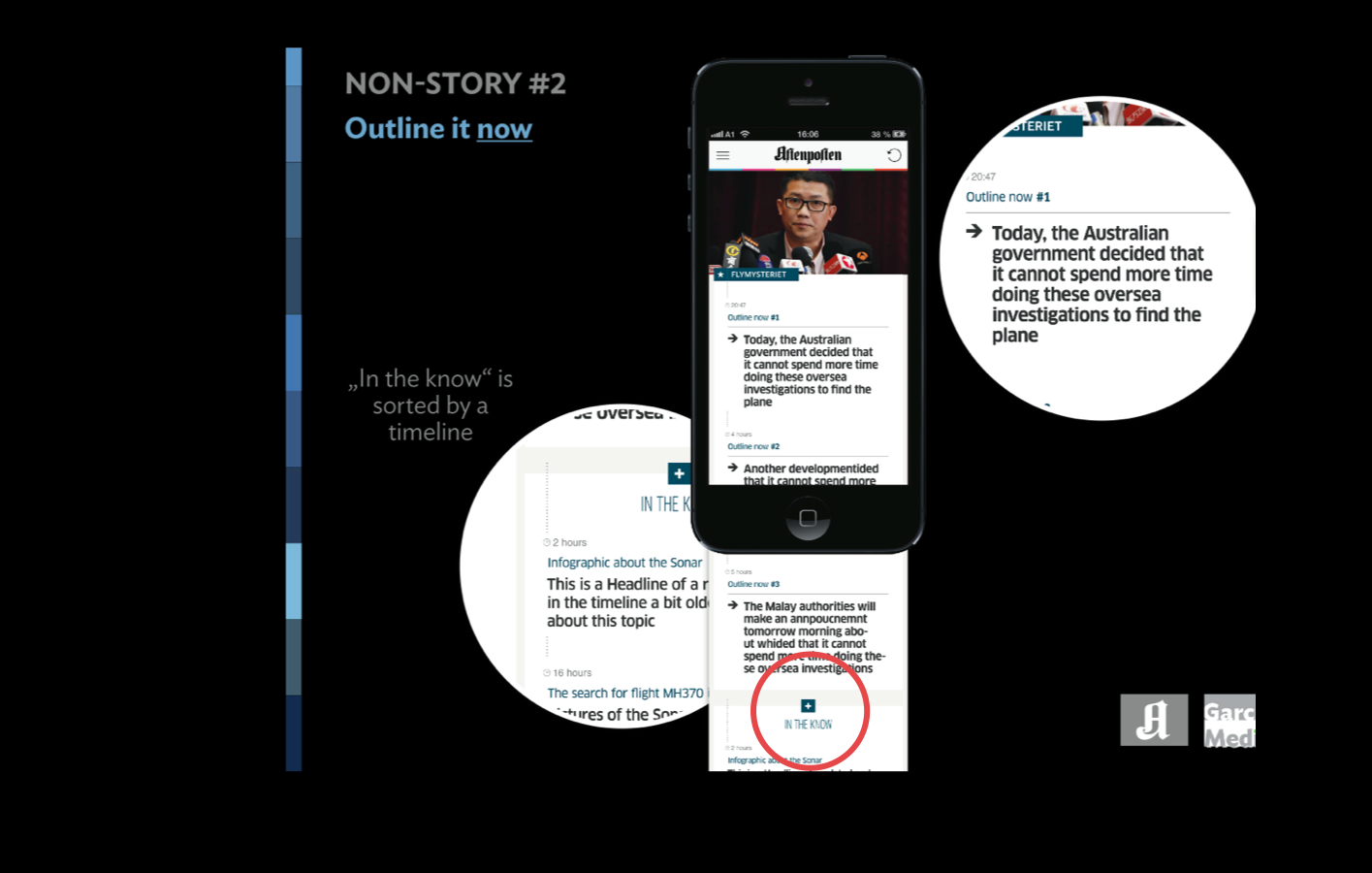
Espen is not necessarily interested in proclaiming the virtues of a digital first mentality, although he is a digital first type of editor. Instead, he emphasizes “quality now”, and demands that his team provides constant updates of the news, not just the words, but the photos, too.
His morning meetings start with references to how certain stories have played online, which becomes the springboard to the discussion of the day’s news agenda.
The follow up
So, where is Aftenposten six weeks after the introduction of the new rethinking that emphasizes the editor's mantra of “quality now”?
Apparently, the rethinking has been quite successful. Here is what Ronny Rudd, Project Manager at Aftenposten, tells me:
Readers like the design of the new Aftenposten and the two new compact books with one big news section. They think it is easy to navigate and follow the content flow in the new way of editing. They also find the number of pages and articles satisfying – and we have, as you know, reduced the number of pages. Readers don't want as much paper as before.
As one can expect, there are always readers who don't like certain asepcts of the changes. In the case of Aftenposten, not everyone is as happy with new location for some of the columns. “But,,” says Ronny, ” generally, the satisfaction is high.”
The fact that so many readers really enjoy the new design elements and the new front page is important for the overall impression.
One of the most important findings, is that young readers (below 35 years) are even more positive than the older ones.