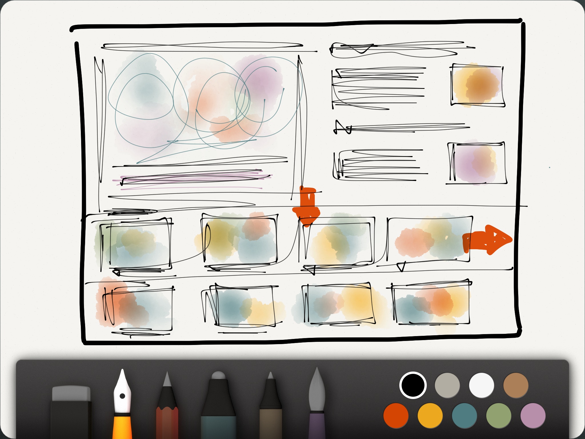
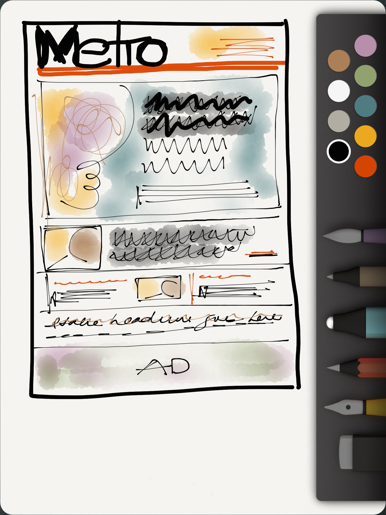
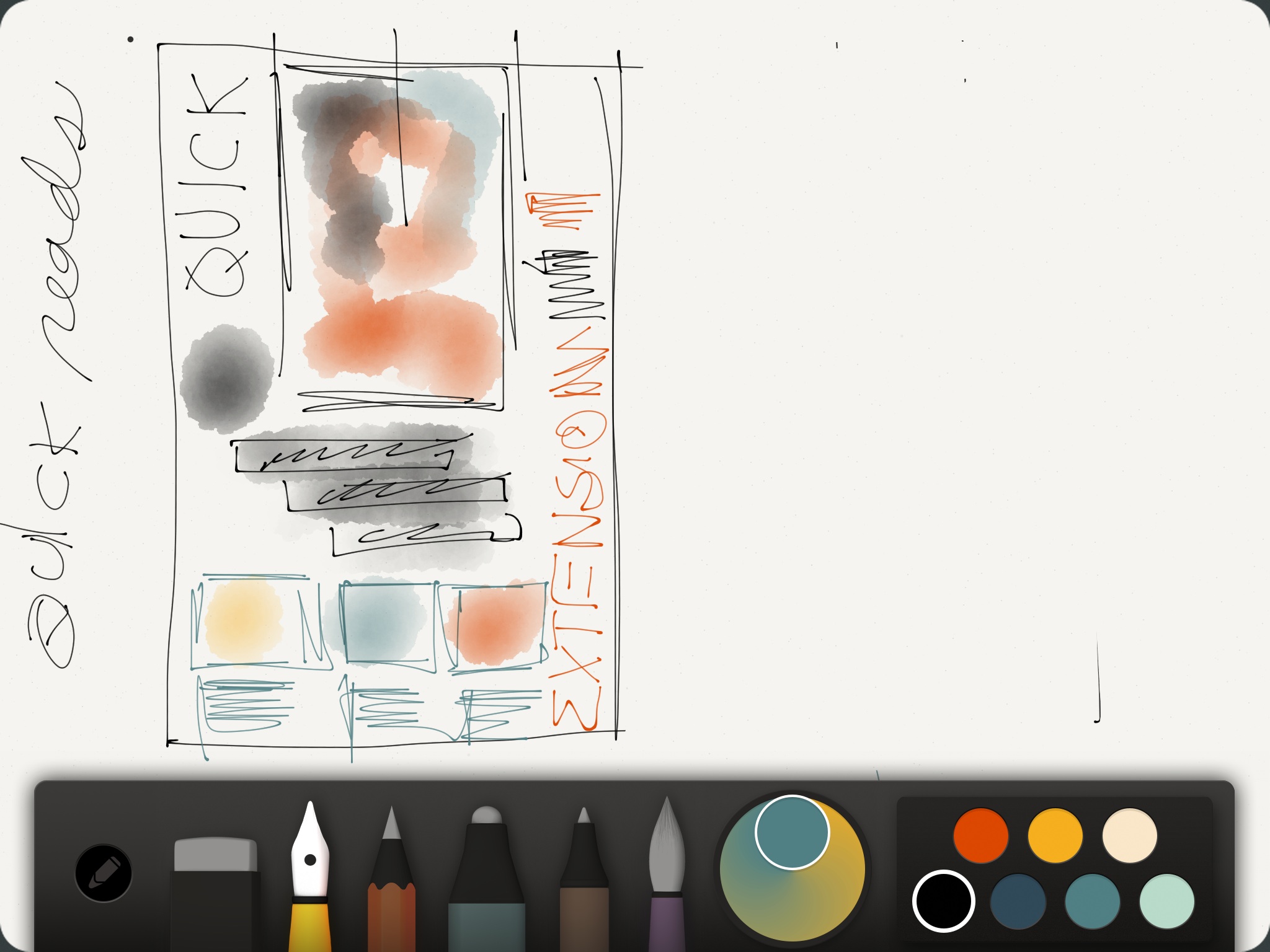
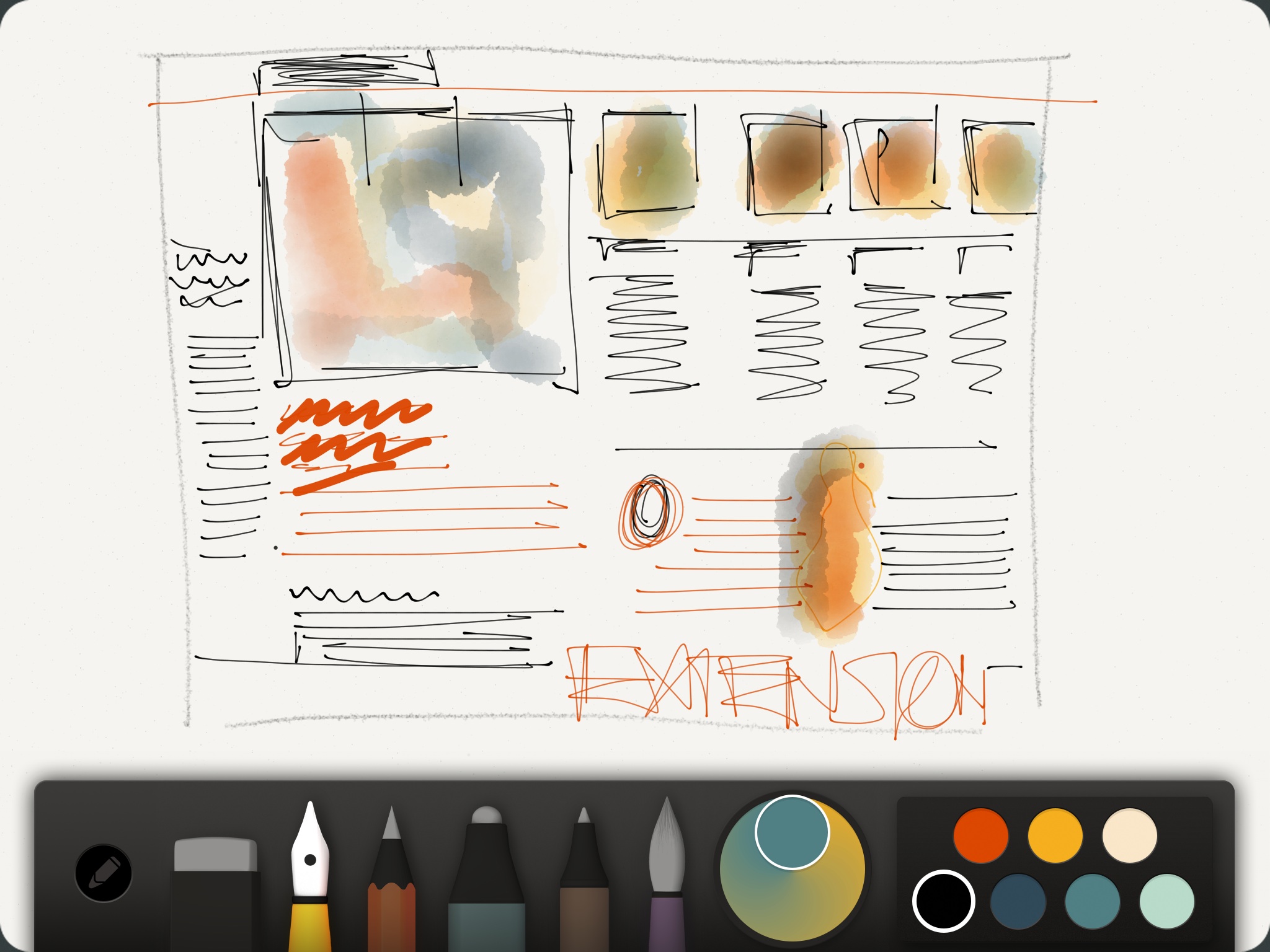
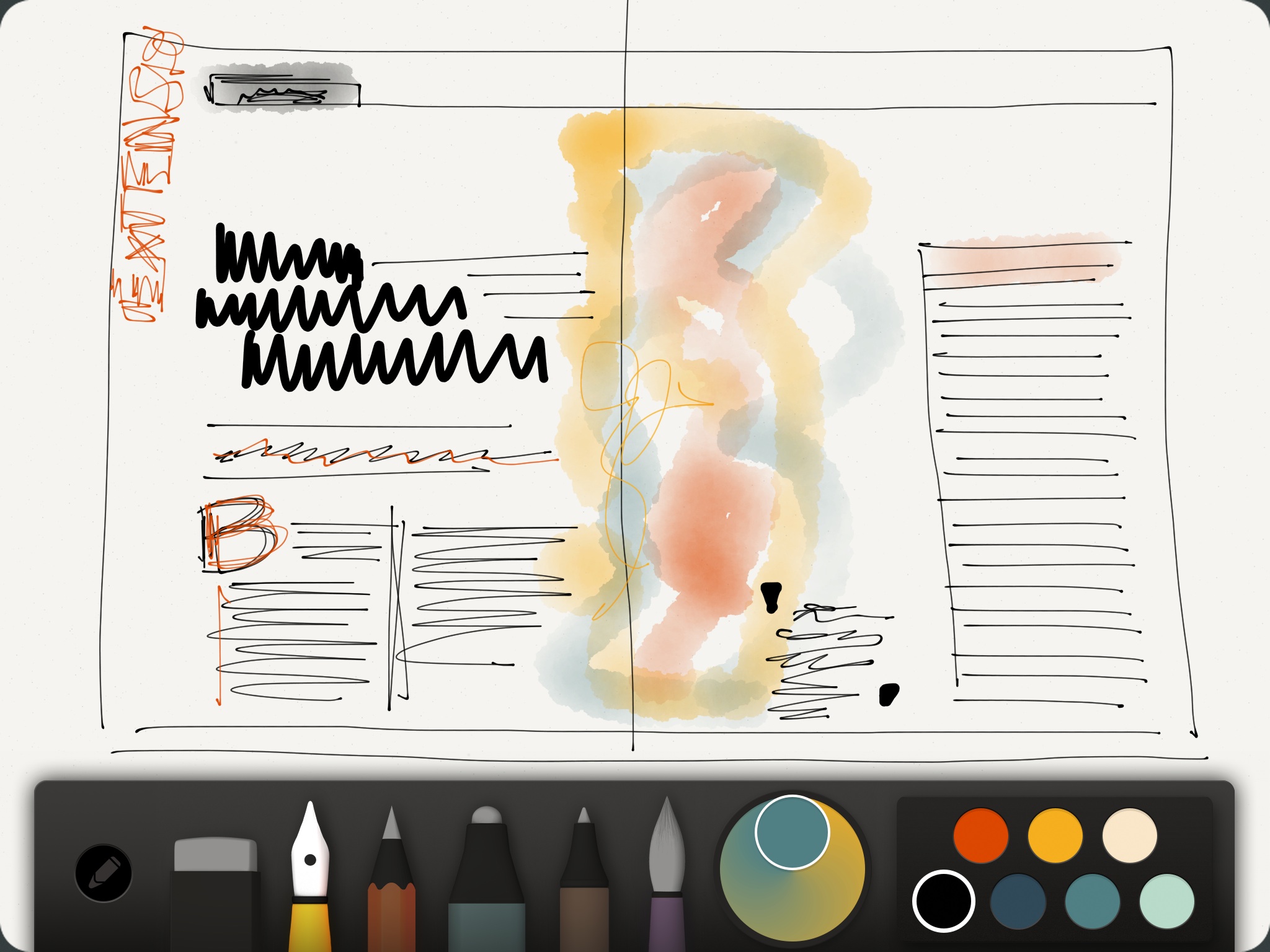
Sketches from recent projects carried out on a favorite app Paper 53
I thank the many of you who have sent me emails, or Facebook messages about my blog yesterday in which I showed the sketches that popped from my project files of 40 years of design work.
Just as I thought, you enjoyed seeing them and reminiscing about the way it was when the hand drawn sketch was the only way to get your thoughts down on paper before executing them.
While we all recognize the vital importance of creating a sketch to guide the design process, we are also aware that more frequently today that sketch is likely to emerge from a screen than directly from hand to paper. I admit that a lot of my sketching activity today is done on my iPad. While these sketches are filed away for future reference, it is not the same thing as those paper sketches that feel so good to the touch—not to mention the mind, as per all the reminiscing they prompt about a specific project in a specific time and place.
Do I advocate returning to paper sketching? First, I highly recommend that a design concept start with a sketch. It is a map to the journey. It serves to guide us in the process, while showing those around us what we have in mind when we describe a certain grid configuration or story structure. Second, one cannot turn the clock back and I would be unrealistic to think that people are going to relinquish the technological advantages of sketching on a tablet, making changes (including color) on the run, and showing the results instantly to those with whom we are working.
From time to time, however, try to print one of your sketches and save it so that, like me, you will have the benefit of revisiting a project by transporting yourself to its beginnings.
Whatever you do, always start with a sketch.
Learning how to sketch


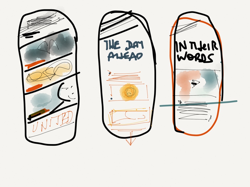
I have received several interesting emails about the subject of sketching. Among those who teach: what is the best way to teach sketching?
It is not complicated, but my tip is as follows: if you are learning how to sketch, try not to try to “create” a design concept at the same time. First, practice and master sketching, then move to the real purpose of sketching, which is to show a concept.
I normally have students learn how to represent each of the elements of a design on a sketch: headlines, text, images, color, boxes. Once they have practiced this and we can all sketch using a similar language, then the next step is to sketch while creating a design concept.
What’s the purpose of a sketch?


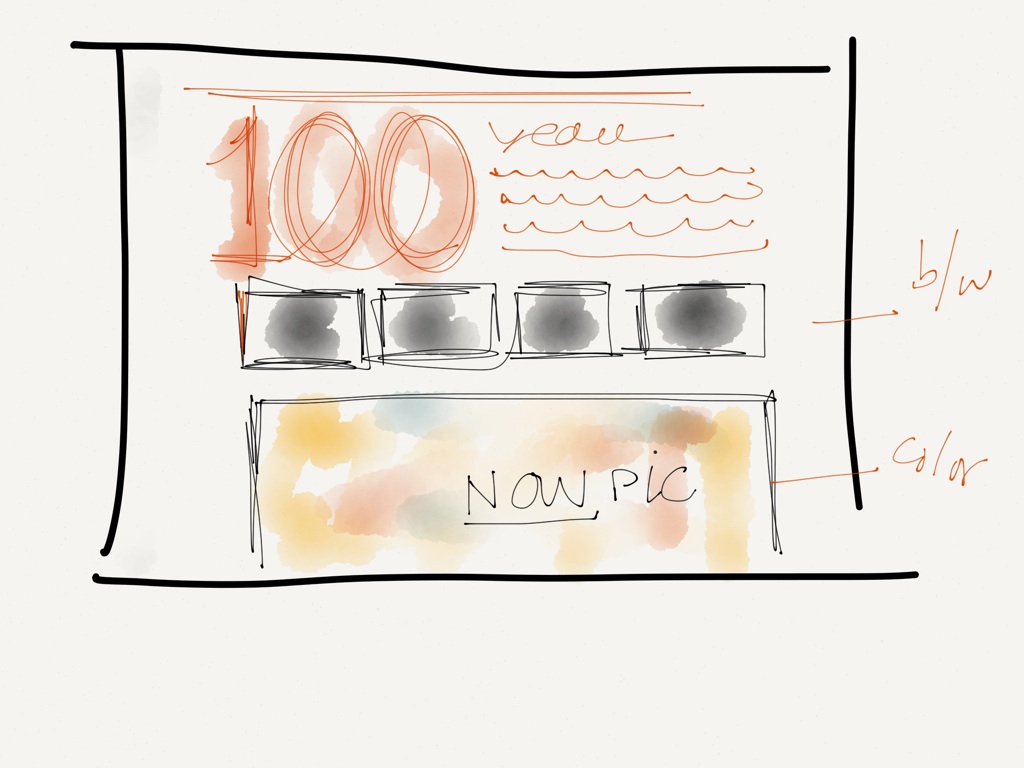
Primarily, a sketch serves one basic purpose: to give you, the designer, an overall view about space and distance, the weight of elements and how they relate to each other. They give your client or boss a sense of how a final layout may turn out (but don't always count on every editor understanding a sketch). This is why the degree to which one completes a sketch depends on the visual literacy of those who will be interpreting it.
If a sketch only makes sense to you, who has drawn it, then it is not likely to serve its purpose. I don't care if the sketch is for my use only, I always try to give a certain finish. It leads to better execution of a design later.
And, while I now do “X's” to indicate headlines, there was a time when we would draw actual letters to resemble the type font used. One vivid memory of this in my head was my collaboration with the great Roger Black, and how he sat there drawing Caslon-inspired headlines. Unforgettable sketching of another time which I miss seeing, but which should not be abandoned simply because we have other means to do it.
When it comes to hand drawn sketches, call me nostalgic. I may not be one to romance print, but I think I'd like to romance hand drawn sketching, which, in my view, may lead to more creative design, even in the era of digital everything.