Simplified (now simplified.com)
“A new way to engage with politics”: I admit I had never seen this one, but apparently it is a fresh approach to presenting information about political stories.
Founder is Mitchell Rosenberg, a 23-year-old based in California. Started in March 2020, at the height of major political reporting in advance of a presidential election, and with a pandemic at our doorstep, Simplified appeared as a way to explain complicated stories. Today, Simplified has more than 100,000 followers and a team of 55.
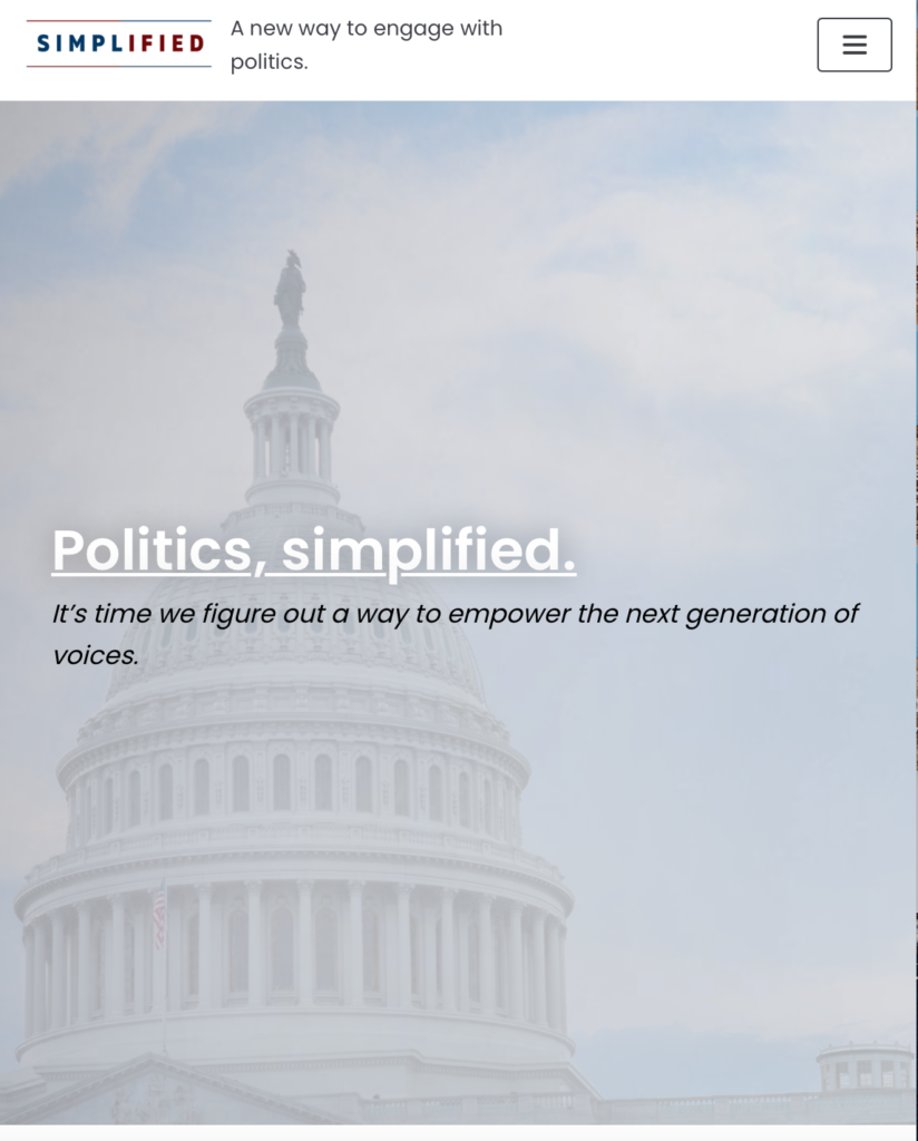
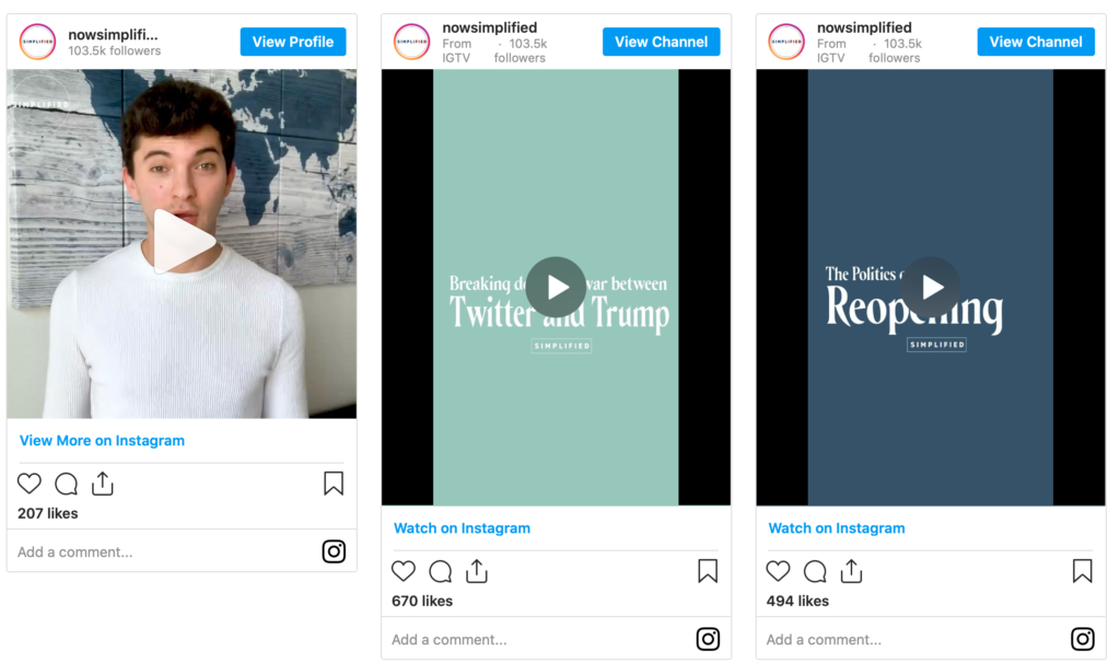
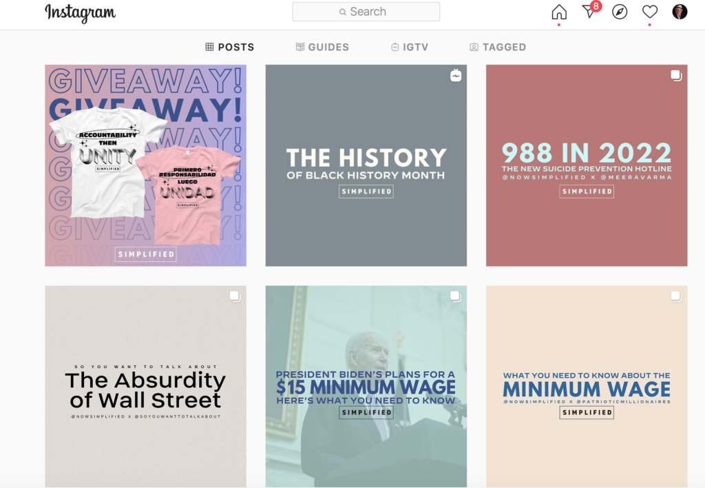
User experience highlights: The menu bar includes Video Explainer, Graphic Explainer. We could not find graphics under Graphic Explainer. There is a Spanish version of Simplified. Simplified has a strong Instagram presence, using “cards” to identify topics.
We Chat (www.wechat.com/)

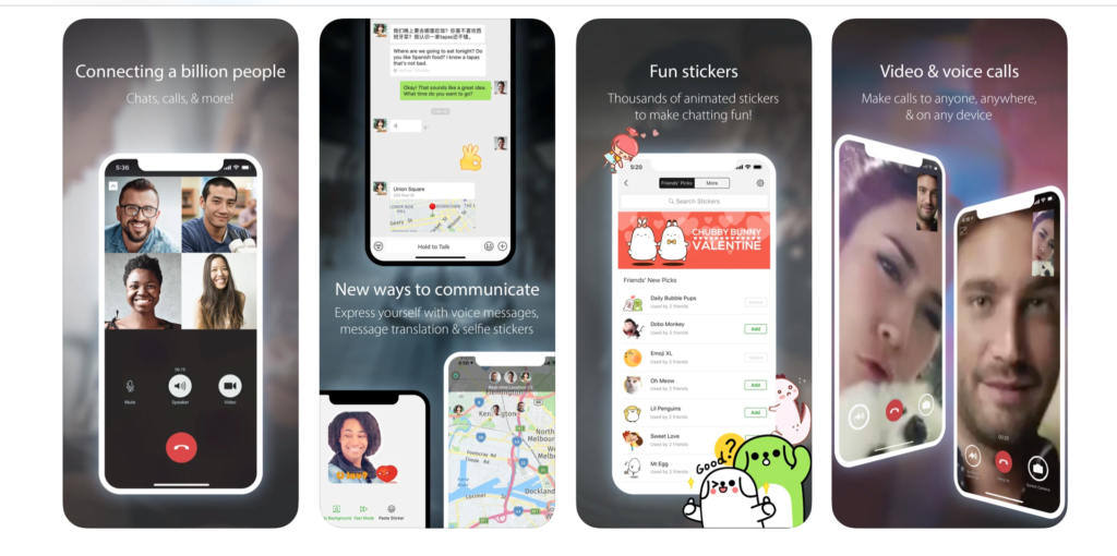
When in China, it’s We Chat: The student who picked this product as her favorite says that it is “like Facebook combined with What’s App.” So, you can chat, read stories (from assorted curated publications), share them on social media.
Attracts a young audience: Apparently news organizations in China are aware of We Chat’s reach with the young, and, thus, assign teams to work specifically with We Chat.
How We Chat describes itself: “WeChat is more than a messaging and social media app – it is a lifestyle for one billion users across the world. Chat and make calls with friends, read news and use local services in Official Accounts and Mini Programs, play games with friends, enjoy mobile payment features with WeChat Pay, and much more.”
Bustle (https://www.bustle.com/)
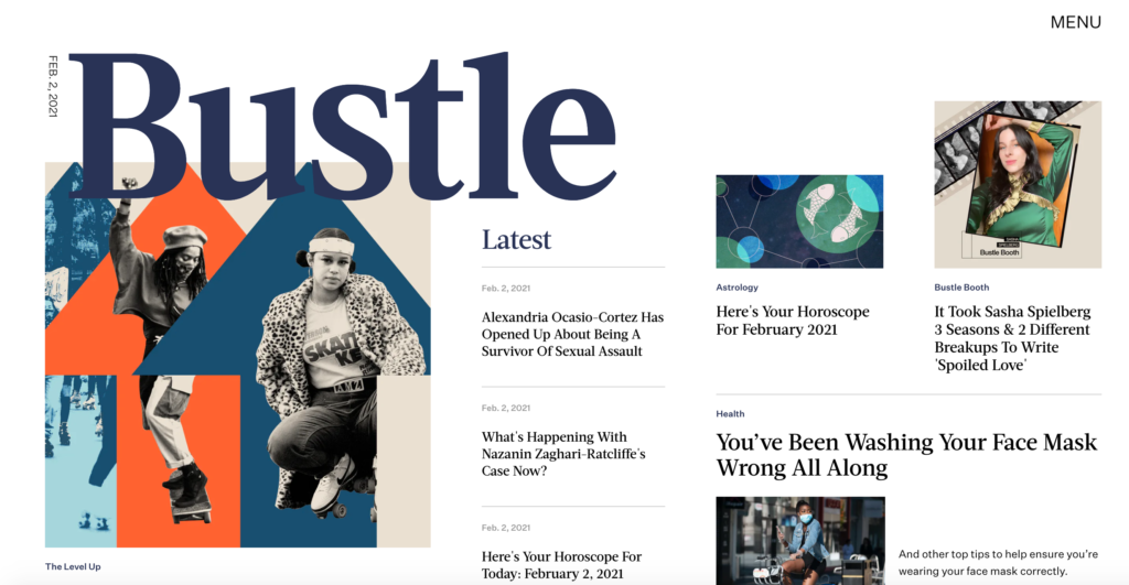
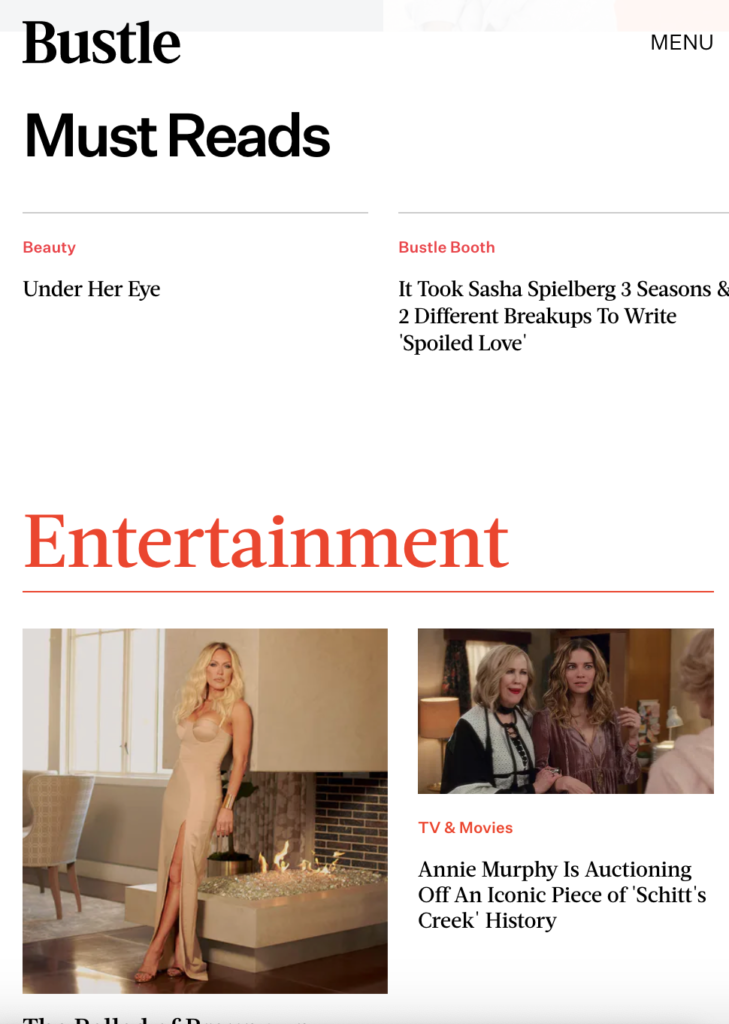
“A magazine that covers news, politics, entertainment and fashion.”–That’s how my student describes Bustle, which she considers “a favorite”.
Something for everyone: This is a true classic magazine content format, updated daily and perhaps the definition of what a mobile magazine should be like for the digital natives. It is visual. It includes fashion, wellness and even a section titled “Bachelor Nation”.
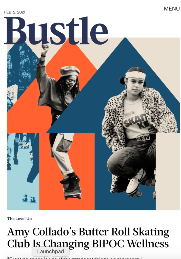
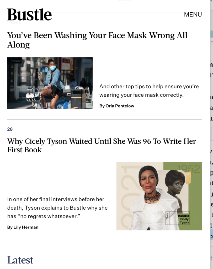
Now about the design: While the content hits the spot, I wonder why the logo, Bustle, is sooooooooo large. After all, it is not as if Bustle has to jump at you at a crowded news kiosk on the side of the subway platform. Right? And, could we kern the serif type used for headlines, please? The grid is uneven and I can only wonder how much more impactful all those good stories and visuals could be with a more precise and orderly grid for presentation. While white space is always desirable, it must be used systematically. Here we sometimes see areas of floating white space. See below:
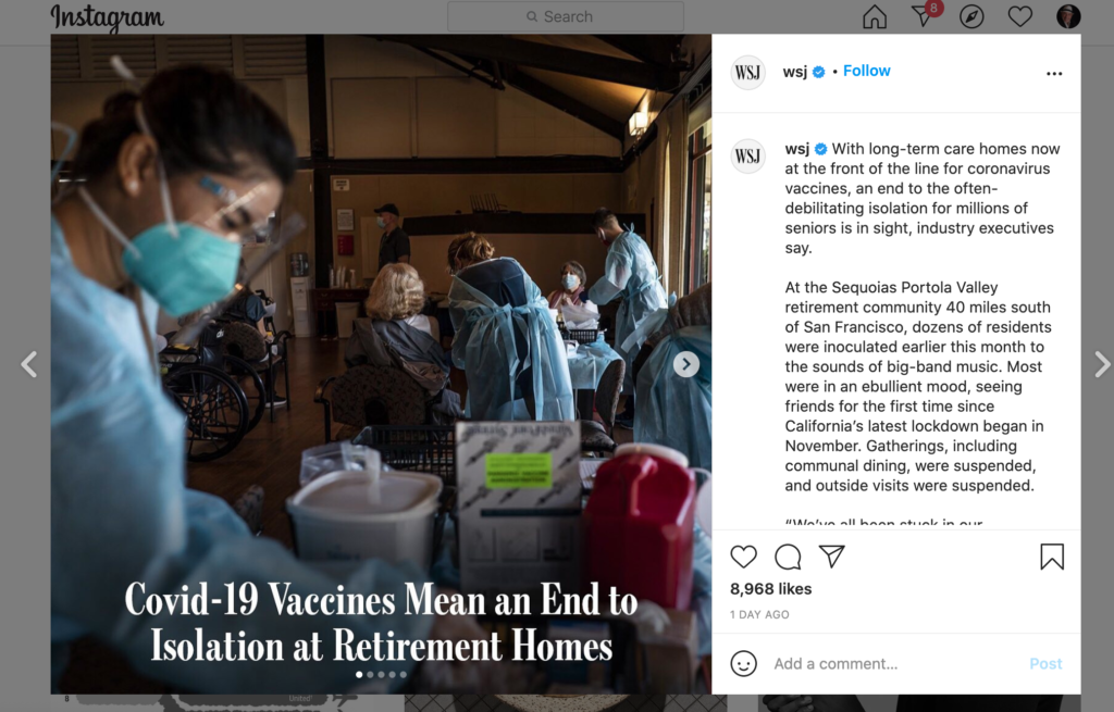
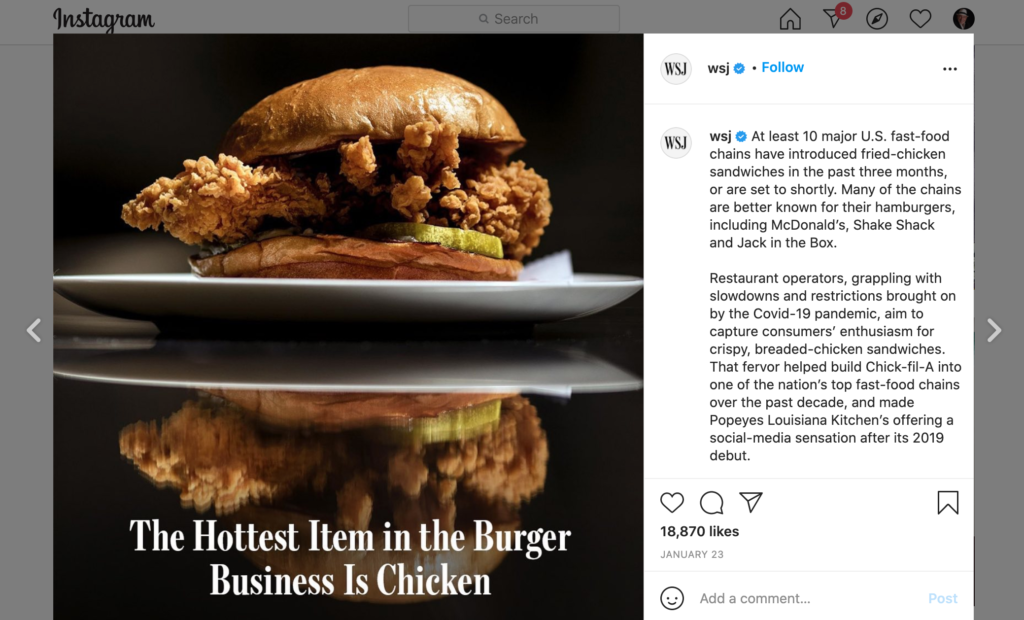
The WSJ Instagram surprises
Why teaching is fun and rewarding: Perhaps this is reason #24 why I continue to teach way into my 70s. I learn from the students, and I am even surprised sometimes by what the students bring my way. For example, I like what the venerable Wall Street Journal (WSJ) brings to its Instagram offering. So hip. So young. So, well, unlike what the WSJ normally creates as part of its gravitas and standing.

About the WSJ branding, I remember it well: Tell me about it, I have worked with WSJ through a variety of projects, all fun, all which honor me just to be present. I see the WSJ initials and I think back to my work with the WSJ Europe and the introduction of those letters, in the background, as sort of there but not there. Editors at the time were not so sure of three letters as part of the newspaper’s iconic brand. But now WSJ is a presence. So happy to see it.

Fun mobile site from Japan
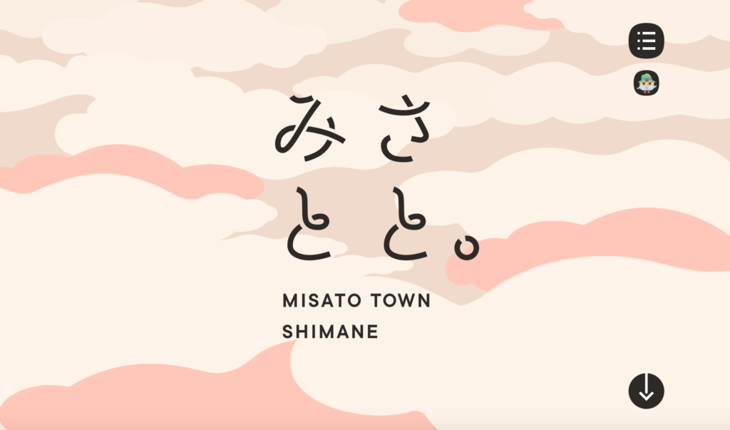
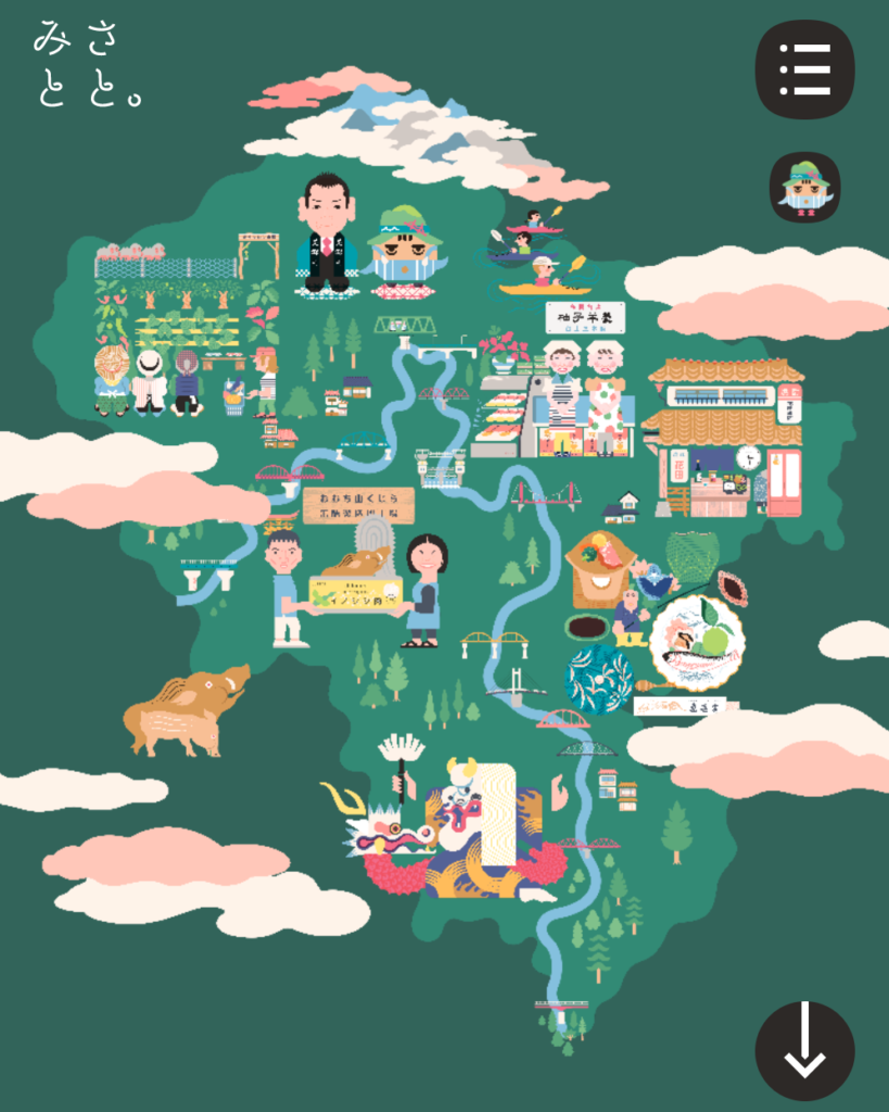
This one has nothing to do with news: However, take a look and discover it. You don’t need to know Japanese, or nevert to English version. Look at the roll over technique and the three dimensionality. I told the class that they can learn visual storytelling here and apply some of the strategies for a journalistic story. Why not? Inspiration comes in many ways. This one inspires all the way.
How the student describes it: “Its colors are cheery and inviting, and the pages are interactive without being complicated.”
Take a look here: https://www.town.shimane-misato.lg.jp/misatoto/
Meanwhile, in print…
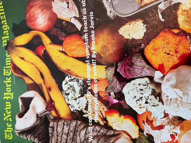
The opposite of a type attack: That happens on this cover from The New York Times Magazine. The illustration is the protagonist. The headline? Small, almost muted. But still there. Works well. Let’s hear it for smart choices in design, knowing when not to shout with type. Could you almost smell these fruits?
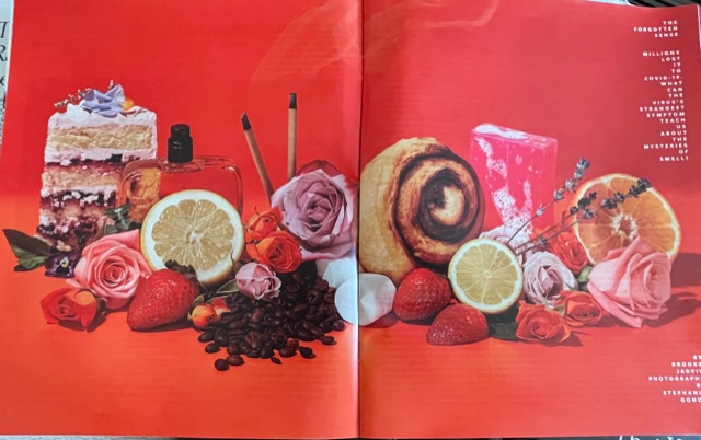
Here is the opening spread for that piece: When red appears, we are instantly seduced. Red is a color we associate with favorite foods too: an apple a day? A fresh tomato on that lunch salad. Radishes, anyone? And, for meat lovers, what would the world be without red meat? The art director knows that red and food go together, as the song reminds us, like a “love and marriage” and “horse and carriage”.
Professors: get your review version of The Story on time for fall classes
As an academic, I know the importance of having the right tools to advance our students, especially on the important subject of mobile storytelling. Please drop me an email if you would like to sample The Story in its digital edition: mario@garciamedia.com
Start writing or type / to choose a block
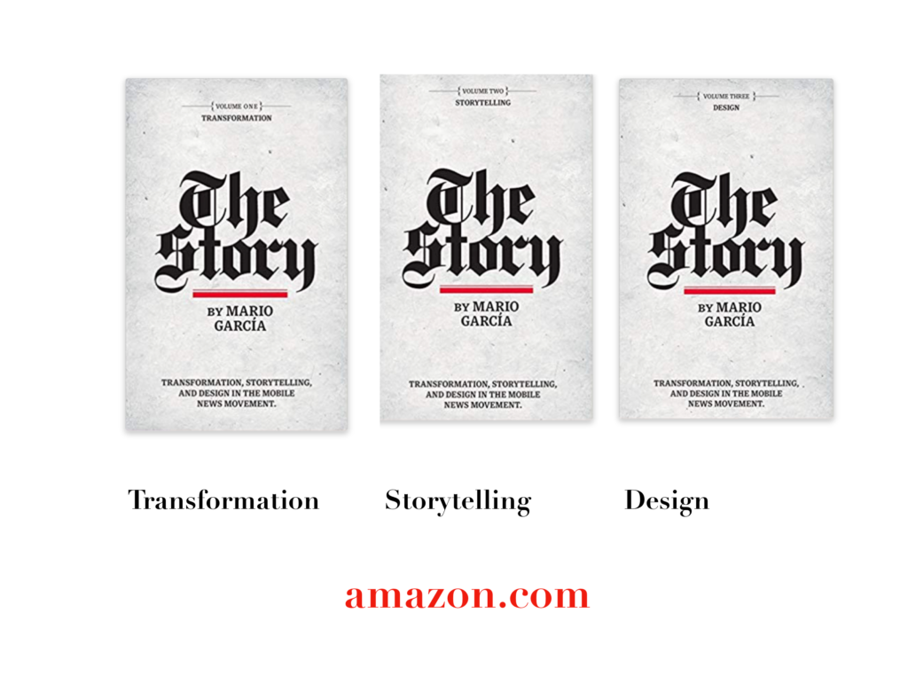
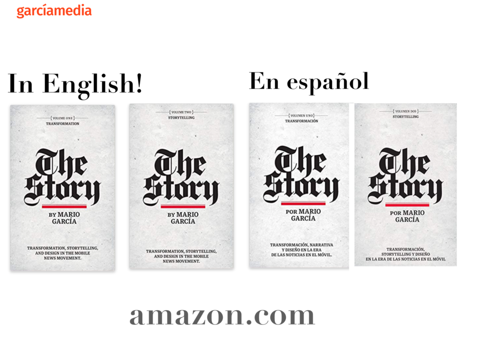
The full trilogy of The Story now available–3 books to guide you through a mobile first strategy. Whether you’re a reporter, editor, designer, publisher, corporate communicator, The Story is for you! https://amazon
TheMarioBlog post # 3267