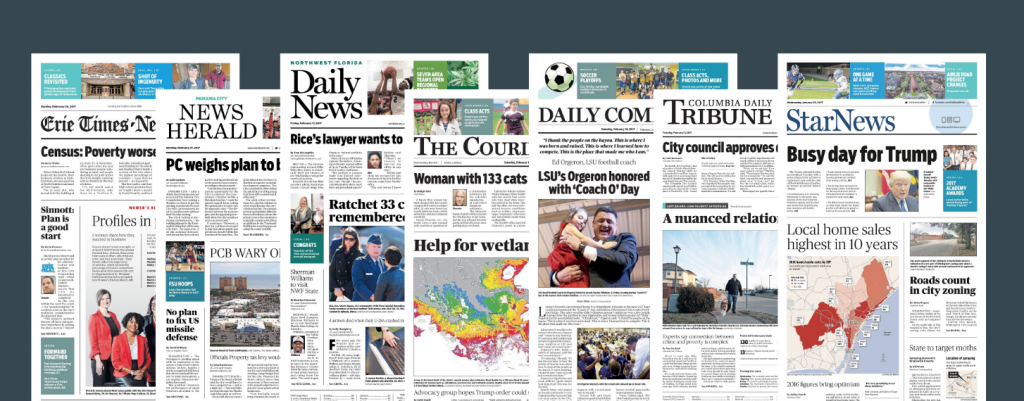
This past week the Sarasota Herald Tribune introduced a new, cleaner, more contemporary look. We at Garcia Media worked with the team of Gatehouse Media (Austin) and Joe Greco, GateHouse’s director of creative development. It is part of a major project in which we became involved in 2015, invited by Gatehouse Media executives to assist with the rethink of its more than 460 local newspapers and media websites, with a particular emphasis on mobile.
From the beginning, we knew that we wanted to create a unified look for all these newspapers, in various markets throughout the United States. Gatehouse Media has a design hub in Austin, Texas. So it was especially important to create a look that would allow for the newspapers to have similar design elements. We discussed overall design philosophy and content strategy through a series of workshops.
“Being bold has always been a goal, no matter the design style. The same is true for clean and organized design. A bold approach to a centerpiece also can have a clean and organized design,” Greco said.
If you take a look at the various Gatehouse Media newspapers that have introduced the new look, you will see that some themes carry through, and those are obvious in the new Sarasota Herald Tribune that just launched its new look.

In a column devoted to introduce the new look in Sarasota, the interim editor, Matthew Sauer, wrote, that the Herald Tribune was “long overdue for some freshening. Our nationally recognized journalism has never flagged, but every newspaper needs a nip and tuck now and again to keep things visually fresh.”. He added:

“It’s a lot warmer outside, but consider this a late spring spruce-up and house cleaning. Today, the Herald-Tribune launches a new look for its print edition.
There is more white space.There are bolder headlines.”
And he added about the color:
“The color palette is familiar: blues evoking our Southwest Florida skies and warm Gulf waters.”
Here you see a front page from the old design and, on the right, the new look for the Herald Tribune:

Greco, who supervises the design of all the Gatehouse Media newspapers from Austin, said:
“The addition of colors and the introduction of cards and more white space certainly can be viewed as bold. But the goal of the redesign wasn’t to simply make the pages look pretty. For the papers that have already launched the redesign, these elements have encouraged more communication between newsrooms and designers working remotely at the Austin-based Center for News Design.”
Reactions to the Herald Tribune redesign
I asked Matthew Sauer about what the readers have said about the new design so far:
The reaction has been overwhelmingly positive from readers. I would say 95 percent of the people who contacted me have been positive about the redesign, many of them effusive.Readers describe it as clean, airy, elegant, easy to read, logical — and that’s across demographics.I had one loyal reader in her 80s who said this was the best, most easy to use design she has seen at the Sarasota Herald-Tribune in her 40 years of reading.
Hi Matthew –
We are writing to congratulate you and your staff for creating the exceptional new look of the Herald Tribune.
The “cards” are eye-catching and handsome, with great blue-green colors, leading the reader to articles of interest elsewhere with ease.
The bolder headlines really stand out.
The airiness of each page is welcome, making it easier to read.
Great enhancements to an already superb newspaper. HT has always been head and shoulders above the other local paper; now it is far more handsome as well.
Thanks for a job well done.
– Ruth Jansson & Bette Conner
Daily subscribers from west Bradenton
Of related interest:
Garcia Media/Gatehouse
https://garciamedia.com/blog/garcia_media_and_gatehouse_media/
Speaking Engagements Coming Up

SIPConnect 2017, to be held in Miami June 21-23, is a program of the Inter American Press Association, IAPA, or SIP (Sociedad Interamericana de Prensa). The venue will be the Hilton Miami Downtown Hotel.
Details:
Join us at the SIPConnect Hemispheric Conference 2017. Organized by the IAPA, SIPConnect is a gathering of media and digital businesses to encourage more audiences and higher revenues. It’s a laboratory for new ideas and successful experiences for the digital transformation. As in the 2016 successful meeting that was attended by media from the US, Latin America and the Caribbean, experts in digital businesses and representatives of innovative companies will participate in this event.
For more information: http://www.sipiapa.org/notas/1211078-llamado-sipconnect-2017