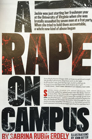
What is fascinating about Dr. Clark’s piece, and our brief discussion in his office about the Rolling Stone story, is that it is a discussion the two of us have had repeatedly over the past 30 years. Indeed, hardly a design and/or writing seminar ever ended at The Poynter Institute without a good discussion of graphics that are “appropriate” to the story content.
I remember an exercise in one of our combined seminars, in which the storyline was about children with learning disabilities. One well intentioned illustrator in the course created a vibrant drawing of a girl with braids that resembled the iconic character Pippi Longstocking. Pippi, as you may remember, was a happy child. The story this illustration would accompany was anything but happy. The discussion between writer and illustrator during that seminar was topical and far reaching.
But, here we are again, with a serious topic, such as rape, and illustrations that confuse more than they help the story. Roy Peter Clark is right when he reminds us that at the core of our work is the basic question: What’s the story about?
In this case, the story and the graphics accompanying it did not quite do each other justice—and may have confused many readers.
“One test of the focus of a story is what the graphic designer decides to do with it. There are no charts and graphs here. No Big Data analysis of sexual abuse on campus. Instead, illustrator John Ritter offers tabloid style red, black, and blue imagery, bloody handprints on the body of a woman who is shielding her face, the tableau of a prone woman, surrounded by empty red beer cups, ignored by others at the party, her bra discarded, someone holding a beer bottle like a weapon.”
For those outside the United States or who may not be familiar with the story from Rolling Stone:
-The story is titled “A Rape on Campus,” and was written by Sabrina Rubin Erdely .
-The story is about an alleged gang rape at a University of Virginia fraternity house, based on interviews with a student identified only as “Jackie.”
If you have not done so already, take a look at the Rolling Stone story and its graphic treatment. It should provide valuable exchanges in the newsroom or in the classroom. A good opportunity to look at how the words and the visuals can come together effectively to enhance the value of a story, or, as it may be the case here, the two do not do much to help the story.
I like Roy Peter Clark's use of the word “decorum” for writers. It is also an apt word for graphic designers to apply to their work.