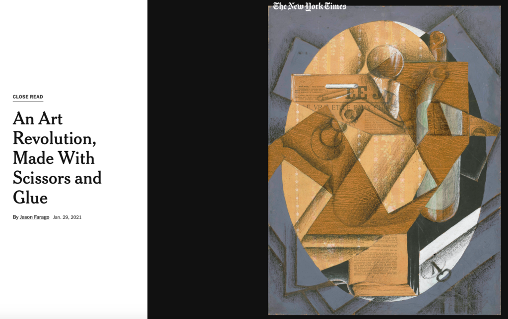
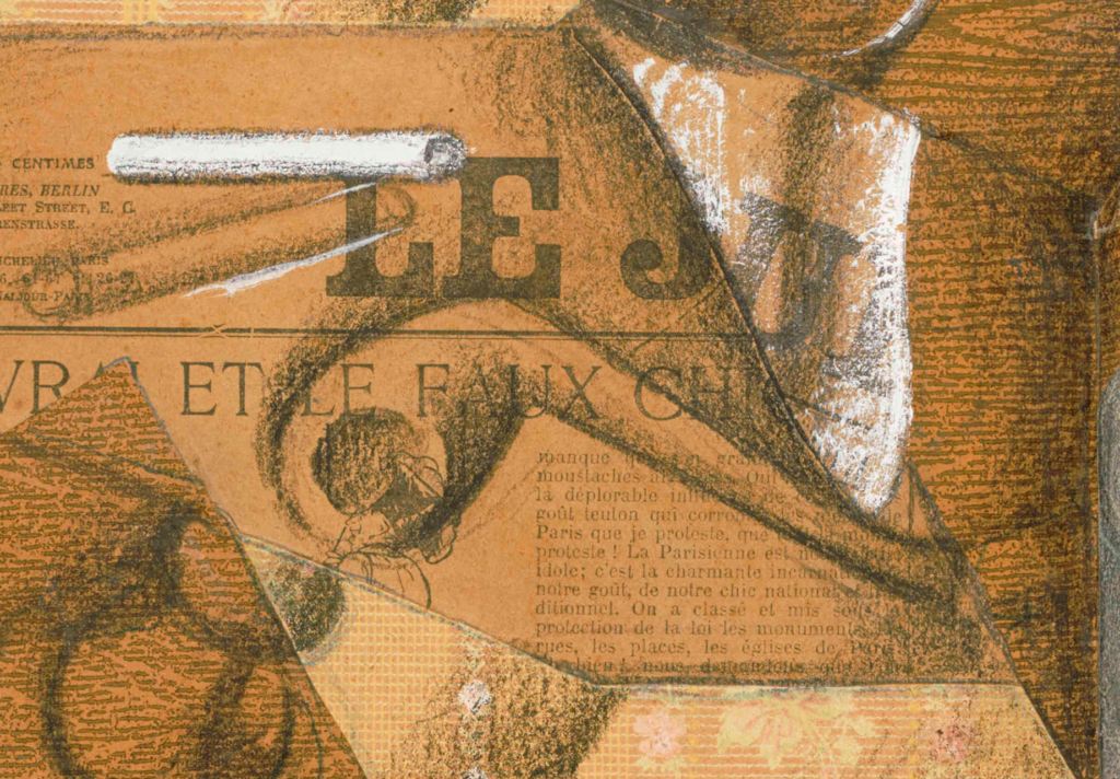
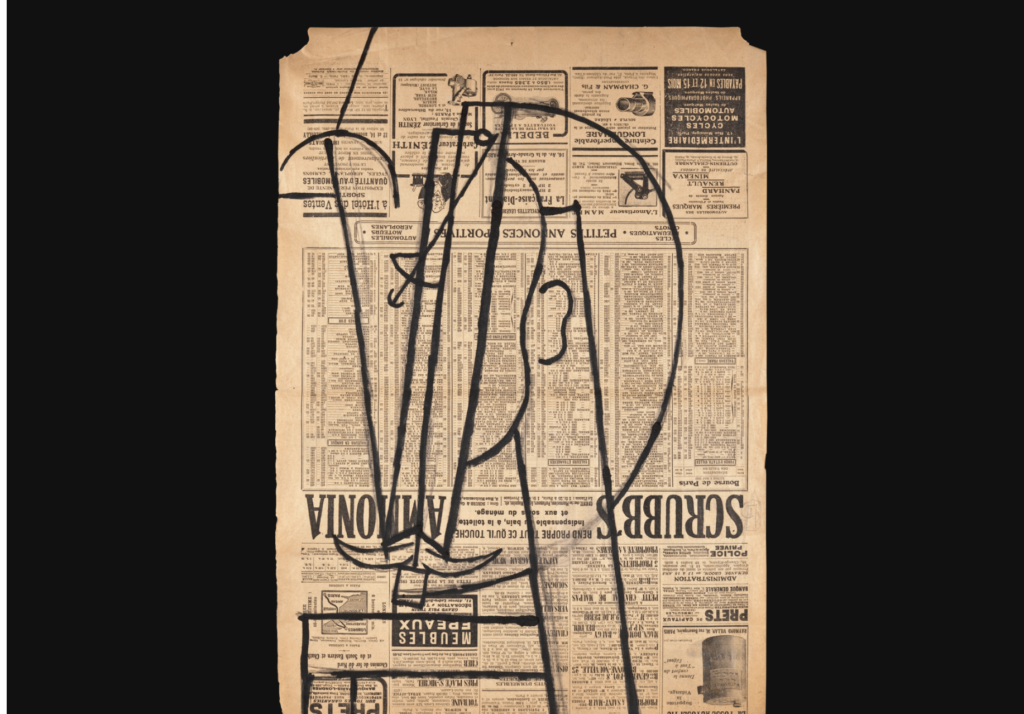
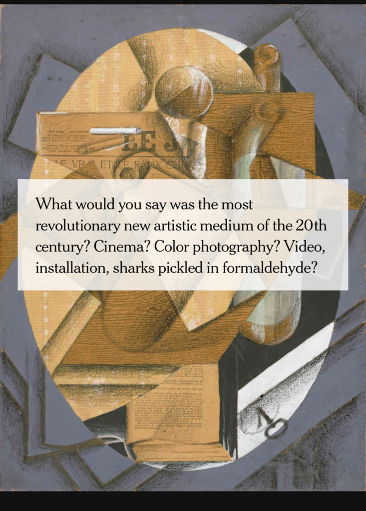
Did you see that newspaper page there?: So, as this story tells us, those collages that we have long admired——and, in my case, which I always took time to study during museum visits because there was usually a newspaper page from another era prominently displayed in the background—were made in a simply way: scissors and glue. Don’t miss that French newspaper page here:
Roll over technique for text: Let’s say that this story about those simple collages and their origins is made in an elegantly simple way, with a roll out technique of text over illustration.
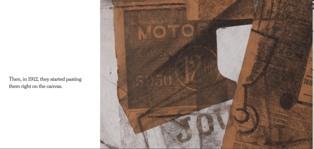
Pasting newspapers over canvas: Here we see how Picasso and others of his period starting pasting newspaper pages on to the canvas of their work, as seen here in 1912:
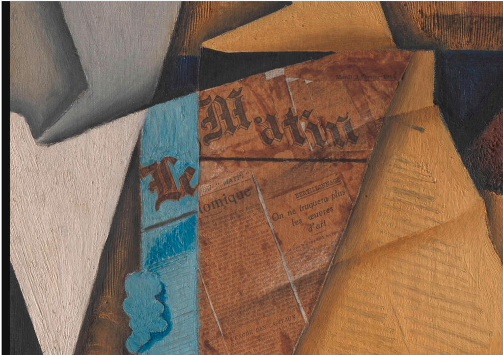
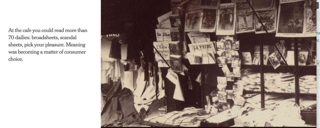
Golden era of print: While I am fascinated by the way this story is told, combining rich text with amazing visuals that we see from various angles, I am delighted to also see how the author of this piece takes us to an era when newspapers inspired artists. Indeed, a golden age of print at the beginning of the 20th Century, and, as we can see in this photo, news kiosks in Paris full of titles.
Go here to read the entire story in The New York Times:
https://www.nytimes.com/interactive/2021/01/29/arts/design/juan-gris-cubism-collage.html
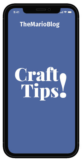
What we can learn from this story: First, it is clear that this story was conceptualized to be told in a format where text and visuals are synchronized to be seen simultaneously. Using the roll over technique, the text appears on the left, the image on the right when seen on a laptop or desktop computer. However, the text rolls over the images when seen on your mobile phone screen, as we see below:
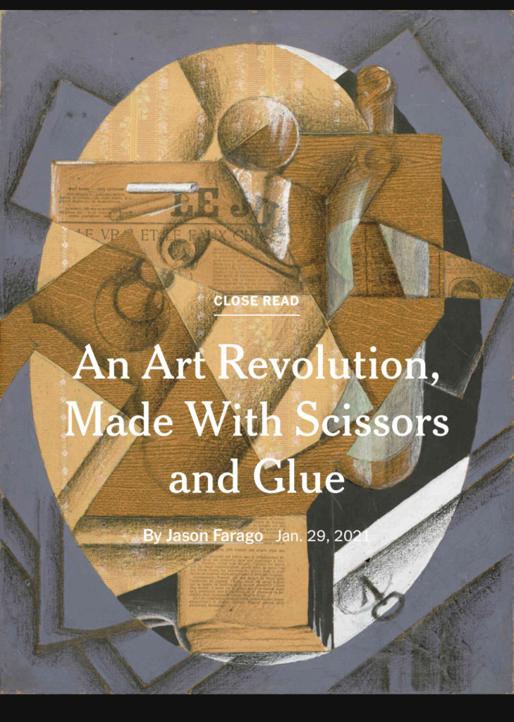
Cover we like
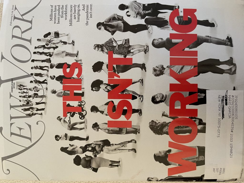
Combo of type/photo: This is a type attack combined with an illustration, a way for designers at New York Magazine to tell the story of how millions of women have been forced from the workforce. It is not easy to allow for both the type and the photo to appear powerful when combined, but this cover shows that it can be done. The color red for the headline helps, a robust color that jumps at the reader.
Best kids’ supplement
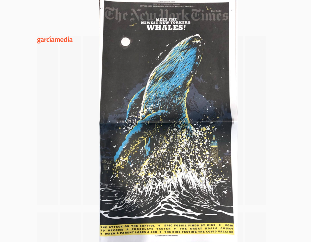
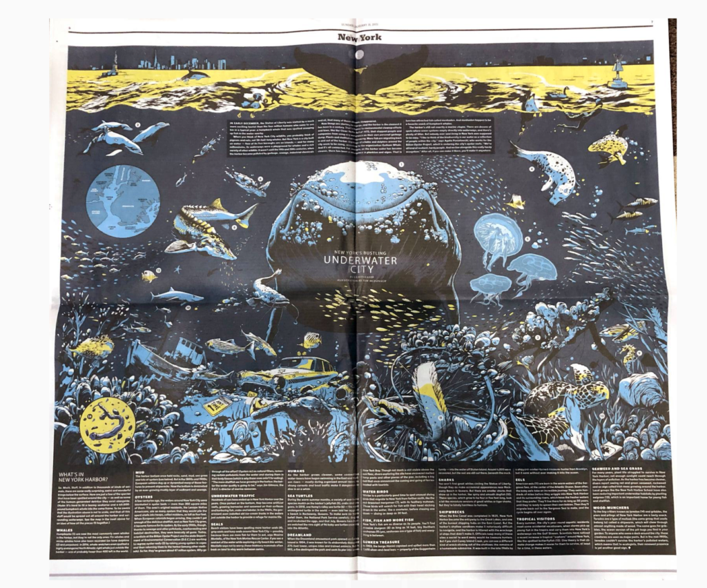
The New York Times for Kids: I continue to admire the work that goes into this supplement for kids, a product that is print driven, plays on big illustrations and takes its role as a newspaper for kids seriously: review of current events, quizzes, games, infographics. Well done.
Professors: get your review version of The Story on time for fall classes
As an academic, I know the importance of having the right tools to advance our students, especially on the important subject of mobile storytelling. Please drop me an email if you would like to sample The Story in its digital edition: mario@garciamedia.com
Start writing or type / to choose a block
The full trilogy of The Story now available–3 books to guide you through a mobile first strategy. Whether you’re a reporter, editor, designer, publisher, corporate communicator, The Story is for you! https://amazon
TheMarioBlog post # 3266