TAKEAWAY: We have received recent issues of two of our magazine projects of 2011: Shang, the magazine of the Shangri La Hotels, and Post, the Sunday magazine of the South China Morning Post. Both are building nicely upon the visual foundation we created. Take a look.
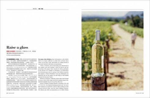
Today we show you follow up visits with two of our projects in Hong Kong earlier this year.
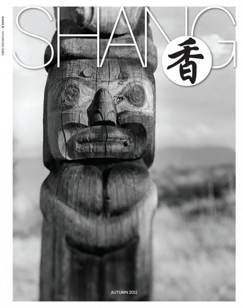
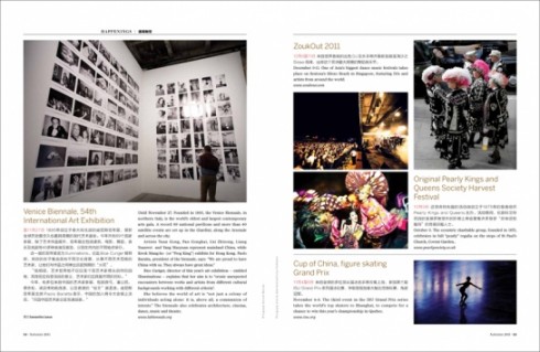
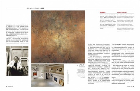
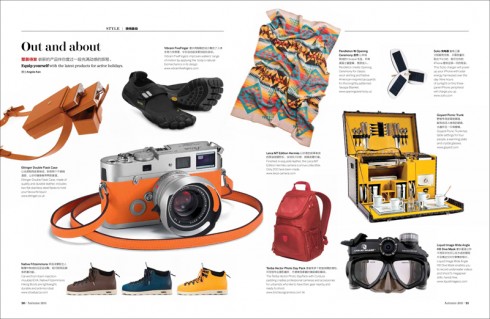
One is Shang, the first magazine ever published by and for the Shangri La Hotels. From the start, our mandate here was to create a visual oasis for the hotel guest who sits down to relax with the magazine he finds on his room’s coffee table. Make it minimalist, very photographic and, one important challenge, with Chinese as the primary langauge, English as secondary.
Working with Nai Lee Lum, a New York-based art director, we put together several prototypes until we found the right formula for what the Shangri La execs wanted to accomplish.
Five months later, we are very happy to see this latest issue, which has evolved, but maintains the core of the visual foundation we created for Shang.
Both Nai and I exchanged notes today expressing how pleased we are. As designers, we create products, deliver them, and then a few months later sometimes the concept is no longer what it was conceived to be.
By the way, for our Chinese readers: “Shang Magazine,” the literal translation of the Chinese name ??? .
Post Magazine (South China Morning Post)
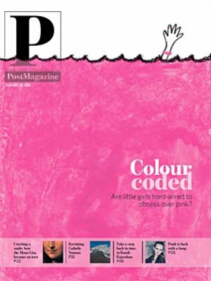
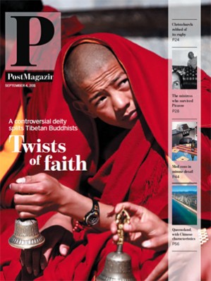
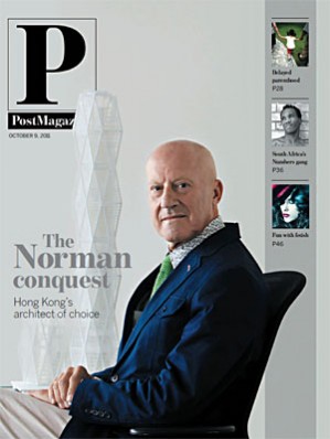
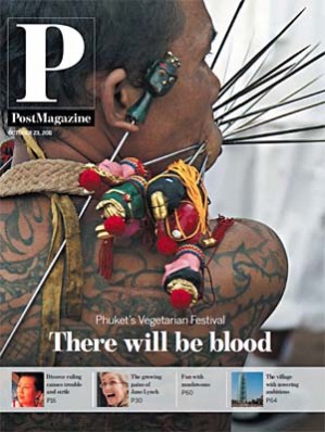
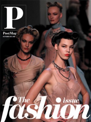
A second project in which Nai and I worked together, parallel to Shang magazine, and during the same period, was Post Magazine, which is published Sunday with the South China Morning Post.
We have reviewed a number of recent issues. Again, the principles stay, each week the magazine evolves and gets better, but all with the foundation that we gave it.
It is my belief that if the four main components of a design are in place, then the rest is a matter of including good content and coming up with creative presentation for it. Those four main areas of design: storytelling techniques, typography, page architecture and color palette. You seem them all working well here.
Notice that the Post cover has a flexible navigator that can run horizontally or vertically, but we are convinced that this general interest magazine, inserted into a big Sunday newspaper, needs to have some sense of navigation on the cover. However, there is also the flexibility of NOT running the navigator on the cover, as you see in the special Fashion issue.
For previous blog posts on Shang and the Post, go here:
https://garciamedia.com/blog/articles/introducing_shang—-the_new_shangri_la_hotels_magazine
https://garciamedia.com/blog/articles/south_china_morning_post_new_beginnings_in_a_new_hong_kong_new_china