I have enjoyed revisiting these two books and realizing that some of the basic “tips” for designers are still as valuable today as they were in 1986 and 1997.
So much has happened since these books were written, but, still, today we find ourselves challenged by some of the same issues that caused editors of designers in the 80s and 90s to pause and take stock of their craft.
Professional Video Graphic Design: The Art and Technology
I wrote this book with the late Ben Blank, managing director of ABC Broadcast Graphics. I learned much from Ben about the importance of developing “over the shoulder of the anchor” graphics that would instantly arouse the curiosity of viewers and make them turn on the volume to hear the stories. For four years, I traveled from Syracuse (where I was a professor at Syracuse University’s Newhouse School of Public Communications), to the ABC studios and Ben’s “graphics shop” so that we would work on the book together.
What are some of the important themes of this book that I believe are still true when we design for digital platforms:
What constitutes a good graphic element-–
The design essentials: An on screen graphic should possess the following characteristics:
-It must have immediate visual impact.
-It should clarify and identify the essentials of a story.
-It should be distinctive.
-It should be empathic.
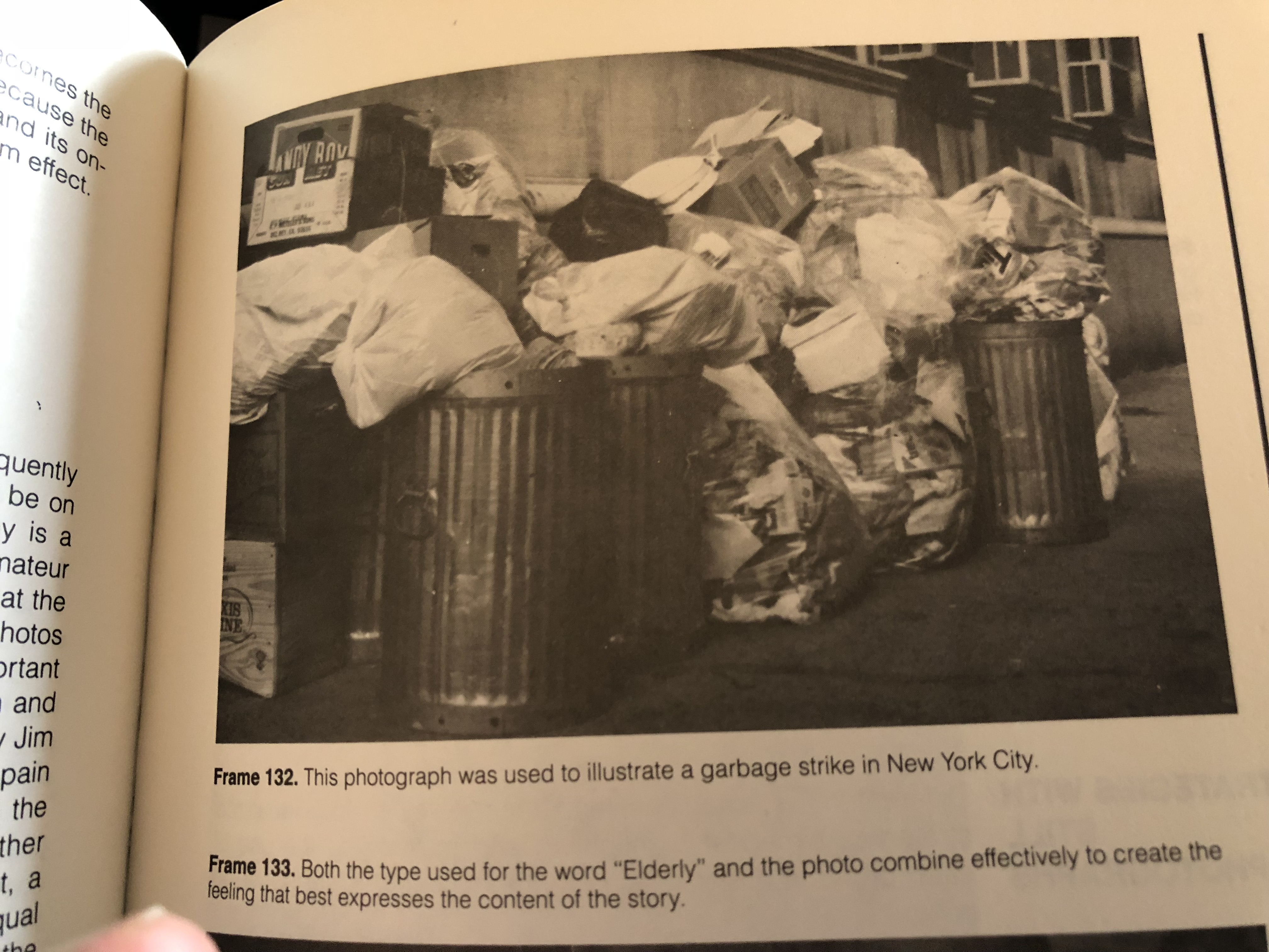
The importance of photography: I found it ironic at the time that many good television news graphics were actually still photographs. Indeed, a medium so saturated with images, via video, continued to capitalize on still photography to convey information. Yet, this is still true today: a dynamic photograph can enhance the design and scope of the message presented on the screen of your phone, too. For example, and this is an actual ABC News image: In telling the story of a New York City garbage strike, no other visual strategy could say as much graphically as a color still photograph of many stacked garbage cans and plastic bags.
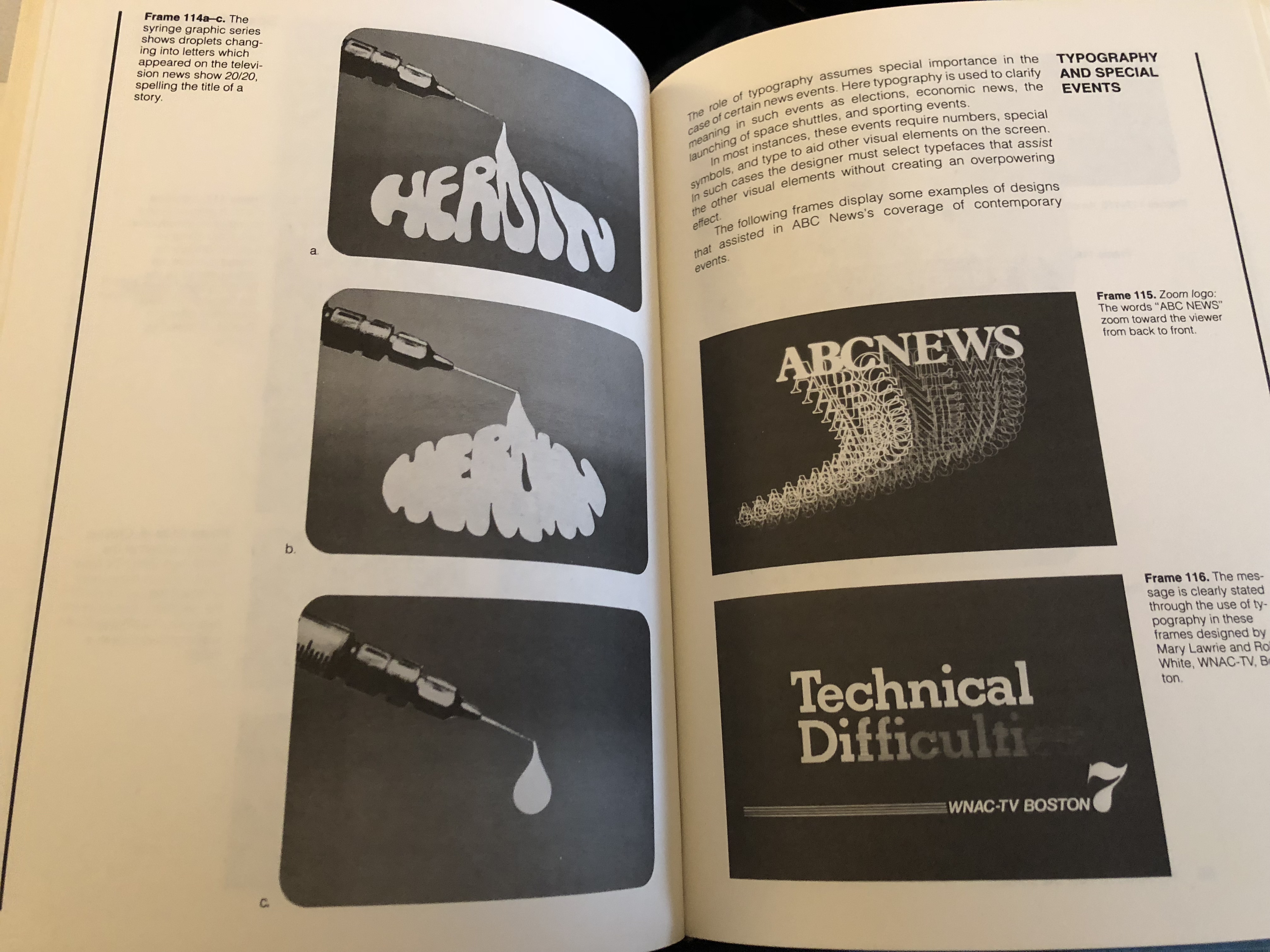
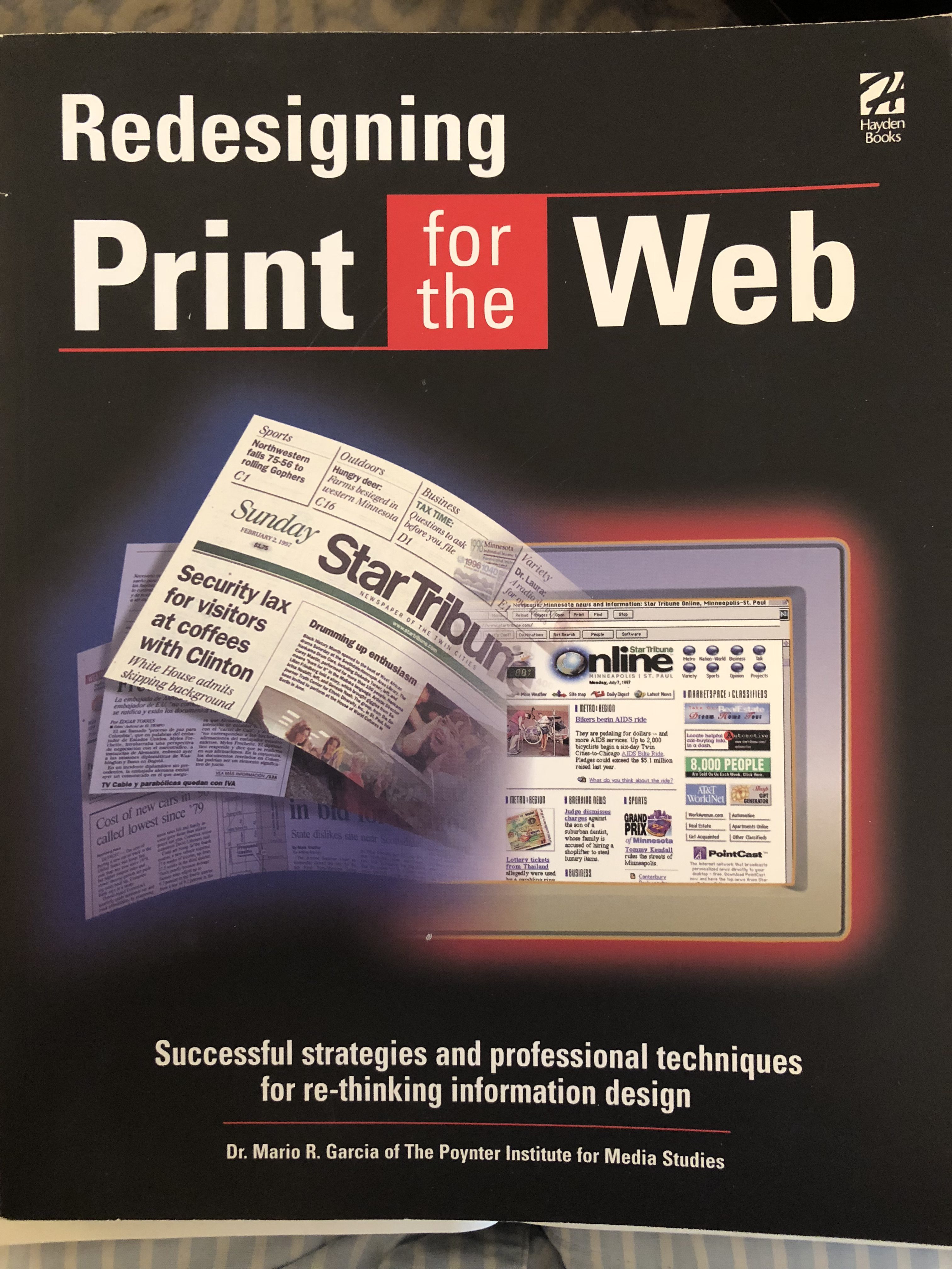
The hand drawn sketch: It worked then, it works like magic today. Start the creative process with a simple sketch done by hand. Ben Blank, too, adhered to this method, as we see here in one of his sketches and how the sketch turned into an actual graphic at .
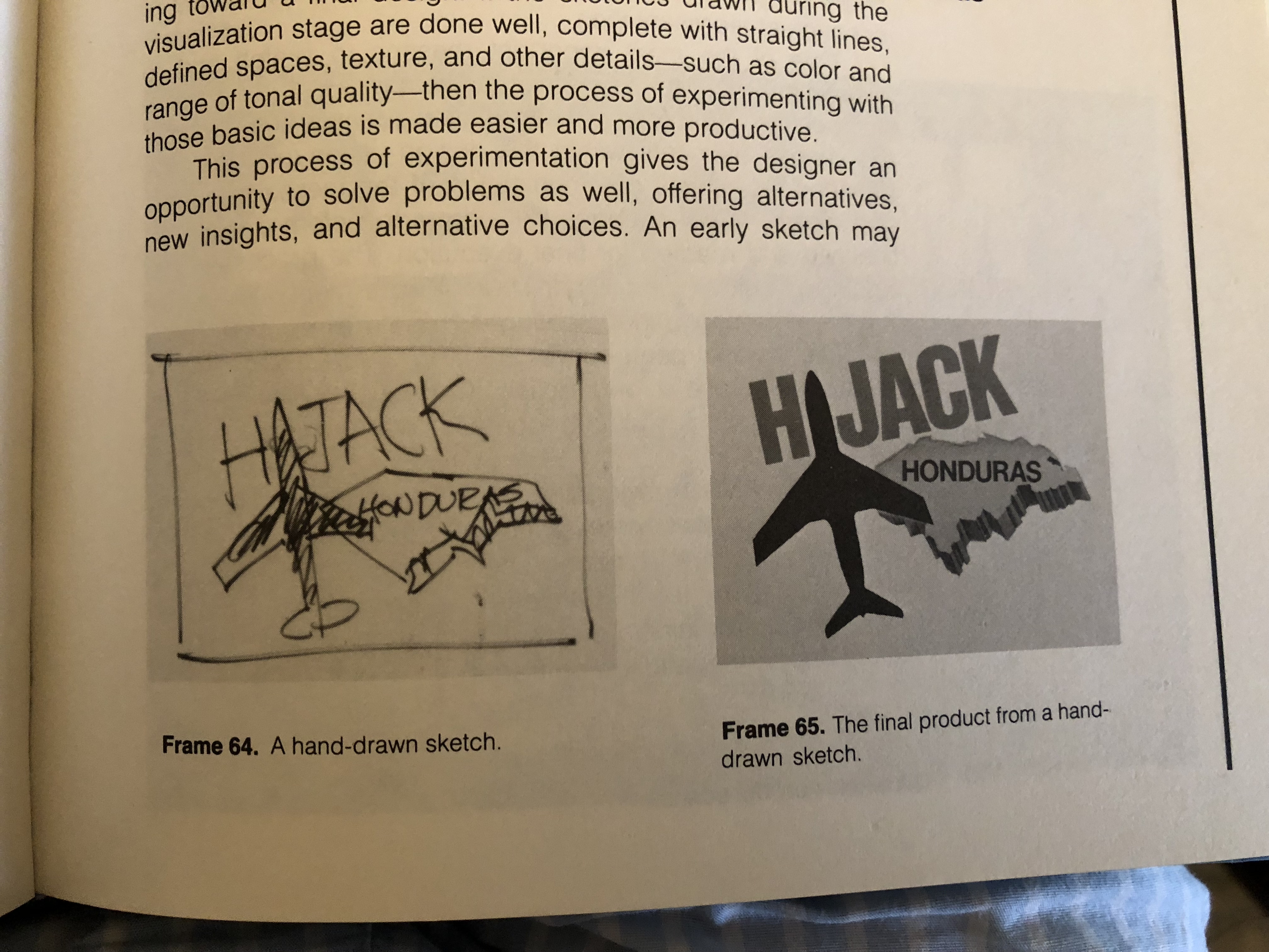
Here is one of my recently drawn sketches for a mobile project:

The design approach:
Experienced designers approach design from the following perspective:
-Visualizing a design (sketching)
-Experimenting with ideas such as enlarging, distorting, abstracting, integrating, separating and adding.
-Executing a final idea.
Qualities of a good visual design:
These are still guiding principles for me in my work with digital storytelling.
Simplicity, boldness, aesthetic value and functionalism
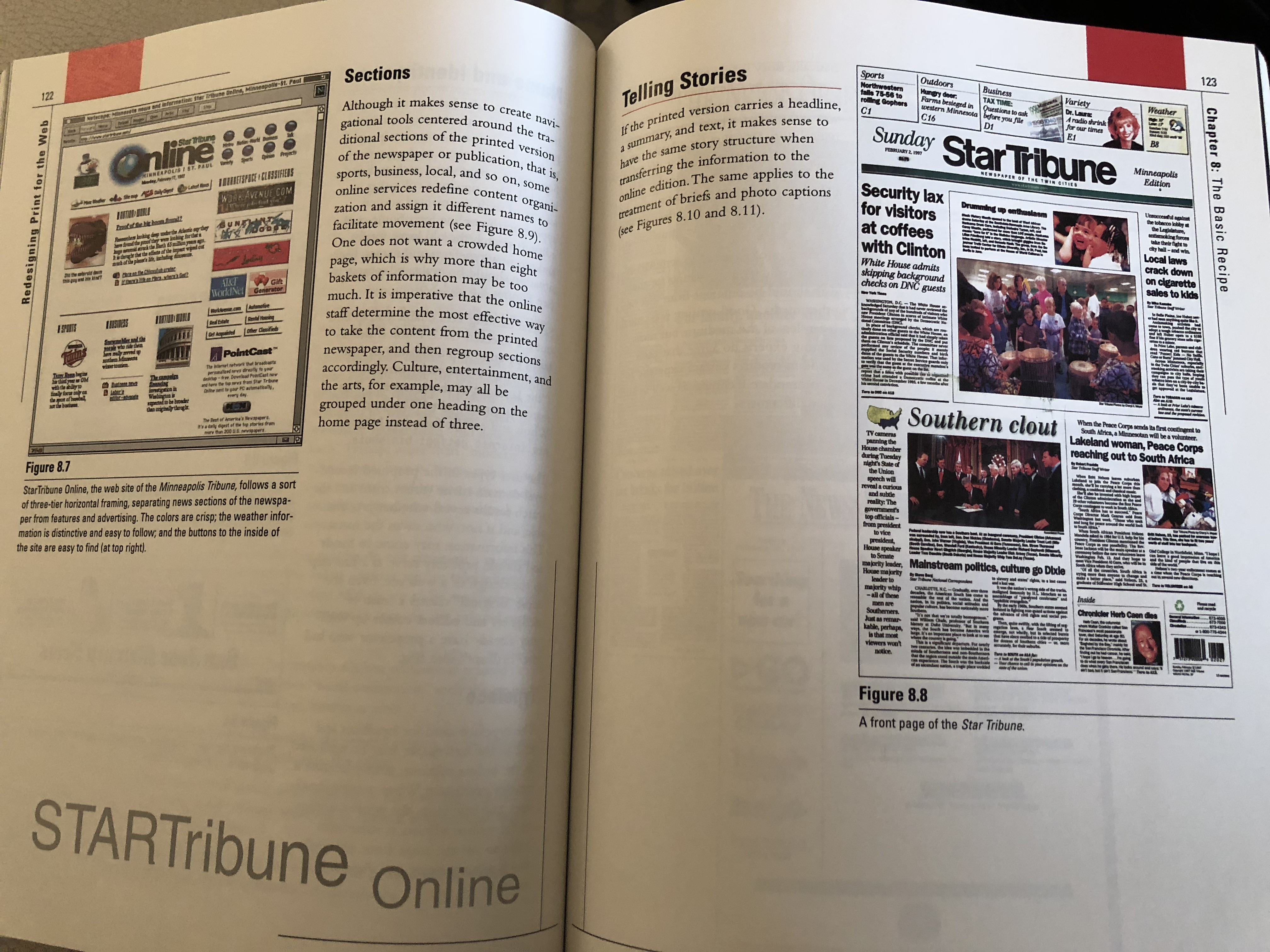
Redesigning Print for the Web
The Mentality of Editors-
‘This book was published in 1997, a time at which editors were beginning to realize the tremendous importance of the World Wide Web, and in which their newsrooms had tremendous trouble making the transition to a different cycle of news. As I re-read some chapters of this book, I realized how much has not changed, and I even had a chapter devoted to “the mentality of editors”. Boy, could I expand on that chapter today, as I deal with so many editors who still come to work each day thinking in terms of “print editions” as opposed to stories that evolve organically through the course of a day! Here is my take on editors and changes of mentality in 1997 (sounds familiar in 2018?):
“This is a conversation I have heard various times at the newsrooms of many newspapers in different countries. The languages, the people and the cultures may be radically different. The question seems to be the same: why are some journalists in the newsroom of newspapers so reluctant to get involved with the online edition of newspapers?
The information designer: This is the first time that I recall using the term “information designer”. I described this information designer as architect. I wrote that:
“This information designer has a strong knowledge of how users access and digest information, how their eyes move on the screen, how visual hierarchy creates organization, as well as hot to effectively use white space.”

Linking versus scrolling:
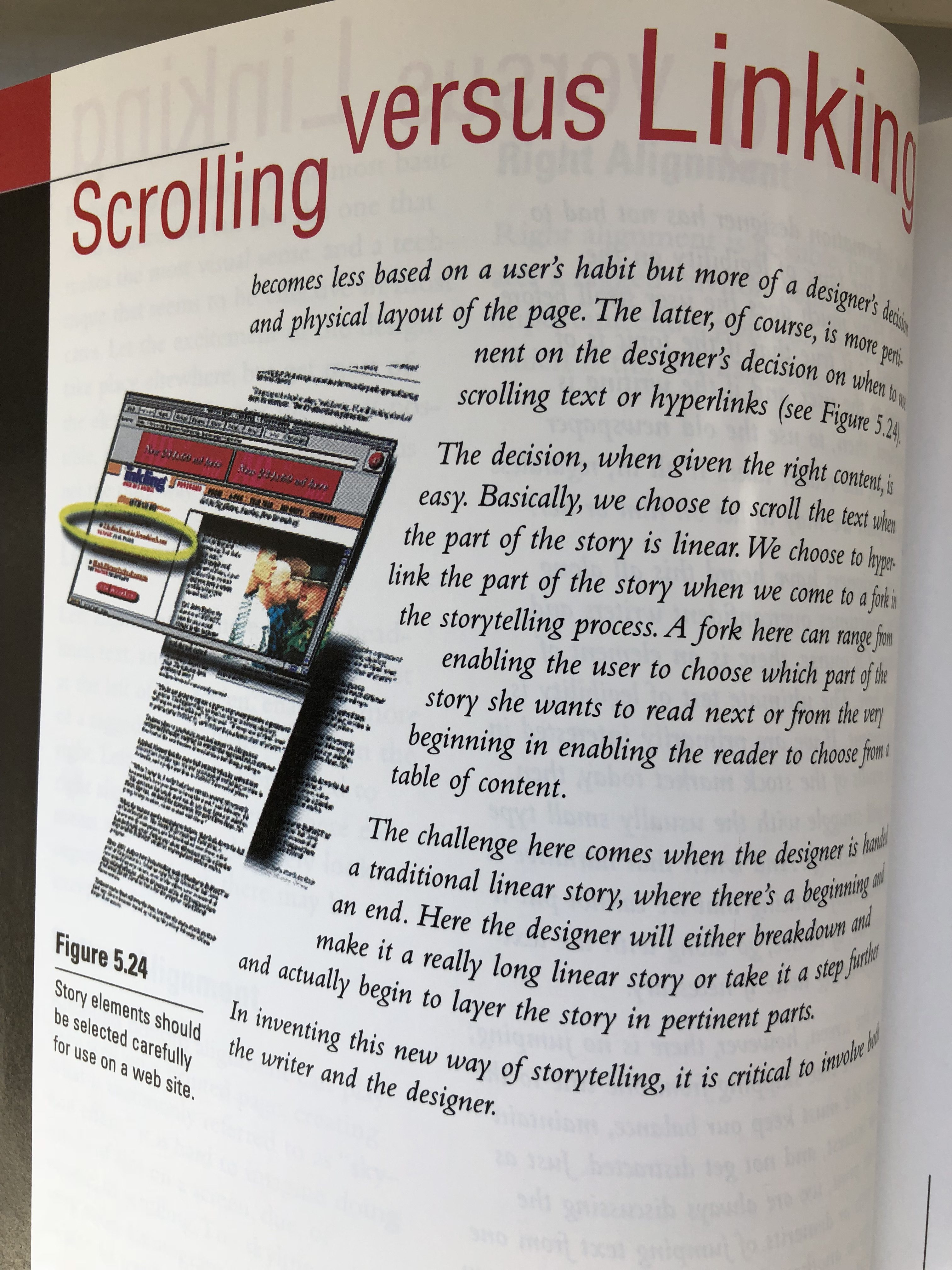
Here is one area where I have had a change of heart. Or, better yet, I have realized that on the small screen of a smartphone, we prefer the linear movement of scrolling. However, this is how I addressed the subject in 1997—when we were reading on the screens of our computers, not on telephones:
Scrolling is a totally linear activity. Linking is less so. Users are more likely to enjoy the motion of linking than that of scrolling, especially after two or three screens.
Then, in what now appears to be true, I added:
As technology and new design solutions come about, the challenge a designer faces regarding linking and scrolling becomes more critical.. With the advent of frames, and the soon to be available style sheets and layer capability, the issue of linking and scrolling becomes less based on a user’s habit but more of designer’s decision and physical layout of the page.
And….
We choose to scroll the text when the part of the story is linear.
Words that I would include in a book today:
In inventing this new way of storytelling, it is critical to involve both the writer and the designer.
A symphony of movement
I like this reference, and one I still would use today (in stronger terms, actually) to describe what we should accomplish on the small screen of a smartphone.
A symphony of movement is created because “the screen is a combination of layers–some visual, some even more visual–with the effects of animation, as well as sound.”
The takeaway
As I revisited two of my own works, I come to the conclusion that the essential takeaway for all of us is this: while the technology and the platforms we use to consume news have changed dramatically since these books were written, one thing remains at the core of it all–it is all about the story. If the content is good, the audience stays.
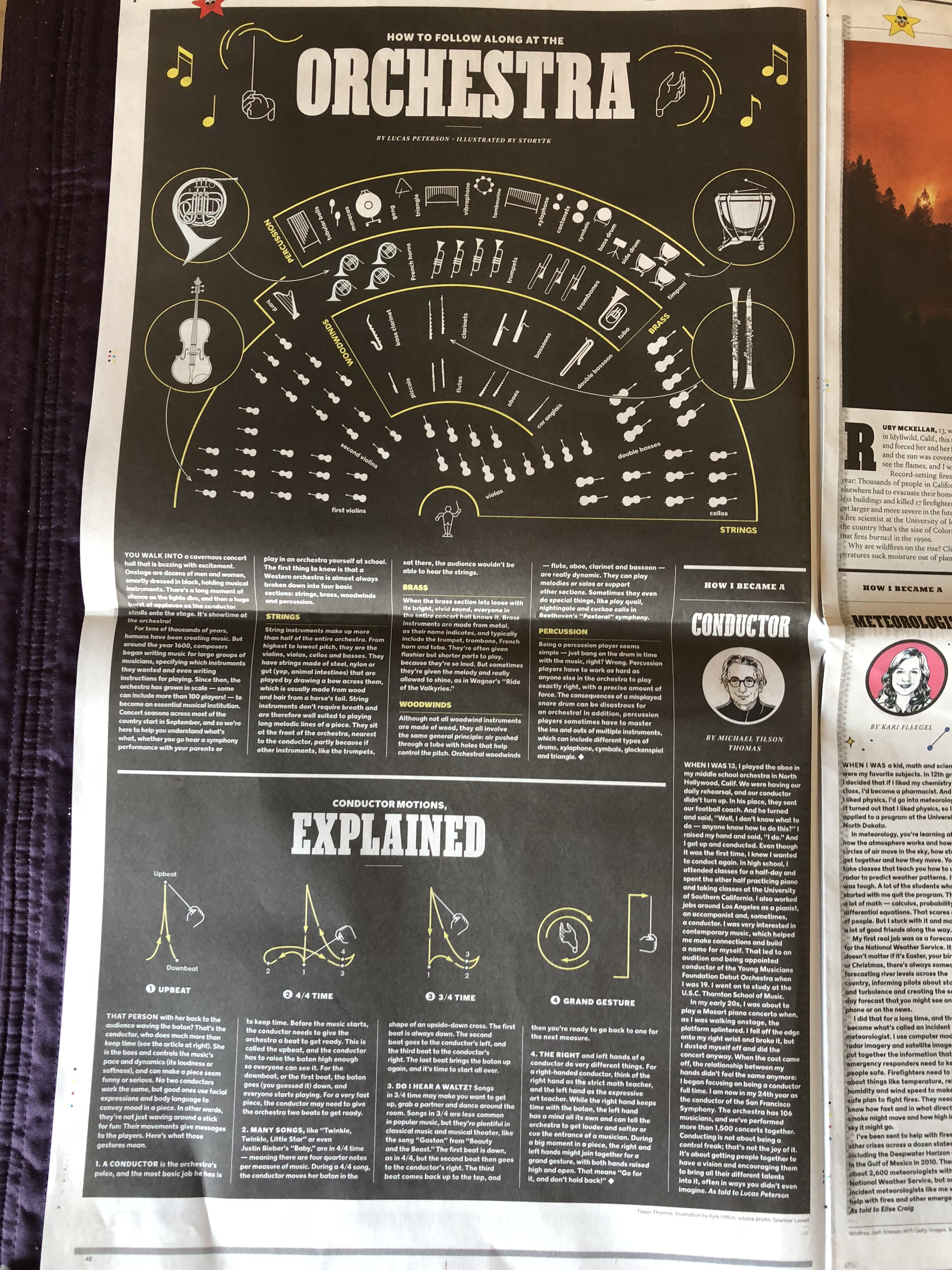
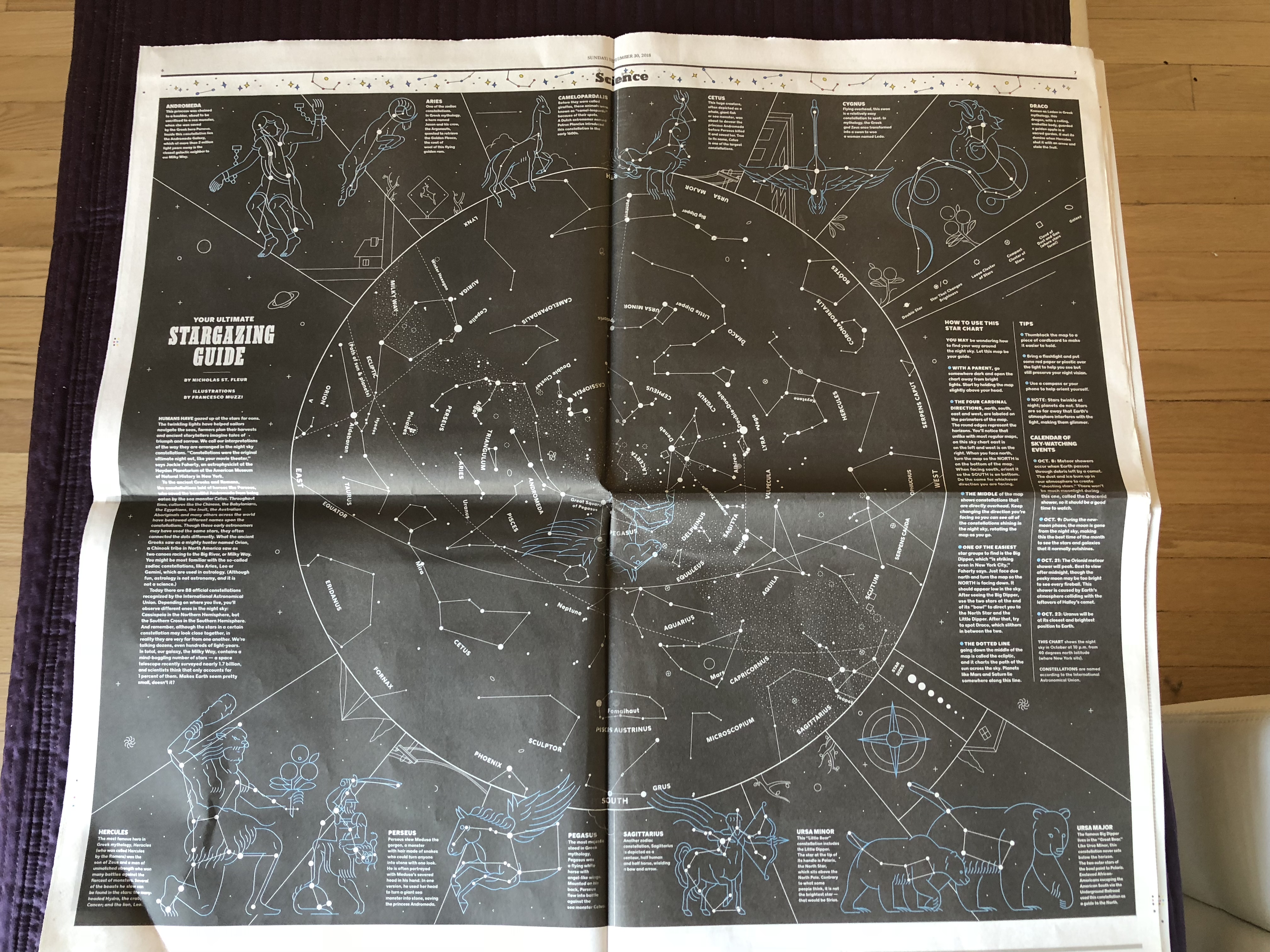
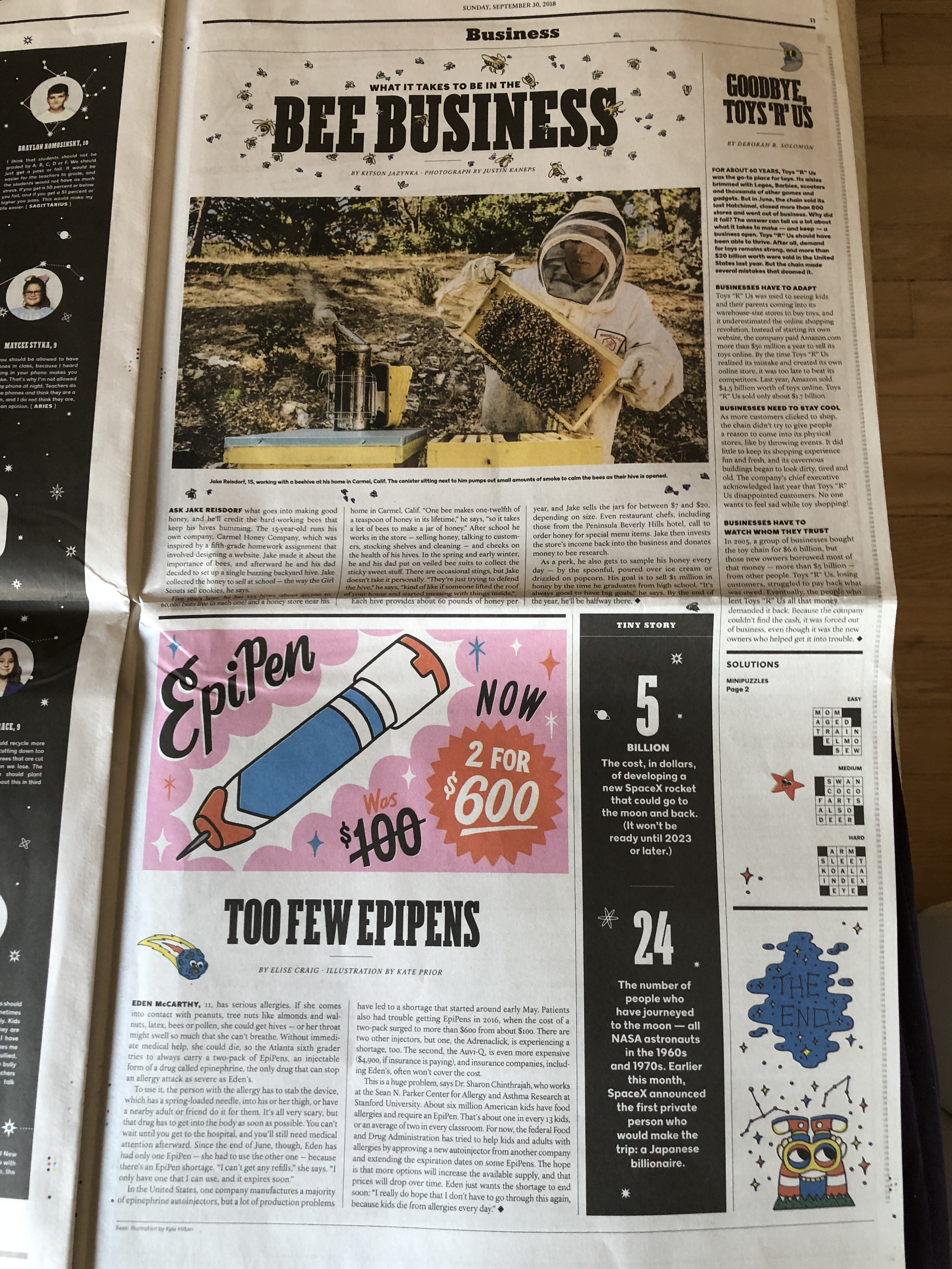
Projects we like
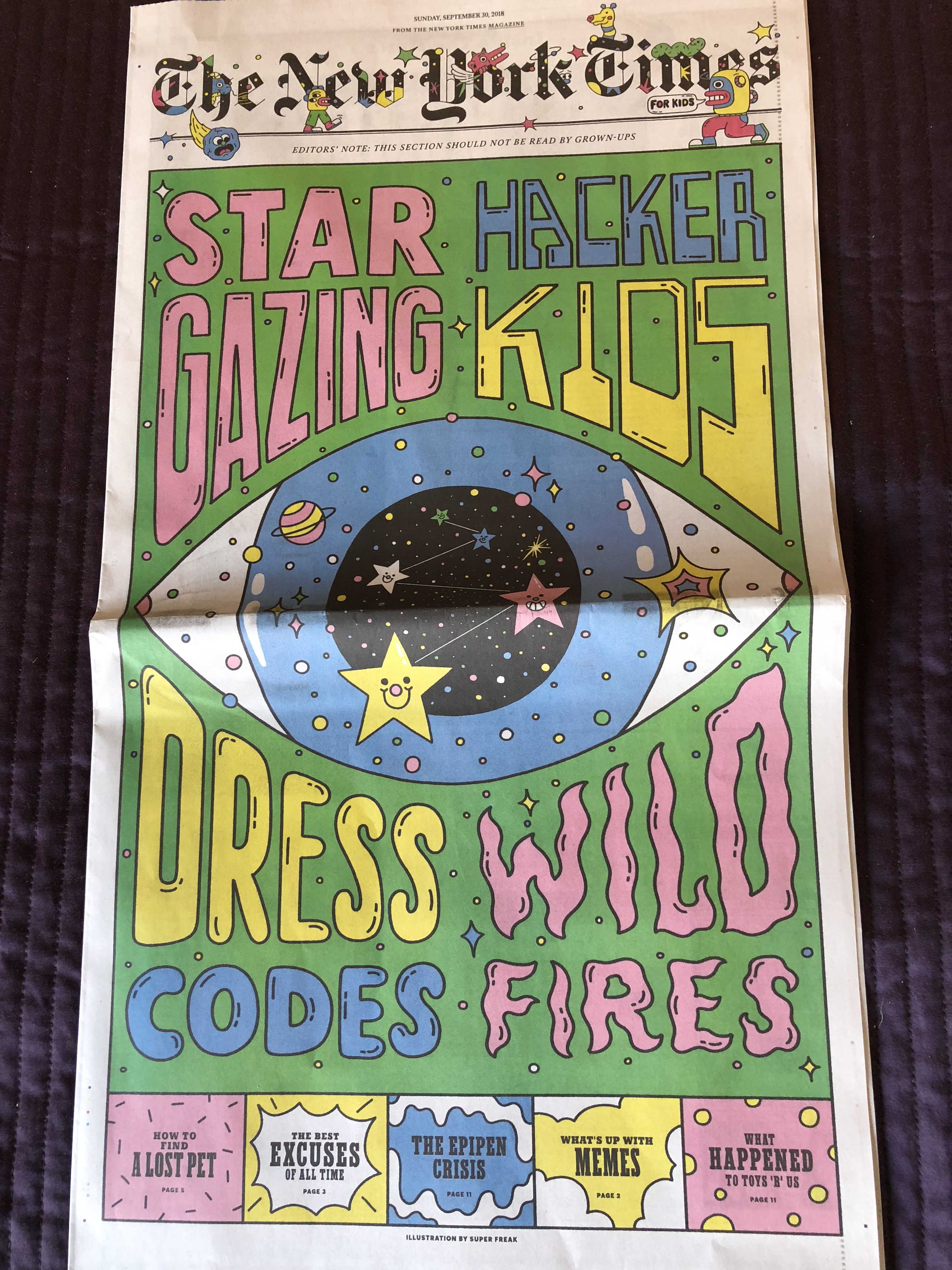
This is the new edition of The New York Times’ For Kids. Always a delightful publication for kids of any age. Take a look.
TheMarioBlog post #2921