Purchase the book on the iBookstore
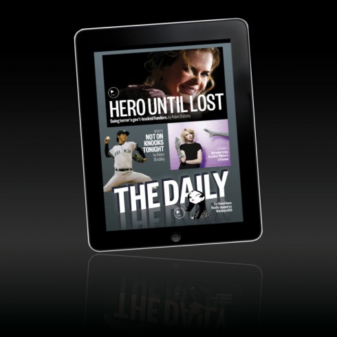
TAKEAWAY: As The Daily shuts its doors, we examine where it went wrong. In the end, it was limited by hewing too closely to a printed newspaper. Editors and designers should learn from this: Embrace the remarkable storytelling possibilities of the tablet.
The iPad Ad Lab—my weeklong examination of creating compelling advertisements for the tablet—will resume Wednesday.
End of The Daily
It’s too much to have to say goodbye to Twinkies, Newsweek and The Daily, all within a month.
Somehow, the announcement Monday that News Corp. is pulling the plug on the first ever tablet newspaper does not totally surprise me. It disappoints me, as one of the 100,000 subscribers who remained there till the end.
A confession from this subscriber: I stopped looking at it as a reader months ago. I would refer to it as a media practitioner with a special interest in all things related to the tablet.
Why did I become disenchanted with The Daily?
It was too much like a newspaper and never advanced to the next level. True, it made inroads with more pop-ups and greater engagement, but it was stuck in the role of a newspaper that had simply moved to a different neighborhood. I want my printed newspapers (which I still read with gusto) to to feel like newspapers. But when I turn my tablet on and lean back, I want to enter the world of the tablet—new, fresh, full of possibilities. It should not be a trip to the attic. It is a journey in which one opens the windows and lets the fresh air in.
To me, The Daily was always The New York Post with a little of a regional newspaper (located who knows where?) thrown in. That was the problem. It suffered from what television did in the beginning, the so-called “radio days syndrome.” The people who went to do television came from radio and took radio strategies with them: anchors sat at a table in front of a microphone and talked, with no movement. It took years for these people to start moving around!
The Daily suffered from the ghost of the newspaper that it wanted to be so desperately.
I still think that the fantastic prototypes created by the talented Alfredo Triviño for The Daily—and which were quickly tossed aside—would have been exactly what the first tablet newspaper should have looked like.

A concept for The Daily created by Alfredo Triviño. If only it were adopted.
What now?
Is the end of The Daily, the end of tablet newspapers?
No, not at all.
The best is yet to come. And, the silver lining here is that The Daily has taught everyone this critical lesson: Don’t try to mimic a print newspaper of another era for the new platform.
Instead, look at the tablet and what it can do. Pretend that you landed in another planet were newspapers never existed. The tablet now affords you the opportunity to communicate news and information in a multi-touch, multi-sensory way. The sky is the limit. Before you start your journey to this planet, leave the ghosts of printed newspapers behind.
Turn up the volume. Let the storytelling develop naturally on the platform for which is intended.
Let the printed newspaper—and, of course, that radio show—continue to exist in their own cozy habitats.
As we say goodbye to The Daily, let’s say hello to the possibilities for this tablet platform—a platform which, after all, is still a toddler, full of potential and discovery.
For more on The Daily’s demise
News Corp. Shutters The Daily iPad App
http://allthingsd.com/20121203/news-corp-shutters-the-daily-ipad-app/
Highlight:
The app was initially hampered by technical problems, but The Daily’s key issue was a conceptual one. While the app boasted lots of digital bells and whistles, in the end it was very much a general interest newspaper that seemed to be geared toward people who didn’t really like newspapers. You can’t make that work no matter what kind of platform you use.
Some lessons from the demise of The Daily: Was it the platform, the content, the structure, or the business model?
http://www.niemanlab.org/2012/12/some-lessons-from-the-demise-of-the-daily-was-it-the-platform-the-content-the-structure-or-the-business-model/
Highlight:
Here’s the thing: The Daily had over 100,000 paying subscribers. That ain’t nothing! With most subscribers paying $39.99 a year (others paid 99 cents a week), minus Apple’s cut, that’s around $3 million in annual revenue — and that’s before you add in advertising revenue. At various points, it was the highest-grossing app in the App Store in 13 different countries. In the United States, it’s been in the top 5 of news apps by gross since launch and, until this summer, consistently in the top 20 of all apps — even including Angry Birds and the rest.
You can absolutely build a real online news organization on that kind of revenue. You just can’t build one that has 200 staffers. Or 150 staffers. Or 100 staffers.
What It Was Like Launching the Doomed iPad Magazine The Daily
http://gizmodo.com/5965193/what-it-was-like-launching-the-daily
The impossibility of tablet-native journalism
http://blogs.reuters.com/felix-salmon/2012/12/03/the-impossibility-of-tablet-native-journalism/
The Daily closes shop: why the news app was doomed from the start
http://www.guardian.co.uk/commentisfree/2012/dec/03/the-daily-closes-app-doomed-from-start?utm_source=feedburner&utm_medium=feed&utm_campaign=Feed%3A+theguardian%2Fmedia%2Frss+%28Media%29
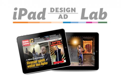
Take advantage of our iPad Design/Ad Lab workshops

Do you want to take your brand to the next level by creating a tablet edition? García Media can help. We now offer one- to two-day “iPad Design Lab” workshops on demand to jumpstart your presence on this exciting new platform. We also offer “iPad Ad Lab” workshops to develop engaging advertising models for your app. Contact us for more information.
The iPad Ad Lab resumes Wednesday with “Kill the Banners!”

Take a video tour of iPad Design Lab
“iPad Design Lab” trailer on Vimeo.
Read the Society of Publication Designers’ review of The iPad Design Lab here:
http://www.spd.org/2012/10/must-read-ipad-design-lab.php

Keep up with Mario Garcia Jr. via Garcia Interactive: helping transform online news since 1995.
www.garciainteractive.com
Here’s a gift you don’t have to wrap!

It’s official. The Christmas/holiday shopping season is here.
Here is a suggestion for someone on your list, the digital book iPad Design Lab: Storytelling in the Age of the Tablet. No need to stand in line, no need to buy wrapping paper. Just send it to someone you think might enjoy a book about this magnificent new platform that is the tablet, and how to maximize its potential for storytelling.
Here is how you can get the book:
The original version of the book is the multitouch textbook version available on the iBookstore for iPad (iOS 5.0 and up):
https://itunes.apple.com/book/ipad-design-lab/id565672822. This version includes video walkthroughs, audio introductions to each chapter, swipeable slideshows, a glossary and a sophisticated look and feel.
Apple only sells multitouch textbooks in certain countries at this time, unfortunately. Copies are available in at least the following countries: Australia, Austria, Belgium, Canada, Finland, France, Germany, Great Britain, Greece, Italy, Latvia, Luxembourg, The Netherlands, Poland, Portugal, Romania, Slovakia, Spain, and the United States.
For those in other countries and without an iPad, we have made the book available in a basic edition for other platforms. This basic edition includes the full text of the original, along with the images and captions, but lacks the other features such as audio and video. It is available on the following platforms in many countries:
Amazon Kindle: http://amzn.to/SlPzjZ
Google Books: http://bit.ly/TYKcew
Scribd: http://bit.ly/PQTwla