This is the weekend edition of TheMarioBlog and will be updated as needed. The next blog post is Monday, December 8.
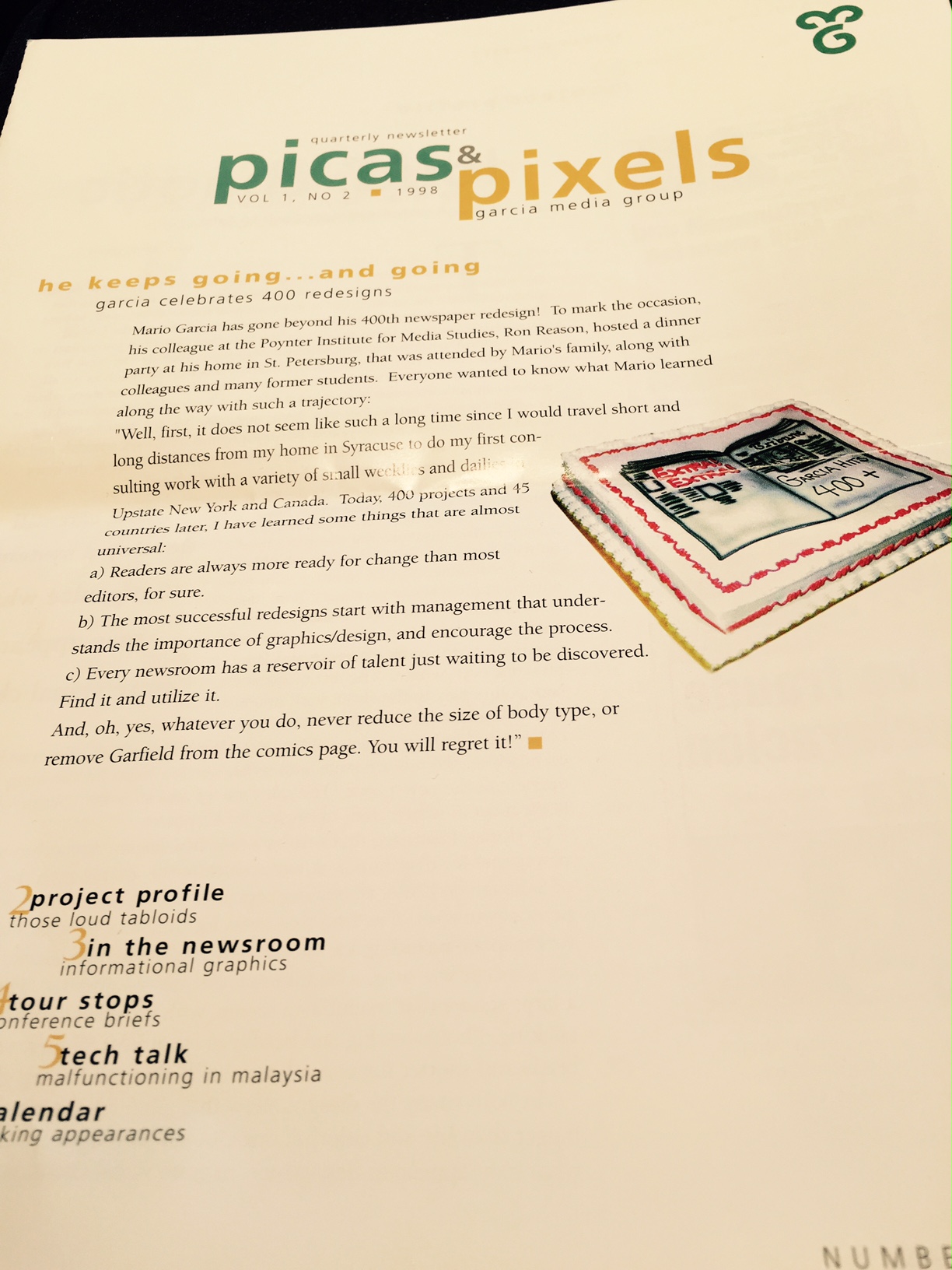
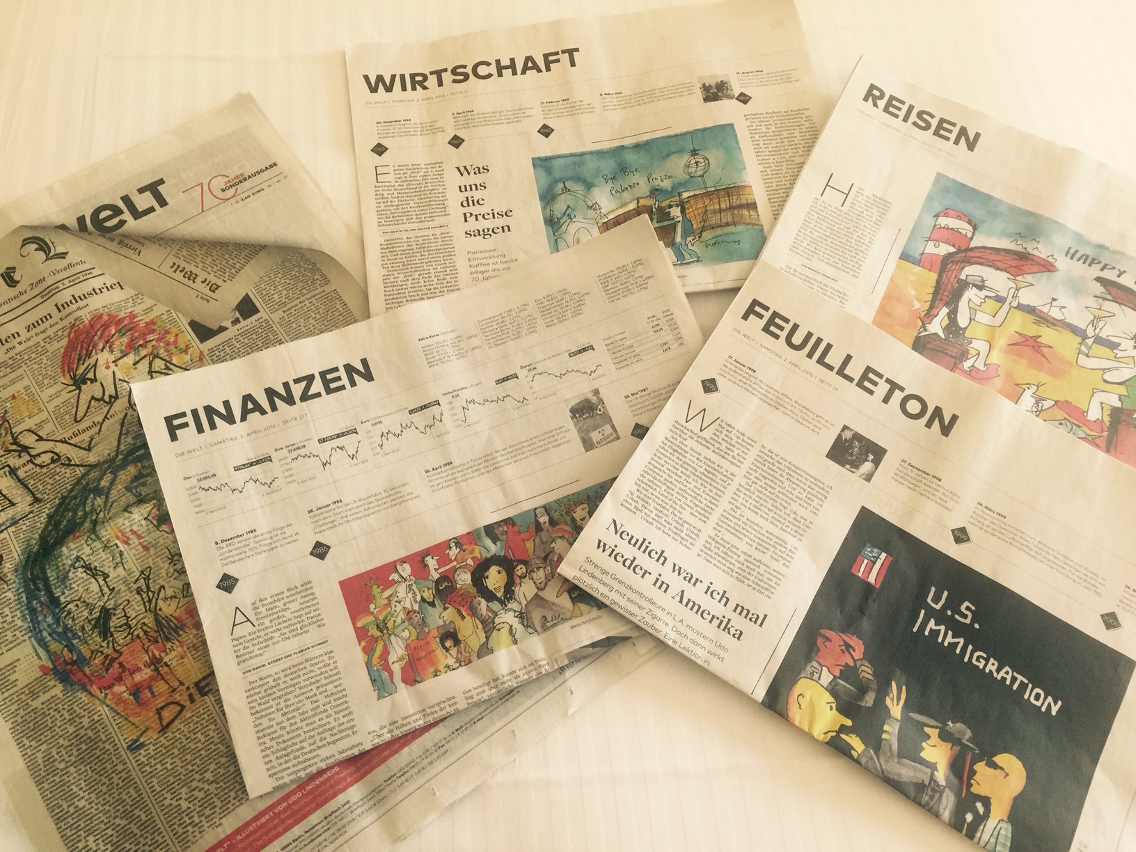
This is a copy of a 1998 Picas & Pixels: a quarterly publication that was the precursor to TheMarioBlog, printed on glossy paper
TheMarioBlog did not exist in the late 1990s, so we did the next best thing to report about things going on with our firm, a quarterly printed newsletter titled Picas & Pixels. It was edited by Mario Garcia Jr., and we printed it on the nicest glossy paper. I had totally forgotten that this publication ever existed, until I opened a box tucked in the back of a bookshelf in my home office.
Picas & Pixels? Suddenly, the memories came back: Mario Jr. chasing me to get him stories just before deadline, procuring illustrations for the stories and making sure that the addresses on those labels were correct. Indeed, Picas & Pixels was mailed to anyone interested in following our activities.
And there were plenty of those. Interesting to recap and to take a look at 16 years ago. Join me.
It seems like only yesterday
Travel: This edition of Picas & Pixels reports that I was travelling in Kobe, Japan; Amsterdam, Holland; Hamburg, Germany, with stops at The Poynter Institute to conduct a four-day seminar.
The 400th project: We had just celebrated completion of the 400th project, at a dinner hosted by my friend and colleague, Ron Reason, at his home in St. Petersburg. I remember it well, complete with a cake and the big 400 on top. As I approach project 700, it is amazing that the same lessons of them resonate with me now:
-Readers are always more ready for change than most editors, for sure…
-The most successful redesigns start with management that understands the importance of graphics/design and encourage the process.
-Every newsroom has a reservoir of talent just waiting to be discovered.
Would I add anything to these three mantras?
Almost nothing: I still maintain that change scares editors more than it creates any problem with readers. Today change is ten times more prominent than it was in 1998, although, in retrospect, perhaps we should have been more vigilant and alert to change then. The Internet was already a presence, but not yet a state of mind for many in the newsroom. The result? Time wasted. Readers lost. The beginning of an erosion that cut through the journalistic heart (and the wallet) of newspapers everywhere.
Indeed, all rethink projects still start with management that wants to proceed, and, today, that understands how the news cycle moves in the era of the media quartet, with two tempos running parallel, and with new notions of frequency that are dramatically different from those of 1998.
The reservoir of talent waiting to be discovered may be even greater today: there are mobile editors lurking in the shadows, waiting for a senior manager to tap them on the shoulder for an invitation to take a seat at the table.
Tabloids: loud, chaotic and by the book
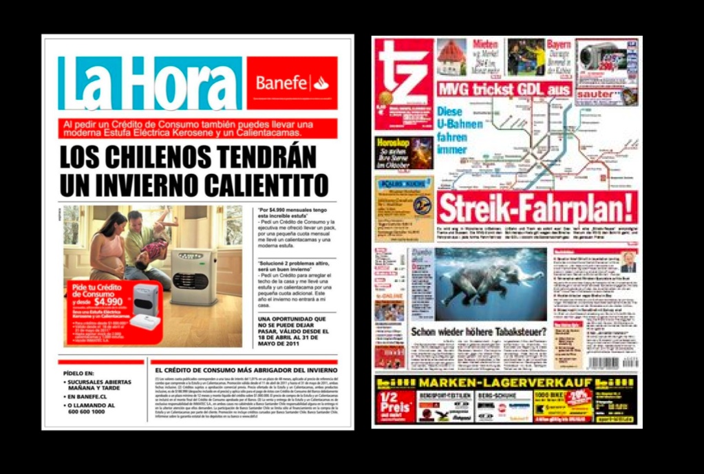
Recent front pages from Chile’s La Hora and Germany’s TZ
One thing is for sure, tabloids have a better reputation in 2014 than they did in 1998, but we still hear editors who tell us “not to make this tabloid too much like a tabloid.”.
Old habits are difficult to break, and, in the newsroom, sometimes impossible to abandon.
In the 1998 edition of Picas & Pixels, I wrote a piece titled Tabloids: loud, chaotic and by the book, with a tagline that read– and with a systematic approach.
At the time I had just completed work with two tabloids, TZ in Munich and La Hora, a newcomer in Santiago de Chile. Both were loud, but successful. The front pages were loud, but, as I wrote then, “I redesigned TZ to bring some systematic approaches to its natural (and likeable) chaos. To that effect, we created a restrictive color palette where only five colors dominate..:
For La Hora, a new newspaper born to hit the streets at precisely 2 in the afternoon in the busy streets of Santiago, “the concept was to go a bit Internet, yes, tabloid internet:”.
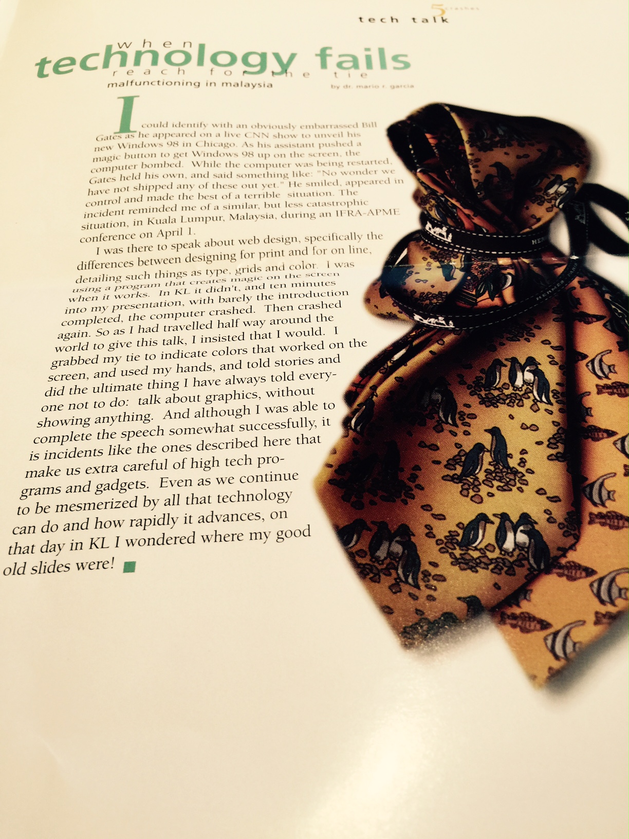
When technology fails, reach for the tie?
While I had totally forgotten this incident (selective forgetting), I have now read my story about a presentation from hell in Kuala Lumpur, Malaysia, where I had 60 minutes to talk about web design and the differences between designing for print and the web, but the technology failed us and I could not show my slides. I had travelled half way round the world to give that presentation, and, indeed, I was going to do it.
So, I grabbed my tie to indicate colors here and there.
And 16 years to the day, it has happened again: it is only a few days ago that I was teaching a 3 hour Master Class at The Poynter Institute. Upon arrival to the Institute that day I found out that I would not be able to show the visuals for projects that I would be discussing.
I was wearing a single color bow tie that day, so I reached for the most descriptive words I could utter when discussing visual details. Remembering my childhood acting days in Havana, I convinced myself that the show must go on. It did. I missed my visuals tremendously but the conversation was fluid and I could see all of those projects in my head as I talked about them.
Hope the audience did too.
The logo in 1998
We promote change at Garcia Media and we look back fondly (sometimes) at our previous decisions when it comes to visuals and branding. The two letters for MG seemed to hit the spot in 1998.
That was then, and this is now. We like to embrace change with the same zest that we propose it to our clients.
Picas & Pixels was appropriate for its day. It has now evolved from quarterly to daily, from Picas & Pixels to TheMarioBlog. The intentions are the same: to keep you updated with what we are doing, to bring you echos of the lessons we learn along the way, and to greet you each day with a thought or a tip that may enhance your work and, most importantly, foster your passion for our craft.
Mario Garcia on fonts, typography
I participated in this interview about the role of typography in design and how readers perceive various news products.
For online preview, go here:
https://www.facebook.com/video.php?v=10152608536069016&set=vb.18568599015&type=2&theater
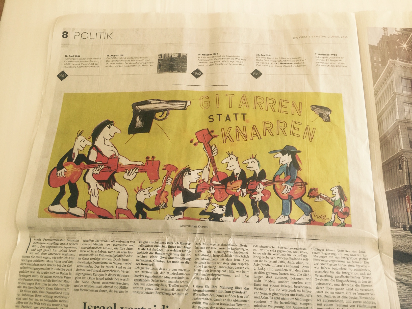
Illustrations on Page One
I like very much to see illustrations used as the main piece of art on the front page. This week, while traveling through Frankfurt, I managed to see three great examples via Die Zeit, Frankfurter Allegemeine and Handelsblatt.