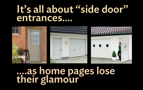
TAKEAWAY: Those news website home pages are not what they used to be, or perhaps the side and back doors have become the more practical and less noisy way to make an entrance.

I remember when we built our house in Temple Terrace, Florida, we were so proud of what the architect, W. Wade Setliff**, had accomplished! Especially, we liked the impact as you open the front door of Villa Tortuga (what we call our house): an open environment with a two story atrium, no walls, and a direct view of the Hillsborough River, along with our own mini forest of old Florida trees lined up to create a relaxing, green environment, in what is actually a Florida environmentally protected area.
But to get the full impact of all of this you had to come in thru the front double doors, stand in the portico, and take it all in.
What disappointment, then (and now), when so many of the people who come to visit us opt to come in thru the side garage door, say hello to the laundry room first (gasp!), then proceed.
No impact. Lots of practicality, however.
Why those side and back doors are so friendly
To me,that is exactly what is happening in the world of news websites, where many of us land there via a link to a specific article, using the back door to the site, and, in many cases, never ever seeing the front door or home page.
Yet, we spend so much of our time designing websites with that home page in mind. Should we shift our attention to the article page, instead? Then make sure that the home page is clearly identified and easy to gravitate to?
The plight of the home page designer
So what is the designer to do when viewed with this dilemma.
In the last two weeks, I have sat in the midst of online edition planning sessions in which new and/or revised “designs” for a newspaper or magazine are being discussed.
Editors and art directors still concentrate a lot of their efforts into that homepage, but becoming more aware that it is not the only and/or preferred entry point for so many users.
“See, print-nostalgic editors (and even some editors who have only worked in digital media) take a certain amount of solace in the homepage,” writes Ann Friedman in a recently published piece from the Columbia Journalism Review provocatively titled Is the homepage dead?
For me, it is time to make sure that even if you come thru the “laundry room”, you have clear directions on how to get to the more attractive and inviting part of the house. How to do this?
Better directives via navigation, not just a “home” reference or button that is almost impossible to find in the navigator bar.
As I myself find that I enter daily to dozens of my favorite websites NOT thru the home page and, in fact, never even go to the home page. Why? Well, I do know those particular websites well, so I maneuver instinctively and out of practice.
Writers and designers must start designing more for pieces that stand alone, period.
Is the home page really dead?
Ann Friedman is pulling no punches and, in the second paragraph of her story, she puts it up front and center:
As more and more traffic comes from search and social, the homepage as the entryway into a site’s content is increasingly obsolete.
The evidence she cites is quite convincing:
—Less than half of visits to nytimes.com start on the homepage
—More than half of Buzzfeed’s visitors come from search and social.
A mere 12 percent of visits to The Atlantic start with the homepage.
I find it very interesting in Ms. Friedman’s piece that she sees the home page as brand billboard, and not a navigator aimed at generating traffic thru the site.
This will change the dynamics of how we see the home page, not to mention how advertisers covet it and pay for space in it.
Reminds me of how I have always engaged with that oldest of books, The Bible. I have not read it in its entirety (I confess), but I am curious to refer to it from time to time, just opening it to a random page, allowing for serendipity to do the rest. I just did, by the way, and here is what I read:
Ephesians 3:16
I pray that out of his glorious riches he may strengthen you with power through his Spirit in your inner being.
Where’s Mario?

Mario’s upcoming speaking engagements

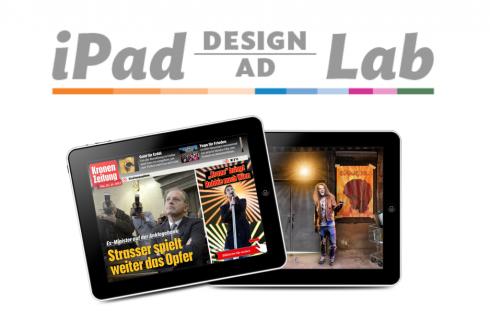
Take advantage of our iPad Design/Ad Lab workshops

Do you want to take your brand to the next level by creating a tablet edition? Garcia Media can help. We now offer one- to two-day iPad Design Lab workshops on demand to jumpstart your presence on this exciting new platform. We also offer iPad Ad Lab workshops to develop engaging advertising models for your app. Contact us for more information.

Purchase the book on the iBookstore
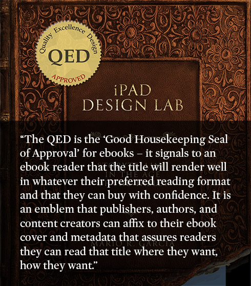
iPad Design Lab has been given the QED Seal

The QED (Quality–Excellence–Design) Seal is bestowed by the judges of the Publishing Innovation Awards after “a thorough, professional 13-point design review with an eye towards readability across multiple devices and in multiple formats.”
Learn more about the QED Seal here.
The EPUB version of book is HERE:
Now available: The EPUB version of  iPad Design Lab: Storytelling in the Age of the Tablet, ready for download via Amazon.com for Kindle:
http://tinyurl.com/8u99txw
Here is how you can get iPad Design Lab book:
The original version of the book is the multitouch textbook version available on the iBookstore for iPad (iOS 5.0 and up):Â https://itunes.apple.com/book/ipad-design-lab/id565672822. This version includes video walkthroughs, audio introductions to each chapter, swipeable slideshows, a glossary and a sophisticated look and feel.
Apple only sells multitouch textbooks in certain countries at this time, unfortunately. Copies are available in at least the following countries: Australia, Austria, Belgium, Canada, Finland, France, Germany, Great Britain, Greece, Italy, Latvia, Luxembourg, The Netherlands, Poland, Portugal, Romania, Slovakia, Spain, and the United States.
For those in other countries and without an iPad, we have made the book available in a basic edition for other platforms. This basic edition includes the full text of the original, along with the images and captions, but lacks the other features such as audio and video. It is available on the following platforms in many countries:
Amazon Kindle:
http://amzn.to/SlPzjZ
Google Books:
http://bit.ly/TYKcew
Take a video tour of iPad Design Lab
“iPad Design Lab” trailer on Vimeo.
Read the Society of Publication Designers’ review of The iPad Design Lab here:
http://www.spd.org/2012/10/must-read-ipad-design-lab.php

Keep up with Mario Garcia Jr.. via Garcia Interactive: helping transform online news since 1995.
www.garciainteractive.com