Watch for weekend updates; next Pure Design installment to be posted, Monday, July 27
TAKEAWAY: Typographically speaking, nothing is more important than text, which constitutes about 75% of what one will see in a contemporary newspaper or magazine. Legibility is key here, especially when catering to audiences which may include older readers. Our Pure Design installment today tells you how to make good text type choices. ALSO: Weekend updates.
It is all about that text type font
If a designer were to be a painter, most of the strokes of the brush would go to text. Even though info graphics and photos have gained tremendous prominence in the past 20 years—-and rightly so—-the main ingredient of the dish that is a page is text type. Be selective.
Tips to consider when selecting text type:
1.Economy: Compare number of characters you can accommodate in one font versus another (this is important to editors, even more so today)
2.Color:Look at how characters would take color, since more and more we have the ability to colorize small type, and get good legibility.
3.Serif vs. sans serif: Most readers in tests prefer a serif font for text, but I am beginning to use more sans serif fonts for text, with success. And, in fact, sans serif text fonts do take color better, an important tip to remember.
Some sans serif text fonts we recommend: Gotham; Interstate; Poynter Gothic Text, and, of course, one of my favorites, and the most economical, Retina, from Hoefler & Frere-Jones.
Look north for best cross media: Norway’s Aftenposten
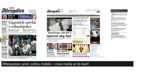
I often mention how much more advanced our Scandinavian media colleagues are when compared to the rest of the world. Shining the brightest perhaps among Scandinavian media, and setting the textbook example for cross media branding and creating a strong news source that allows consumers to get information through their preferred channel, is Aftenposten (Aftenposten Multimedia AS, Norway).
I have met editors of Aftenposten at different conferences worldwide, always surprised by how far ahead of the pack they continue to be.
Aftenposten is the second largest newspaper in Norway with about 240.000 subscribers; the web site currently sees around one million unique visitors weekly. Aftenposten also has a dedicated product for mobile. More recently, Aftenposten has developed a campaign for its website developed around the concept: “More Aftenposten, more multimedia”
Of course, this is pure genius here, since most users coming to a newspaper website want the reassurance that there is more of the newspaper they have come to rely on for news, to respect, to believe in, BUT they also want reassurances of the modern kind: more multimedia, interactivity, and mobile editions.
Aftenposten does all of that, and more, which is what I have decided to highlight them here today. I am one of the judges for IFRA XMA Cross Media Awards, and this Norwegian group is certainly a standout as I move from entry to entry this month.
Five valuable tips for successful cross media
Lessons we all can learn from the Aftenposten cross media experience:
1. The brand: Creation of a strong brand across all channels. No different names for different media. It is all Aftenposten. Most newspaper companies NEED to hear this message: your brand is the strongest thing you have going for you. Exploit it. Use it. Flaunt it. Don’t try to deviate from it. In fact, no need to even attach .com to it. Simply say Aftenposten, and the music starts playing! Simple as that.
2. Go local, local, local: Give local content/features/entertainment/service/guide to your region top priority when building the substance of your platforms. Allow each platform to do what it can do best: remembering that newspapers are something you read, the web is something you do.
3. Digital storytelling: Put more efforts into digital storytelling: not everything needs to be told in terms of a headline and text. Aftenposten has worked hard to achieve this. See http://www.aftenposten.no/spesial
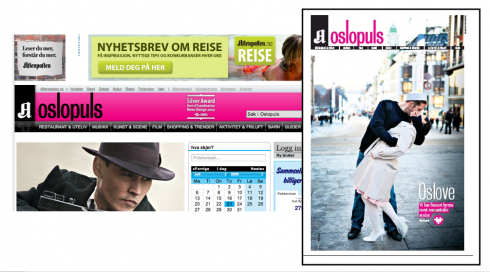
4. Service and entertainment: In terms of your online edition, use the medium’s capabilities to reach out to younger audiences, and to highlight the best of your city and region, as Aftenposten has done with its entertainment guide, Oslopuls
5. Make sure the editor believes in cross media: It takes an editor in chief who believes in storytelling across the platforms. At Aftenposten, this is the formula, as stated in their contest entry: The cross-media design and branding has been driven by the editor-in-chief who regularly has emphasized the importance of offering our content in two equal channels: Paper and digital. As a result of the strategy designers for the newspaper and web site are cooperating much more closely than before.
Keep an eye on Aftenposten. I know I do. I am never disappointed. I am often surprised. Look north, for sure.
Pure Design: It’s all in the details
Details. They make or break a design concept. If you think that little byline in 9 point, or the caption under the photo, or even the photographer’s credit line, are not important, think twice. Sometimes I begin an entire design concept by concentrating on the most miniscule of items on the page. From there, things grow.
I remember, when redesigning the Des Moines Register (Iowa), that the first thing that struck me as needing help with that newspaper in the 1980s was that bylines simply did not look good. They were cumbersome, looked too bold, and created a visual block for the readers trying to get to the first paragraph of the story. So, without thinking it twice, I started the Register’s redesign by sketching one byline idea after another.
Sometimes the little details lead to the larger picture.
When I evaluate newspapers and magazines, I often turn to type elements set under 12 points, to see how those are handled. They are great indicators of how the rest may look.
Download entire first section of Pure Design: Words
Now that I have fully presented the first of six sections of Pure Design on TheMarioBlog, I am offering the entire initial section, “Words,” available for download—all 33 pages of it. This may be useful for those of you saving or printing out Pure Design and will be done following each of the remaining sections. At the end of our journey through words, type, layout, color, pictures, and process, I will publish the entirety of Pure Design in one file.
Follow me at www.twitter.com/tweetsbydesign
Follow the Marios
Two Marios. Two Views.
Follow Mario Jr. and his blog about media analysis, web design and assorted topics related to the current state of our industry.
http://garciainteractive.com/
Visit Mario Sr. daily here, or through TweetsByDesign (www.twitter.com/tweetsbydesign)
In Spanish daily: The Rodrigo Fino blog
:
To read TheRodrigoFino blog, in Spanish, go:
https://garciamedia.com/latinamerica/blog/
TheMarioBlog posting #315