TAKEAWAY: Pure Design segment 3 today: Layering stories PLUS: More about Newsweek’s redesign ALSO: More Michael Jackson
Layering and secondary readings were never more important
No doubt about it, if, as I wrote in 2002, headlines are like beacons to lead us to stories, then secondary elements, such as summaries, subheads and info boxes are sort of beeps that alert us to special elements of the story. Scanners delight in those elements. As readers and users have less time not so much to read, but also to browse through newspapers and magazines, it is those elements beyond the headline that can make the difference in that important decision: to read or not to read.
For today’s Pure Design segment, go here:
Newsweek redesign revisited


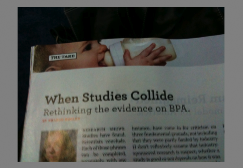
What are these top of the page panel photos supposed to say?
I have just tried to get thru another edition of the newly redesigned, newly revamped Newswrrk.
As I finish reading the last page of the magazine, I find myself uttering this word: awful.
Yes, a new design has to be given a chance.
Yes, you must let go of the old, welcome the new. Be open. Be sensible. You know the score.
In this case, I repeat: Awful.
What were they thinking?
What are those panel photographs running at the top of the page? Are they supposed to communicate anything? Do they go with the article below?
Why is the wonderful Fareed Zakariah article made to look like a Viagra advertorial?
The fact that this “design concept” is still around makes me wonder.
The content of Newsweek deserves better. Right now, the great stories (and may truly are) seem to be packaged in a sort of Spiegel shopping catalog—-remember those?
I am sure that someone at Newsweek is probably thinking like I am. My comment to them: it is never too late to regroup, to reorganize, to take a step back and do damage control.
Simply accept that a lot of what went into this look is just not right, and was not meant to be forever. Two months of it is long enough for me.
What I like about the new Newsweek
By the way, not all is lost in this new Newsweek concept. For example, I like how The Scope section is presented. It has a vibrancy, a sense of directness and an energy that disappears in other sections.
I also like the internal navigation, where a small box to the right margin of the page tells you what the next article coming up is.
It is here that one see sparkles of creativity and innovation.
Bild Zeitung’s Jacko comparison

Michael Jackson coverage continues along worldwide. Today’s Bild Zeitung (Germany) does a half page treatment of a comparison of the king of pop’s transformation through the years. Simple but striking.
Twitter with me

Follow me at www.twitter.com/tweetsbydesign
Follow the Marios

Two Marios. Two Views.
Follow Mario Jr. and his blog about media analysis, web design and assorted topics related to the current state of our industry.
http://garciainteractive.com/
Visit Mario Sr. daily here, or through TweetsByDesign (www.twitter.com/tweetsbydesign)
In Spanish daily: The Rodrigo Fino blog
:
To read TheRodrigoFino blog, in Spanish, go:
https://garciamedia.com/latinamerica/blog/
TheMarioBlog posting #296