TAKEAWAY: Take a look at this script font that says happy and playful.
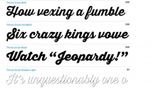
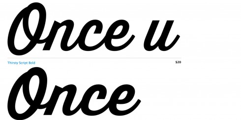
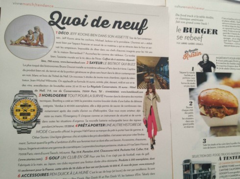
Here you see how Thirsty, which is used quite small to identify subsections (see right of image), has been used larger as header for this one destination page
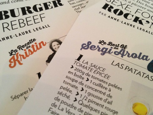
As used in smaller sizes
It’s the kind of surprises that we all like to have on a Monday, especially if it is cloudy: the discovery of a font that makes you smile.
Take a look at Thirsty. Yes, I am not making it up, that is exactly what this scripty and fun typeface looks like, and we are using it as an accent font in the new look of Paris Match, the leading French weekly, which will introduce some interesting changes by the end of May.
Here are a couple of applications of Thirsty. Primarily, we will use it very small to identify secondary or third level sections within sections of the magazine. However, I thought that perhaps we could hit it out of the park a bit for a one page feature, such as What’s New, or the end of the book, a sort of Once Upon a Time (celebrities share special moments in their life).
I thought I would share my Monday surprise with you. The designers and I have had fun working with Thirsty.
For those interested in more delectable script fonts, check out Filmotype and Sudtipos.”
A creative cover
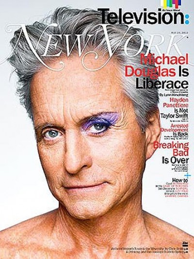
Here is Michael Douglas on the cover of the new New York Magazine. Douglas plays the famously flamboyant pianist and Las Vegas superstar, Liberace, with Matt Damon as his young lover, in Behind the Candelabra, a new HBO movie to air May 26.
For short video clip go here: http://www.extratv.com/2013/04/01/liberace-sneak-peek-michael-douglas-and-matt-damon-in-the-bathtub/
I thought this cover is simple, direct and, indeed, quite creative.