This is the weekend edition of TheMarioBlog and will be updated as needed. The next blog post is Monday, April 1

TAKEAWAY: The first Washington Post tablet app appeared in 2010; now 3 years later, a new one is here. It offers some highlights, but also disappointments, as it stays close to the “newspaper” look and away from those engaging pop ups.
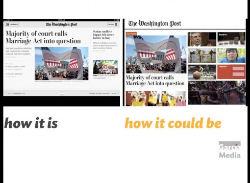
Some changes make a difference in that first screen, where users take a look at what’s inside the app
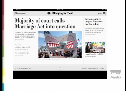
Here is how the new Washington Post tablet app opens: clean and easy on the eyes, but too closely related to print edition look & feel
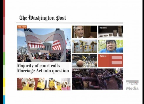
My suggestion: a more visual, photo driven navigator, to get more items up there on that first screen
It’s clean. It’s elegant. It’s the new Washington Post tablet edition. But, is it Post Classic? Does it advance the state of newspaper tablet editioning to that next level ? I certainly and respectfully don’t think so.
Of course, this is totally subjective and it depends on how you look at the app, one swipe of the screen at a time.
This new Post incursion into tablet land (its first tablet edition was introduced in 2010) channels the tablet edition of its forever rival, The New York Times.
As a daily reader of the Times’ tablet edition, I wake up every morning hoping that the Times has moved a few steps forward into what a newspaper tablet edition should be in 2013: more visual, less static and more pop up friendly.
And here is where The Washington Post’s new tablet edition disappoints me a little at various levels.
Disclaimer: I confess I have only looked at the Post’s new tablet edition for the first time Thursday, so my observations are based on that one experience.
What I like:
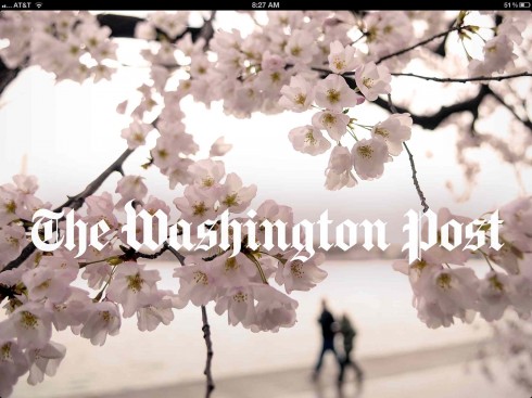
One of the best features of the WaPo app: the door page
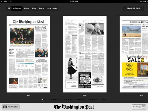
I found the access to the daily print edition of The Washington Post a much welcome feature
1. It’s that pure Washington Post DNA that has transferred here. One enters the world of the Post, past and present. This is not post classic, this is classic Post, every swipe of the screen.
2. I still love the “door page” which places you right in Washington—and because it is spring, it is beautiful cherry blossoms. In fact, my disappointment is that such a grand opening, so tablet like and inviting, leads to disappointment with that first screen.
3. Simplicity is key here. While there is nothing that advances the cause of newspaper tablet editioning, the Post’s new tablet adventure is easy to follow. Navigation is circa 2010 with the same pop up navigator window that the Post used in its first version. It must have worked well
4. Swipe only: there’s no scrolling here, it is all swipe to the right for every action. I have always enjoyed swiping, so I do like what the Post has done here. Scrolling can be useful, though—it’s all about thoughtfully choosing the best navigation method for your app.
5. Printed edition here: I think that users (include me) will like very much the ability to go and see what the printed edition of the Post looks like for that day. It took a little longer than I had liked to download the edition, but it is well known that people who read newspapers in the tablet LIKE to see the print edition. (I find it ironic that a highlight of this new WaPo app is the presentation of its print edition pdfs!)
The disappointment
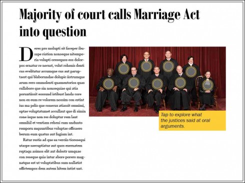

Just a simple “pop up” like the ones here—that I have created with the help of Reed Reibstein, our art director/project manager at Garcia Media—make a difference and allow user to engage with the story.
Oh, it is 2013, and we now know so much more about how tablets are used and what they have the potential to do. So, to create a tablet app that is rather static is not what I was expecting.
True, there are some videos sprinkled thru this edition, but not enough. Pop up moments are not there at all.
You simply swipe screens, read headlines and text and see small images, with the occasional video to compliment storytelling.
Just as I have hoped The New York Times tablet app will get a little more pop up friendly, I also hope that the Post’s will make the move.
Of course, my disappointments are those of someone who evaluates from a distance, the iconic Monday morning quarterback. I have no intimate knowledge of how this app was created, or whatever limitations the team may have as they put out a daily tablet edition. My observations and suggestions are presented in the spirit of collegiality and because a mission of TheMarioBlog is to teach and to stimulate discussion.
What’s research telling them?
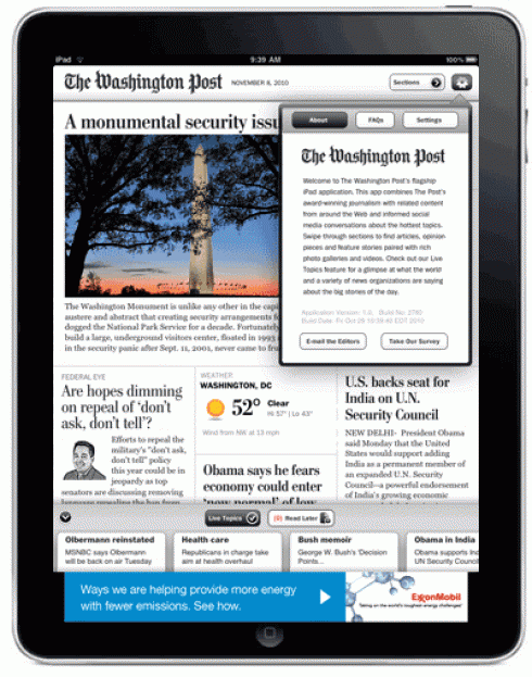
This was the original Washington Post tablet edition in 2010
But, wait a minute, do both the Times and the Post know something about their readers’ preference that reassures them to create these type of apps?
Have their internal focus groups revealed that readers of these iconic newspapers want the tablet edition to follow the print edition closely?
If so, those findings are similar to the results of a study conducted by Visiolink in collaboration with Aarhus University in Denmark, which showed that newspaper tablet readers there wanted the tablet edition to be as close as possible to the print edition. However, our own Poynter EyeTrack Tablet study showed that users preferred a carrousel navigator to start, more visual than headline driven.
The Post’s tablet edition is definitely not a 5.0 version in my view, but we may be seeing a bit of a “settling down” in the styles of newspaper apps, and the fact that the Post has banked so strongly in a classically traditional mode for its new journey into tablet territory may be an indication.
As I browsed thru the Thursday edition of the Post, I was thinking that it would not be too difficult to make this new effort more tablet driven:
—Create a secondary navigation screen that is more visual (see sketch above)
—Select two or three stories each day for which you will “go tablet” (that is, let the finger exercise itself a little). In this Thursday edition, with a lead story about the Supreme Court and a discussion of the Marriage Act, why not carry an image of all of the Justices, allowing me to touch the photo and immediately read how this particular Justice feels about the hot button issue of what constitutes marriage?
It’s all about which style you follow
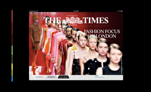
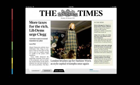
The Times of London’s new app: opens with a tablet driven element, then offers option of the more familiar Times of London newspaper look
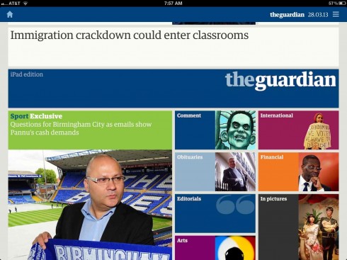
The Guardian’s app: visual navigator


Austria’s Kronen Zeitung’s app: curated edition published each evening
Recently, another iconic classic newspaper, London’s The Times introduced its new tablet edition. In that case we see elements of the curated edition with the more traditional style. The Times gets closer to 5.0.
And another UK newspaper, The Guardian, has gone for the more Flipboard, carrousel style navigator as the first image one sees upon entering: attractive, visual and ready for the finger to click. Visual energy is the key here.
And so, as winter turns to spring this year 2013, newspaper tablet editions begin to fit into categories: the classics (The New York Times, The Washington Post), the mixed style (The Times), curated edition (Bild, Kronen Zeitung) and the visual energy mode (The Guardian, Tages Anzeiger).
Which one will it be for you?
Garcia Media and The Washington Post
While we worked with The Washington Post in its Sunday print edition, we have not had any official involvement as consultants with their tablet edition, past or present.
Here are links to our previous WaPo stories:
At The Washington Post: the power of good storytelling with great design
https://garciamedia.com/blog/articles/at_the_washington_post_the_power_of_good_storytelling_with_great_design
The Washington Post introducing lots of new changes this Sunday
https://garciamedia.com/blog/articles/the_washington_post_introducing_lots_of_new_changes_this_sunday/
More about pops ups in TheMarioBlog:
The iPad Lab 19: Pop ups don’t have to be complicated
https://garciamedia.com/blog/articles/the_ipad_lab_19_pop_ups_dont_have_to_be_complicated
The Art of the Simple Pop UP
https://garciamedia.com/blog/articles/theipad
Creating some simple pop up moments in your tablet
https://garciamedia.com/blog/articles/creating_some_basic_pop_up_moments_in_your_tablet/
Of related interest
Talking about tablet edition variety for newspapers, the Financial Times now announces that it will have two different tablet editions, the constantly updated one that FT readers are accustomed to, plus a morning edition that is more customized and curated.
See the video where FT Managing Editor Robert Shrimsley explains the new tablet offerings:
http://apps.ft.com/preview/webapp.html
The 2010 Washington Post first tablet edition
http://talkingnewmedia.blogspot.com/2010/11/washington-post-releases-its-first.html
TIME Magazine’s latest cover
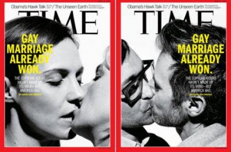
As Supreme Court justices in the United States finished hearing oral arguments on the Defense of Marriage Act, TIME Magazine has chosen the topic for its cover story in this week’s edition.
Two different covers have been created, as you see here.
Where’s Mario until April 28, 2013?
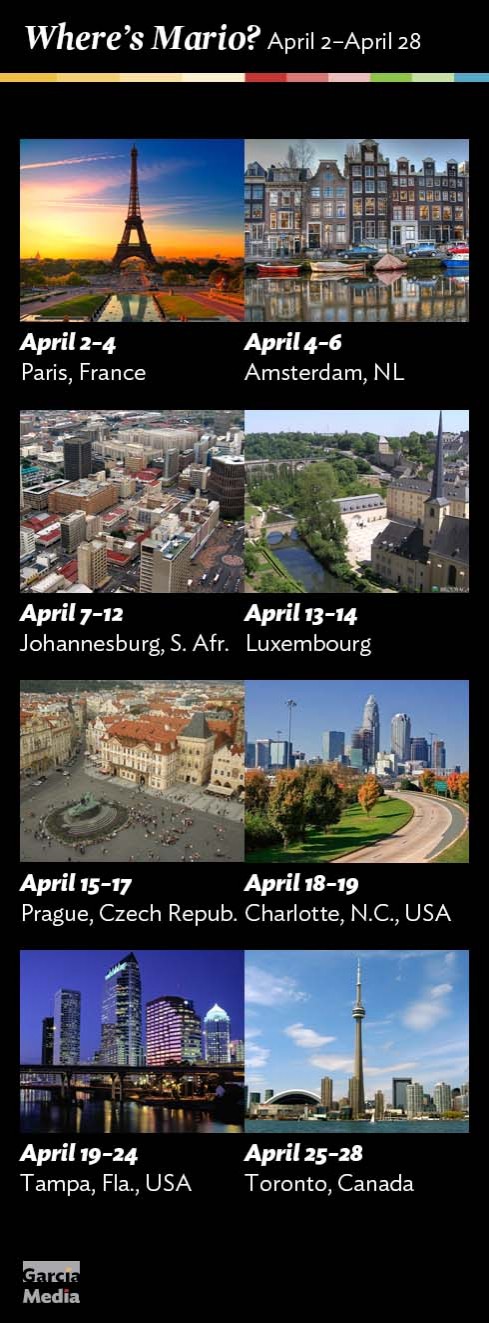
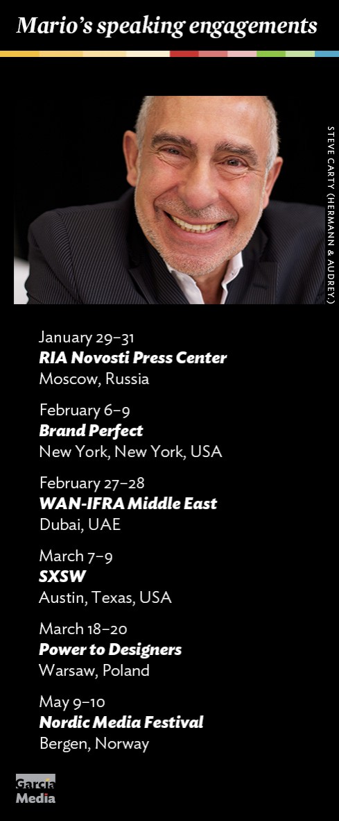
Mario’s upcoming speaking engagements
Take advantage of our iPad Design/Ad Lab workshops

Do you want to take your brand to the next level by creating a tablet edition? Garcia Media can help. We now offer one- to two-day iPad Design Lab workshops on demand to jumpstart your presence on this exciting new platform. We also offer iPad Ad Lab workshops to develop engaging advertising models for your app. Contact us for more information.

Purchase the book on the iBookstore