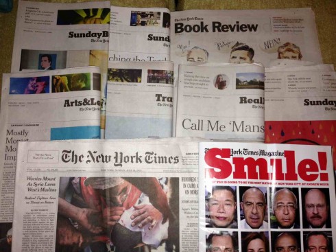
The New York Times: print versus tablet on a lazy Sunday
TAKEAWAY: It is a richly engaging experience to read the print edition of the Sunday New York Times. The tablet version pales by comparison. It does not have to be so.

One of the many pleasures of living in New York City is to wake up to a fat, multi section print edition of The New York Times.
It’s like a box of Godiva chocolates. Just looking at the box creates the excitement that sends the palate flying into the highest of a anticipatory altitudes. Same is true when one picks up a copy of the Times and runs through all the sections, peeling them apart, taking a look at what Travel , Arts & Leisure, Homes, Sunday Business, Automobiles, have to offer, before embarking into an orderly (for me, at least) journey starting on Page One.
Turn to pages 2-3 of the first section and it is a comprehensive, well organized navigator to all that is inside the chocolate box. Ironically, this is a very digitally-inspired table of contents, but not one we see displayed as such in the tablet edition. In it, tons of stories to sample, dozens that seduce into further in depth reading, others for which the summary is enough.
As I lean back and leisurely navigate my Sunday print edition of the Times, accompanied by at least three cups of black coffee, I can’t help but wonder why the tablet edition fails to provide the same unique, overall experience. I know that this is a topic I have covered here before, but which becomes more obvious when I have access to a New York City printed edition of the Sunday newspaper.
It is not that I think you can—or should—translate the entire print edition experience to the tablet. (Though also putting PDFs of the print pages in the app might not be a bad idea, since I usually read my Sunday Times in some remote corner of the world, away from the **Times’**epicenter.)
On the contrary: The tablet edition should take advantage of its unique potential benefits—notably, pop-up moments and more multimedia.
First, you can’t (except by putting pdfs of the pages there, which might not be a bad idea, and one I would welcome, since I am usually reading my Sunday Times in some remote corner of the world, outside of the Times’ epicenter), and, second, the tablet should provide its unique potential benefits (as in pop ups, more multi media).
However, the visual appeal of the print edition of the Times could and should transfer to the tablet. That is not currently happening.
To have all the sections of Sunday’s Times in my hands, complete with a series of illustrations in Sunday Review, type that dances on the pages, effective use of white space, all of that is missing from the tablet edition, which is, put bluntly, just plain white toast (I am appreciative that I can at least reader the essential and often surprising content, regarding of the packaging, but, does it have to be?).
I believe that a tablet edition of a newspaper should extend the brand, enhance the visual storytelling and engage the reader. This is the next natural step for the Times to take with its tablet edition, and, why not start with a more curated Sunday edition? This could pave the way for doing it daily as it evolves.
If the Times is serious about its quest for digital dominance and excellence, this should be part of the priorities.
Until that occurs, there is another reason for me to try to wake up in New York City on Sundays more often.
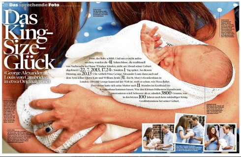
Pages we like


It was Royal Babymania all of last week with the birth of Prince George. In its Sunday edition, Bild am Sonntag, culminated all the baby excitement with a double page photo of the heir to British throne, accompanied by a headline that reads : King Size Luck.