This is the weekend edition of TheMarioBlog and will be updated as needed. The next blog post is Monday, August 19.
TAKEAWAY: It’s a new day and totally rethought product for South Africa’s daily, The Citizen. A behind the scenes at how the process went.
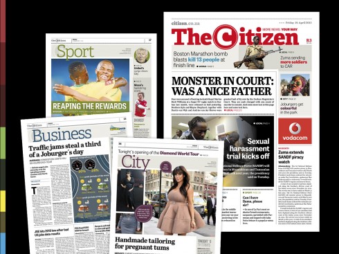
How readers see all new sections of The Citizen daily
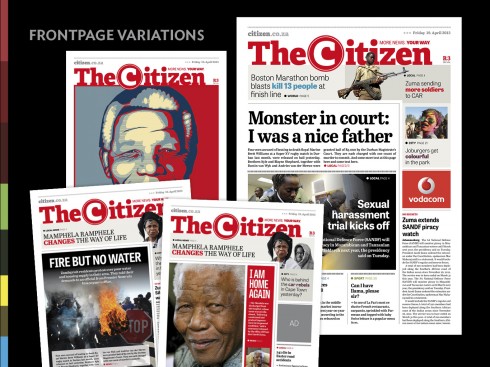
The new front page emphasizes variety: the logo and the navigator in the shape of the number 7 dominate top of front page. The design of the front page allows editors flexibility to tailor the design to the needs of the day’s content
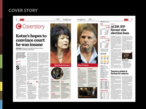
Pages 2-3 develop the main story of the day
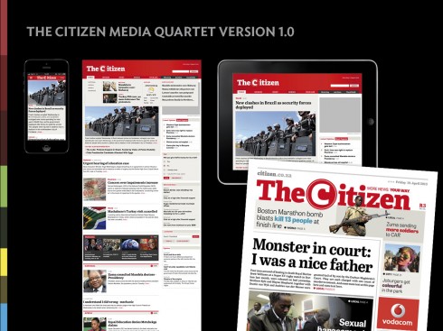
The Citizen and the media quartet: one look across all four platforms
Newspapers should evolve with the times, and, more importantly, with the lives of their readers. Nothing is static, especially today. Readers’ habits, lifestyles, economies and preferences change more rapidly today than ever before.
The newspaper industry finds itself in its most tumultuous change perhaps. With that come challenges and opportunities.
In South Africa, The Citizen decided to face those challenges and seize the opportunities, while sending a message to its devoted readers: you have changed, and so have we.
We at Garcia Media are very proud of our collaboration with publisher Eureka Zandberg and her team in the creation of a new The Citizen. Our art director for Garcia Media on this project is Constantin Eberle. The Citizen’s art director is Seelan Pillay. Editor is Martin Williams.
On August 1, The Citizen hit the streets of Johannesburg with a new look and a more vigorous and functional way of presenting information, the result of months of research, creative thinking, workshops and, most importantly, paying attention to what the readers had told us concerning their preferences, their lifestyle and how they consume the news in today’s multi media environment.
The results so far, extremely encouraging, and, according to publisher Zandberg, the sales figures show it. In her words:
The rethink of The Citizen was certainly the most exciting journey we could have embarked on. At the same time it was also the most stressful. We did everything possible to deliver a quality product in the hands of our readers that would give them an informative, yet pleasurable reading experience. The very first edition, hot off the press fulfilled our expectations. However, we knew it would be the readers that would determine whether we have achieved our goal. After a week, we can say we have – our readers love their new Citizen.
The process
From the start we knew that this would not be a redesign in the traditional definition. It is a total rethinking to accommodate the needs of readers in the digital age. We have not left any areas uncovered when it comes to how present information in a more effective manner. Not that design did not play a key role.
In today’s world, however, how information is packaged becomes important. We are constantly bombarded by information through what I refer to as the media quartet: mobile telephones, online, print and tablets.
While we created a new typographic palette (Adelle, Abril Text and Tablet Gothic), a clean and more precise page grid (four and five columns) and a vibrant color palette (with both soft and bold hues), we also aimed for a design that made the newspaper easy to navigate and to read as the images here will show you.
The real changes for the new The Citizen are in the ways storytelling is approached, especially in the use of graphics that will facilitate understanding of major stories.
All in all, the changes readers see in their new newspaper will make their journey through the newspaper easier and more pleasant.
Across platforms
While The Citizen aims for the entire media quartet, the process will evolve. We have completed the design and editorial work for all of the digital platforms, but how they are introduced will be an evolutionary process.
The first step is a vibrant new online edition. The site, which does not duplicate the printed edition, only uses selected articles. Dedicated online journalists add variety to the mix with special web-only content. Generic wire copy is also used to provide a wide range of interesting articles.
During the first phase of this digital evolution, a responsive site was built which adapts to the device being used.
Going forward there will be a dual strategy for mobile and tablet, based on the media quartet.
Hendri Pelser,deputy editor, reports that the South African digital media landscape differs considerably from American and European markets.
The lack of affordable broadband has lead to a large part of the population relying on cellular internet as the main tool for their digital news consumption. Historically, The Citizen’s mobile traffic stands at about 20% which is comparable with the rest of the industry. In addition, the South African digital news market is dominated by a single player which publishes generic wire copy.
This, and the aversion to paywalls locally, has meant that The Citizen had to find a different way to win online market share.
Next a special tablet edition will make its appearance in the future, offering a lean back, evening news experience. The tablet edition will not copy the print edition but play to the strengths of the technology and audience preferences.
“In essence, the online, mobile and tablet platforms are used in the same way newspapers have been for decades – a conduit for information that plays to the strength of the medium it is presented on; a media quartet,” Hendri reports.
Take a look at the online edition here: http://citizen.co.za
Evolution of the design concept
Before and after
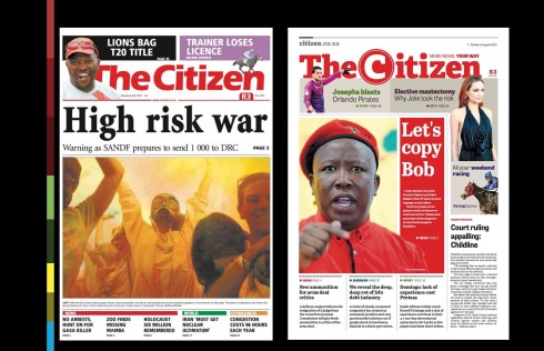
The Citizen front page: before and after introduction of new look and feel as it evolved from a more down market, single story cover to a front page that includes a wider selection of stories for readers to sample
The typography
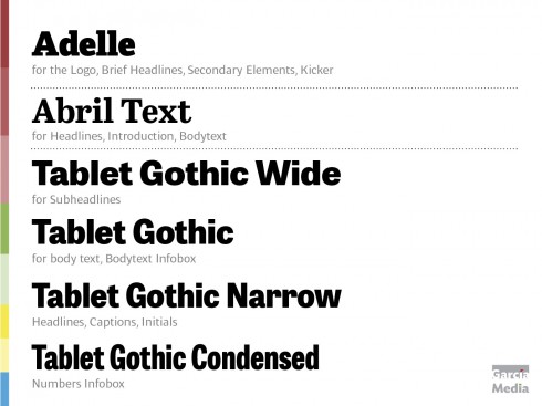
Here is the type palette of The Citizen
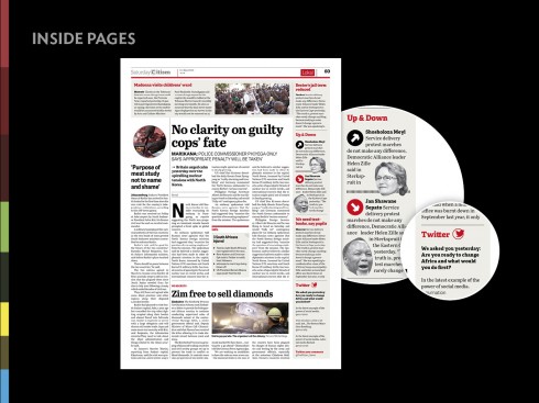
Typographic tools to guide reader to digital and social media
The grid configuration
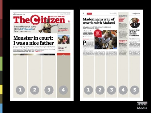
The grid: strict use of a four and five column grid across entire newspaper
The story structures (creating hierarchy on each page)
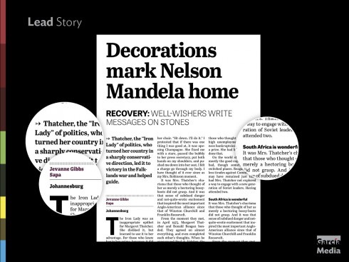
Story structures: from lead story to compacts and briefs, establishing a clear hierarchy for stories on the page
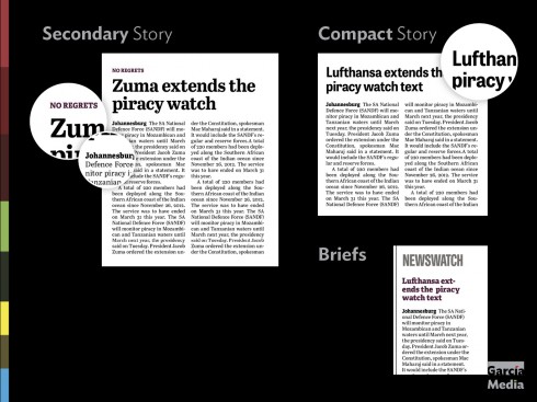
More story structures
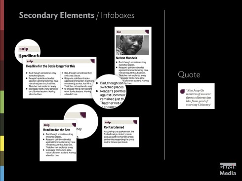
Details for secondary readings
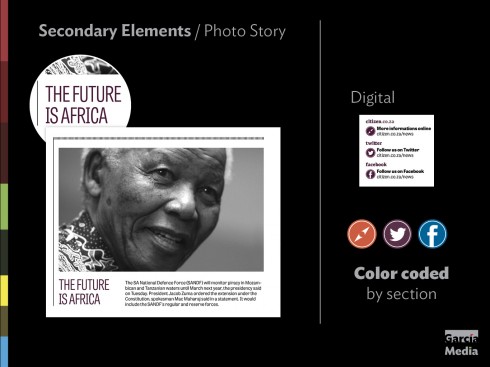
Captions and other type details
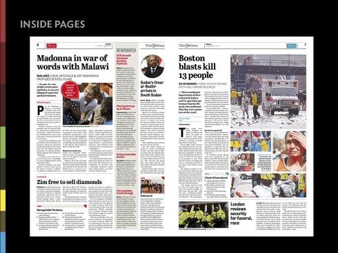
Two typical inside pages showing the hierarchy of how stories are displayed around the page from lead to briefs.
The color palette
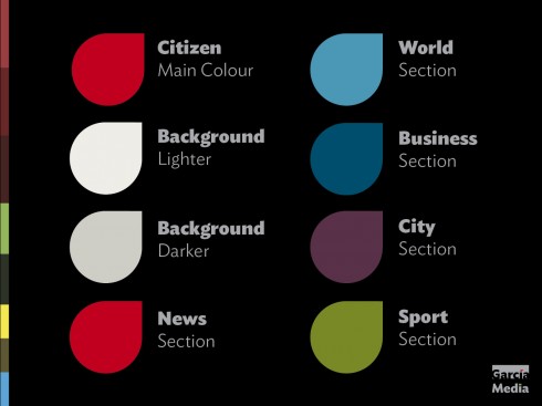
Here is the color palette
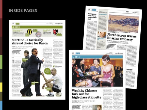
Color coding of sections highlights inside pages as well
How the design carries across sections
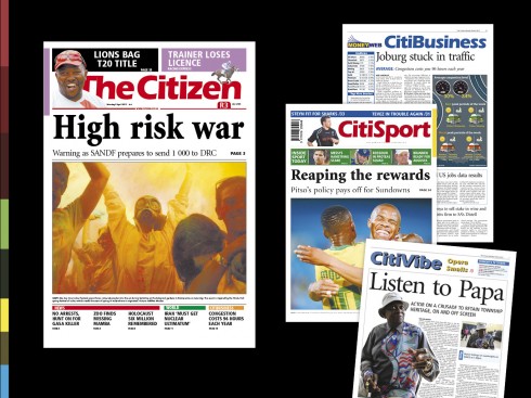
The sections BEFORE the redesign
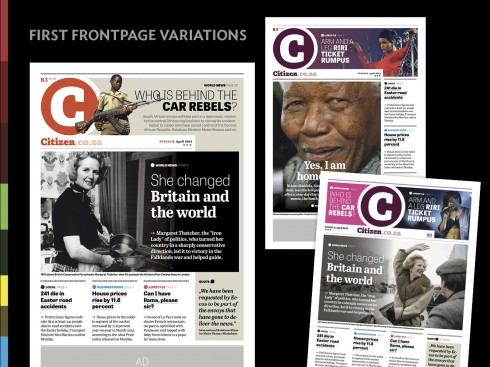
How first front page design started
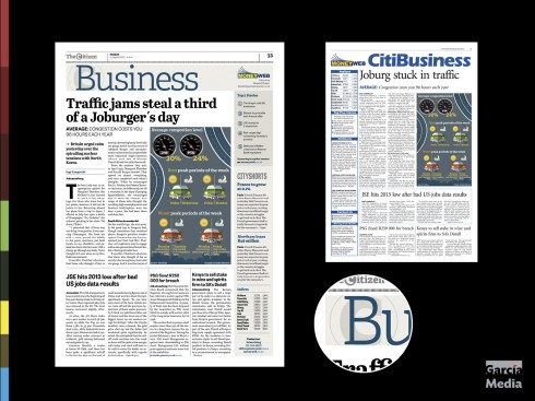
Business section before and after
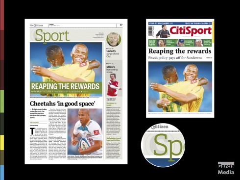
Sports before and after
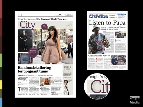
City before and after
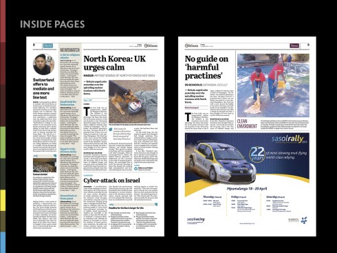
Inside pages showing advertising
The Saturday section (a more lean back approach visually and editorially)
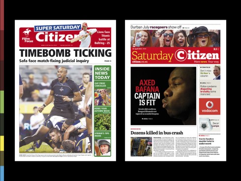
The Saturday edition front page: a more lean back day for reading.
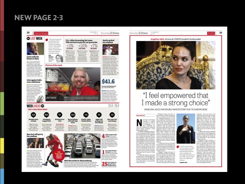
Pages 2-3 from the Saturday edition
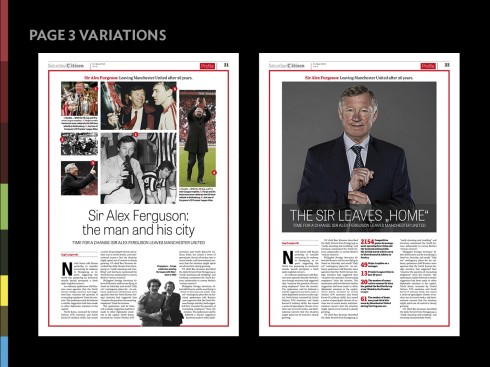
Saturday edition Page 3 variations, allowing editor the flexibility of one or more images to go with week’s personality profile
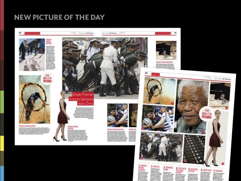
Photo galleries on the Saturday and daily editions
How elements of continuity move across the design
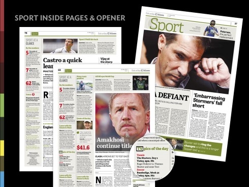
Sports pages
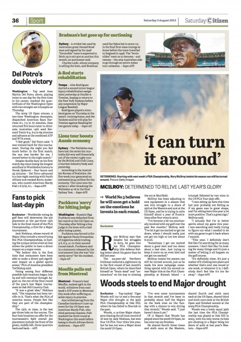
Inside page of sports: shows how new designs allows to play with page architecture
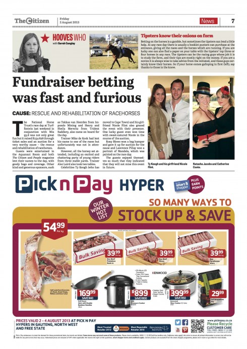
Balconies run horizontally across inside pages, allowing for better use of finger reading
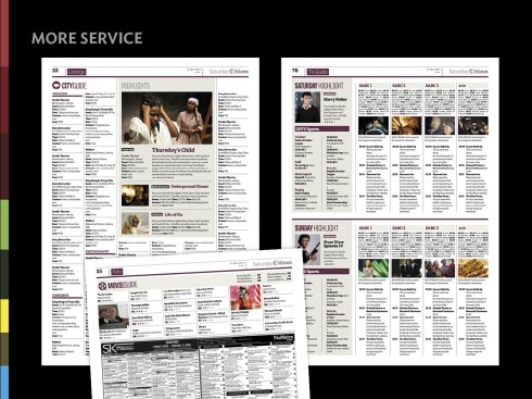
Arts, entertainment and television listings
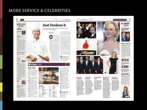
Feature pages
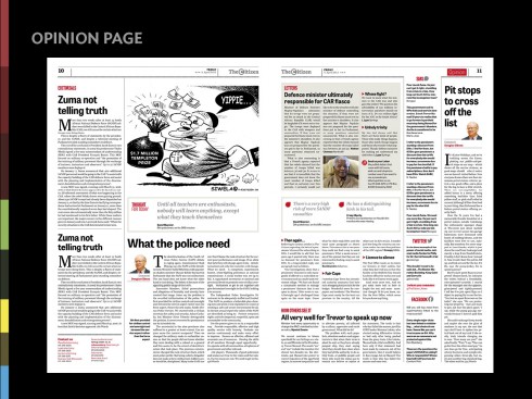
Opinion pages
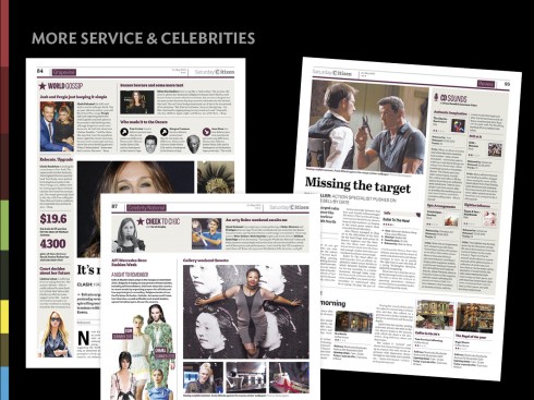
Service content, celebrity news
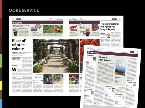
Single and double pages for features/content service
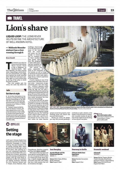
Inside Travel section page
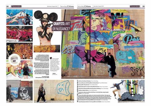
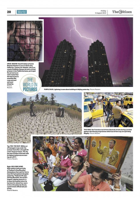
The World in Pictures: Just as photo galleries are a favorite in those digital platforms, they are too in print.
The supplements
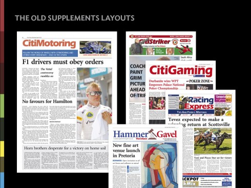
These are the various supplements in their old look
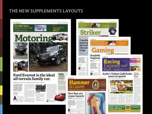
Supplements’ new look
Recent pages of The Citizen
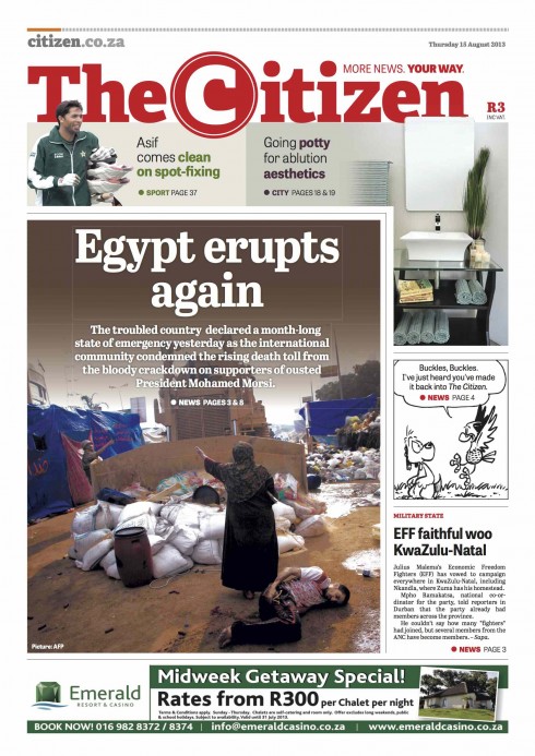
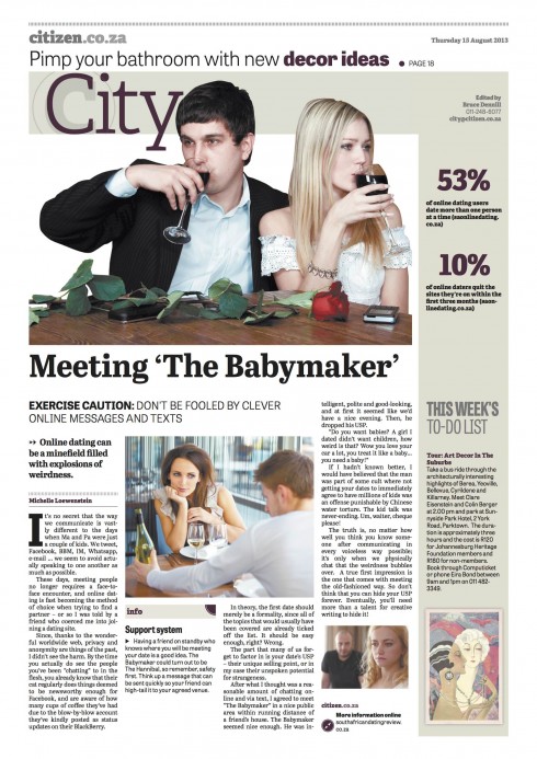
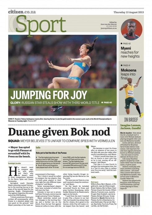
Pages from this week’s The Citizen
The readers’ feedback
I asked publisher Eureka Zandberg about readers’ reaction:
We received very positive feedback from both readers and advertisers. It was encouraging to hear and read how passionately readers responded to their new-look Citizen. Naturally, there was negative feedback, but the complaints were mostly regarding certain content they wanted back in their newspaper. We took these to heart, and the editor, Martin Williams, communicated with readers and kept them informed in terms of what content would be brought back, and when.