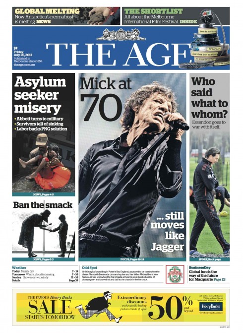
TAKEAWAY: Almost five months after The Age underwent a transformation from broadsheet to tabloid format, its front page now evolves into a true highly visual navigator.

When we at Garcia Media worked with the teams of Australia’s The Sydney Morning Herald and The Age, the main task at hand was to take those dailies from a broadsheet to a tabloid format. We know that this is always a challenge for newspaper publishers and editors, who are afraid to shock their most loyal readers.
The day of that big change was March 4, 2013. What appeared that day, however, was not necessarily the same visual concept we had created, working together with Matt Martel, the Morning Herald’s national presentation editor. While I had proposed a very visual front page, with little or no text, the editors had decided that going that radical with the look of a newspaper, on top of changing the format to tabloid, could alienate readers.
The front pages that followed normally included text.
However, this week, and for the first time since the format change, The Age has published a front page that is exactly as our original prototype was. I got a pdf of the page (seen here) from editor Andrew Holden, who wrote:
See the attached – we did listen! We generally go with the more conservative approach, as per reader research, but every now and then I take the shackles off. And you’ll be even more pleased to hear that the treatment is known as a “Super Mario”!
I am extremely pleased with what I see here. It proves what we all have experienced in this business: sometimes these concepts need to evolve slowly, allowing for editors and designers to become comfortable with the concept, then allowing it to get into the page in a sort of organic way.
Good work, Andrew, and The Age‘s team.
Of related interest:
https://garciamedia.com/blog/articles/pits_new_compact_format_for_australias_sydney_morning_herald_and_the_age_p