Updated Sunday, Nov. 8, 14:31 EST
TAKEAWAY: Building those prototypes takes time, effort and patience; however, a well developed prototype should be an a la carte menu of ideas ready for the taking. It is the designer’s grand opportunity to bring about change. AND: My most memorable prototype presentation moment PLUS: Do you have a memorable prototype for a project that was never implemented? Send it along.

Another Sunday and Jacky reads through Bild Am Sonntag, that most entertaining of Sunday reads in Germany. Here is what picked Jacky’s interest for today. Always an animal story, of course (elephant doing yoga), then human interest stories such as why women under 40 need a man in their lives, and how an old punk rocker lives (graphic photo of the day).
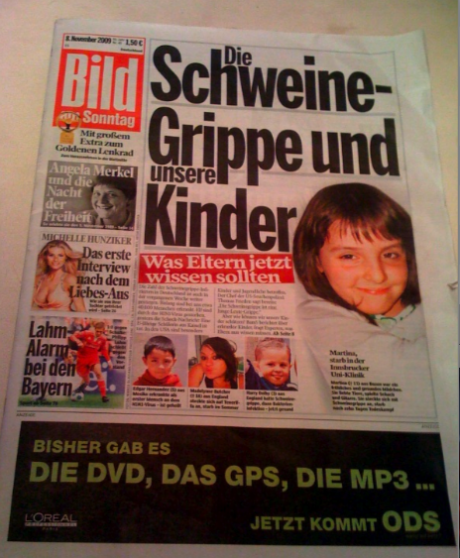
Cover of today’s Bild Am Sonntag
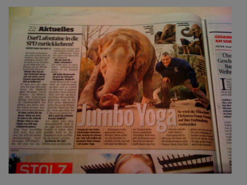
Elephant Yoga: Jacky asks, can doggies also do this?
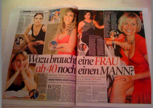
What for do women under 40 need a man?——that is the headline here
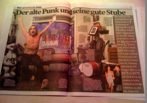
An old punk rocker’s living room dissected
Who is Jacky?
Jacky belongs to Frank Deville. The Luxembourg-based pooch is an “avid reader” of the German newspaper, Bild Am Sonntag. Every Sunday Jacky picks stories and interesting graphics in Bild Am Sonntag , the German newspaper.
Alfredo Triviño explains his redesign of The Australian
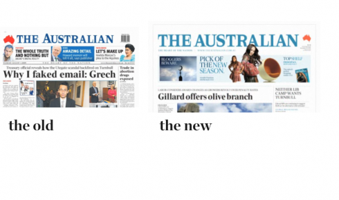
The Australian has introduced a new look this weekend. In charge of “retouching it” as he describes it was one of our favorite designers out there, Alfredo Triviño,Chief Designer of News International. In a video posted through The Australian’s website, Al explains his choice of colors (inspired by the country’s magnificent landscapes and art works), typography, architecture and overall look and feel.
As far as Al is concerned, The Australian’s project was more tweaking than major changes:
You will see that this redesign does not set the world on fire. Quite the contrary, it is all about basic details. I insisted on using the same typography that they have had for a long time as I did not see a good reason to change it, also similar page architecture, and, yes, a good revision of hierarchy and how stories are presented. This is the start of other changes that may come in the future and for which I have great expectations.”
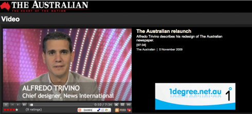
Go here to see the video and hear the changes explained by Al:
http://www.theaustralian.com.au/
Forming ideas begins here
In our continued series of blog posts inspired by my reading of Tim Brown’s Change by Design: How Design Thinking Transforms Organizations and Inspires Innovation, today I devote space here to the concept of “prototyping”.
We all do prototypes. Depending on the scope of the project, the needs of the client and the amount of experimentation desired, sometimes up to two or three prototypes are developed during the course of a media design project.
And, of course, there are the exceptional cases: I did 11 prototypes for Die Zeit of Germany, before hitting the spot, which is one reason this remains as a most memorable project in my mind.
Prototyping a Latin American giant
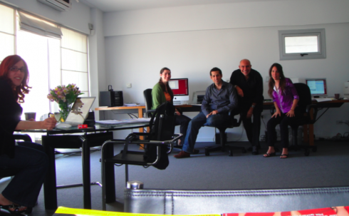
Part of the Garcia Media Latinoamerica team: here I am,from left, with Paula Ripoll, Romina Cupé, Remigio Badana, Natalia Erroz
I am in Buenos Aires working with our team of Garcia Media Latinoamerica in our beautiful office here——yes an ample terrace with view of Palermo Hollywood, complete with barbecue ready to make those fabulous Argentine parrilladas. And, did I mention that there is a lap swimming pool and sun deck at the top of the building?
Anyway, this is about prototyping here. We are deep to our necks on pages and more pages of a prototype for a major Latin American daily.
As last count, I heard Paula Ripoll, our senior art director, tell a designer today that we would have close to 62 pages to show the top echelon of this newspaper.
I also commented today that when the publisher/top editors look at this concept——now four steps more developed than when we first presented it to them two months ago—-our goal is for them to make a commitment to the concept. Forget the design details at this point, I reminded our team. Let’s discuss philosophy. Let’s explore new content flow and how this major and classic daily can move to the next step, and get ready for 2012 and beyond.
A good, solid prototype is the first step in cementing the foundations of how a series of good ideas will take hold, which is why I found myself in total agreement with Tim Brown as he case studied prototypes his design firm has been involved with.
Brown on prototyping
First, I agree with Brown’s definition of prototyping in his book:
He writes that “prototyping—-the willingness to go ahead and try something by building it—-is the best evidence of experimentation.” He adds: “Anything tangible that lets us explore an idea, evalute it and push it forward is a prototype.”
I also concur with Brown that “prototyping generates results faster”, which is why today I insisted on adding two or three more concepts of a model Sunday front page for our client, simply because it would take little time for us to approach the opening of that Sunday front page in a different way. Although we already had FIVE concepts for the Sunday front, I thought a sixth would add a different dimension. The team proceeded to do it. It looks great.
I know that it may be kicked out in a second later today during the presentation. I also know that it may be the idea that seduces someone in the top group. The prototype effort makes the decision making faster, for sure.
The prototype archives
Every designer out there probably holds on to his/her own prototype archive: those wonderful ideas that never had a chance to fly, dead on arrival, you might say.
I, too, keep many of those, glancing at them from time to time, reliving the moment that bright idea appeared, trying to forget when it was shot down. But, for a few ephemeral moments, one can look back at the old prototypes, rejoice in the memory of such experimentation and say to yourself: that was not such a bad idea, after all.
Prototyping organizations
These days, we prototype more than the physical product that the user will see and touch. There is a more exciting type of prototyping taking place: the prototyping of organizations. In some newspapers, we are at least a decade late with such prototypes, and we have paid the price for the delay.
Brown has something to say about this too: “…protoyping new organizational structures is difficult. By their nature, they are suspended in webs of interconnectedness.”
Previous blog posts inspired by Tim Brown’s book:
https://garciamedia.com/blog/articles/bikes_and_newspapers_similarities_abound/
https://garciamedia.com/blog/articles/a_new_way_of_looking_at_design_try_design_thinking/
Doing the prototype “gallery walk”
I call it the “gallery walk” and we will do it again for our Latin American client today. All concepts are put on the wall, and we present the concept first, then allow for questions/discussion to follow.
Shown here you will se photographs from our own project files showing the “gallery walk” in action.
One particular project where there were not enough walls for all the pages we had to show was the prototype for Paris Match, of France. Perhaps magazine prototypes are more involved than for newspapers. WE offered so many ideas here, that nothing was left behind.
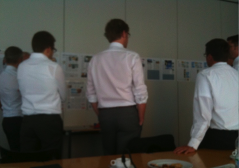
Editors in matching white shirts (for no particular reason) look at pages on the wall during project in Germany
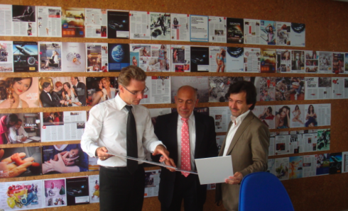
Showing the first set of prototypes of the French magazine Paris Match: Editor in chief Olivier Royant, myself and Art Director, Michel Maiquez
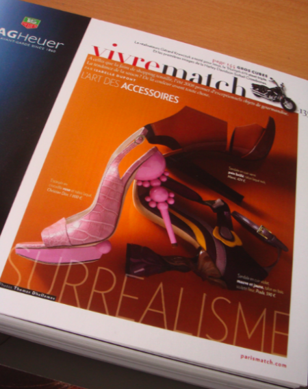
Showing the “magazine inside the magazine” concept for prototype of Paris Match
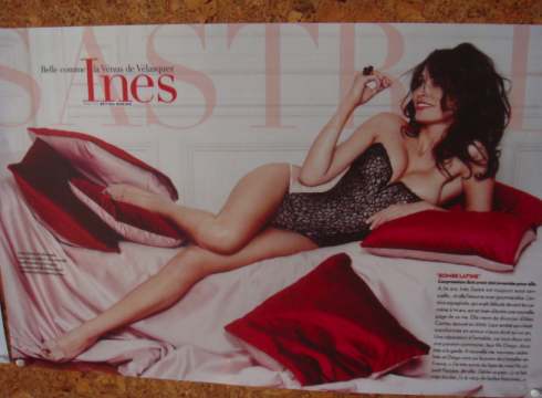
Showing the double page entertainment feature for Paris Match prototype
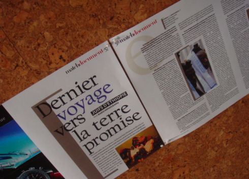
Showing how we would handle a “type attack” for a Paris Match double page spread
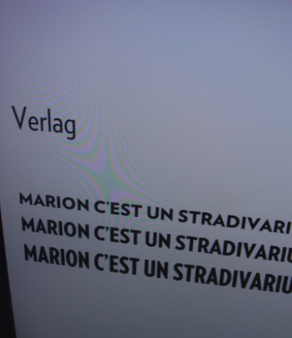
We always show samples of type considerations, in this case Verlag, which was adopted for Paris Match
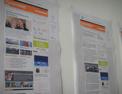
Showing first screen prototype concepts for www.handelsblatt.com
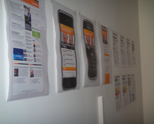
Showing prototype concepts for Handelblatt online/mobile phone applications
My most memorable prototype presentation moments?
Two such moments come to mind:
Die Zeit, Germany: I was presenting my seventh version of a prototype to a group of editors of Die Zeit. It was a large group. At the end of my presentation of this NEWER model of what Die Zeit could look like with color and photos, a young editor stood up and said: Dr. Garcia, to be honest, many of us here don’t think that you, as an American, could ever truly understand German elegance.
One memorable prototype moment of the “let me jump out of the window now, please” kind.
The Wall Street Journal, New York: It was a project to bring COLOR to that grayest of ladies—-The Wall Street Journal. In our first prototype, we decided to be daring and to “wallpaper” with a background champagne hue the entire Wha’t News navigator column on Page One—-the most read item on the page. We said: Let’s give it a shot. If we want to tell readers that the Journal now has color, then let’s apply it gently to the one part of Page One that is most popular with the readers. We thought it would last ten seconds on the board during the gallery walk, then gone.
To our surprise, the then CEO of Dow Jones, Peter Kahn, looked at it and said: I really like that.
One memorable prototype moment of the “I can’t believe this is really happening” kind.
How about your own prototypes?
If any of you have that one prototype that you think was going to be IT, but wasn’t, and if there are no confidentiality problems with you showing it and discussing it, send it along, with your comments. I will review what we get and pick some to display here. We can all learn from each other.
In the believe it or not department

Cover of the new Al-Qaeda magazine
Andrew Losowsky, whose website deals with the magazine industry worldwide, writes that the Saudi branch of Al-Qaeda, the terrorist organisation ,apparently has its own magazine, called Sada al-Malahim (The Echo Of Battle).
TheMarioBlog posting $415