TAKEAWAY: It’s a new format for Recharge, the multi platform publication of the wind and solar energy industry. It is the third project launch for Garcia Media in 2013.
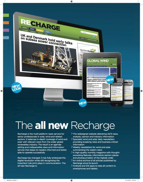
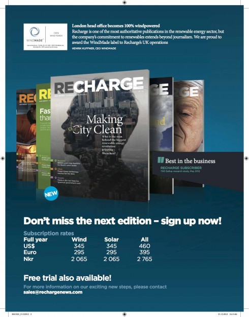
Promoting the new Recharge across all platforms:a multi platform information provider for senior professionals in wind, solar, and related sectors
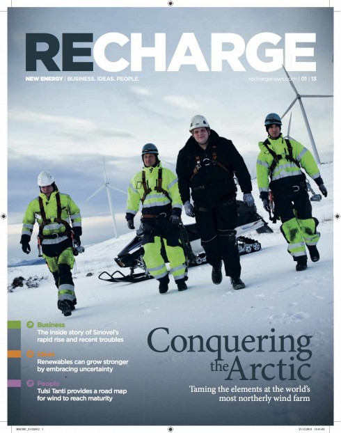
Cover of the first issue of the new Recharge: section navigation starts right here
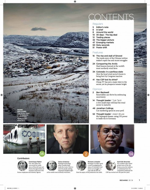
Table of contents page: highlighting the magazine’s main baskets of information, along with highlights of the issue
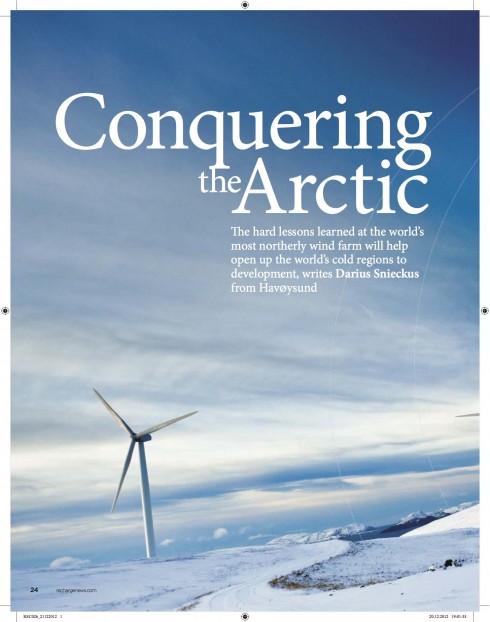
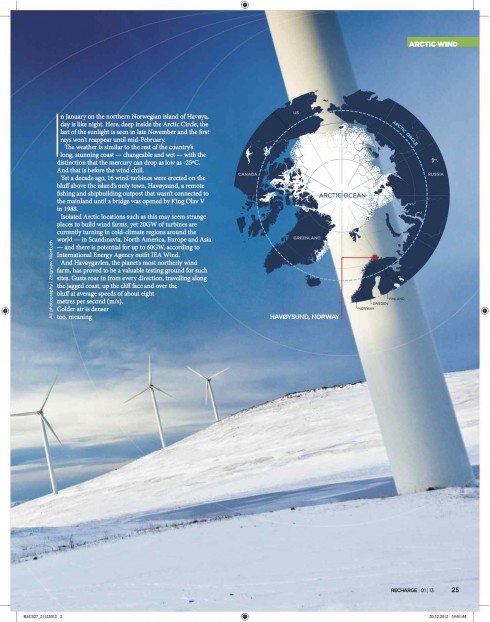
Cover story
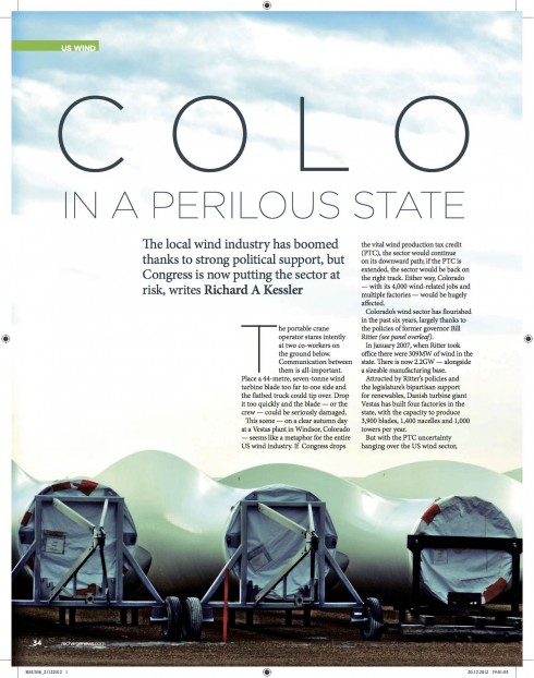
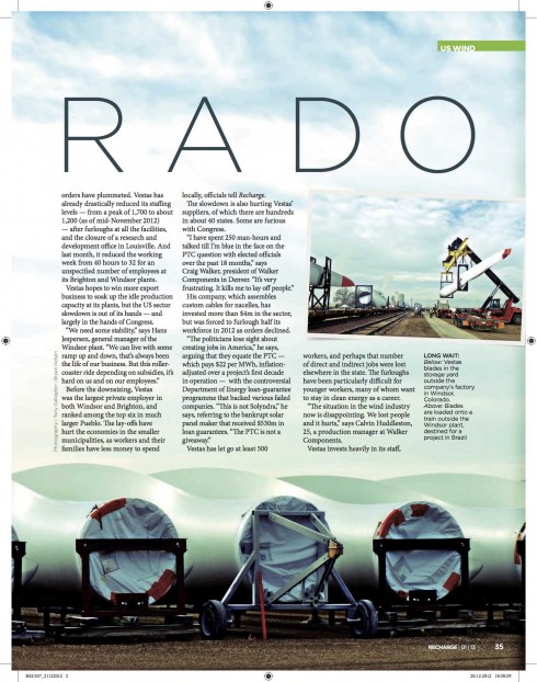
Major secondary feature
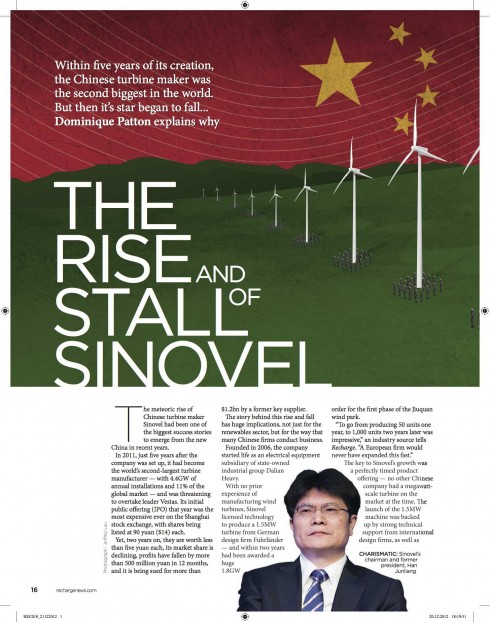
Features abound in the new Recharge
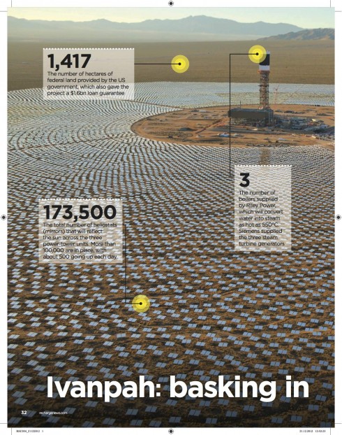
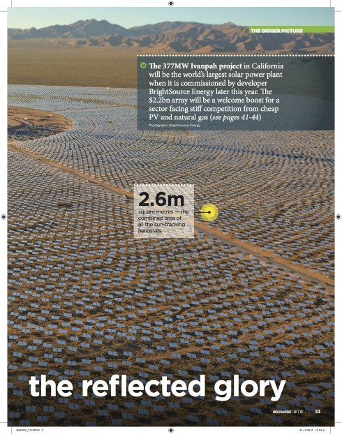
Every issue a photo story full of mini stories related to the image
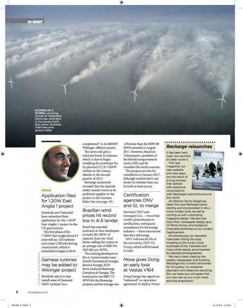
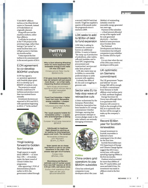
Briefer items in four column grid architecture
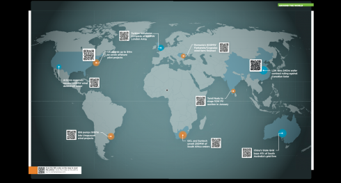
A double page map on every issue with highlights of parts of the world where renewable energy projects are located, along with barcode to lead to digital coverage
There seems to be a publication available for almost any topic one can think of, including the renewable industry, comprising wind and solar content.
Recharge is the premiere publication in the field and we had the honor of working closely with the Recharge team, including editor in chief Ben Backwell and art director Simon Bogle, as the title went from a weekly printed journal to the glossy magazine that readers received the first week of January 2013.
Recharge serves up to the minute content via its redesigned website, as well as a brand new tablet and smart phone edition, becoming a multi platform information provider for senior professionals in wind, solar, and related sectors. The redesign allows Recharge to provide wind and solar news as separate content streams, including dedicated wind and solar home pages with business-critical information, weekly sector newsletters and log-in specific content streams on the app and tablet versions.
Working along with me and Simon on this project was Garcia Media Europe art director, Constantin Eberle. For us, the challenge was to create a smooth transition for readers accustomed to the weekly tabloid Recharge, printed in newsprint, to a glossy magazine that becomes more of a lean back platform.
“Creating something that was sharp and business like”
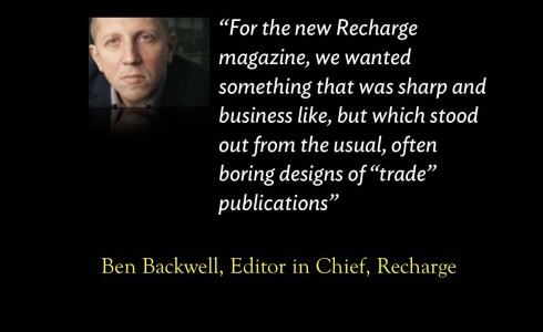
“For the new Recharge magazine, we wanted something that was sharp and business like, but which stood out from the usual, often boring designs of “trade” publications, given that he renewable energy sector is one of the most forward looking, innovation based industries in the world,” says Recharge Editor in Chief Ben Backwell. “Dr Mario Garcia worked with our Art Editor Simon Bogle and the rest of our team to create a layout that organizes new and feature content in a really clear way, and allowing ample scope for the striking photo based spreads that we are producing from around the world.”
The rethinking process
Navigation: For starters, we worked to create a good sense of navigation, starting on the cover itself, and right on with the table of contents page. Then, a better display of photos, and, borrowing from what we know is the digital mentality of readers today: mini stories for the big photos, as opposed to a single caption see double page photo story here).
Lean back with printed Recharge: As a monthly accessory to its real time news updates, Recharge becomes an important part of the family of offerings, but it comes as a sort of dessert, allowing people to enjoy it leisurely, with major features and stories that enhance the package and leave the readers wanting to come back for more.
Color coding strategy: Color coded sections are used, starting on the cover of the magazine. We find that the use of color coding is especially useful for the new digitally minded reader. In a sense, it was USA Today that introduced the concept more than 30 years ago. Today, as we must design for multi platforms, color coding allows for easier navigation, while serving as a branding element that helps to identify a publication’s look and feel from one platform to the next.
Typography: Typographically, these are the two fonts used for Recharge: the sans is Gotham, and Minion Pro is the serif font.
Use of photos: And perhaps the biggest challenge for the art director, Simon Bogle, is how to maintain interest and create visual excitement when the photos available will tend to be rather similar, reflecting the wind and solar industry. But, as Simon has shown so extraordinarily well in the first edition, there are great opportunities, too, for exciting photographic moments, as in the Conquering the Arctic cover story, or a secondary story about the state of Colorado (see images above).
Reading about the wind and solar energy industries was never more visually appealing.
Of related interest
Recharge is part of a trio of specialized publications, based in London and Oslo. Its sister titles are Upstream, for the oil and energy industry, and TradeWinds, devoted to the shipping industry. We at Garcia Media have worked on the rethink of those as well.
Both Upstream and TradeWinds will also start publishing special quarterly supplements in their respective topics, and we at Garcia Media are presently working with the editors and art directors to assist them with those projects.
Rethinking for the newspaper of the oil and energy industry
https://garciamedia.com/blog/articles/upstream_a_rethinking_for_the_newspaper_of_the_oil_and_energy_industry/
TradeWinds introduces a new cleaner look
https://garciamedia.com/blog/articles/tradewinds_introduces_a_new_cleaner_look/
Where’s Mario?
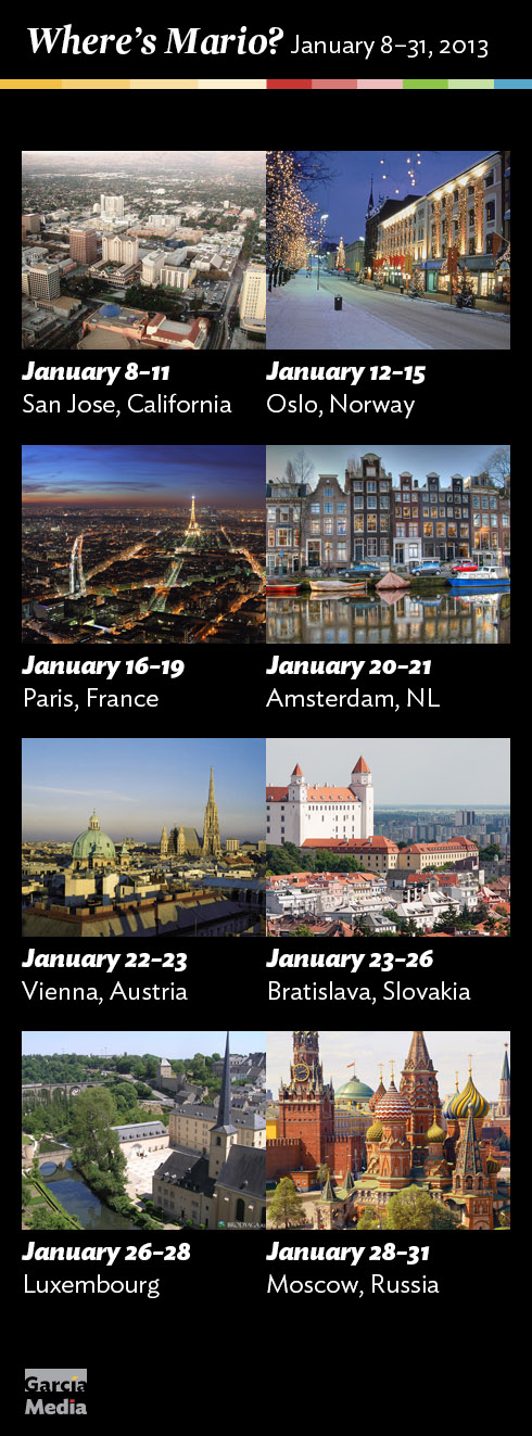
Mario’s upcoming speaking engagements
Take advantage of our iPad Design/Ad Lab workshops
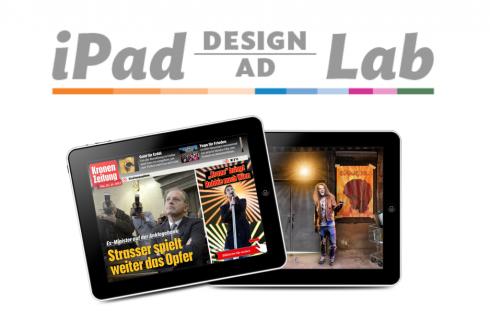
Do you want to take your brand to the next level by creating a tablet edition? Garcia Media can help. We now offer one- to two-day iPad Design Lab workshops on demand to jumpstart your presence on this exciting new platform. We also offer iPad Ad Lab workshops to develop engaging advertising models for your app. Contact us for more information.

Purchase the book on the iBookstore
iPad Design Lab has been given the QED Seal
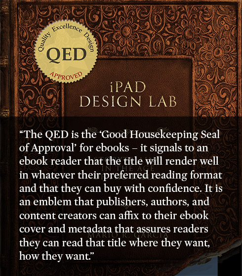
The QED (Quality–Excellence–Design) Seal is bestowed by the judges of the Publishing Innovation Awards after “a thorough, professional 13-point design review with an eye towards readability across multiple devices and in multiple formats.”
Learn more about the QED Seal here.
The EPUB version of book is HERE:
Now available: The EPUB version of  iPad Design Lab: Storytelling in the Age of the Tablet, ready for download via Amazon.com for Kindle:
http://tinyurl.com/8u99txw
Here is how you can get iPad Design Lab book:
The original version of the book is the multitouch textbook version available on the iBookstore for iPad (iOS 5.0 and up):Â https://itunes.apple.com/book/ipad-design-lab/id565672822. This version includes video walkthroughs, audio introductions to each chapter, swipeable slideshows, a glossary and a sophisticated look and feel.
Apple only sells multitouch textbooks in certain countries at this time, unfortunately. Copies are available in at least the following countries: Australia, Austria, Belgium, Canada, Finland, France, Germany, Great Britain, Greece, Italy, Latvia, Luxembourg, The Netherlands, Poland, Portugal, Romania, Slovakia, Spain, and the United States.
For those in other countries and without an iPad, we have made the book available in a basic edition for other platforms. This basic edition includes the full text of the original, along with the images and captions, but lacks the other features such as audio and video. It is available on the following platforms in many countries:
Amazon Kindle:
http://amzn.to/SlPzjZ
Google Books:
http://bit.ly/TYKcew
Take a video tour of iPad Design Lab
“iPad Design Lab” trailer on Vimeo.
Read the Society of Publication Designers’ review of The iPad Design Lab here:
http://www.spd.org/2012/10/must-read-ipad-design-lab.php

Keep up with Mario Garcia Jr.. via Garcia Interactive: helping transform online news since 1995.
www.garciainteractive.com