This is the weekend edition of TheMarioBlog and will be updated as needed. The next blog post is Monday, March 18
Update #4:Saturday, March 16, Miami, Florida, 14:58
TAKEAWAY: This is my last installment (for now) of this nostalgic trip to Bahia Blanca, Argentina, to rethink La Nueva Provincia, a newspaper that I first redesigned 34 years. Today: looking back and looking forward
PLUS: More pages we like announcing the new Pope Francis
Sorry to have interrupted the Project Nostalgia diaries yesterday, as I had promised, but who can blame me? Yesterday was the day that Pope Francis, from Argentina, was announced.
It was a day of celebrating, euphoric demonstrations and overall Argentine pride, and so I wrote about that one unforgettable moment, one of those you never forget.
Thursday it was back to the Project Nostalgia workshop at La Nueva Provincia, and a productive one it was. Some highlights:
We now prepare to take this Print First operation to a Story First concept, across all the platforms of the media quartet. Presently they are only print and online, so new mobile and tablet editions are on the drawing board.
It is time to get everyone in the newsroom to sit together, and to plan together (right now it is the “print” people here, and the “digital” folks there). Not good. And, although they all get along real well—-this is NOT about personal animosities—-I am told that the separation is more by design: give print the advantage. Well, I have told them, it is 2013, and the story should have the advantage NOT one platform.
Then come the considerations of brand extensions, better marketing opportunities, ideas for capitalization and revenue producing strategies.
It’s all part of our 2013 project for this iconic and influential regional Argentinean daily, which, like most newspapers globally, has seen a fast and amazing rise in the number of readers for its online edition, while declining circulation for the printed product.
A trip down memory lane
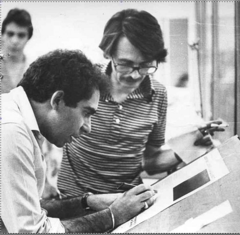
Circa 1981: working with the design and editorial team of La Nueva Provincia, Bahia Blanca, Argentina
It’s quite enjoyable, and at times emotional, to return to a place in which you worked 34 years ago. There is the rush of memories, the images of another era, what was, compared to the present.
As I looked at those first editions of La Nueva Provincia just after the redesign, I put my thoughts into two categories: What Was I thinking? and That’s an idea that still holds
What was I thinking?
These are not truly regrets. More likely, they are reflections about decisions made with the team at the time that could have used a little more time for gestation.
Bold sans headlines: Here was a newspaper with no color printing capabilities, yet, most of my type palette was composed of bold versions of Universe, with little use of medium and light weights
Why no serifs?: As I looked through the old bound volume of copies I kept wondering: why not use two typefaces, a sans and a serif? Well, we had just said goodbye to a very poorly kerned version of Bodoni, and I think I had my share of serifs for a while. I wanted a clean break with that messy typographic past of LNP. Besides, in the early 1980s sans serifs were all the rave, inspired perhaps by Frank Ariss’ all Helvetica displayed in the Minneapolis Star
Smaller logos and sigs: This, too, may be part of the times. I felt, looking through inside pages, that all those columnist’s sigs, logos to identify pages, etc. were just too bold and big. Clunky is the word I would use.
That’s an idea that still holds
Inside page hierarchy: This was, in my view, the greatest contribution I could have made to La Nueva Provincia. I organized inside pages around lead story, secondary story, third level stories. I made sure that headlines did not bump into each other (put that in the stylebook, too),
Center of Visual Impact: Although this took place years before we engaged in the pioneer Poynter Institute EyeTrack Research, I also created a design where one major photo or illustration created a Center of Visual Impact, allowing the reader to enter thru that image. Eventually, the EyeTrack research revealed that this is the way to guarantee that readers enter and stay with you and your page. The latest EyeTrack Tablet research proved the same for the new digital platform.
Promo and navigation: Not that we used the word navigation back then. Not at all. This was a maritime term. However, we introduced promos above the nameplate sometimes to call attention to inside content, way ahead of the time when these became the darlings of designers and editors. They still are, by the way, some better executed than others.
Looking forward
As this first Project Nostalgia visit ends, my team and I now start the exciting part of the job, the creative moment when we begin to bring to life, via sketches, the many ideas and suggestions cooperated by a core group of La Nueva Provincia top editors, both for print and digital, which will now be presented some 45 days from now.
While retracing my steps, seeing old friends, honoring the memory of those no longer here, and seeing pictures of me when I was a young man, has been superb fun, the best is yet to come.
We now prepare to create a multi media platform environment for
the newspaper, one that presents the excellent very local and regional content of La Nueva Provincia across platforms.
Starting point: creating a new brand identity that will carry for the entire media quartet, then conceptualizing what each platform will do, and, then creating a look and feel starting with the smallest canvas: the mobile telephone.
We could not, in our wildest dreams of 1981, have imagined that all of this was possible. It’s what makes life interesting.
Previously about La Nueva Provincia in the blog:
For our blog post on my initial work with La Nueva Provincia:
https://garciamedia.com/blog/articles/40_years_40_lessons_7._abroad
Project Nostalgia: The rethinking of Argentina’s La Nueva Provincia
https://www.garciamedia.com/blog/articles/pproject_nostalgia_the_rethinking_argentinas_la_nueva_provincia_p
Project Nostalgia 2: Re-entering the world of La Nueva Provincia
https://garciamedia.com/blog/articles/pproject_nostalgia_2_reentering_the_world_of_la_nueva_provincia_p
How announcement of new Argentinean Pope became the ultimate textbook example in our workshop
https://garciamedia.com/blog/articles/phow_announcement_of_new_argentinean_pope_became_the_ultimate_textbook_exam
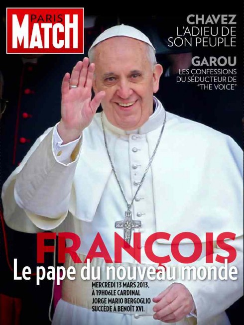
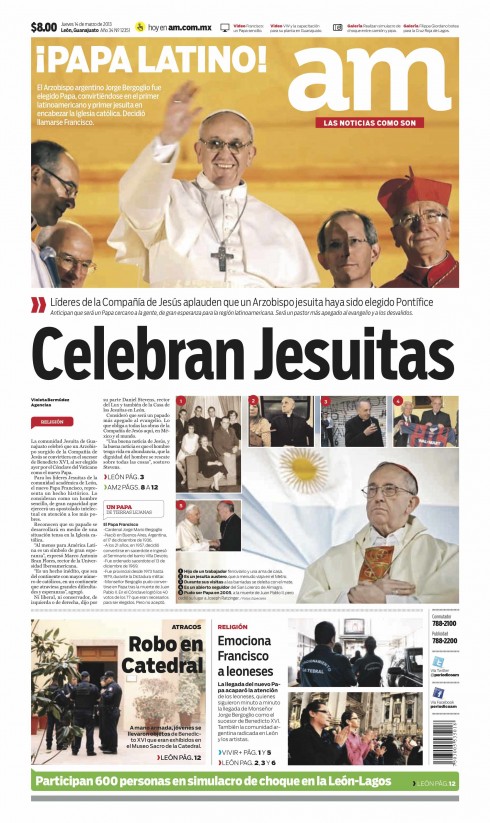
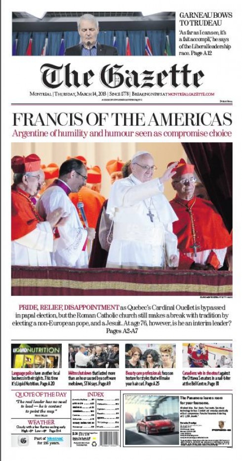
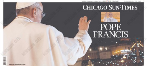
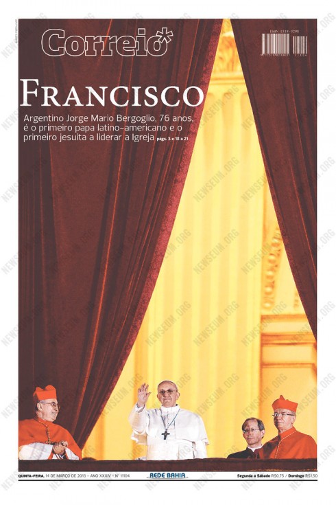
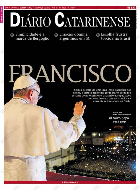
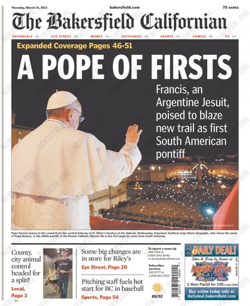
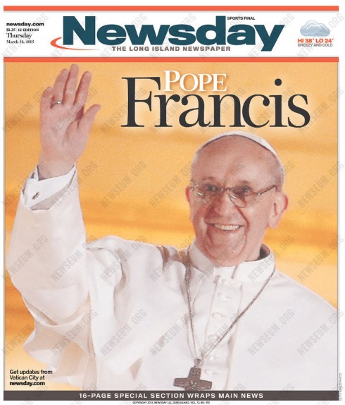
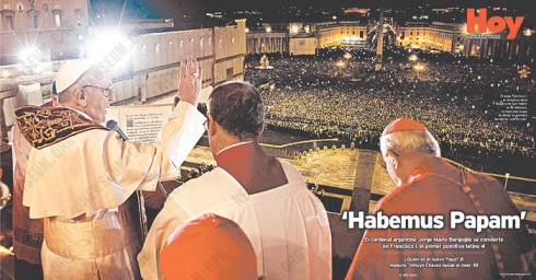
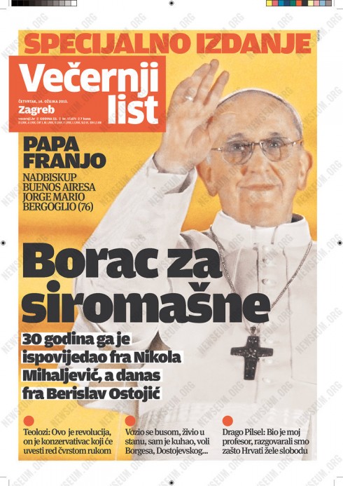
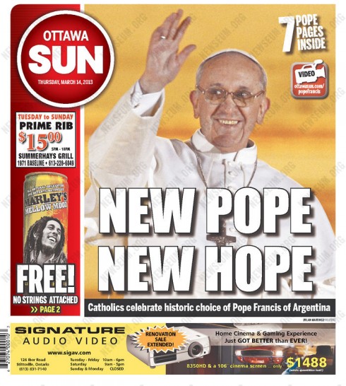
More Pope Francis pages we like
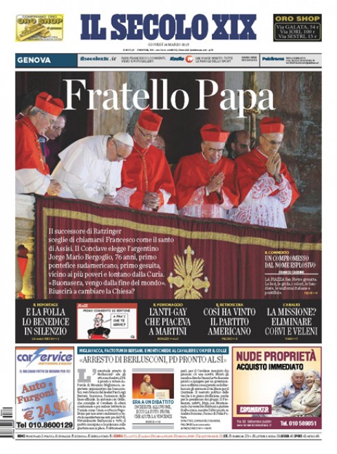
There is an interesting note from Massimo Gentile, design director, Il Secolo XIX about his choice of photo for this historic front page:
Fratello means brother, as in the meaning attached to St. Francis. Almost all the newspapers used the photo of Pope Francis with his raised hand, saluting the crowd. Let’s remember that there were two key moments that night: first the silence of when he arrived at the balcony, it was 32 seconds, a long silence, but photos can’t capture silence. The second key moment was when Pope Francis lowered his head in a sign of humility, of respect for the entire world. We decided to choose that moment. Now I see that Folha de Sao Paulo and The New York Times also selected that image. We are in good company.
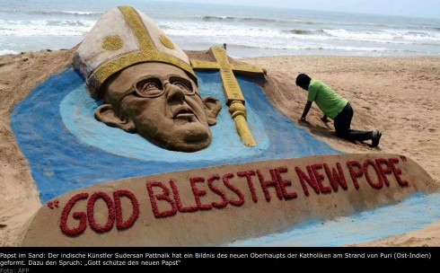
From Bild
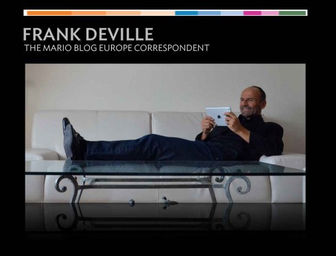
Frank Deville, our European correspondent, sends this image as it appeared in Germany’s Bild Zeitung. A sand sculpture created and displayed on a beach in India:
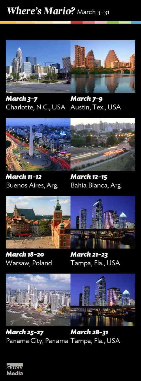
Where’s Mario until March 21, 2013?
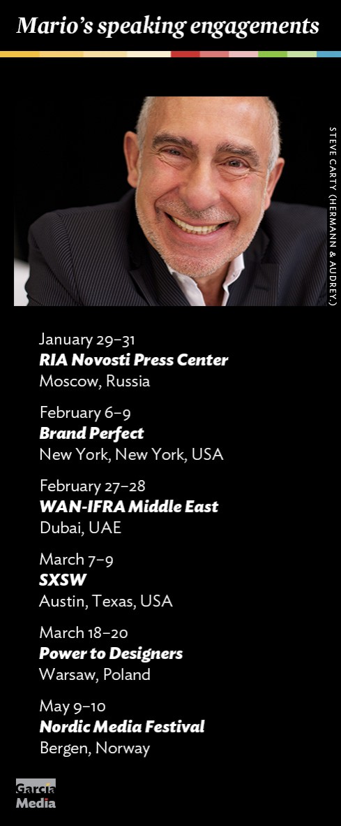
Mario’s upcoming speaking engagements
Take advantage of our iPad Design/Ad Lab workshops
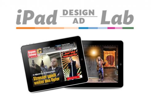
Do you want to take your brand to the next level by creating a tablet edition? Garcia Media can help. We now offer one- to two-day iPad Design Lab workshops on demand to jumpstart your presence on this exciting new platform. We also offer iPad Ad Lab workshops to develop engaging advertising models for your app. Contact us for more information.

Purchase the book on the iBookstore