Update 2, Vienna, Wednesday, Jan. 23, 11;30
TAKEAWAY: It has a nice ring to it, Print is Eternal, and editors in almost every newsroom around the globe love the sound of that phrase. Don’t take me wrong, it is also a true statement. Could it be turned into a three-act musical? PLUS: The New York Times redesigns its Science Times section.
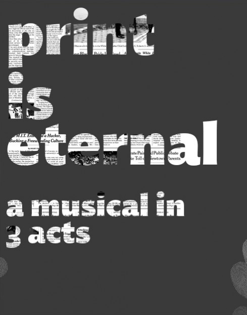
Illustration by Reed Reibstein/project manager and art director, Garcia Media
It is the part of the workshop that we need to get out of the way first, the discussion that, indeed, print is eternal. Just like saying your name and what you are planning to do. It must come at the beginning, to set the record straight, see everyone in the room breathe a sigh of relief, and then get on with the business at hand which is, basically, how to make print eternal by supporting it strongly with its digital siblings.
For me, if Print is Eternal was a three-act musical, it would go something like this:
Act One: Doing Print Happily
Act Two: The Sounds of the Media Quartet
Act Three: Tap, Click, Read
Yes, you guessed it, Print is Eternal, is better suited as a musical, in the old fashioned style, with tops of singing and dancing.
Seriously, I often think that someone has to write this script, then take it on international tour.
In my workshops, we are already singing the tunes that would be appropriate to this musical.
Act One: Doing Print Happily
For example, for Act One: Doing Print Happily—no matter how digitally minded an organization is, as long as the print product exists, as it continues to do in most places (thank you), one needs to give it tender loving care. Don’t drag print to the attic or the basement as a rag doll. Instead, give it the 21st century reality injection: rethink it, re-accommodate it for its role in a multi media environment, and don’t just do it to satisfy your quickly evaporating older readers. Do it because, I am convinced, younger readers will find print interesting, different, an oasis in the midst of the always connected world that suffocates them at times.
In a nutshell, doing print happily means: accepting that print has lost the time advantage, but that it has other good things going for it; develop more of the invisible and the honey stories; go for the surprise photo feature; remind your readers that there are other platforms and that you do them happily too.
In all of our current projects, we are happy to say that we are doing print happily, celebrating it, making it look and read better. That is a good Act One, for sure.
Act Two: The Sounds of the Media Quartet
In Act One we introduce that important character, Print. In Act Two, we build the rest of the cast, via the media quartet: mobile phones, online and tablet.
For storytellers, as I keep repeating, but not enough, these are the best times, because we can make music and tell stories thru these four platforms. Each has a uniqueness. Each can do what the other can’t. Together, the quartet allows for a media house to give its clients the news and information they want when they want it and how they want it.
The Media Quartet needs a good and energetic conductor, however. One who can play each instrument well, or who can at least understand enough about each.
How can I start a story in one platform, and extend it across the others? That is what it is all about. Thinking in terms of multi sensory approaches to storytelling. The media quartet demands it and facilitates it.
In newspapers and magazines where the media quartet plays well, this Act Two is a key one to the future, and to the present.
Act Three: Tap, Click and Read
In the theater and in film scripts, the third act is time for the denouement or climax.
In our workshops, this is the time for show and tell: here is how your product could look with a little rethinking, to be a part of the media quartet.
Yes, a variety of approaches to stories. Users will tap, will click and will read, of course. You as editors need to provide opportunities for these actions to happen.
Start with the mobile phone edition: what is your mobile phone presence? If you do not have one in early 2013, get moving and have one in place by summer 2013.
When was the last time you reviewed your online edition? Is it getting rusty and looking like something out of 2000? Shame on you. Take a good look there. Online is the second platform in the midst of the media quartet. It is lean forward. It is right there with the mobile phone in commanding the daily attention of your audience.
The tablet? Well, advertisers are telling us that this is the one platform they are most enthused about. There are 100 million of them around the globe, just take a look the next time you get on the subway, or sit in an airport lounge, or a restaurant. Are you already having a tablet presence for your publication? If so, what type of tablet edition?
The climax for Act Three in these workshops, in my view, is when those attending come to terms with the reality of their situation and shift into action.
This Print is Eternal play is one with a sequel for sure.
Stay tuned.
It’s “redesign” time for The New York Times
The New York Times redesigns happen in print, too
http://www.niemanlab.org/2013/01/for-the-new-york-times-redesigns-happen-in-print-too/
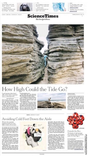
The newly redesign front page of the Times’ Science Times
My take: The new Science Times redesign continues the long held Times tradition of elegance, text driven pages, subtle touches of white space and, like a good Coco Chanel black dress, passing the test of time with straight As. It is possible that some Times’ most loyal readers will not notice the difference. They shouldn’t. This is not, in my view, a redesign, but more like a re-envigorating of the brand, a visual reminder to all that the Times is, well, the Times, unequal, still here, and offering the type of content, very especially in the Science Times section, that would do well even inside a fortune cookie. Great and inspired work led by the Times’ design director Tom Bodkin.
Where’s Mario?
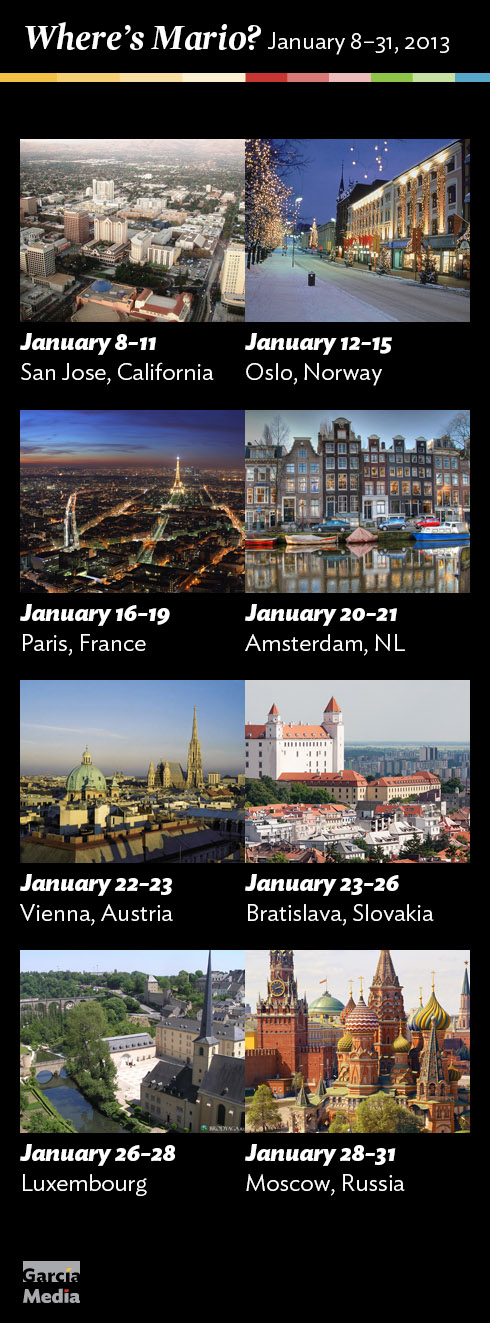
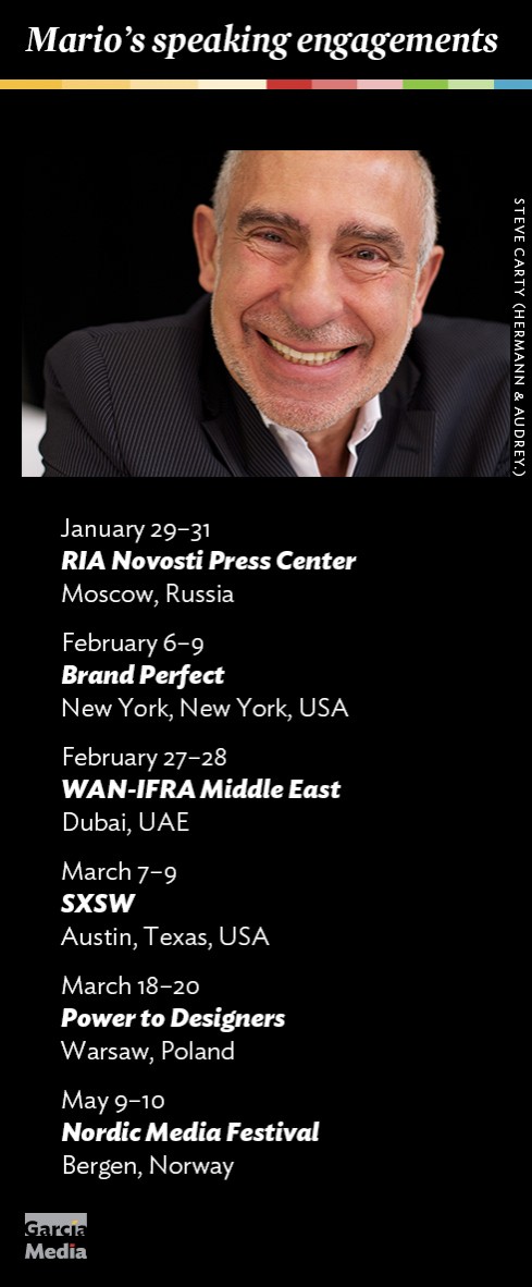
Mario’s upcoming speaking engagements
Take advantage of our iPad Design/Ad Lab workshops
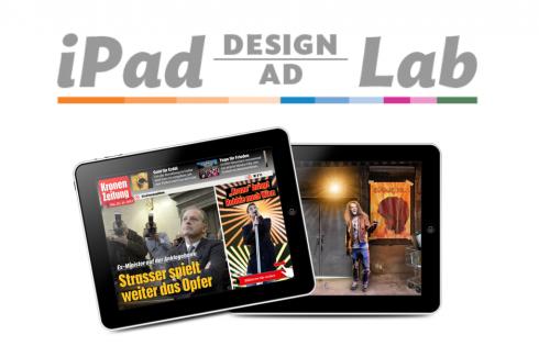
Do you want to take your brand to the next level by creating a tablet edition? Garcia Media can help. We now offer one- to two-day iPad Design Lab workshops on demand to jumpstart your presence on this exciting new platform. We also offer iPad Ad Lab workshops to develop engaging advertising models for your app. Contact us for more information.

Purchase the book on the iBookstore
iPad Design Lab has been given the QED Seal
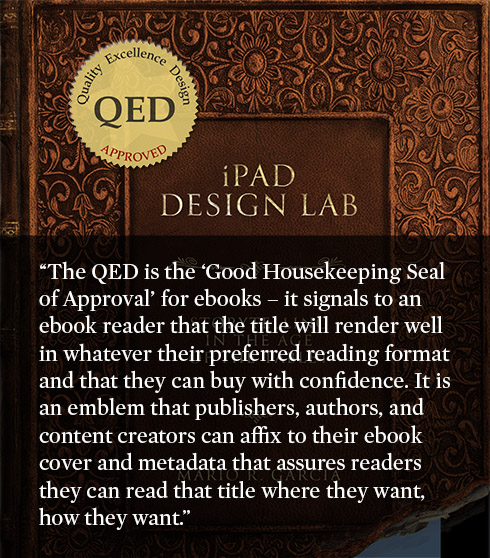
The QED (Quality–Excellence–Design) Seal is bestowed by the judges of the Publishing Innovation Awards after “a thorough, professional 13-point design review with an eye towards readability across multiple devices and in multiple formats.”
Learn more about the QED Seal here.
The EPUB version of book is HERE:
Now available: The EPUB version of  iPad Design Lab: Storytelling in the Age of the Tablet, ready for download via Amazon.com for Kindle:
http://tinyurl.com/8u99txw
Here is how you can get iPad Design Lab book:
The original version of the book is the multitouch textbook version available on the iBookstore for iPad (iOS 5.0 and up):Â https://itunes.apple.com/book/ipad-design-lab/id565672822. This version includes video walkthroughs, audio introductions to each chapter, swipeable slideshows, a glossary and a sophisticated look and feel.
Apple only sells multitouch textbooks in certain countries at this time, unfortunately. Copies are available in at least the following countries: Australia, Austria, Belgium, Canada, Finland, France, Germany, Great Britain, Greece, Italy, Latvia, Luxembourg, The Netherlands, Poland, Portugal, Romania, Slovakia, Spain, and the United States.
For those in other countries and without an iPad, we have made the book available in a basic edition for other platforms. This basic edition includes the full text of the original, along with the images and captions, but lacks the other features such as audio and video. It is available on the following platforms in many countries:
Amazon Kindle:
http://amzn.to/SlPzjZ
Google Books:
http://bit.ly/TYKcew
Take a video tour of iPad Design Lab
“iPad Design Lab” trailer on Vimeo.
Read the Society of Publication Designers’ review of The iPad Design Lab here:
http://www.spd.org/2012/10/must-read-ipad-design-lab.php

Keep up with Mario Garcia Jr.. via Garcia Interactive: helping transform online news since 1995.
www.garciainteractive.com