TAKEAWAY: No detail is too small when it comes to creating a design that is functional and aids the reading process


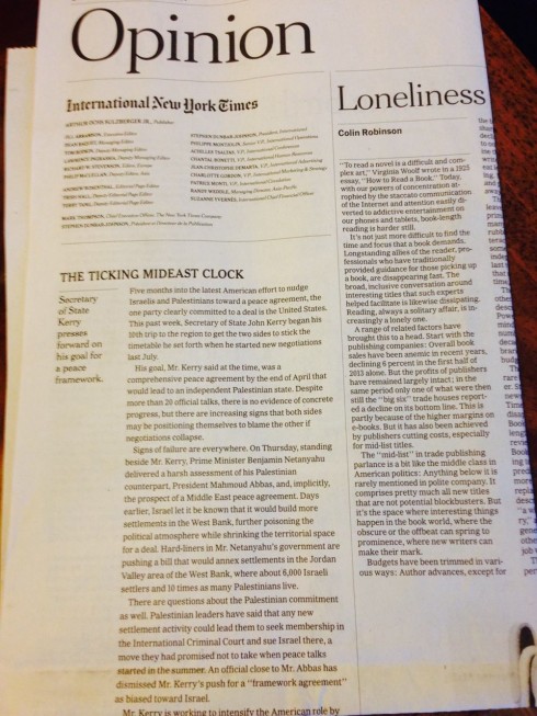
Perhaps this has been there on the Opinion page of the International New York Times, but it is only this week that I noticed it.
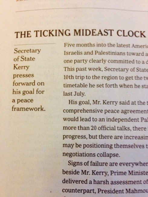
The newspaper’s editorials seem to be shorter ( a good thing), but what caught my eye was the mini column of white space that is now to the left of the editorial text, along with the summary that tells us precisely what the essence of the editorial is. Normally, editorial headlines can tend to be vague, so the use of the summary is welcome by readers who may do one of two things—either, get an idea what the editorial conveys, or, for those who might not read the text of the editorial, to get a sense of what the Times had to say on the subject.
For example, in the edition I have highlighted here, the headline reads The Ticking Mideast Clock, but the summary is what offers us a more concrete idea of the editorial’s content:
Secretary of State Kerry presses forward on his goal for a peace framework.
This works well.
The Return of the Type Attack

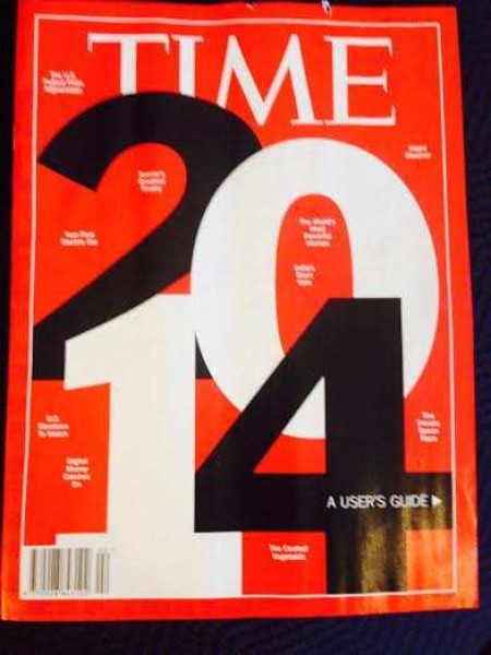
It’s a Type Attack on the first cover of TIME for 2014
TIME Magazine’s first cover of the year is a pure Type Attack. This is when the designer only uses type to convey the meaning of the story. In this case, it is a guide to what the year 2014 may offer. The number IS the cover, along with some small headings that serve as navigational tools, but without a page number (I would have included that to make it more functional).
Type Attacks can come in handy when a photo or illustration is not the best way to convey a story. We used to see them more often, usually in magazines, but I had not seen one on the cover for quite sometime.
Good to see TIME bringing back the Type Attack, a design tool that can sometimes save the day.