TAKEAWAY: Stick to your principles, but be open to listen to others’ ideas. Some call it compromise, I prefer to call it smart practice
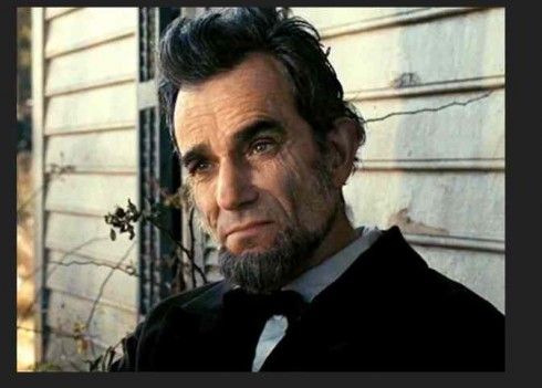
Lincoln: Daniel Day-Lewis won a Best Actor Oscar for his portrayal of the 16th President(Photo: DreamWorks Pictures/Twentieth Century Fox)
As my Monday blog reporterd on the launch of the new compact format for Australia’s Sydney Morning Herald and The Age, I made a reference to the fact that my recommendation to the team was for a front page that was more photo oriented and carried less body text. While Matt Martel, national presentation editor, and his team of designers, created such models, the management decided that it would be too radical and would alienate some of the newspapers’ most loyal readers.
The front pages you see are a combination of visual navigation and text for two stories on the page.
So, in the past 24 hours I have had inquiries via email about this subject, and how I feel about recommending one thing and seeing something else appear upon implementation of the project.
It’s the most normal thing, and it happens, to some degree, in all projects. These projects are all about collaboration, team effort, with the best idea winning, or, as in this case, the concept that the management considers to be the most viable.
One must respect that.
As a consultant, I see my role as one of studying the facts, making recommendations, then allowing for discussion and, ultimately, for the team to decide what they consider to be the best option.
Do I consider my time with the SMH/The Age team wasted?
Not at all. Quite the contrary. We had great discussions and workshops, with everyone’s participation. The new look that premiered Monday includes many of the concepts we discussed, such as creating balconies for double page spreads, to add secondary readings that scanners always appreciate, as well as opinion pages that include more layers of white space to facilitate the reading of longer pieces.
But because this was a team effort, the project also includes ideas from a variety of editors and designers.
In my opinion, one must have the ability to be principled without having to be stubborn. Go for dialog, present your ideas, stick to your principles, but be willing to listen to the other opinions in the room.
It is the type of behavior that is obvious when we watch the movie Lincoln, and how our greatly revered 16th President managed to be highly principled, without becoming an obstructionist.
Perhaps some members of our stubborn and belligerent Congress might benefit from watching the movie, too, learning that, like Lincoln, one can be principled but willing to give. This constitutes the highest level of leadership.
As for the two Australian dailies and their new compact look: I am honored to have been a part of the project, and, of course, I am also hopeful that the ideas I contributed for page one will eventually find their way in, as the new look evolves and readers become more familiarized with it.
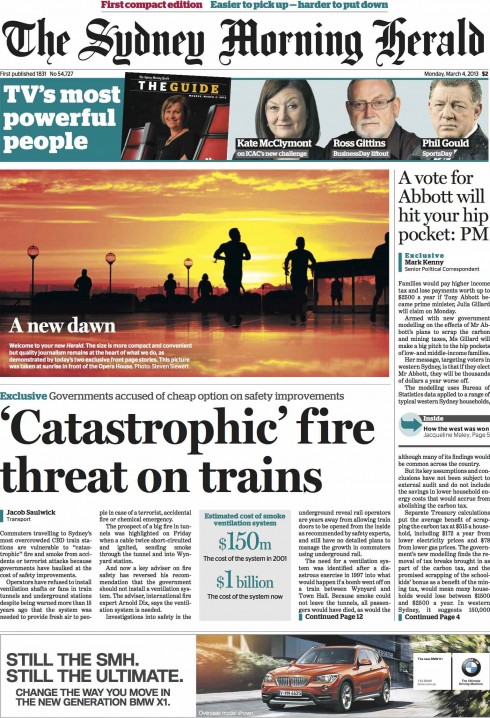
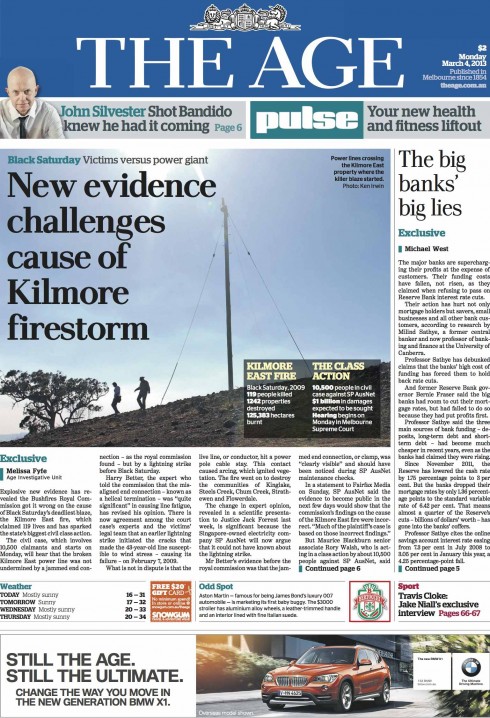
Here are the front pages of today’s Sydney Morning Herald and The Age
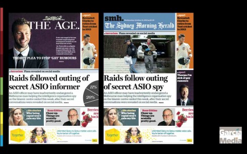
Here are models of the prototype we created together, with much less text on the front page
Our Monday blog:
New compact format for Australia’s Sydney Morning Herald and The Age
https://www.garciamedia.com/blog/articles/pits_new_compact_format_for_australias_sydney_morning_herald_and_the_age_p
Of special interest today
Twitter Reaction to Events Often at Odds with Overall Public Opinion
Twitter Reaction to Events Often at Odds with Overall Public Opinion
First paragraph:
The reaction on Twitter to major political events and policy decisions often differs a great deal from public opinion as measured by surveys. This is the conclusion of a year-long Pew Research Center study that compared the results of national polls to the tone of tweets in response to eight major news events, including the outcome of the presidential election, the first presidential debate and major speeches by Barack Obama.
The new look of American Airlines revisited

The new American Airlines livery
As readers of this blog may remember, I made some comments when American Airlines unveiled the new look for its brand, planes, etc.
While others in our industry expressed their outright dislike for the new abstract “eagle”, and the overall look adopted by the airline, I felt it was not as bad as the others thought it was. In fact, I did mention that the folks at FutureBrand, had done a splendid job here.
Monday, as I took off from Miami International Airport en route to Charlotte, NC, an American airliner displaying the new livery touched down close to us. It was exactly 4:32 pm EST.
I did not like much of what I saw: over the top, too many things fighting for attention, and, especially, the tail, just too busy. Coincidentally, another American jet was stationed nearby, with the old branding, and, hands down, the existing look beats the new one.
Forget splendid. I take it back. It makes a difference to see this new American Airlines design up close. Massimo Vignelli, who created the original AA design, would probably agree.
Where’s Mario until March 21, 2013?
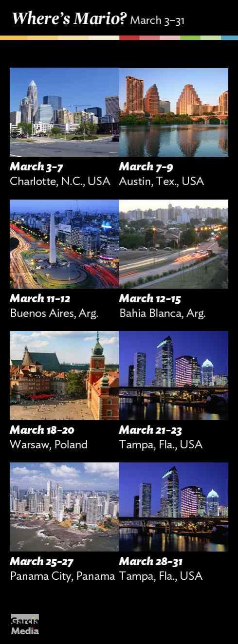
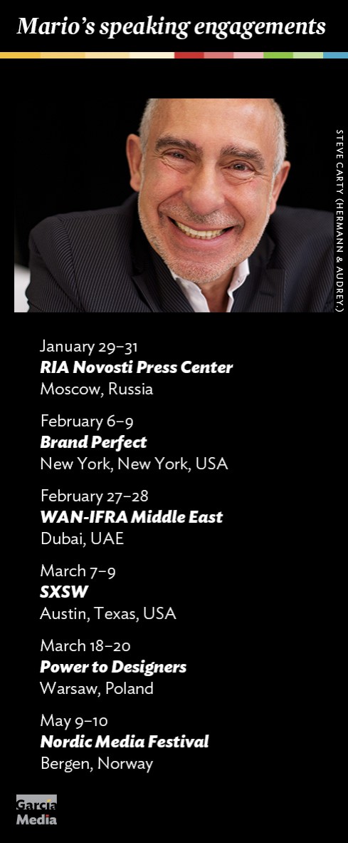
Mario’s upcoming speaking engagements
Take advantage of our iPad Design/Ad Lab workshops

Do you want to take your brand to the next level by creating a tablet edition? Garcia Media can help. We now offer one- to two-day iPad Design Lab workshops on demand to jumpstart your presence on this exciting new platform. We also offer iPad Ad Lab workshops to develop engaging advertising models for your app. Contact us for more information.

Purchase the book on the iBookstore