TAKEAWAY: Let’s not get carried away with navigation, to the point where repetition sets in. What’s the way to do it just right? Striking a balance does it.
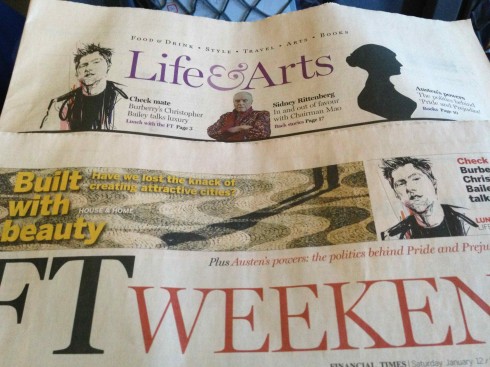

We are all for proper navigation, for promoting the good stuff that’s inside that newspaper or magazine. If you don’t promote it, you obviously won’t call attention to it.
But, what’s the limit of repetition? When is too much promotion not recommended?
The reason I get into this topic—-a recurring one from time to time in workshops I conduct globally—is the weekend edition of the venerable Financial Times (January 12-13, 2013).
A very nice illustration of Burberry’s Christopher Bailey is seen three times in that edition. We first encounter Christopher on Page One, with a headline that lures us to the Lunch with the FT feature: *Burberry’s Christopher Bailey talks luxury.
Then we pull out the Life & Arts section and, you guessed it, there is Christopher again, with the same headline: Christopher Bailey talks luxury (and the reader is saying, yes, I know, I know, I know, let’s get on with the story, please!).
Finally, we are on page 3 of the section, a full page devoted to Lunch with the FT: Christopher Bailey, and, alas, a different headline, this time: “This is going to be fun!”.
It had better be fun after such heavy promotion.
What should be the rule in cases like this?
Sum it up in two words: avoid repetition.
Remember, your audience is smart and sophisticated: one promotion is enough. If you have profiled the story/image on your Page One because it deserves that kind of wattage, then, that should be enough, or, if you are tempted to do it again for a section opener with that story in it, choose another image, change the headline. I believe one promo is enough. Play the rule of hierarchy and ask yourself a simple question: how important is this feature?
If it is so robust that it must go on your Page One, then you have done it justice, perfect. No need to overdo it.
It it did not make the cut for Page One, then you profile it with gusto on the section opener.
But, please, please don’t get promo happy and hit me over the head with a sledgehammer to remind me of the goodies in your bag, especially without taking the time to change the image and/or headline.
Pages we like

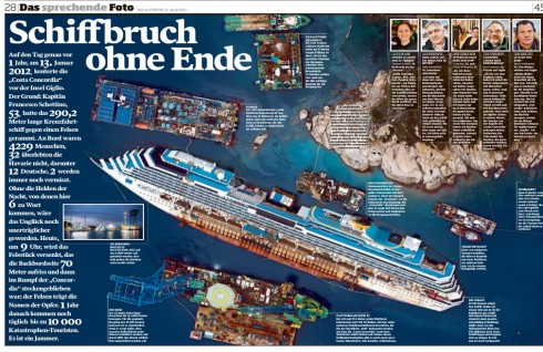
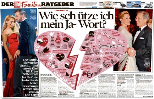
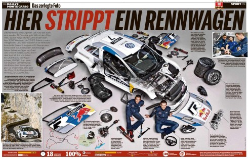
Here is Bild’s take on the first year anniversary of the Costa Concordia disaster, when the massive ship ran aground with 3,200 passengers and 1,000 crew members on board.
Bild uses a two page spread packed with all the numbers that describe what happened that chaotic night one year ago.
Here it is all about the keys to keeping the marriage alive.
Finally, stripping a race car to its bare bones.
In each case, informative and visual ways of presenting stories in a different, appealing way. And, we must add, one that adapts well to the tablet platform, where clicking and reading become keys.
This, in essence, is what storytelling in a multi platform world is all about. It requires editors who think across the platforms, see the story then project it for what each platform can do best with it.
But, as these examples show, they work very well for print, too.
Where’s Mario?

Take advantage of our iPad Design/Ad Lab workshops
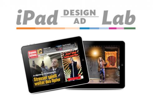
Do you want to take your brand to the next level by creating a tablet edition? Garcia Media can help. We now offer one- to two-day iPad Design Lab workshops on demand to jumpstart your presence on this exciting new platform. We also offer iPad Ad Lab workshops to develop engaging advertising models for your app. Contact us for more information.

Purchase the book on the iBookstore
The EPUB version of book is HERE:
Now available: The EPUB version of  iPad Design Lab: Storytelling in the Age of the Tablet, ready for download via Amazon.com for Kindle:
http://tinyurl.com/8u99txw
Here is how you can get iPad Design Lab book:
The original version of the book is the multitouch textbook version available on the iBookstore for iPad (iOS 5.0 and up):Â https://itunes.apple.com/book/ipad-design-lab/id565672822. This version includes video walkthroughs, audio introductions to each chapter, swipeable slideshows, a glossary and a sophisticated look and feel.
Apple only sells multitouch textbooks in certain countries at this time, unfortunately. Copies are available in at least the following countries: Australia, Austria, Belgium, Canada, Finland, France, Germany, Great Britain, Greece, Italy, Latvia, Luxembourg, The Netherlands, Poland, Portugal, Romania, Slovakia, Spain, and the United States.
For those in other countries and without an iPad, we have made the book available in a basic edition for other platforms. This basic edition includes the full text of the original, along with the images and captions, but lacks the other features such as audio and video. It is available on the following platforms in many countries:
Amazon Kindle:
http://amzn.to/SlPzjZ
Google Books:
http://bit.ly/TYKcew
Take a video tour of iPad Design Lab
“iPad Design Lab” trailer on Vimeo.
Read the Society of Publication Designers’ review of The iPad Design Lab here:
http://www.spd.org/2012/10/must-read-ipad-design-lab.php

Keep up with Mario Garcia Jr.. via Garcia Interactive: helping transform online news since 1995.
www.garciainteractive.com