TAKEAWAY: Two Project Pinstripe launches this past week: have taken place, this time the Minneapolis Business Journal and the Nashville Business Journal now join the seven other titles of the American City Business Journals undergoing a total rethink.
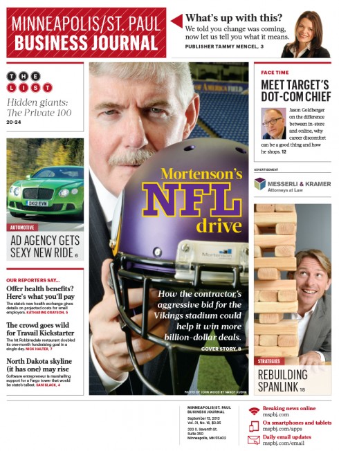
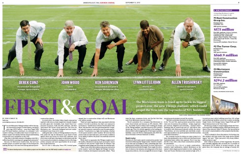
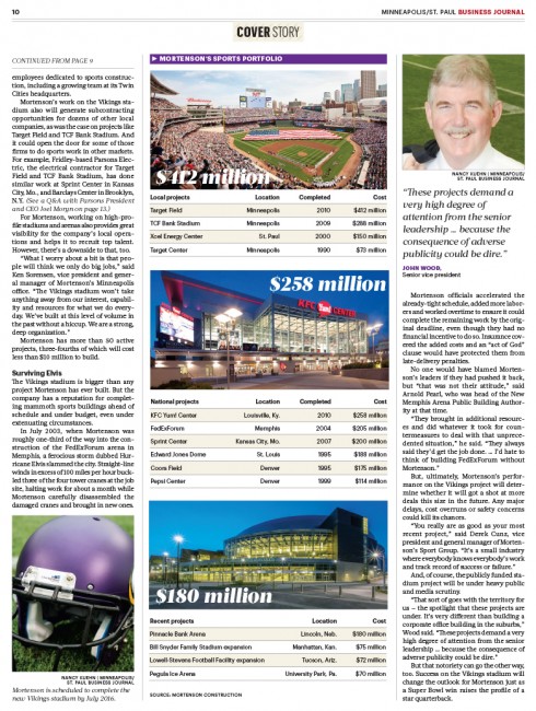
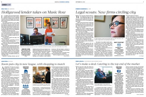
New front page and centerpiece pages of the Minneapolis Business Journal
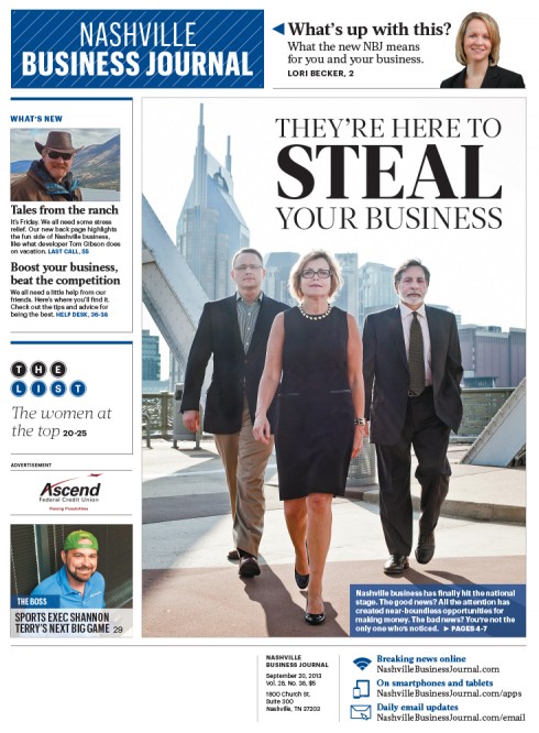
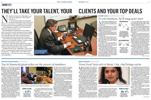
New front page and centerpiece pages of the Nashville Business Journal
Minneapolis and Nashville: it’s two for the road as business journals continue launch of Project Pinstripe.
The Minneapolis Business Journal and the Nashville Business Journal become the 8th and 9th of the 40 weeklies part of American City Business Journals to launch a common style of storytelling, story hierarchy and visual presentation.
We at Garcia Media have worked closely with the ACBJ team, including Emory Thomas, chief content officer for American City Business Journals and creative director Jon Wile. Over the course of a year, and a half-dozen workshops, we have created a formula that is flexible enough to allow for the specific and unique features of each of the titles, while establishing a foundation that ensures a similar style for telling stories and for adapting to a digital first philosophy in the presentation of content.
However, as one would expect, each of the weeklies approaches Project Pinstripe differently. Each newsroom and its inhabitants must be open to big change.
In each case, we like to examine a specific area that showcases how the newspaper has embraced this opportunity for total reinvention.
A highlight for these two projects is in how advertising space is sold. Let’s hear Jon Wile, creative director, summarize what’s new with these two launches:
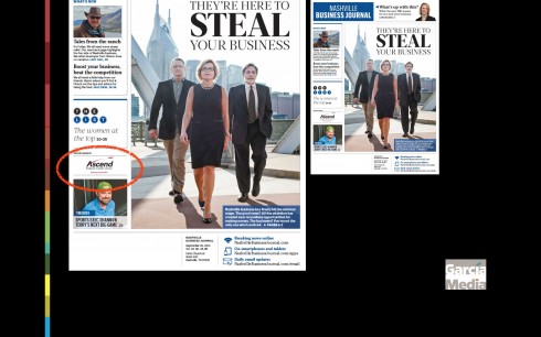
While an editorial reinvention was one of the key components of this process, it would be impossible in this media climate to ignore revenue opportunities, especially in print. New advertising units have become a major piece of this project, including the ones shown here.
Silent ads on page one
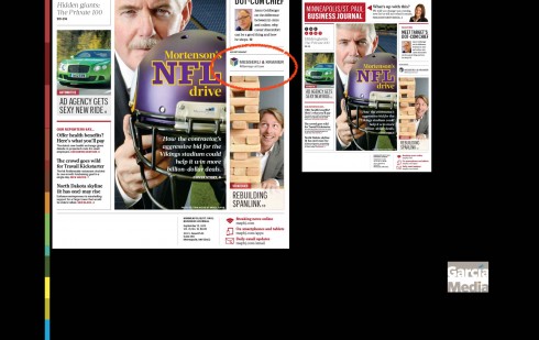
This unit is a small company logo placed on the front page and is clearly labeled as an advertisement. The logo moves around the page and is always surrounded on three sides with content (Above, Below and Left/Right). The ACBJ front pages use both a horizontal and vertical grid based on the size of this ad, allowing the ad to move seamlessly around the page from week-to-week.
Belt
_thumb.jpg)
_thumb.jpg)
This 2.5-inch high ad is vertically centered across a spread and has been one of the most popular ad units in the project. Art directors must design these pages as four “quadrants” and cannot jump content vertically over the ad. These pages have worked best when they are dense with type, allowing the ad to be the dominate visual element on the page.
Triangle
_thumb.jpg)
This runs only in the agate sections of the paper to allow the type to wrap evenly around the unit. Because these pages are so dense editorially, the advertisement has more “pop.”.
Microbars
_thumb.jpg)
This shallow unit strips across a spread and is reminiscent of a “leaderboard” ad from the digital world. The ad hangs below the folio and above the page flag/pennant.
Wave
_thumb.jpg)
This ad arcs slightly from the left or right side. As with the belt ad, the art director must carefully build the page to make sure that the page is more editorially dense just above the ad, wrapping the type in a logical experience for the reader.
List strip
_thumb.jpg)
The List is one of ACBJ’s signature features, thus it would be a good spot for advertisers. The new design on the table of data allows for an ad to easily slide underneath it by simply tightening the padding between rows.
According to Jon, it seems like the new ad units, coupled with the reinvention have drawn excitement in Nashville.
Normally the paper has been between 32 and 40 pages each week this year, but the launch issue weighed in at 56 pages. This week’s issue will be 56 pages again.
Next for ACBJ Project Pinstripe
The Albany Business Review and the St. Louis Business Journal will go through the transformation process this week.
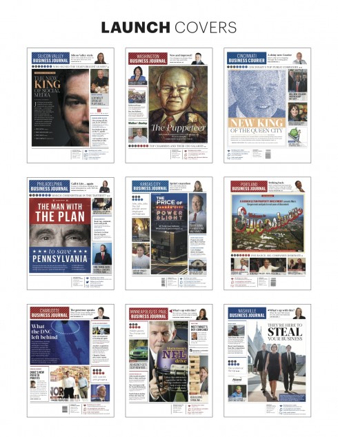
Front pages of each Project Pinstripe launch, via Hannah Hitchcock / ACBJ
Other blog posts on innovative advertising placement:
Introducing new product to advertisers
https://www.garciamedia.com/blog/articles/introducing_new_product_to_advertisers
Take a second look at what you could do with print ads
https://garciamedia.com/blog/articles/ptake_a_second_look_at_what_you_could_do_with_print_ads_p
With magazine advertising surging, time to get more creative about mobile
https://garciamedia.com/blog/articles/with_magazine_advertising_surging_time_to_get_more_creative_about_mobile_pl
It’s time to do more experimenting with advertising in print
https://garciamedia.com/blog/articles/its_time_to_do_more_experimenting_with_advertising_in_print
All about silent ads:
Silent ads: What we can learn from online advertising strategies
https://garciamedia.com/blog/articles/silent_ads_what_we_can_learn_from_online_advertising_strategies