TAKEAWAY: It’s been the essential French weekly magazine since 1949. Now, Paris Match introduces a variety of changes in its content and design to make its superb journalistic and photographic content even better.
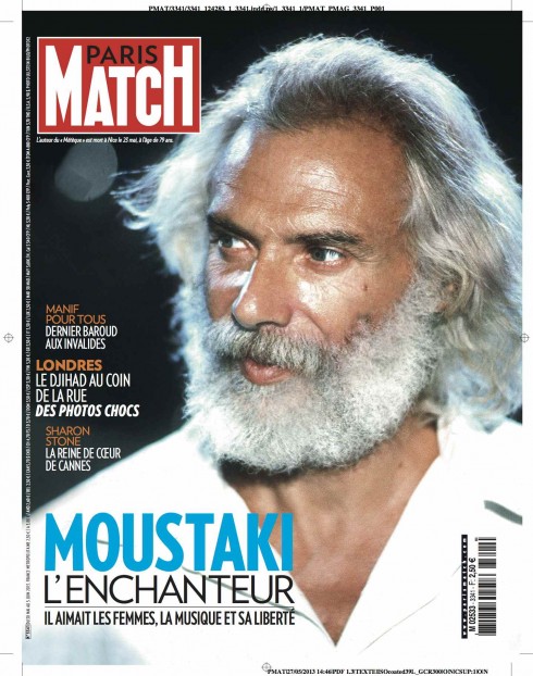
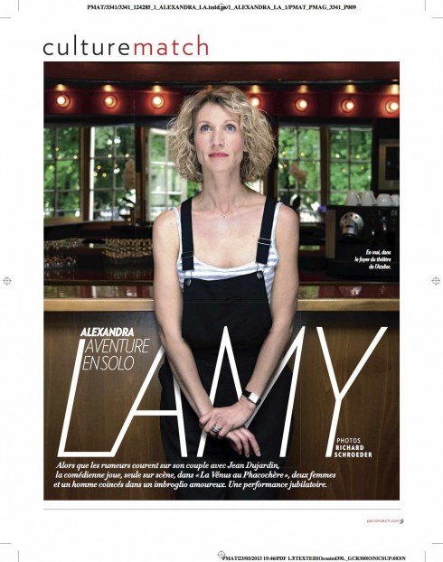
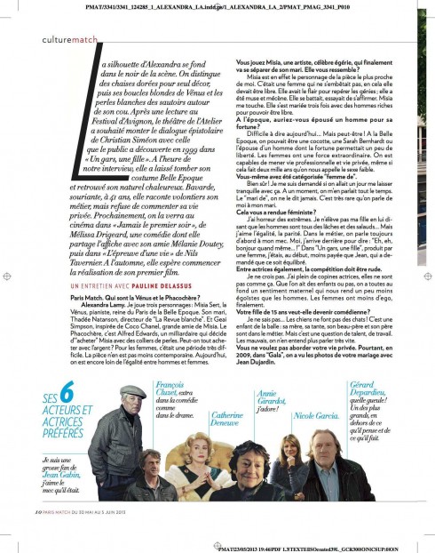
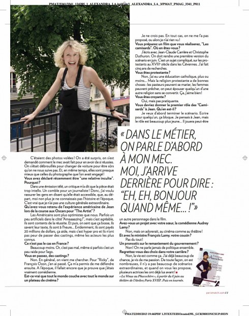
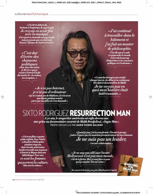
Assorted pages from this week’s edition of Paris Match: introducing changes both visually and journalistically
It’s a sort of pre-summer refreshing for Paris Match, the French weekly magazine that excels in its style of visual journalism, with photo reportages, and a clever mixture of news, analysis, commentary and tons of people news.
We are honored to have been associated with Paris Match for the since 2008, when the magazine underwent a major redesign.
This time, again working with editor Olivier Royant and art director Michel Maiquez, we took a look at the magazine from cover to back cover and analyzed storytelling processes, content flow and how the robust journalistic and photographic content of this 64-year-old magazine could be made more interesting, easier to find and more enjoyable to read.
Working in workshop settings with Michel and his talented group of young designers we did it the old fashioned way: listen to the editor of each section, then sketch ideas, turn those ideas into page dummies for discussions, and make the necessary changes and corrections to adapt suggestions. Isolated in a “design” room , the designers went to work, and, at the end of the day, we had a perfect gallery of pages on the wall, ready for the editors to evaluate.
This week’s Paris Match is the culmination of such efforts.
Here is how editor Olivier Royant views the changes:
You can’t reinvent Paris Match, it is still showing life as it is, with reporters and photographers out in the field, unflinchingly seeking out the truth. Yet the world is changing, and with it, the expectations of our readers and our journalists. This is why we have decided to redesign our layout, making it more dynamic, enhancing the “match” experience with new narrative formats to mirror our evolving world.
Here is a sampling of more pages:
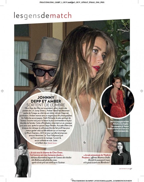
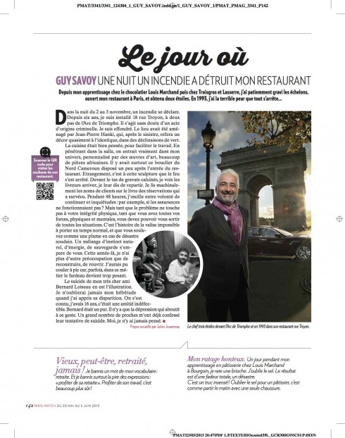
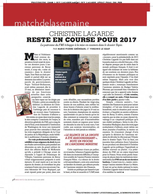
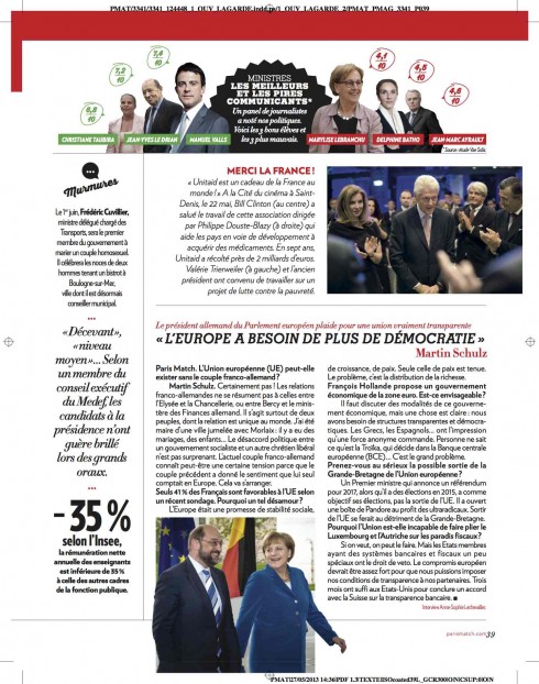
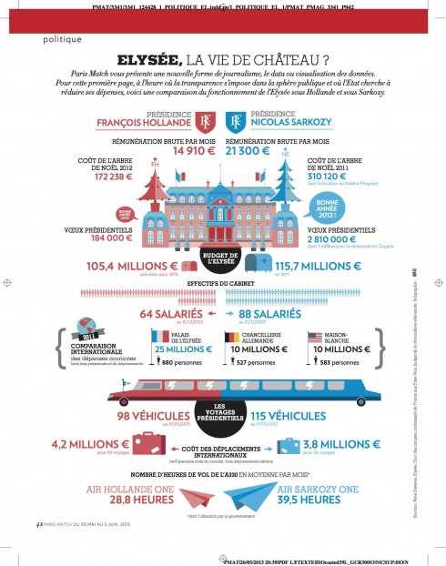
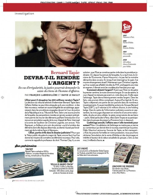
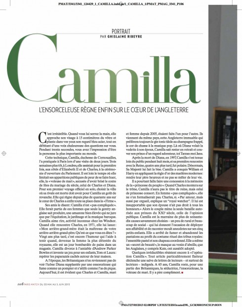
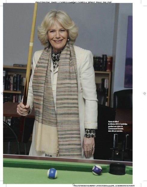
These are pages from one of Paris Match’s best read sections, Match de la Semaine, where the magazine goes newsy, reporting and updating the news of the week that passed, offering analysis, people news and projecting what’s to come in the week ahead. In this new version, special consideration has been given to introducing a good balance of longer narrative pieces with shorter, finger-reading material.
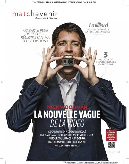
The new Match Avenir
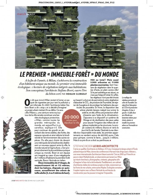
It’s all new content for Match Avenir, which presents the latest personalities developing ideas for the future, creating new paths, carving out new ways of thinking. For example, in this issue, the opening story is about Nick Woodman and his brilliant video camera GoPro, and also includes a story about the first Building Forest in the world that was just completed in Milano by architect Stefano Boeri. It boasts 20,000 full sized trees on the buildings 27 floor balconies!
The Match Avenir section is ambitious in the range of topics it covers, from art and culture to money, finance, business, computers, architecture, and basically anything innovative and the people behind those innovations.
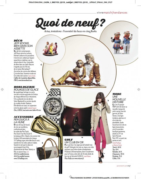
There is also a graphic-driven new data page as well as mini data graphics throughout the magazine on various pages of the different thematic columns.
Paris Match typography:
Here are details of the fonts used for Paris Match.
Paris Match‘s typographic palette centers on Hoefler & Frere-Jones’ Verlag, which is used in a variety of sizes from the cover lines to captions. H&FJ Didot, Memphis and its new script font Times Ten.
And related to Paris Match typography:
Thirsty: a playful font with a memorable name
https://www.garciamedia.com/blog/articles/pthirsty_a_playful_font_with_a_memorable_name_p
Previously about Paris Match:
Paris Match: the remaking of a French institution
https://garciamedia.com/blog/articles/paris_match_the_remaking_of_a_french_institution/
Paris Match: Magazine of the Year
https://garciamedia.com/blog/articles/paris/