A look back at 2012: Projects launched and lessons learned-Part One
TAKEAWAY: These were projects we at García Media collaborated on and launched in 2012. Each project is unique, and we learned a great deal from each. Today and tomorrow we will share what we learned with you.
Gulf News
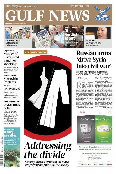
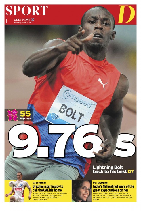
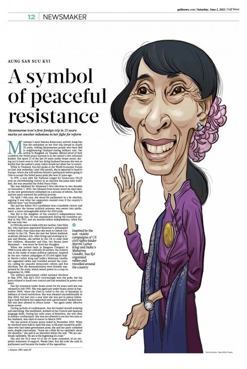
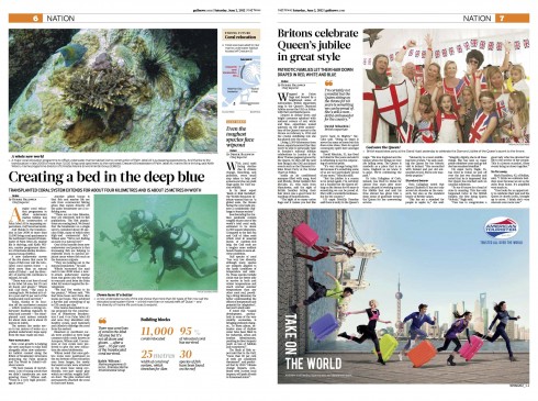
The publisher of Gulf News, the leading daily newspaper in the Gulf region, decided to make it the first Berliner format newspaper in the area. The change involved a total rethinking of its content—How could its stories be told on a Berliner instead of on a broadsheet? A particular challenge was in adapting advertising measurements.
The change gave all involved a chance to rethink the newspaper from top to bottom. The result is an attractive, easy-to-read, easy-to-carry and easy-to-navigate new Gulf News, which has become a favorite with readers.
Lesson: It takes time to do a format conversion right. The Berliner format is a happy medium between a broadsheet and a tabloid. This was also our first time doing a style guide in the form of an app. But, after a positive experience with it, certainly not the last!
Design director: Miguel Gomez
García Media art director: Reed Reibstein
For more details:
Creating the design concept for the new Berliner Gulf News
https://garciamedia.com/blog/articles/creating_the_design_concept_for_the_new_berliner_gulf_news/
Here is your new Gulf News Berliner format, new look
https://www.garciamedia.com/blog/articles/here_is_your_new_gulf_news_berliner_format_new_look
Images from Gulf News
New Straits Times
One of Malaysia’s leading English language dailies, the New Straits Times (NST) wanted to undergo a total visual makeover. But these days, a cosmetic change is not enough. We helped the team entirely rethink the product, starting with a front page that offers a better navigational window to the inside.
Lesson: A modern and dynamic daily newspaper must emphasize storytelling variety through story structures. In the case of the NST, it needed more compacts and briefs, as opposed to an over-abundance of lengthier stories. Such a reinvigoration was critical, and our work with the NST shows that it can be done.
Design Director: Fred Mah
García Media Art Director: Constantin Eberle
For more details:
New Straits Times: it is 11-11-11 and launch day
New Straits Times relaunch: The digital platforms
Images from the NST
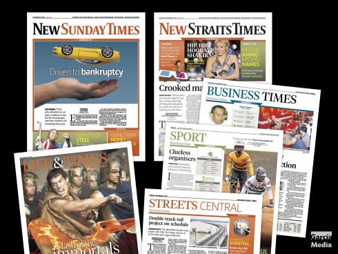
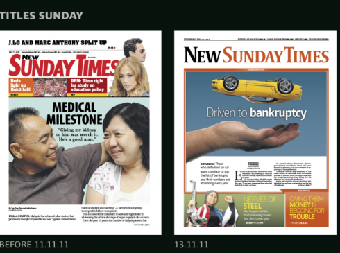
The Sunday front before and after the redesign of the New Straits Times
NST digital
Our NST project involved the entire media quartet and a curated version of the tablet edition.
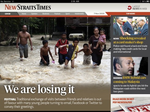
Here is the landing screen for the new New Straits Times app, which launched 11-11-11
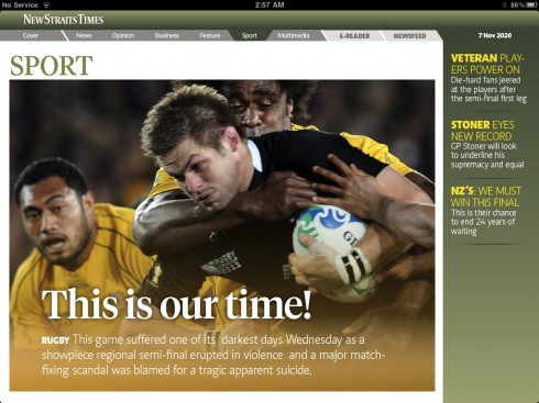
Opening of the sports section: navigation on the right to sports stories; the horizontal navigator at the top takes the user to other sections
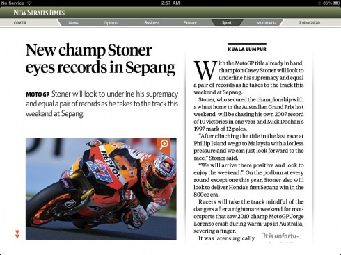
Article screen in the sports section—all about reading
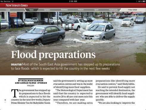
One of the article screen templates
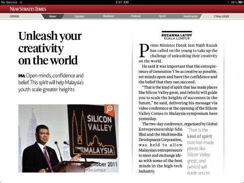
Template #2 for article reading mode
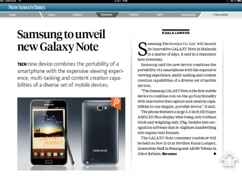
Opening of the business section
a.m.
One of Mexico’s most respected regional newspapers, a.m., published in León, in the province of Guanajuato, went for a major redesign and rethinking of its storytelling. Here the emphasis was on how to give a more magazine or tabloid feel to a newspaper that is published as a broadsheet. We accomplished part of this by going for a visual lead (usually around the newspaper’s logo), with) and a journalistic lead underneath, under it.
Lesson: A front page does not have to necessarily rely on the image that corresponds with the lead story of the day, which may or may not be a great choice. Instead, discover the best photo of the day, then bring it forward to your front page.
Art Director: Ana Laura Romero
García Media Art Directors: Rodrigo Fino and Paula Ripoll / Garcia Media Latinoamérica
For more details:
July 1: two of our projects relaunching this day
Images from a.m.
Here is a selection of pages from the July 1 edition of Mexico’s a.m. on the first day with the new look and rethinking:
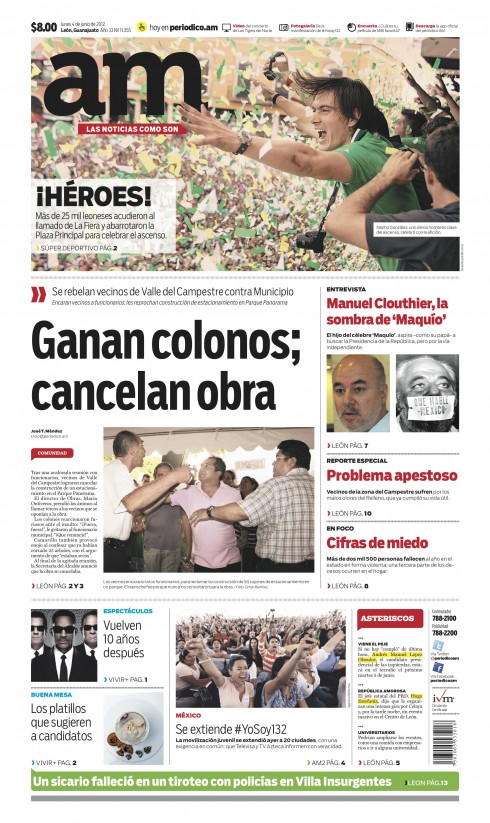
Prototype of the new front page for Mexico’s regional daily, a.m.
WirtschaftsBlatt: Mobilista
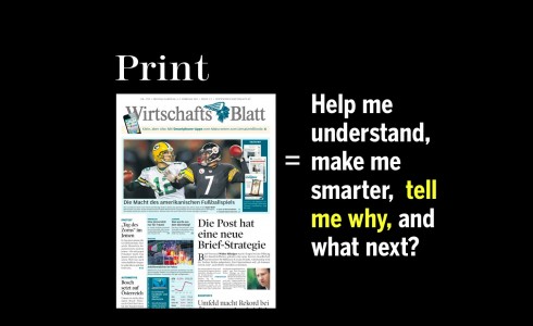
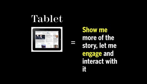
Perhaps one of our most interesting workshop-inspired projects of the year was our collaboration with the team of Austria’s WirtschaftsBlatt. This project was avant grade and rewarding, ultimately leading to a streamlined workflow of how stories move across platforms in the newsroom.
Lesson: It is possible to bring traditional print editors into the mix through workshops in which the story becomes more important than the platforms. At one point in the Mobilista workshops, it was almost impossible to identify who in the group came from the world of print or from the digital side of the operation.
Art directors: Jan Schwieger, Ellie Tzortzi
Project leader: Alexis Johann
For more details:
Austria’s WirtschaftsBlatt: Mobilista workshop, a step closer to seamless integration of content
Today’s media consumer: Jumping from one platform to the next
Mobilista workshop 4: relating to the audience’s needs
In Austria, the WirtschaftsBlatt uses cross media to attract subscribers
Images from Mobilista
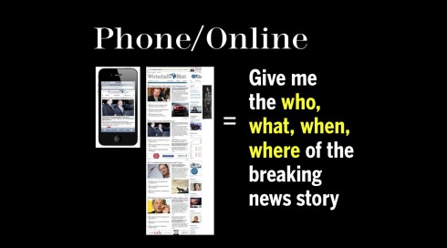
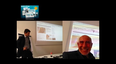
Scenes from the Mobilista 4 workshop: Alexis and Mario explaining details of new digital platforms
Berita Harian
Berita Harian is a sister publication of the New Straits Times. It is published in the Malay language and targets a middle class audience with aspirational values. One important task for us here was to create a new logo, which we did, modernizing it by creating a pill box approach. This facilitates greater energy and variety for the front page. Each supplement and all inside pages were redesigned as well.
Lesson: This was a reminder more than a lesson: Readers are more ready for change (including that of a logo) than the editors producing the newspaper! (But I already had learned that in the late 1970s with the redesign of the St. Cloud Daily Times and the change of its famous eagle nameplate—https://garciamedia.com/blog/articles/40_years_40_lessons_6eagke).
Art Director: Shahrul Nizam (YoYo)
García Media Art Director: Constantin Eberle
For more details:
July 1: two of our projects relaunching this day
Images from Berita Harian
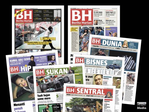
Don’t miss today
Mashable redesign is smashing!
http://www.garciainteractive.com/mashable_redesign
Highlight:
Mario Garcia Jr. reviews this newly launched redesign of Mashable and mentions an important point: give any new redesign time to evolve before you review it!
– USA: Register owner buys O.C. magazine group Churm Media
http://www.ocregister.com/articles/churm-380386-register-orange.html
– USA: Is Aaron Kushner the Pied Piper of Print? Can the novice publisher save The Orange County Register and transform journalism in the process?
http://www.ocweekly.com/2012-12-13/news/aaron-kushner-the-orange-county-register-freedom-communications/
– #Podcast: Industry experts share predictions for digital journalism in 2013
http://blogs.journalism.co.uk/2012/12/14/podcast-industry-experts-share-predictions-for-digital-journalism-in-2013/
– Newspapers will put themselves out of business if they take advice from commentators who are telling them to become “more like” new media
http://aboutmediaecon.blogspot.fr/2012/12/newspapers-will-put-themselves-out-of.html
– From Funny Pages to Front Page: an interview with the founders of Symbolia
http://knightcenter.utexas.edu/en/node/12318
Take advantage of our iPad Design/Ad Lab workshops
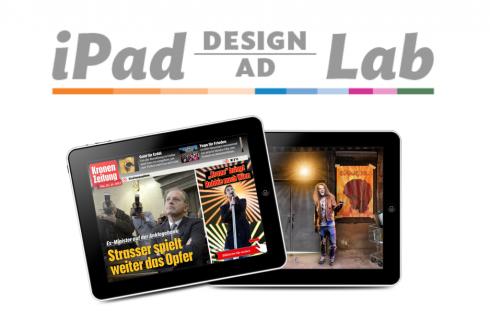
Do you want to take your brand to the next level by creating a tablet edition? Garcia Media can help. We now offer one- to two-day iPad Design Lab workshops on demand to jumpstart your presence on this exciting new platform. We also offer iPad Ad Lab workshops to develop engaging advertising models for your app. Contact us for more information.

Purchase the book on the iBookstore
The EPUB version of book is HERE:
Now available: The EPUB version of iPad Design Lab: Storytelling in the Age of the Tablet, ready for download via Amazon.com for Kindle:
http://tinyurl.com/8u99txw.
Take a video tour of iPad Design Lab
“iPad Design Lab” trailer on Vimeo.
Read the Society of Publication Designers’ review of The iPad Design Lab here:
http://www.spd.org/2012/10/must-read-ipad-design-lab.php

Keep up with Mario Garcia Jr.. via Garcia Interactive: helping transform online news since 1995.
www.garciainteractive.com
Here’s a gift you don’t have to wrap!

It’s official. The Christmas/holiday shopping season is here.
Here is a suggestion for someone on your list: my digital book iPad Design Lab: Storytelling in the Age of the Tablet. No need to stand in line nor buy wrapping paper. Just send it to someone you think might enjoy a book about this magnificent new platform we call the tablet and how to maximize its potential for storytelling.
Here is how you can get the book:
The original version of the book is the multitouch textbook version available on the iBookstore for iPad (iOS 5.0 and up): https://itunes.apple.com/book/ipad-design-lab/id565672822. This version includes video walkthroughs, audio introductions to each chapter, swipeable slideshows, a glossary and a sophisticated look and feel.
Apple only sells multitouch textbooks in certain countries at this time, unfortunately. Copies are available in at least the following countries: Australia, Austria, Belgium, Canada, Finland, France, Germany, Great Britain, Greece, Italy, Latvia, Luxembourg, The Netherlands, Poland, Portugal, Romania, Slovakia, Spain, and the United States.
For those in other countries and without an iPad, we have made the book available in a basic edition for other platforms. This basic edition includes the full text of the original, along with the images and captions, but lacks the other features such as audio and video. It is available on the following platforms in many countries:
Amazon Kindle: http://amzn.to/SlPzjZ
Google Books: http://bit.ly/TYKcew