TAKEAWAY: With a title as provocative and inspiring as Power to Designers, the conference in Warsaw, Poland, took participants through the paces of the role of design (and technology) from print to screen to street.
If there was a recurring theme of the Power to Designers conference Tuesday, this was it: break the rules, question what is, dismantle, clash and the results are often amazing. This is where Power to Designers resides.
A second theme of discussion among the designers off stage: what role does technology play in the creative process? Has technology now moved beyond what our brains can reasonably process? How is that affecting our creative work?
The answer was a resounding: use the full potential of the technology as it impacts your project, but let the creative process be the guiding light. Don’t overdo, don’t overdesign simply because the technology allows you to do it.
My own take on this: I use the technology, I don’t let it use me. The more I work with digital platforms, such as editioning for mobile phones and tablets, the more I am impacted by the combination that is a process of storytelling and creativity first, then technology second.
Power to Designers conference highlights
Jacek Utko, conference organizer/moderator and Design director at Bonnier Business Press International
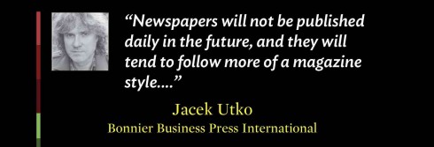
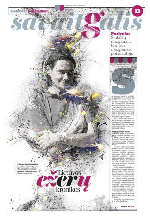
Jacek cited this Lithuanian business newspaper, Verslo Zinios, as an example of a daily transitioning effectively to a more magazinish look
Jacek’s takeaway: Newspapers need to turn to magazines for inspiration, while avoiding complex designs that are difficult to execute day to day.
Jacek mentioned that he believes newspapers will not be published daily in the future, mostly weekends, perhaps.
He referred to newspapers in Germany and Lithuania which are putting more emphasis on magazine storytelling and design, but with strong local emphasis.
One tip from Jacek for designers: don’t just look for inspiration in newspapers and magazines, go outside to get visual inspiration from other sources as well, including digital.
.
Carlos Monteiro: Infographics Editor from Portugal’s ‘i’
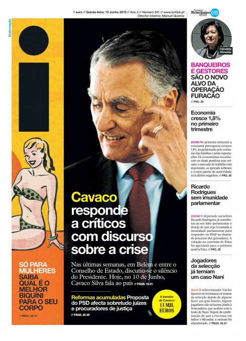
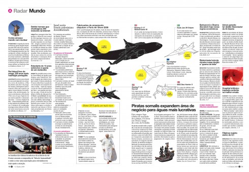

These pages from Portugal’s i, the award winning daily, show the level of sophisticated visual storytelling that characterizes the newspaper
Carlos’ takeaway: “At i newspaper, we believe in variety”
Carlos showed a variety of outstanding pages, where photos, illustrations and graphics play a key storytelling role. Carlos advice to editors: Get reporters and graphics people together.
Second important tip: create tempos within the newspaper. For his newspaper, i, one section called Radar Mundo (World Radar) full of quick takes for reaffirmation news, while Zoom is devoted to longer texts. “Here is where we prepare the reader for a calmer reading rhythm—but it is a challenge to do this everyday. Difficult to maintain high level of creativity daily,” he said.
A highlight of “i” is that not two front pages are alike. Photos, illustrations, fact boxes, they could all be a visual lead here. The reader is taken by surprise, seduced instantly, really managing to strike a fabulous visual balance between the newsy world of newspapers and the visually appealing look of magazines. The logo is playful and on wheels, moving around the page with ease.
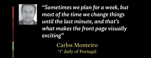
Planning: “Sometimes we don’t plan too much, we change things in the last minute; sometimes we plan for a week, but we are used to make changes quickly,” Carlos said.
Reality: Power to Designers in Carlos newsroom means saying NO sometimes; reporters may ask for something that it is not possible to do, or nothing special about a story that reporter wants to do something with.
Marek Knap: art director Edipresse
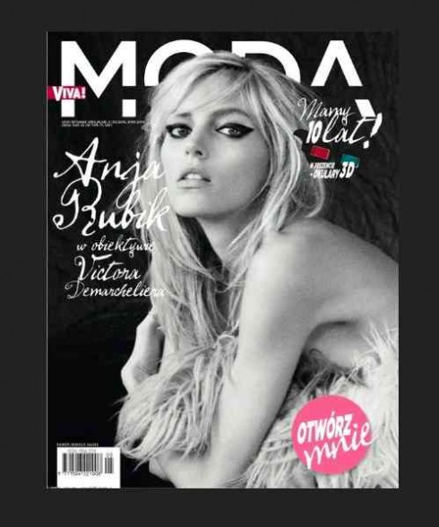
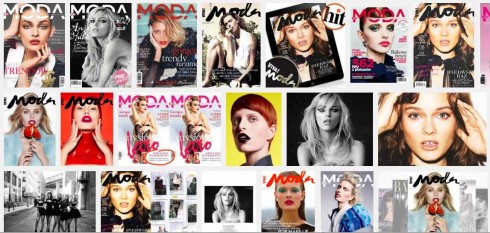
Marek applies his “dismantle” philosophy to the pages of Viva Moda magazine, which he art directs
Marek’s takeaway: Dismantle thru the rules and surprises will happen
Marek maintains that there is a constant clash of cultures, of knowledge, that designers must cope with.
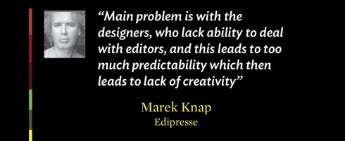
“The longer I deal with this business, the more isolated I feel from outside world. It’s a paradox, ” he said. “Main problem is with the designers, who lack ability to deal with editors, and this leads to too much predictability which then leads to lack of creativity.”
Marek showed one of his projects, Viva Moda, a fashion magazine.
He is concerned that designers spend too much time behind their computers, and not in touch with the real world. “Laziness, prevents creativity,” he said.
How can designers gain inspiration?
“Look around, take in your surroundings,” he advised. Or, better yet, he said “reverse the process, dismantle it, bring conflict to the modular process.”
He added: “Let’s change how we design, learn how to assemble things from different perspective.”
When we dismantle, we place things in not obvious areas/places, designing is about knowhow, where dismantling is the opposite, it is asking questions, opposing to the know how, being creative and translating something to the creative level. Dismantling is about emotions. I went to the Willem de Kooning exhibition and was inspired by the intensity of Black and White Rome one ho2 I translated my impression in a VIVA MODA spread. Dismantling allows for us to go beyond the rules, the modules. It’s a good disruption.
Edgar Bak: One of Poland’s up and rising designers, specializes in visual identity and posters.
Edgar’s takeaway: Find that graphic element that stands out in an Internet world where we are bombarded by images.
The Internet has created many opportunities for graphic designers, but also has bombarded us with graphic images. Requires that we pay more attention to visual language.
Sometimes you have to break the rules for things to happen.
Patrick Waterhouse: Creative director in Colors magazine for Benetton group
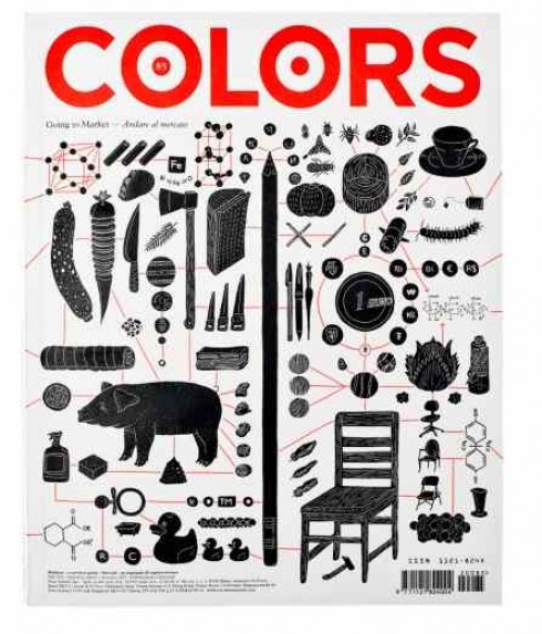
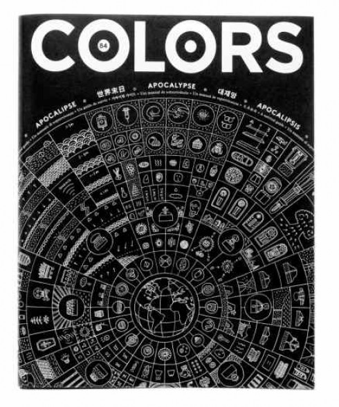
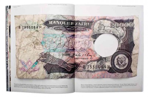

Colors magazine: topics that inform and surprise, design that breaks through and challenges the classic style, while creating its own
Patrick’s takeaway: Simple visual language is the key to make the world’s most complex problem easy to grasp. He does that at Colors of Benetton magazine.
Perhaps one of the most fascinating presentations at the conference, this one showed Patrick’s creative and visually exciting work with Colors, a magazine with an attitude, a mission, and topics that are not what you usually find elsewhere.
Patrick’s Colors creates survival guides for a variety of topics from Shit to Happiness (no kidding). But it is all fun to look at even though the subjects are serious and deserve our attention. Shit survival guide was all about sanitation and the importance of making sure that children in the third world have access to clean everything. Happiness survival reviews our mental processes and what determines our being happy or sad.
Huncwot: Run by Lukasz Knasiecki, Arek Romanski and Adam Widmanski
Takeaway: We have seen tremendous technological development the past two years, and responsive design now permits us to create a design that adapts to whichever device users engage with!
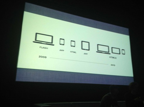
Showing technological progress from Flash to html5
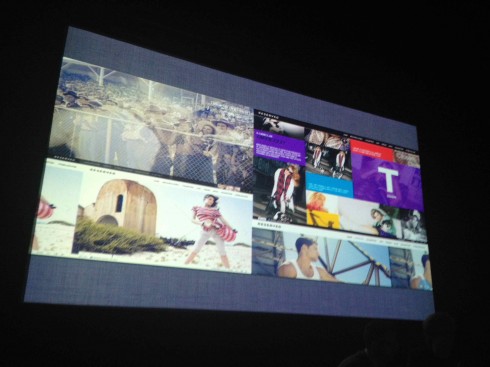
From phones to websites: emphasis on design that promotes e commerce
They reviewed the historical technological sequence from Flash to app to html to apps to html5, and how it has affected the work they do for websites and mobile device apps.
“Technology is giving us real opportunities as designers today, solutions we could not have thought about only a year ago, and we are learning and applying as quickly as we can,” they said.
As most other presenters in the conference, the guys from Huncwot emphasized the importance of grids as the foundation of work across all platforms.
Grids are important for responsive design, they said. “Remember that the design will look the same and will adapt with 1000 pixels difference between phone and online, for example.”
David Eriksson: CEO and creative director of North Kingdom
My favorite of the North Kingdom projects presented, take a look at ROME: “WebGL: The Technology Behind ‘3 Dreams of Black’”
See North Kingdom’s Adidas project
https://www.adidas-archive.org//#/home
David’s takeaway: Use the technology to its full potential, but don’t let it keep you from pushing yourself creatively. Vibrant storytelling that engages thru audio, video, animation, but always with a story that touches on the emotions.
Ericksson and his team at North Kingdom (www.northkingdom.com) are working for Adidas, Disney, Google, Lego, Coke Zero, Diesel, Absolut, Vodafone, AT&T, Toyota, LG, Sony & Ericsson.
Talk about storytelling at various levels of execution, these guys at North Kingdom, in northern Sweden, the so called land of the midnight sun, do have it. Every single project is about a story first, appealing to all the senses and to emotion. I was telling David after his presentation that I was hard pressed to choose one of his projects to show here. All had a dimension that I wanted to highlight.
A sidebar: My presentation came before David’s and I showed how we scope the sequence of a news app design on the wall, on paper. “We do, too, Mario,” he said. “We do paper dummies at the start of every project.”
You see, paper lives and thrives at the moment of conception even in the most digitally oriented projects. Nothing beats those marker and paper sketches you can hang on the wall and discuss, put stickies on and then retrieve to your digital devices to complete the project.
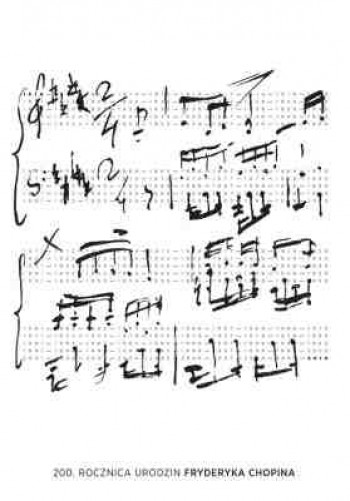
Michal’s award winning poster for the celebration of Chopin’s 200th birthday
Michal’s takeaway: Poster design and conceptualizing, the truth wins.
Michal’s explanation of how he conceives his idea was a highlight of his presentation, especially when discussing a poster he created for the 200th anniversary of Chopin’s birth.
“I remember that I wrote down 200 years plus music plus Chopin, and I knew that music and mathematics would mix well, and that I did not want the image of Chopin, which has been seen so much, to be the dominant in the poster,” he said. “The result was just an info graphic poster.”
Indeed, Michal created the pentagram musical bars, but made of numbers, as in the 200 dates from Chopin’s birthday to today. ,Simple, impactful, and not something anyone would have seen before.
WWAA: Architects Marcin Mostafa and Natalia Paszkowska are founders of WWAA studio, that won a competition for designing Polish pavillion at Expo 2010 in Shanghai
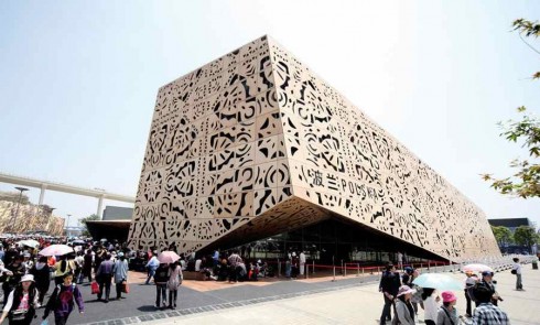
The team from WWAA designed the Polish Pavillion Expo 2010 in Shanghai
Takeaway: Today’s architects must show their work not just to owners and investors, but to the people. Street design comes to the people level.
Marcin and Natalia explained how they now promote their projects via videos to show to clients when they pitch projects.
The designers in the room could identify with these two young and inspiring architects who showed splendid projects, then mentioned the realities in going from conceptualization and mock ups to the construction phase of the project.
“That is when the problems usually start. WE may have one plan that we have conceived carefully, but when the real building begins, things unravel and we must adapt,” Natalia said.
It is pretty much the same for us media designers going from concept to implementation.
What I learned
As I spent the last two days with the talented team of designers who participated in the Power to Designers conference, I reached a few conclusions that I share here:
1. Whether we are architects designing monumental building structures, or graphic designers conceptualizing posters, or digital wizards bringing animation and high level cutting edge technology to our work, we all begin with an idea and it is that idea that somehow survives through the obstacles that are part of the process. It is that first rush of creativity that takes over, saves the day and shines at the end.
2. All designers face moments when staring at a blank page or screen can be the most intimidating, horrifying experience of all, sort of being held hostage by a stranger whose face is covered and whose hands press hard on our brain.
3. Technology advances faster than we could ever advance ourselves, so it is either the white elephant in the room, or the lap cat that we pet, return to its cozy bed as we move on and do our thing.
4. In the end, our best ideas, our most exciting work must pass the final test of how those who commissioned it rate it, and, of course, how those for whom it was intended receive it.
5. More than technology, compensation and anything else, it is PASSION that drives us.
In the meantime, nobody can possibly have a more exciting job and nobody in the room would have traded it for anything else.
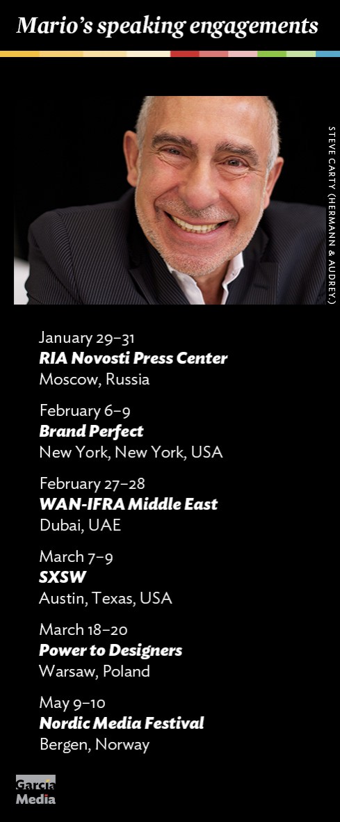
Where’s Mario until March 21, 2013?
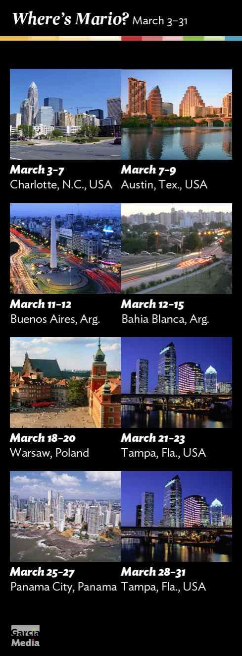
Mario’s upcoming speaking engagements
Take advantage of our iPad Design/Ad Lab workshops
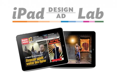
Do you want to take your brand to the next level by creating a tablet edition? Garcia Media can help. We now offer one- to two-day iPad Design Lab workshops on demand to jumpstart your presence on this exciting new platform. We also offer iPad Ad Lab workshops to develop engaging advertising models for your app. Contact us for more information.

Purchase the book on the iBookstore