TAKEAWAY: For the millions who try to access the Obamacare website, there is an element of frustration in the process; experts tell us the design of the website has failed. Did the design fail? How does one define “design”? AND: It’s a race for global brand distribution and recognition for the world’s leading English-language dailies.

Home page for the Obamacare website
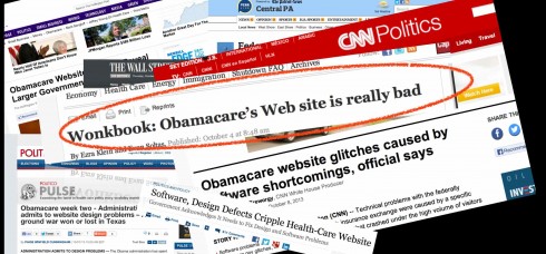
The headlines globally have not been kind to the Obamacare website
Design.
Information Architecture.
Technology.
The three pillars on which a website flies or crashes.
For the much discussed ObamaCare website all three are blamed, at different times by various sources, as the culprit for the many glitches that have kept millions from the simple act of just logging in.
Did all three of the pillars fail? If so, what has caused what some critics describe as a “train wreck”?
The Wall Street Journal recently started an editorial headlined Obamacaid in the October 10 edition this way:
ObamaCare’s website is so poorly designed that it’s not clear how many Americans have been able to sign up.
It blamed the design for the glitches that have plagued the ObamaCare website since its first minute of operation October 1.
Just Sunday The New York Times’ lead story was headlined:
From the Start, Signs of Trouble at Health Portal. The article summarized the problems with the ObamaCare website:
For the past 12 days, a system costing more than $400 million and billed as a one-stop click-and-go hub for citizens seeking health insurance has thwarted the efforts of millions to simply log in. The growing national outcry has deeply embarrassed the White House, which has refused to say how many people have enrolled through the federal exchange.
From the media to technological experts (who have been paraded two to five at times to present their diagnosis), to even comedians (Jon Stewart among them), the ObamaCare website is getting a grade of D+ at best and an F by many, depends on who you ask for a rating.
Even Jon Stewart of ‘The Daily Show’ made fun of the website and its problems. Last week, Stewart had Health and Human Services Secretary Kathleen Sebelius as a guest and the host “bet that he could download every movie ever made before she could log on to the ObamaCare website.”
The site’s problems “are real”
Obviously, there are problems. Every website ever launched had to cope with glitches at the start. However, not every website ever launched had millions waiting at the door to come to try it, as ObamaCare‘s website did.
Seven million visitors came to HealthCare.gov in the first two days. Nine million had passed through by Friday of last week.
“They have a Web site that almost nobody has been able to successfully use. If Apple launched a major new product that functioned as badly as ObamaCare‘s online insurance marketplace, the tech world would be calling for Tim Cook’s head,” wrote Ezra Klein and Evan Soltas, of The Washington Post.
They added:
The site’s flaws are real
and if there was more focus on them, they’d be quite embarrassing.
An insurance executive quoted in the NYT’s piece said:
These are not glitches. The extent of the problems is pretty enormous. At the end of our calls, people say, ‘It’s awful, just awful.’
As you would expect, even (especially?) lawmakers have something to say about the ObamaCare website. Indeed, House and Senate Republicans are investigating the problem-ridden rollout of ObamaCare after administration officials downplayed technology flaws with the federal health overhaul website.
“We are concerned by recent comments to the media that the system suffers from architectural problems that need design changes,” the lawmakers wrote. “We seek information about these problems as well as whether you still expect individuals to suffer a tax penalty if they do not purchase government-approved health insurance.”
Just Tuesday, President Obama himself expressed his disappointment to CNN with the way the Obamacare website is NOT doing its job efficiently:
“I am the first to acknowledge that the website that was supposed to do this all in a seamless way has had way more glitches than I think are acceptable and we’ve got people working around the clock to do that,” Obama said. “We’ve seen some significant progress but until it’s 100% I’m not going to be satisfied.”
How does one define design in the digital age?
What would a newspaper or magazine publisher do if it encountered this barrage of problems with its newly minted website?
They would probably get their IT team to work round the clock to solve the issues. They would also have editors and columnists explaining the problem to readers and reassuring them that help was on the way.
It would be a combined public relations/damage control campaign with a robust technological team review of the situation.
Obviously, while it is not even fair to compare the HealthCare.gov and a newspaper website, the issue that interests me about the subject is how the word “design” is used by a variety of sources.
This ObamaCare website controversy affords us an opportunity to go back to definitions of the term design.
I personally do not believe that in all cases people are referring to “bad design” in the aesthetic sense when referring to the failures of the ObamaCare website. The HealthCare.gov site is clean and visually appealing but NOT functional.
The word design seems to be utilized here to imply technical aspects of the site, how it was “technically designed” perhaps, or how it wasn’t “designed” to accommodate the avalanche of millions who came in to use it.
When we list the three pillars of creating a website as design, information architecture and coding, we see those three as very different and necessary areas. To many, the term design is all about the look & feel, which has nothing to do with technical details that could make the website less than functional.
However, and we may look favorably towards this, “design” in its purest definition is the totality of something that looks good and is functional—that it does what it is supposed to do well.
In that sense, the beautifully designed cover of a magazine that also navigates us to inside content in an efficient manner constitutes excellent design. Same applies to a newspaper front page, or any page. And, of course, this extends to a chair or a tablet (a concept that those folks at Apple understand and apply well)
When design works, the eyes are happy (or mesmerized), but so is the brain. Design has accomplished its mission when things look and work well.
In the midst of a government shutdown and all the political controversies surrounding ObamaCare and Washington generally, it may appear a trivial point for us to deal here with definitions of “design” .
However, we don’t think ObamaCare‘s website represents a visual failure, but, perhaps, a failure of code.
Try to explain those nuances to the millions who are having trouble just simply logging in at the ObamaCare website.
Of related interest:
ObamaCares’ website is really bad
http://www.washingtonpost.com/blogs/wonkblog/wp/2013/10/04/wonkbook-obamacares-web-site-is-really-bad/
Healthcare technology analysis
http://www.reuters.com/article/2013/10/05/us-usa-healthcare-technology-analysis-idUSBRE99407T20131005
Glitch-filled launch of ObamaCare site decried as train wreck
http://www.foxnews.com/tech/2013/10/10/glitch-filled-launch-obamacare-site-decried-as-train-wreck/
Launch of ObamaCare becomes the butt of late night jokes
http://www.1800politics.com/launch-obamacare-become-butt-late-night-jokes/
The race for global supremacy among English-language iconic newspapers
First day front page under new name/logo

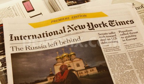
International New York Times replaces International Herald Tribune as name of global newspaper published in Paris
As of this week, it’s a new name, new logo for the newspaper formerly called International Herald Tribune, which now is a global extension of The New York Times, not just through content but also in name.
Starting this week, the new logo proclaims the name International New York Times.
By moving in this direction, The Times continues to advance its goals of becoming the premiere and most authoritative English language voice for news globally. But The Times is not alone in such pursuits. The editor of The Guardian, in the UK, aspires to a similar status for his newspaper, and, within the financial journalism field, both The Wall Street Journal and The Financial Times are in the race.
I keep thinking that the next media company to announce its global ambitions will be The Washington Post, via its new proprietor, Jeff Bezos.