TAKEAWAY: It’s a new logo and design for the legendary music magazine, Billboard. Gone is the colorful Jim Parkinson logo that dates to 1963; in is a clean, minimalist one by Pentagram.
PLUS: We take the opportunity to discuss what happens when our redesigns are redesigned!
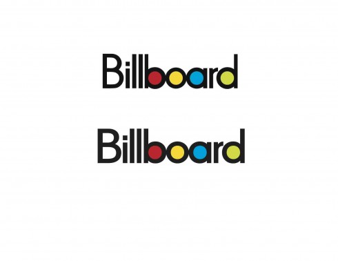
Top, the original 1963 Billboard logo; below, the retouched logo, a collaboration between Jim Parkinson and Josh Klenert
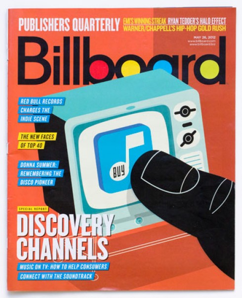
Billboard in its old design
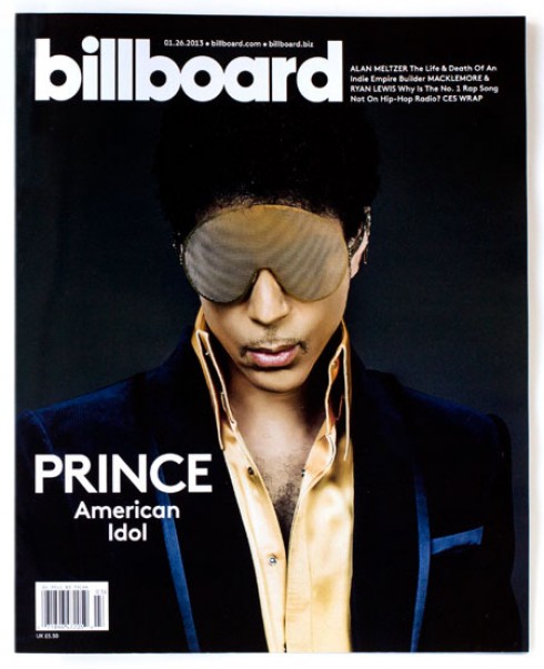
The new design and logo for Billboard
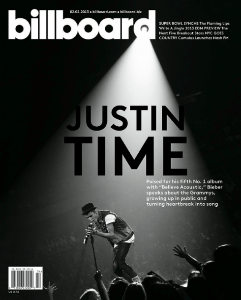
Cover of the February 2 edition of the new Billboard
Billboard, the music business’ magazine, has just rebranded itself across platforms, an impeccable remake in the hands of the Pentagram studio.
The new Billboard sports a different logo: minimalist, clean, classic, and without the colors in the bowls of the o’s that were made famous in the 1963 Jim Parkinson original, and later in a collaboration between Parkinson and Josh Klenert. The color version of the new logo will be used in the online edition and for marketing purposes, not in the print magazine.
One interesting observation: while the old logo used a capital B for Billboard, the new one goes all lowercase.
It is quite appropriate that I just wrote a blog post about change and how we usually can benefit from it, so this change is welcome, and it will give Billboard a new life and attract another generation of music enthusiasts to its content via all the platforms.
I like what I see and, while I will miss the colorful Parkinson logo, I know I will also get used to this one. We move on.
My colleague Roger Black thinks that ” it looks like they wanted it more “business” and less “entertainment.” But it still is “Billboard.”
What happens when your redesign is redesigned?
For me, what is interesting here is the thought of how one feels when his original concept is redesigned. Happens often, as it should.
I have been there, done that, and I admit that the first reaction stings momentarily, as when you get a flu shot.
Later, as you think of how long your creation was there, and how well it served its purpose for a specific time and place, then you come to terms with the notion of change.
Almost nothing is forever, and that applies to logos and to design concepts, too.
There are several stages of evolution in the design work that we do.
First, the concept is introduced, usually to a satisfactory reception, then it stays in place almost exactly as the style guide suggests.
Second, the evolution of the new design begins, sometimes three years later (in today’s environment, much sooner). Editors come and go, so do art directors. One of the ways editors and art directors mark their spot and impose their presence is by, you guessed it, “making changes in the redesign, which is a little dated.”
Third, sometimes after 7 years or longer, it is time for a new design. Just like we get tired of the same shoes and ties, we get tired of the same look. For us, about 80% of what we do is return business, so we find ourselves redesigning our redesign, which can be fun, but nonetheless a little painful. Sometimes, the management decides to bring in a new design firm, which is fine, too. That is when real changes come in, when the historical visual chain is broken, and you start at point zero.
Eventually, the new product comes out, looking nothing like what you had done. That is the moment that stings a little.
Then you ask yourself: Do you wear the same shirts that you did when you redesigned that publication? Of course, not. So, time for change and something new.
I usually do not comment on the work that has been done to one of my previous projects. It is professional not to do so, and, in many cases, the new work represents the stage at which that publication should be in the present.
Jim Parkinson has sent us the original 1963 Billboard logo, and the more recent one in collaboration with Josh Klenert that you see here.
For now, it is a new visual identity for Billboard and we know for sure that this one, too, will undergo changes, as it should.
Billboard project team
Michael Bierut, partner-in-charge and designer; Laitsz Ho, Michael Deal, Lisa Maione, Deva Pardue and Jessica Svendsen, designers.
Of related interest
*Josh Klenert writes about the Billboard redesign*
http://www.spd.org/2013/01/billboard-redesign.php
Josh offers a rich trip down memory lane with Billboard covers dating back to 1896
Another view on the Billboard redesign:
http://www.underconsideration.com/brandnew/archives/billbold.php
Pages we like
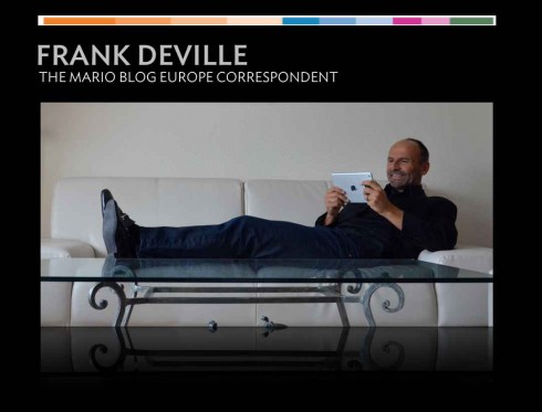


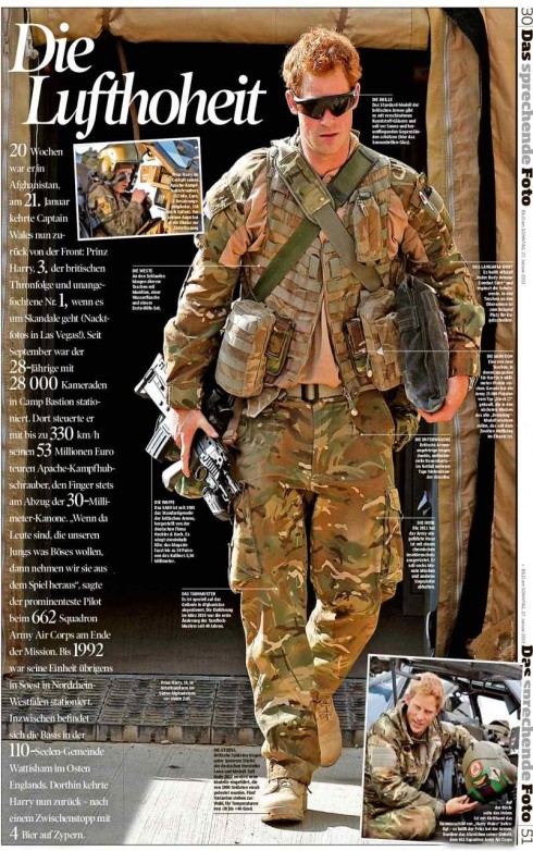
Our European correspondent Frank Deville picks these pages from Bild am Sonntag
Two double page spreads are devoted to the subject of wrinkles, with the poetic headline: Wrinkles: Memories of the Skin.
A double page (that you need to turn vertically) carries a photo of Prince Harry in military uniform, then offers detailed descriptions of everything he carried out his duties as an Apache helicopter pilot with the Army Air Corps in Afghanistan.. Headline: Air Supremacy.
American Airlines’ brand redesign: another view
Something Lousy in the Air: Analyzing American Airlines’ Disastrous Redesign
http://www.vanityfair.com/online/daily/2013/01/analyzing-american-airlines-disastrous-redesign
On our January 19 blog post, we discussed American Airlines’ rebranding.
Here is another take on the redesign of American Airlines’ brand, this time courtesy of Vanity Fair’s Paul Goldberger.
He did not like it much. Here is a highlight from his review:
The airline just unveiled a new design—oops, sorry, I meant to say “new branding”—that replaces the Vignellis’ classic design with a tiresome, rather trite abstraction of the American flag on the tail, the American name in gargantuan gray letters on the fuselage, and a bizarre new logo that abstracts the eagle into nothing more than a disembodied, curving white beak that looks like it is ripping into a field of blue and red.
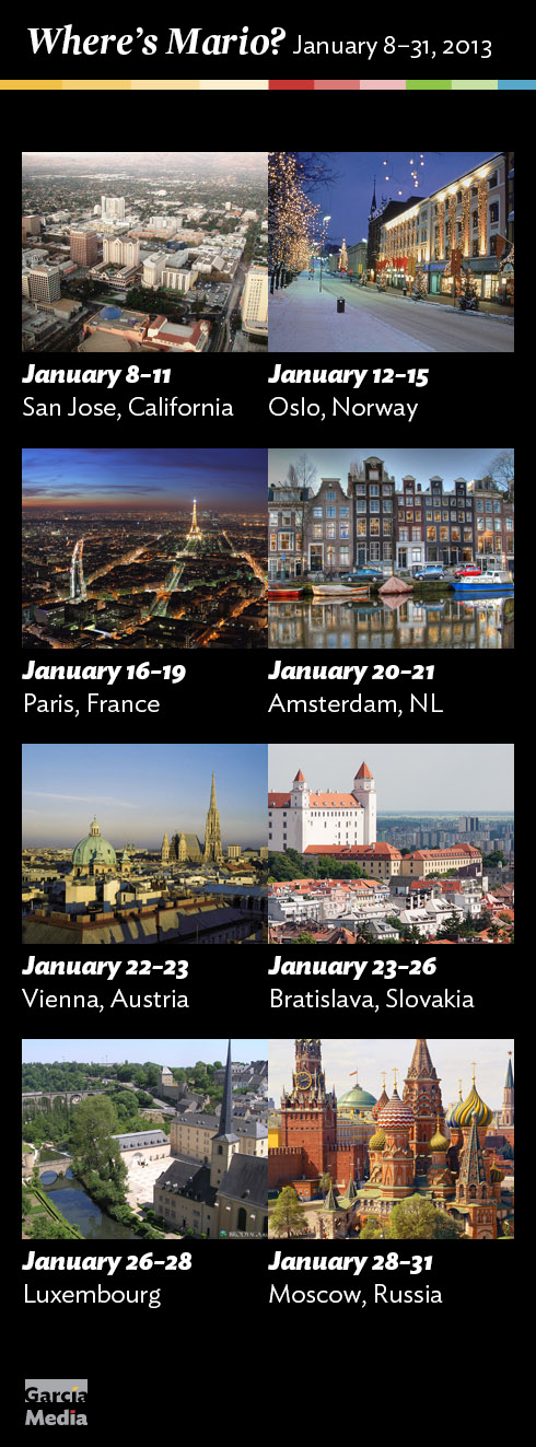
Where’s Mario?
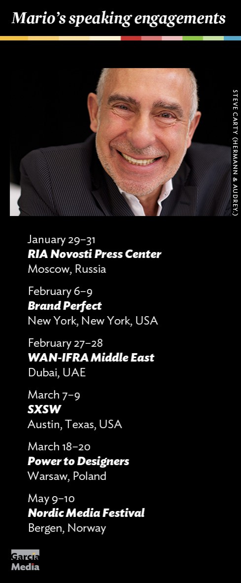
Mario’s upcoming speaking engagements
Take advantage of our iPad Design/Ad Lab workshops
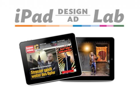
Do you want to take your brand to the next level by creating a tablet edition? Garcia Media can help. We now offer one- to two-day iPad Design Lab workshops on demand to jumpstart your presence on this exciting new platform. We also offer iPad Ad Lab workshops to develop engaging advertising models for your app. Contact us for more information.

Purchase the book on the iBookstore
iPad Design Lab has been given the QED Seal
The QED (Quality–Excellence–Design) Seal is bestowed by the judges of the Publishing Innovation Awards after “a thorough, professional 13-point design review with an eye towards readability across multiple devices and in multiple formats.”
Learn more about the QED Seal here.
The EPUB version of book is HERE:
Now available: The EPUB version of  iPad Design Lab: Storytelling in the Age of the Tablet, ready for download via Amazon.com for Kindle:
http://tinyurl.com/8u99txw
Here is how you can get iPad Design Lab book:
The original version of the book is the multitouch textbook version available on the iBookstore for iPad (iOS 5.0 and up):
https://itunes.apple.com/book/ipad-design-lab/id565672822
This version includes video walkthroughs, audio introductions to each chapter, swipeable slideshows, a glossary and a sophisticated look and feel.
Apple only sells multitouch textbooks in certain countries at this time, unfortunately. Copies are available in at least the following countries: Australia, Austria, Belgium, Canada, Finland, France, Germany, Great Britain, Greece, Italy, Latvia, Luxembourg, The Netherlands, Poland, Portugal, Romania, Slovakia, Spain, and the United States.
For those in other countries and without an iPad, we have made the book available in a basic edition for other platforms. This basic edition includes the full text of the original, along with the images and captions, but lacks the other features such as audio and video. It is available on the following platforms in many countries:
Amazon Kindle:
http://amzn.to/SlPzjZ
Google Books:
http://bit.ly/TYKcew
Take a video tour of iPad Design Lab
“iPad Design Lab” trailer on Vimeo.
Read the Society of Publication Designers’ review of The iPad Design Lab here:
http://www.spd.org/2012/10/must-read-ipad-design-lab.php

Keep up with Mario Garcia Jr.. via Garcia Interactive: helping transform online news since 1995.
www.garciainteractive.com