TAKEAWAY: Here is one website that I like and I am sure you would too: lots to learn from Nautilus about simplicity, functionality and, of course, interesting storytelling.
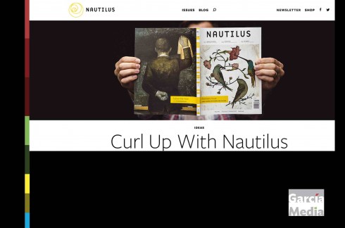
In case you have not seen it yet, take a look at Nautilus.
Nautilus is a new magazine on science, culture, and philosophy. It now publishes a print version quarterly, a happy phenomenon of publications that are born purely digital, but then expand via print. A good thing when the publishers and editors are thinking of the ever growing power of disconnect which mostly print affords.
The magazine aims to inform its readers about science and its connection to our lives.
Each month, editors choose a single topic. Each Thursday, they publish a new chapter on it. Astrobiologists stand next to neurologists and fiction writers. Artists illustrate archeology. There are essays, investigative reports, and blog posts; interactive games, interviews, videos, and graphic stories.
All of this content revolves around the single monthly topic. As the editors describe it:
To us, science spills over the borders that are usually built around it. You’ll see that in our pages. At Nautilus, the world’s leading scientists, writers, philosophers and journalists join in a conversation unlike any in science publishing – all with sumptuous, custom illustration.
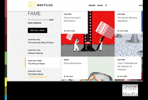
This month’s topic is all about Fame. Now running is Chapter 3: The Price of Fame. In the Culture section, a piece about Justin Timberlake and the Whoever of Whatever.
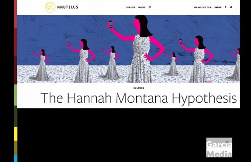
Take a look at the home page and right there on that first home page one finds a full navigator to what to expect inside, and, while the headlines are small (and seductive), the visuals are prominent and enticing.
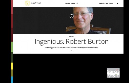
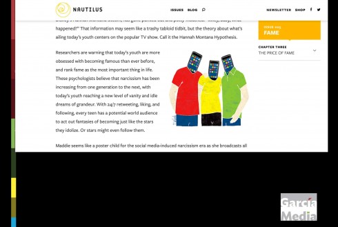
The article read page is clean, with easy to read type, plenty of spacing around all the elements and the same overall minimalist approach that gives Nautilus its fresh and appealing look.
Why can’t more news websites be as simple and appealing as this?
Is it because they try to be like their print editions too much?
As we at Garcia Media work hard to rethink our own website, I find many interesting features of Nautilus that I hope will also be evident when we unveil our new website hopefully before the end of the year.
By the way, Nautilus’ website design is not necessarily a replica of what it would be in print, mainly because Nautilus did not exist in print when it was created. I find it that organically digital publications don’t seem to have the urge to replicate their digital look when they go to print, something we can’t say with precise accuracy about the other way around.
Check out Nautilus:
http://nautil.us
Best of News Design
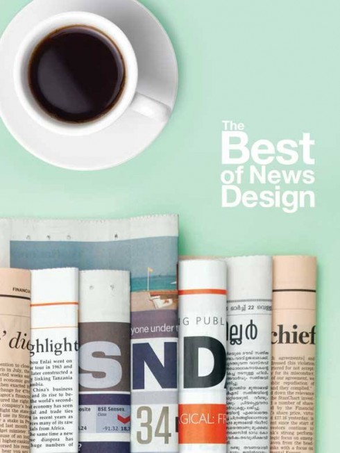
That ultimate book of design inspiration, The Best of News Design, is here in its new edition.
Cover design by the super talented Osama Aljawish of Times of Oman and Al Shabiba.
The Best of News Design 34th Edition (Best of Newspaper Design) (Hardback)
http://www.bookdepository.co.uk/Best-News-Design-34th-Edition-Society-for-News-Design/9781592539420?b=-3&t=-20#Fulldescription-20