TAKEAWAY: In the UK The Daily Mail is an iconic newspaper with a huge following; now Mail Plus takes that content, adds interactivity and carries its appeal to a new generation of readers.
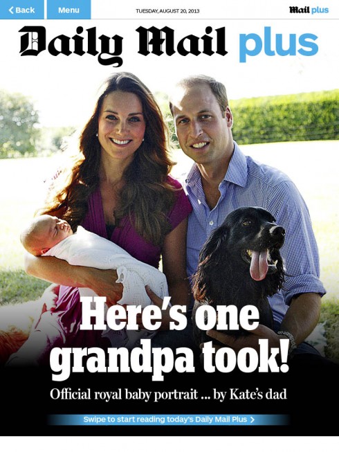
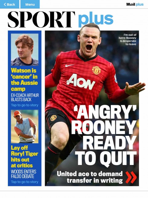
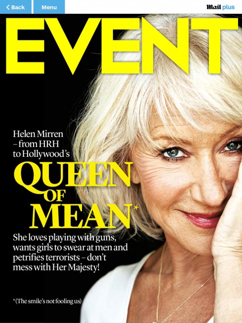
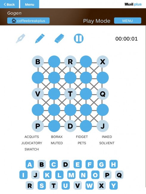

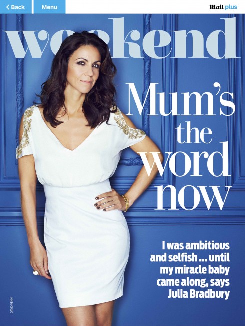

Shown here: Daily Mail Plus cover, Sport Plus cover, a typical puzzle (Gogen), TV Plus cover, plus 3 magazines – Weekend (Saturday), You and Event (both Sunday).
The look and feel are familiar: the big headlines that cover half the screen, the photographs and the people oriented content. But, Mail Plus does more than that: it publishes 30 daily interactive crossword puzzles, huge 360 degree photographs, a daily section on shopping and much more.
In the process, says Paul Field, editor of Mail Plus, not only are they attracting new readers, but converting many of the millions of traditional, devoted readers, to read on the tablet.
Paul Field presented a case study of Mail Plus during the WAN IFRA World Publishing Expo 2013‘s 6th Annual Tablet & App Summit in Berlin this week.
“Let’s face it, the typical Mr. and Mrs. Mail readers are about 58 years of age,” says Paul. “But they are cosmopolitan, tech savvy and have the money to spend, so we welcome them to Mail Plus.”
Mail Plus and multimedia
The Daily Mail takes multimedia to the next level, as in a recent edition in which they decided to be truly a “lean back” experience, according to Paul.
They started the tablet edition with music that the editors suggested users kept on while perusing through the pages of Mail Plus.
We wanted people to relax and listen to music.Fantastic reaction. People loved listening to music while interacting.
In this case, lean back became lie back. For editor Paul, this is a long time coming. He related how 18 months ago he was given the challenge to start a tablet edition for one of the UK’s most revered daily newspapers.
His mandate: Reimagine the mail on a tablet.
“It was quite a challenging undertaking,” Paul says. “It was not just a daily newspaper, but a very extensive weekend package, complete with two magazines.”
“We bring cinematic quality to those magazines, with animation videos to introduce them and to differentiate it from what we do in print,” Paul said.
From the start, Paul and his other colleague assigned the task of starting the tablet edition decided they would create what he describes as ” a compelling extension of our print brand.”
Because the audience is different and so is the platform, the design needs to be different, Paul said.
The results?
Readers have loved it, Paul told me. “Revenues are growing for what is already a popular newspaper brand. We have 134 million unique browsers, 10.6 million daily uniques and4.6 in the US daily and growing.”
Paul says that the Daily Mail already has the biggest newspaper website in the world. So, a question some asked was: When you have a website with global reach, why would you launch a paid for tablet edition?
Paul says that Mr. and Mrs. Mail are the reason.
“The average age of Mrs Mail is 58. They are cosmopolitan, have money to spend, UK centric and they LOVE the printed paper,” Paul said.
So, while holding on to Mr and Mrs Mail, the idea of the Daily Mail is to attract a completely different younger audience.
But, in addition, they are aware that even Mr. and Mrs. Mail have started to love iPads, Galaxy tablets, Kindles. “We know that they love technology, and especially the tablet,” Paul said. “So we saw great potential in older readers loving tablets as well, and they have.”
The Daily Mail‘s biggest challenge?
The Daily Mail online is free. So, asked Paul, “how are we going to get Mr. and Mrs. Mail to come to Mail Plus?”
The answer, new content tailor made for the iPad: a section called coffee break, plus 30 interactive puzzles, daily
TV Plus. These extras have made the tablet edition richer and of more service.
Then came time to create a prototype, to create a look & feel.
“What we have done is to stay close to the look and feel of the printed paper,” Paul said. “Relationship between photo and headlines is same as paper. A single color ties it all together—-the color blue implies interactivity.”
The Mail Plus tablet edition includes a favorite feature with readers: The 360 Panorama, a photo gallery. In addition, there are also shopping pages daily, which do not appear in print.
I asked Paul for some tips for those considering the start of a tablet edition for their newspaper:
Be realistic about a launch date and don’t share it with anyone until you’re 100pc confident you’ll meet the deadline. I said we’d launch the iPad app last November, then I revised it to Christmas, then early January. We launched February 4!
Development ALWAYS takes longer than the developers say it will. Leave plenty of time for user testing… and then refine, refine, refine.