TAKEAWAY: We are in Bahia Blanca, Argentina for the launch Dec. 12 of a new rethink and new look for La Nueva Provincia. Today: a discussion of how digital platforms will work.
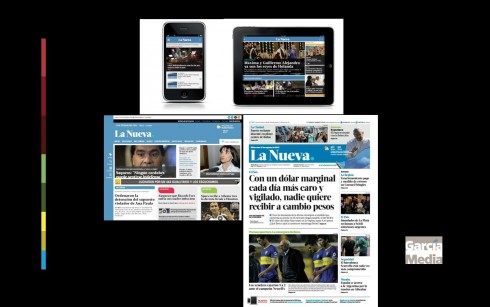
One brand, one newsroom, the media quartet
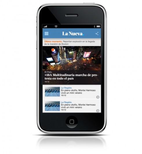
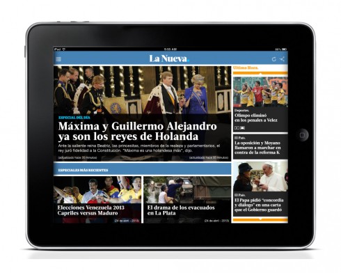
The media quartet has taken up residence at the headquarters of La Nueva Provincia in Bahia Blanca, Argentina.
It’s beginning to tune the instruments and ready to play Dec. 12. While La Nueva Provincia has had an online presence for several years, it was an addition to the mighty print edition, and not a fully integrated one.
With this project, digital platforms move to the front. The printed newspaper transforms from a broadsheet to a tabloid format. That same look and the new brand carry over to the other three platforms: phone, online and tablet.
Of course, this will be an evolutionary process, but this the beginning of a journey that has taken over seven months to complete. During this time we at Garcia Media Latinoamerica (with Rodrigo Fino and Paula Ripoll as art directors and project managers), have conducted several workshops, created the look & feel for the new concept and worked with the editors to guarantee that storytelling, too, adapts to the media quartet concept with four platforms.
Readers today want the news when they want it, where they want it. The new La Nueva offers readers that opportunity.
Here is how Alejandro Massot, executive director of La Nueva puts it:
Since we launched our web edition in 1996, we have seen it grow at a tremendous pace, up to numbers of readers never before imagined. This dramatic change is, in a way, our recognition to this growing digital readership that day after day has been choosing La Nueva Provincia.com as their digital news source; turning it into the most visited news web page in the region.
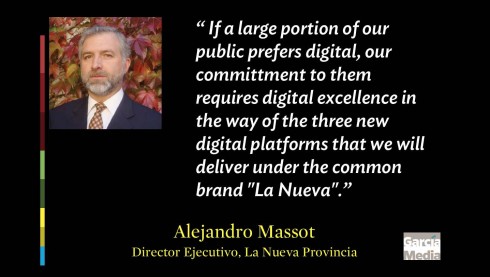
If a large portion of our public prefers digital, our committment to them requires digital excellence in the way of the three new digital platforms that we will deliver under the common brand “La Nueva”. On the other hand, we feel that our paper edition is still meant to lead this revolution; hence, by the same standards of excellence and modernization, it is being transformed in format and design as a key player of the quartet.
According to Fernando Monacelli, managing editor of La Nueva, this was the right time for his newspaper to go with the concept of the media quartet. And, he says, while newspapers everywhere may have taken the necessary steps to accomplish that, “we at La Nueva had not done so in an aggressive way. Remember, we had to make internal changes in the newsroom: we changed our editorial system from one day to the next, as we were still working here as in the decade of the 80s! It was really a PC playing the role of typewriter, that was it.”
This was a great moment of change and adaptation to the new. But now I look back and reflect on it. We did it. In spite of my doubts and fears, we knew we had to move forward, that our newspaper deserved it and it was the only way for La Nueva to continue its trajectory.
Fernando says that going to a full digital throttle mode, he had to inspire his team:
I tried to communicate to our team that we simply could not stay where we were. That we had to move to a new house of sorts, with all the risks that brings. Not that we have all the answers, but we do know today where we want to go, the course of the journey for La Nueva. That much we know, and the team is convinced.
Most impotently, my final message to the team these days: this is a beginning of the journey for La Nueva. It is not that we have arrived, but that we are now way on our way to the journey of where we wish to arrive. That is a good feeling.
“Getting closer to where the audience is”
Abel Escudero Zadrayec is chief editor of lanueva.com. For him, this project signifies big changes in how his job is carried out and perceived by his colleagues. Abel, who joined La Nueva when he was 16 in 1991, was sitting by himself in a corner, and not fully integrated until this project kicked in.
I asked Abel what the change meant for him specifically:
From the digital point of view, the BIG change for #LaBuenaNueva can be divided into two areas: 1) the modernization of our production tools, and 2) a more robust presence in the various platforms.
Both of these things allow us to take another key step, and a very necessary one. That step is to go even more where the audience is, to listen to what it has to say, and to serve it like it deserves, creating the best possible journalism
Supplement explains what’s new with digital
The digital platforms will flow via responsive design. A more robust lanueva.com will allow users of phones and tablets to read stories on those platforms. This is the beginning step, with more curated editions planned for the future.
First, as I tell the team, the media quartet baby steps. For readers of La Nueva: a new beginning, and the hope that some of those younger readers who have seen La Nueva Provincia in their homes forever, will also now become loyal readers via their mobile platforms.
Phone:
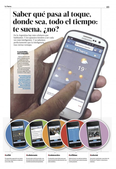
Without any doubt, of all the digital platforms, the phone continues to rise as the most important. It is in our pockets. It is the first platform we use when we wake up, and perhaps the last one we check before we go to sleep. La Nueva introduces a new mobile experience, an effort to attract those 18-30 year old readers, while also offering a rich and informative experience for the rest.
Tablet:
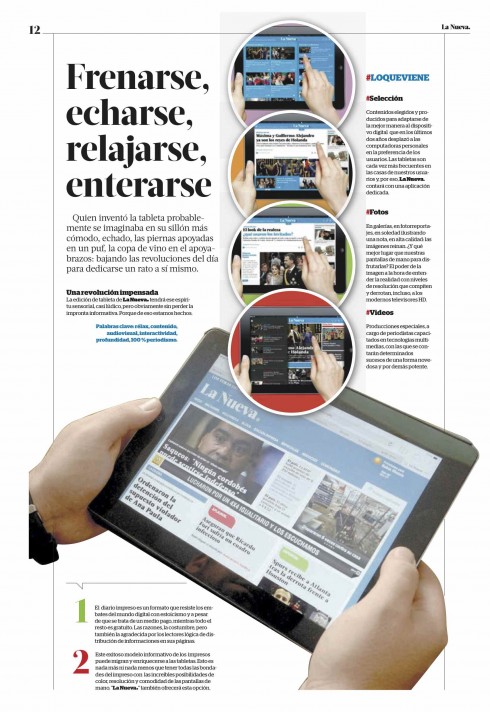
La Nueva goes tablet! Along with the telephone, this is the platform that has become essential in the daily life of readers—-including in Argentina. Here is a platform where readers can read at any time of the day, but also have a total lean back experience in the evenings. It’s all here: read, touch, see.
lanueva.com—
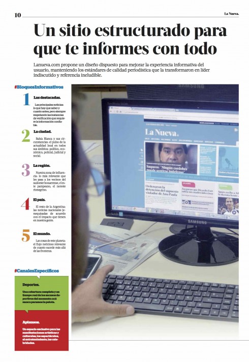
It is here that La Nueva offers its audience a constant flow of information, 24/7. Readers who don’t want to miss out on any news check on the newspaper’s website several times a day. The new lanueva.com offers an easier navigational system, while extending the branding elements from all the other platforms.
In the end, as managing editor Fernando Monacelli explains in a column welcoming readers to La Nueva’s changes:
If you ask what’s new with La Nueva, the answer is a new format, a redesign, more digital engagement, and all sorts of novelties that will delight our readers. But, the essential of what is new, in my view, is our decision to bank on the future, and how we, as journalists, can offer the information that you readers want and need, when you want it and need it and where you want it.
It takes a newspaper that adheres firmly to the media quartet to accomplish that. La Nueva sets on a course to accomplish it with this redesign.
Of related interest
Monday: Argentina’s La Nueva Provincia: it’s a new look across platforms
https://garciamedia.com/blog/articles/pargentinas_la_nueva_provincia_its_a_new_look_across_platforms_p
Tuesday: La Nueva Provincia: The Styleguide
https://www.garciamedia.com/blog/articles/pla_nueva_provincia_the_styleguide_p
I tell the complete story of my first visit to La Nueva Provincia in one of my 40 Years/40 Lessons installments:
https://garciamedia.com/blog/articles/40_years_40_lessons_7._abroad
About the new typography: Acta
http://typographica.org/typeface-reviews/acta-acto/ http://www.myfonts.com/fonts/dstype/acta-display/
Acta Display is part of the larger Acta super-family, including Display, Text, Poster (very black weights), Symbols, and the sans-serif complement Acto. It was designed by Portuguese designer Dino dos Santos of DSType in 2010, originally for the Chilean newspaper La Tercera. Acta Display is elegant, with very high contrast and sinuous curves. It could be categorized as a Didone like Bodoni and Didot, but is less rigid than most in that genre. Acta Display Black is the heaviest weight of Acta Display and makes a strong statement.
Watch the promotional video for La Nueva.
The concept starts with the question: How is your day?
The star of this promotion is basketball star and Bahia Blanca native, Juan Espil , well known by all, and a good way of attracting those younger readers.
http://es.wikipedia.org/wiki/Juan_Alberto_Espil