This is the weekend edition of TheMarioBlog and will be updated as needed. The next blog post is Monday, February 4
Update #3, Frankfurt, Germany, Friday, Feb. 1, 08:20
TAKEAWAY: Working around the media quartet and users who get their information from various platforms, not just one. This will change the way we as editors and designers work with each of the platforms as well. PLUS: Revisiting Moscovskiye Novosti in Moscow, three years later.
Moscovskiye Novosti: three years later
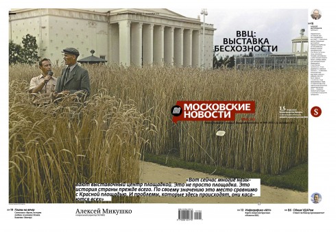
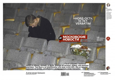
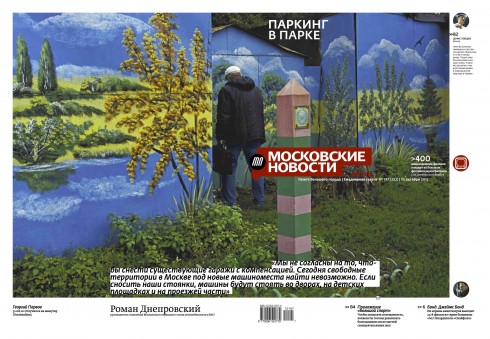
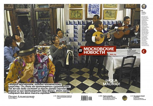
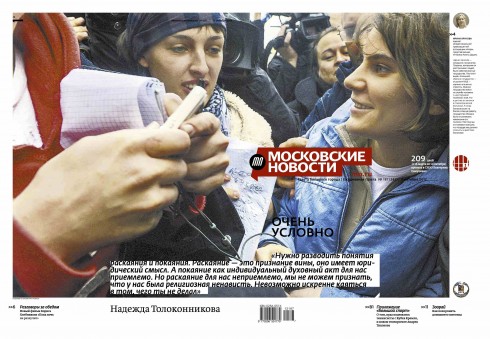
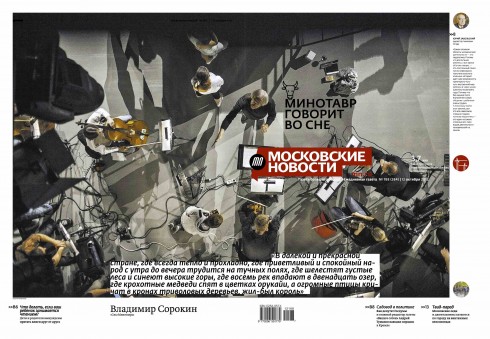
Recent front pages from Moscovskiye Novosti in its compact,daily-magazine style format: the new MN wraps a “photo of the day” around its front and back covers. The photo is seldom the news image of the day, in fact, the editors want it to be a visual surprise that may start the conversation, and not the photo other newspapers may have as its lead on page one.
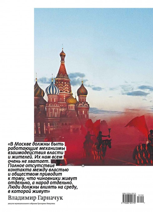
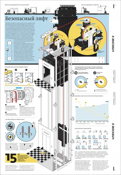
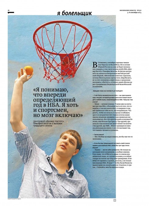
The front page of the new Moscovskiye Novosti is not limited to images; sometimes graphic illustrations or even “type attacks” make the cover

This combo captures various moments during my public lecture Thursday in the RIA Novosti headquarters in Moscow. RIA Novosti photos / Alexander Natruskin; combo photo editing/design, Frank Deville
This week I spent part of my time in Moscow, doing a workshop for the talented team of Moscovskiye Novosti, the Russian daily that we helped bring back in 2010. It now changed its format (a sort of daily magazine as a compact), and, with a new team, it aims at a younger audience who may not necessarily be reading their newspaper at home before going to work. The images you see here are the work of the MN Creative Team:
Ilya Ruderman, RIA Novosti art director and deputy editor in chief ; Anton Stepanov, Moscovskiye Novosti art director
Instead, the MN team tells me, these digitally minded younger types, mostly Muscovites, wait till later in their day to read the MN and do so leisurely while sitting at a Starbucks (yes, those are all over Moscow these days).
“These readers already know a lot of the news headlines already, so what they find in our newspaper is more features, analysis, surprises and chronicles that get the conversation going,” Alexander Bogomolov, the MN print editor told me in the course of our workshop.
The new MN is pictorial starting on Page One, where a photo of the day becomes the entire wrap around the front page.
In addition to my workshop with the MN team, I also was invited to offer a public lecture, sponsored by RIA Novosti, attended by the public at large, with a youngish audience of media professionals, editors, designers and journalism students.
Highlights of the lecture:
Become a top storyteller, then concern yourself with the specific platform in which your story will be displayed.
Learn to write, edit and design for mobile devices, because they are hot in the present and should remain so in the future.
Give it all your passion: that will be one way of showing your superiors that these are the most exciting times to be a storyteller in our multi platform world.
Read on for more on the media quartet and fine tuning those instruments.
Our previous blog posts about Moscovskiye Novosti
https://garciamedia.com/blog/articles/today_is_the_day_moscovskiye_novostis_comeback_premieres/
https://www.garciamedia.com/blog/articles/moscovskiye_novosti_marketing_campaign_creates_controversy
Fine tuning those instruments in the media quartet
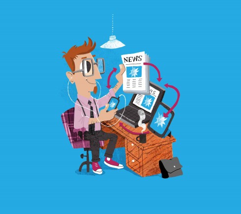
Media quartet illustration from The iPad Design Lab: Storytelling in the Age of the Tablet, by Luis Vazquez
It’s a thought that has followed me since the iPad came out in 2010 and I started discussing the “media quartet”, always a fascinating topic in my presentations, but one that acquires new meaning—and status—- when we begin to see that while the four platforms of the media quartet——mobile, online, print and tablet—-each has its unique characteristics, functions and potential, users move from one to the other with great ease, and sometimes use two of them simultaneously.
You can call it the ultimate fine tuning of the instruments here, at least for the users, who are becoming pros on what platform does what for them. Each member of the media quartet provides a distinct type of sound: phone and online remind me of trombones, with staccato tones that brings us to the alert mode; print and tablets more like soothing violins, inspiring meditation and reflection.
For all of us users of the various platforms in the media quartet, the sounds of those two instruments are welcome, and we choose when to use which.
Sequential use of platforms
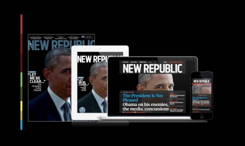
The newly relaunched look of The New Republic is an excellent example of brand extension with one look and feel across the four platforms of the media quartet. The New Republic’s website includes a “read later” feature that allows you to start an article on one device and pick it up where you left off on another.
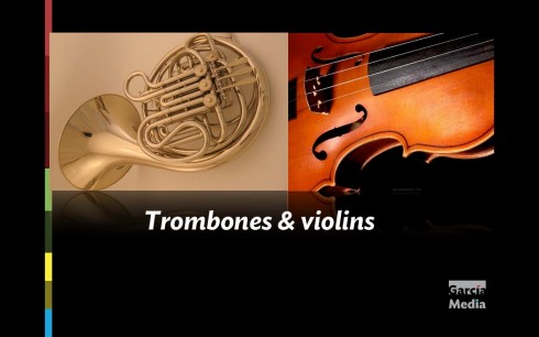
The four platforms in the media quartet are more like trombones (mobile, online) and violins (print and tablet)
This is conveyed in a piece
titled Windows on the Web which I read this week about sequential use of different devices. Yes, the idea that one can be reading a feature on the tablet, while watching a favorite TV sitcom. Not far fetched, and, in fact, more common than rare for many users.
They want the same content, presented so they can find it, navigate it, and read it. They imagine that their devices are different-sized windows on the same content, not entirely different containers
What are we as editors and designers to do with this information?
I am sure that the marketing people will get hold of this information and plan “platform duets” made in heaven. One could be reading a piece about cooking with olive oil, while watching a super celebrity chef do it on TV, or read all about the great Agatha Christie, just the night that a retrospective of the mystery writer is televised. Advertisers will probably chime in, too, with just the right product to sell to a captive double-platform invested audience of people with similar taste and addictions.
Editors will evaluate the potential of a story to travel across platforms: what do I wish to see or to read of this story on my mobile phone, or online, or on print and/or tablet? Are there stories for which all four platforms could offer distinctive material? Indeed, sports and culture come to mind.
Designers are the ones who will be affected the most here, I think. While the emphasis will be on exploiting the specifics of each platform,I predict that we will definitely move towards a more unified look and feel for ALL the platforms, something The New Republic has done so well in its relaunched product (see image here). This will free the designer to concentrate on the selection of visuals, that 40% of the surprise that we expect from each of the platforms.
We have only begun to hear the first notes played by the media quartet. They are sweet, harmonious and, I believe, the sound of things to come.
Those gems of the past
When the discussion in our workshops turns to revenue producing ideas, I usually look in the direction of the newspaper’s “morgue” (for the youngsters among you, that’s the archaic term for the archives, the library where old editions, photo files, etc. are stored).
It is there that every publication in the globe saves its treasures of materials, in many cases, or, in fact, in all cases, unique to a specific region, country or expertise developed by this newspaper or magazine over decades, or centuries.
Enter the digital platforms, like the tablet, for example, and editors with imagination and a soft spot for nostalgia, can capitalize on those riches that lie dormant in a file. No question about it, nostalgia sells. It is sweet and there is always a pocket of the audience that longs for it. Give it to them.
Now Timehop
is the mobile app that serves up a daily summary of your past social activity on Facebook and Twitter from years ago . The guys at Timehop are convinced that we all wish to dwell a bit on the “sweet nostalgia” of days gone by:
“It’s longing paired with the passage of time, a sense of how things were once “better,” or at least different, than they are today. Bottle that feeling, and you’ve got a potential customer in the bag.”
So this may be the reason why USA Today has partnered up with Timehop, and is now delivering users relevant news from the past in their daily Timehop updates.
What’s in it for USA Today?
All of the past stories inside the app will link out to a USA Today piece hosted on the publication’s site. It’s a small way of driving an extra bit of traffic out to the paper’s daily site. And, for “the nation’s newspaper”, which has turned 35 years old already, there is nostalgia to cultivate and packed files ready to please those wishing to have a rendezvous with a favorite moment, event or year of the past.
So, start raiding those archives, develop your own nostalgia apps, and let them come and tell you how $weet nostalgia is.
Of special interest this weekend:
Guardian CEO Andrew Miller on paywalls, mobile, and going global
http://www.niemanlab.org/2013/01/guardian-ceo-andrew-miller-on-paywalls-mobile-and-going-global/
Highlights of interview with Guardian CEO Andrew Miller on a variety of key subjects:
Paywalls
So on Facebook and Twitter, you’ll never have a paywall, because it doesn’t make sense. You want your news to be consumed in a social way. Never say never, but a paywall wouldn’t seem to make sense there. Whereas enhanced product formats, where you’re getting real extra value in the way you’re doing it, it probably does make sense to have a paywall. But it only makes sense to have a paywall on the secondary level when you’ve got the right size of audience who’ll convert to it.
You might have a unique proposition that is very meaningful in an iPad format for a very closed and small audience — maybe a unique audience, like financial news. And in that case, I think a hard paywall on that does make sense. But if you want to own the discussion with advertisers as meaningful, you’ve got to have a large audience that you understand, who understand your products.
iPad and revenue producing
….The iPad’s a great example. It’s obviously free at the beginning, and the free trial shows very strongly there’s a huge demand for iPad interaction and the enhancement that gives. As soon as you put a paywall above it, not surprisingly, the number of people who really subscribe to it really falls off quite dramatically. The conversion rate we’ve seen is about 15 to 20 percent of the free trial. Which I think is pretty good, actually, by iPad type metrics.
Responsive design and The Guardian
It’s a very realistic position with the proliferation of tablet devices in all different formats. If you’re not in a responsive-based site, your content won’t be served in the right way for the site. That’s just about being in the game. It’s not about an agenda of advancing our own products coming behind it; it’s about actually being in line with the pace of the change going on. The mobile growth we’re seeing at the moment, across all the geographies, is phenomenal
The newsonomics of Aaron Kushner’s virtuous circles
Highlight:
If there were a Pulitzer for getting the most done in six months, Aaron Kushner should win it.
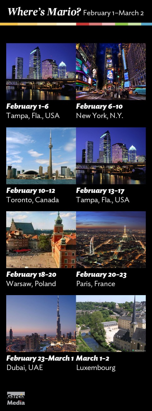
Where’s Mario until March 2, 2013?
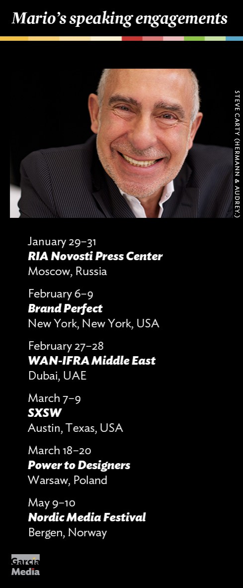
Mario’s upcoming speaking engagements
Take advantage of our iPad Design/Ad Lab workshops
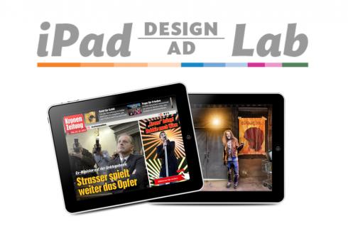
Do you want to take your brand to the next level by creating a tablet edition? Garcia Media can help. We now offer one- to two-day iPad Design Lab workshops on demand to jumpstart your presence on this exciting new platform. We also offer iPad Ad Lab workshops to develop engaging advertising models for your app. Contact us for more information.

Purchase the book on the iBookstore
iPad Design Lab has been given the QED Seal
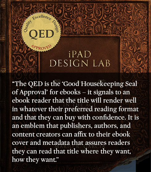
The QED (Quality–Excellence–Design) Seal is bestowed by the judges of the Publishing Innovation Awards after “a thorough, professional 13-point design review with an eye towards readability across multiple devices and in multiple formats.”
Learn more about the QED Seal here.
The EPUB version of book is HERE:
Now available: The EPUB version of  iPad Design Lab: Storytelling in the Age of the Tablet, ready for download via Amazon.com for Kindle:
http://tinyurl.com/8u99txw
Here is how you can get iPad Design Lab book:
The original version of the book is the multitouch textbook version available on the iBookstore for iPad (iOS 5.0 and up):
https://itunes.apple.com/book/ipad-design-lab/id565672822
This version includes video walkthroughs, audio introductions to each chapter, swipeable slideshows, a glossary and a sophisticated look and feel.
Apple only sells multitouch textbooks in certain countries at this time, unfortunately. Copies are available in at least the following countries: Australia, Austria, Belgium, Canada, Finland, France, Germany, Great Britain, Greece, Italy, Latvia, Luxembourg, The Netherlands, Poland, Portugal, Romania, Slovakia, Spain, and the United States.
For those in other countries and without an iPad, we have made the book available in a basic edition for other platforms. This basic edition includes the full text of the original, along with the images and captions, but lacks the other features such as audio and video. It is available on the following platforms in many countries:
Amazon Kindle:
http://amzn.to/SlPzjZ
Google Books:
http://bit.ly/TYKcew
Take a video tour of iPad Design Lab
“iPad Design Lab” trailer on Vimeo.
Read the Society of Publication Designers’ review of The iPad Design Lab here:
http://www.spd.org/2012/10/must-read-ipad-design-lab.php

Keep up with Mario Garcia Jr.. via Garcia Interactive: helping transform online news since 1995.
www.garciainteractive.com