TAKEAWAY: Guess what? Those millenials don’t read news much more differently than their parents and grandparents—-except they almost exclusively read it on a mobile device.

Image from http://nycprowler.com
I recently got a chuckle after reading this piece in The Atlantic with a summary that reads:
For all the attention given to “bold rich multi-media experiences,” young mobile news readers still prefer stories the way their great-great-grandparents did: In columns of text.
The article, based on a new report from the Pew Research Center (pdf) suggests that, when it comes to reading the news on mobile devices, young people aren’t so different.
Not that they were different about viewing and digesting content in print, either. And here is where you find me smiling and shaking my head.
For years, I have never understood why editors and designers believe that for a newspaper page to be “attractive” to young people, it had to incorporate an element of “cutesiness”, or do one of the following:
-Use slanted headlines or photos
-Use typographic elements that were not part of the newspaper’s palette (yes, you guessed right, this opened the door for chambers of typographic horror, as editors favored type that looked crazy, was hard to read and created an eyesore on the page)
-**Turn the page upside down** to make it “more fun”.
None of these ever worked, and I always insisted that young people digested their food the same way older folks did, just as their eyes favored order, not chaos, and one did not have to make an effort to go visually crazy to appeal to the young.
(By the way, it is worth remembering at this point that the same misconceptions are there when editors wish to create a down market product for the not so educated: let chaos rule the day! How wrong can they be. To be perhaps not so well educated or financially advantaged does not mean we want to read chaotic pages in a newspaper or magazine.)
In the digital era
Today, “cutesiness” for the young translates into a razzle dazzle of special effects sometimes.
So, amen to this Pew research study that tells us, among other things:
First, millenials use their tablets and smartphones to read the news at nearly identical rates to 30- and 40-somethings
Young mobile readers don’t want apps and mobile browsers that look like the future. They want apps that look like the past: 58% of those under 50, and 60% of Millennials, prefer a “print-like experience” over tech features like audio, video, and complex graphics
18-to 29-year-old tablet news users touch or click on ads when getting news to a far greater degree than older generations
Food for thought for all of us in this business. And, a reminder, that youth is not necessarily wasted on the young, but that we older folks do waste too much time orchestrating things the way we think these youngsters would want it.
Time to rethink our strategy for the young, while rejoicing in the fact that they are quite smart, after all.
For more about the Pew study:
The Demographics of Mobile News: Men, College Grads and the Young are More Engaged
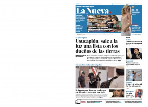
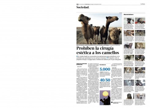
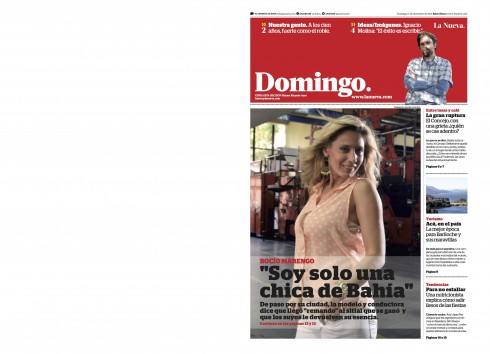
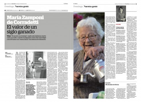
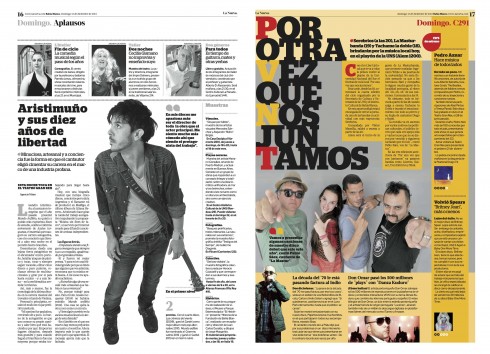
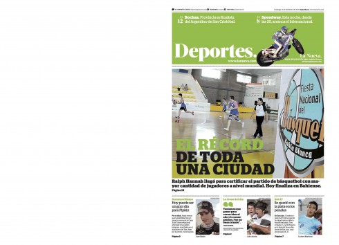
La Nueva: the first Sunday edition after redesign
Last week we were in Bahia Blanca, Argentina, for the launch of La Nueva with a new format (conversion to tabloid), new name (shortened from La Nueva Provincia to La Nueva), and even a new logo. These are pages from the first Sunday edition after the redesign, courtesy of Jose Luis Ponte, editor in charge of layout and design.
A Twitter story
Riding Bus 19 to the top
http://storify.com/BostonDotCom/making-good-from-almost-nothing/embed
Here is a story totally told via 140-character tweets by Billy Baker, a reporter for The Boston Globe
Of special interest today:
Register-Guard’s smartphone strategy starts with responsive design platform
http://www.inma.org/blogs/ideas/post.cfm/register-guard-s-smartphone-strategy-starts-with-responsive-design-platform
Highlight:
Redesign takes site from mobile unfriendly to traffic that doubled in six months and is bringing in revenue.