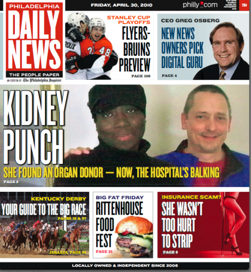
TAKEAWAY: The first visible results of Garcia Media’s work with the Philadelphia newspapers appeared today, as the Daily News introduced its new front page style, part of an evolutionary process that will be continued through the inside of the newspaper in the weeks and months to come.

Front page of the Friday Philadelphia Daily News; new look highlights a full page one navigator, more photography
Today was the day!
The Philadelphia Daily News is sporting a new front page, and it is the first visible part of our work with the Philadelphia Newspapers (See previous blogs about The Philadelphia Story).
The DN is basking in the glory of its recent Pulitzer Prize honor, and now the editors have chosen today to start utilizing some of the design elements that we have recommended to give the front page of the newspaper a greater chance to display photography and to serve as a navigator to a variety of topics on the inside.
I have done our DN work with Reed Reibstein (Yale University ‘11) as my copilot and assistant art director. Reed and I have travelled several times to Philadelphia to work with Michael Days and Design Editor, John Sherlock.
Here is how Editor Michael Days puts it:
The Philadelphia Daily News published a new layout style Friday, after
fine consul from designer Mario Garcia. This new format is the perfect vehicle for selling the Daily
News, at the very least, on Fridays. We can promote local news and our
significant weekend sports and entertainment offerings in a way that
really pops. It’s great to have another tool in the arsenal.”From Design Editor, John Sherlock:
“Garcia’s group helped us light a spark under our promotional style.
This “Megatout” format translates well for print and online. We think
its a great look for the iPad, so we’re anxious to see it in action in
the very near future. The layout enhances the at-a-glance attention
factor our paper needs to spur street sales. Initial reaction to our
soft launch of the cover has been overwhelmingly positive.”TheMarioBlog post #544
—